Note
Go to the end to download the full example code.
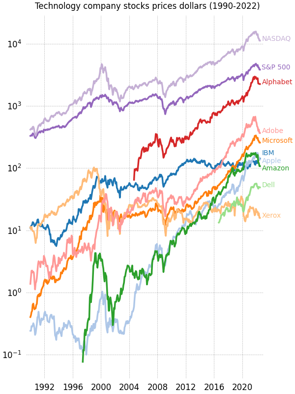
Stock prices over 32 years#
A graph of multiple time series that demonstrates custom styling of plot frame, tick lines, tick labels, and line graph properties. It also uses custom placement of text labels along the right edge as an alternative to a conventional legend.
Note: The third-party mpl style dufte produces similar-looking plots with less code.
import matplotlib.pyplot as plt
import numpy as np

from matplotlib.cbook import get_sample_data
import matplotlib.transforms as mtransforms

with get_sample_data('Stocks.csv') as file:
    stock_data = np.genfromtxt(
        file, delimiter=',', names=True, dtype=None,
        converters={0: lambda x: np.datetime64(x, 'D')}, skip_header=1)

fig, ax = plt.subplots(1, 1, figsize=(6, 8), layout='constrained')

# These are the colors that will be used in the plot
ax.set_prop_cycle(color=[
    '#1f77b4', '#aec7e8', '#ff7f0e', '#ffbb78', '#2ca02c', '#98df8a',
    '#d62728', '#ff9896', '#9467bd', '#c5b0d5', '#8c564b', '#c49c94',
    '#e377c2', '#f7b6d2', '#7f7f7f', '#c7c7c7', '#bcbd22', '#dbdb8d',
    '#17becf', '#9edae5'])

stocks_name = ['IBM', 'Apple', 'Microsoft', 'Xerox', 'Amazon', 'Dell',
               'Alphabet', 'Adobe', 'S&P 500', 'NASDAQ']
stocks_ticker = ['IBM', 'AAPL', 'MSFT', 'XRX', 'AMZN', 'DELL', 'GOOGL',
                 'ADBE', 'GSPC', 'IXIC']

# Manually adjust the label positions vertically (units are points = 1/72 inch)
y_offsets = dict.fromkeys(stocks_ticker, 0)
y_offsets['IBM'] = 5
y_offsets['AAPL'] = -5
y_offsets['AMZN'] = -6

for nn, column in enumerate(stocks_ticker):
    # Plot each line separately with its own color.
    # don't include any data with NaN.
    good = np.nonzero(np.isfinite(stock_data[column]))
    line, = ax.plot(stock_data['Date'][good], stock_data[column][good], lw=2.5)

    # Add a text label to the right end of every line. Most of the code below
    # is adding specific offsets y position because some labels overlapped.
    y_pos = stock_data[column][-1]

    # Use an offset transform, in points, for any text that needs to be nudged
    # up or down.
    offset = y_offsets[column] / 72
    trans = mtransforms.ScaledTranslation(0, offset, fig.dpi_scale_trans)
    trans = ax.transData + trans

    # Again, make sure that all labels are large enough to be easily read
    # by the viewer.
    ax.text(np.datetime64('2022-10-01'), y_pos, stocks_name[nn],
            color=line.get_color(), transform=trans)

ax.set_xlim(np.datetime64('1989-06-01'), np.datetime64('2023-01-01'))

fig.suptitle("Technology company stocks prices dollars (1990-2022)",
             ha="center")

# Remove the plot frame lines. They are unnecessary here.
ax.spines[:].set_visible(False)

# Ensure that the axis ticks only show up on the bottom and left of the plot.
# Ticks on the right and top of the plot are generally unnecessary.
ax.xaxis.tick_bottom()
ax.yaxis.tick_left()
ax.set_yscale('log')

# Provide tick lines across the plot to help your viewers trace along
# the axis ticks. Make sure that the lines are light and small so they
# don't obscure the primary data lines.
ax.grid(True, 'major', 'both', ls='--', lw=.5, c='k', alpha=.3)

# Remove the tick marks; they are unnecessary with the tick lines we just
# plotted. Make sure your axis ticks are large enough to be easily read.
# You don't want your viewers squinting to read your plot.
ax.tick_params(axis='both', which='both', labelsize='large',
               bottom=False, top=False, labelbottom=True,
               left=False, right=False, labelleft=True)

# Finally, save the figure as a PNG.
# You can also save it as a PDF, JPEG, etc.
# Just change the file extension in this call.
# fig.savefig('stock-prices.png', bbox_inches='tight')
plt.show()
References
The use of the following functions, methods, classes and modules is shown in this example:
Total running time of the script: (0 minutes 1.238 seconds)