Note
Go to the end to download the full example code.
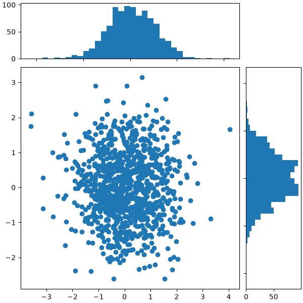
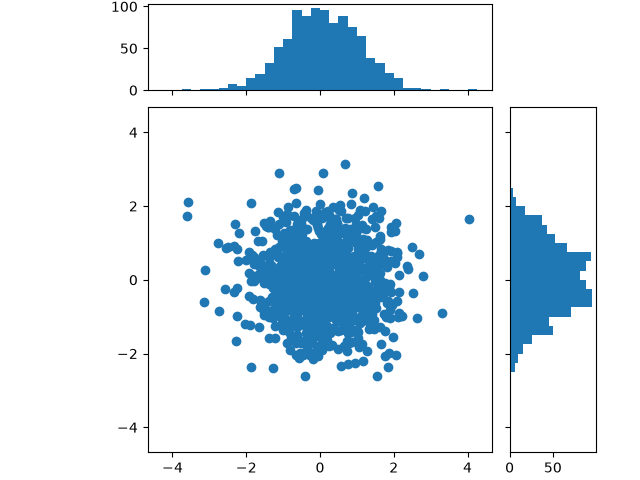
Scatter plot with histograms#
Add histograms to the x-axes and y-axes margins of a scatter plot.
This layout features a central scatter plot illustrating the relationship between x and y, a histogram at the top displaying the distribution of x, and a histogram on the right showing the distribution of y.
For a nice alignment of the main Axes with the marginals, two options are shown below:
While Axes.inset_axes may be a bit more complex, it allows correct handling
of main Axes with a fixed aspect ratio.
Let us first define a function that takes x and y data as input, as well as three Axes, the main Axes for the scatter, and two marginal Axes. It will then create the scatter and histograms inside the provided Axes.
import matplotlib.pyplot as plt
import numpy as np

# Fixing random state for reproducibility
np.random.seed(19680801)

# some random data
x = np.random.randn(1000)
y = np.random.randn(1000)


def scatter_hist(x, y, ax, ax_histx, ax_histy):
    # no labels
    ax_histx.tick_params(axis="x", labelbottom=False)
    ax_histy.tick_params(axis="y", labelleft=False)

    # the scatter plot:
    ax.scatter(x, y)

    # now determine nice limits by hand:
    binwidth = 0.25
    xymax = max(np.max(np.abs(x)), np.max(np.abs(y)))
    lim = (int(xymax/binwidth) + 1) * binwidth

    bins = np.arange(-lim, lim + binwidth, binwidth)
    ax_histx.hist(x, bins=bins)
    ax_histy.hist(y, bins=bins, orientation='horizontal')
Defining the Axes positions using subplot_mosaic#
We use the subplot_mosaic function to define the positions and
names of the three axes; the empty axes is specified by '.'. We manually
specify the size of the figure, and can make the different axes have
different sizes by specifying the width_ratios and height_ratios
arguments. The layout argument is set to 'constrained' to optimize the
spacing between the axes.
Defining the Axes positions using inset_axes#
inset_axes can be used to position marginals outside the main
Axes. The advantage of doing so is that the aspect ratio of the main Axes
can be fixed, and the marginals will always be drawn relative to the position
of the Axes.
# Create a Figure, which doesn't have to be square.
fig = plt.figure(layout='constrained')
# Create the main Axes.
ax = fig.add_subplot()
# The main Axes' aspect can be fixed.
ax.set_aspect('equal')
# Create marginal Axes, which have 25% of the size of the main Axes.  Note that
# the inset Axes are positioned *outside* (on the right and the top) of the
# main Axes, by specifying axes coordinates greater than 1.  Axes coordinates
# less than 0 would likewise specify positions on the left and the bottom of
# the main Axes.
ax_histx = ax.inset_axes([0, 1.05, 1, 0.25], sharex=ax)
ax_histy = ax.inset_axes([1.05, 0, 0.25, 1], sharey=ax)
# Draw the scatter plot and marginals.
scatter_hist(x, y, ax, ax_histx, ax_histy)

plt.show()
While we recommend using one of the two methods described above, there are number of other ways to achieve a similar layout:
The Axes can be positioned manually in relative coordinates using
add_axes.A gridspec can be used to create the layout (
add_gridspec) and adding only the three desired axes (add_subplot).Four subplots can be created using
subplots, and the unused axes in the upper right can be removed manually.The
axes_grid1toolkit can be used, as shown in Align histogram to scatter plot using locatable Axes.
References
The use of the following functions, methods, classes and modules is shown in this example:
Total running time of the script: (0 minutes 1.750 seconds)