Note
Go to the end to download the full example code.
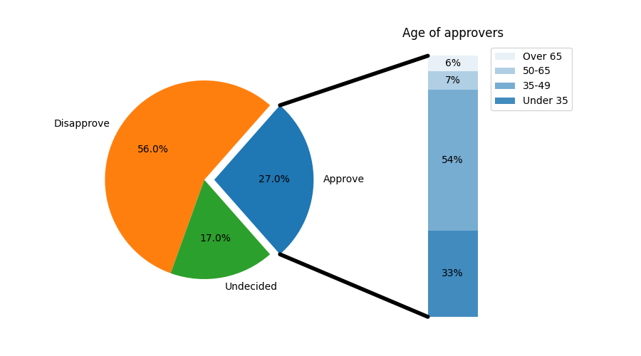
Bar of pie#
Make a "bar of pie" chart where the first slice of the pie is "exploded" into a bar chart with a further breakdown of said slice's characteristics. The example demonstrates using a figure with multiple sets of Axes and using the Axes patches list to add two ConnectionPatches to link the subplot charts.
import matplotlib.pyplot as plt
import numpy as np

from matplotlib.patches import ConnectionPatch

# make figure and assign axis objects
fig, (ax1, ax2) = plt.subplots(1, 2, figsize=(9, 5))
fig.subplots_adjust(wspace=0)

# pie chart parameters
overall_ratios = [.27, .56, .17]
labels = ['Approve', 'Disapprove', 'Undecided']
explode = [0.1, 0, 0]
# rotate so that first wedge is split by the x-axis
angle = -180 * overall_ratios[0]
pie = ax1.pie(overall_ratios, autopct='%1.1f%%', startangle=angle,
              labels=labels, explode=explode)

# bar chart parameters
age_ratios = [.33, .54, .07, .06]
age_labels = ['Under 35', '35-49', '50-65', 'Over 65']
bottom = 1
width = .2

# Adding from the top matches the legend.
for j, (height, label) in enumerate(reversed([*zip(age_ratios, age_labels)])):
    bottom -= height
    bc = ax2.bar(0, height, width, bottom=bottom, color='C0', label=label,
                 alpha=0.1 + 0.25 * j)
    ax2.bar_label(bc, labels=[f"{height:.0%}"], label_type='center')

ax2.set_title('Age of approvers')
ax2.legend()
ax2.axis('off')
ax2.set_xlim(- 2.5 * width, 2.5 * width)

# use ConnectionPatch to draw lines between the two plots
theta1, theta2 = pie.wedges[0].theta1, pie.wedges[0].theta2
center, r = pie.wedges[0].center, pie.wedges[0].r
bar_height = sum(age_ratios)

# draw top connecting line
x = r * np.cos(np.pi / 180 * theta2) + center[0]
y = r * np.sin(np.pi / 180 * theta2) + center[1]
con = ConnectionPatch(xyA=(-width / 2, bar_height), coordsA=ax2.transData,
                      xyB=(x, y), coordsB=ax1.transData)
con.set_color([0, 0, 0])
con.set_linewidth(4)
ax2.add_artist(con)

# draw bottom connecting line
x = r * np.cos(np.pi / 180 * theta1) + center[0]
y = r * np.sin(np.pi / 180 * theta1) + center[1]
con = ConnectionPatch(xyA=(-width / 2, 0), coordsA=ax2.transData,
                      xyB=(x, y), coordsB=ax1.transData)
con.set_color([0, 0, 0])
ax2.add_artist(con)
con.set_linewidth(4)

plt.show()
References
The use of the following functions, methods, classes and modules is shown in this example: