Note
Go to the end to download the full example code.
Center labels between ticks#
Tick labels are aligned relative to their associated tick, and are by default centered.
However, there is no direct way to center the labels between ticks. To fake this behavior, one can place a minor tick in between the major ticks. Then label the minor tick, and hide the minor tick lines and the major tick labels.
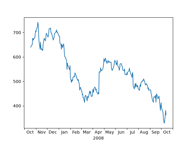
Here is an example that labels the months, centered between the ticks.
import matplotlib.pyplot as plt

import matplotlib.cbook as cbook
import matplotlib.dates as dates
import matplotlib.ticker as ticker

# Load some financial data; Google's stock price
r = cbook.get_sample_data('goog.npz')['price_data']
r = r[-250:]  # get the last 250 days

fig, ax = plt.subplots()
ax.plot(r["date"], r["adj_close"])

ax.xaxis.set_major_locator(dates.MonthLocator())
# 16 is a slight approximation since months differ in number of days.
ax.xaxis.set_minor_locator(dates.MonthLocator(bymonthday=16))

# The NullFormatter removes the major tick labels
ax.xaxis.set_major_formatter(ticker.NullFormatter())
ax.xaxis.set_minor_formatter(dates.DateFormatter('%b'))

# Remove the minor tick lines
ax.tick_params(axis='x', which='minor', tick1On=False, tick2On=False)

imid = len(r) // 2
ax.set_xlabel(str(r["date"][imid].item().year))
plt.show()