Note
Click here to download the full example code
Psd Demo
Plotting Power Spectral Density (PSD) in Matplotlib.
The PSD is a common plot in the field of signal processing. NumPy has many useful libraries for computing a PSD. Below we demo a few examples of how this can be accomplished and visualized with Matplotlib.
import matplotlib.pyplot as plt
import numpy as np
import matplotlib.mlab as mlab
import matplotlib.gridspec as gridspec
# Fixing random state for reproducibility
np.random.seed(19680801)
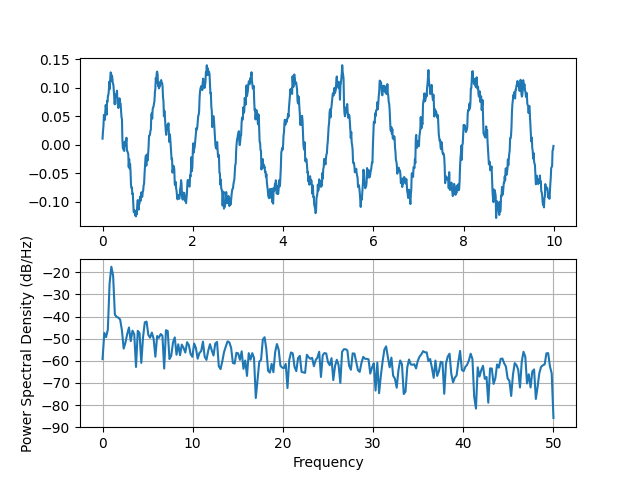
dt = 0.01
t = np.arange(0, 10, dt)
nse = np.random.randn(len(t))
r = np.exp(-t / 0.05)
cnse = np.convolve(nse, r) * dt
cnse = cnse[:len(t)]
s = 0.1 * np.sin(2 * np.pi * t) + cnse
fig, (ax0, ax1) = plt.subplots(2, 1)
ax0.plot(t, s)
ax1.psd(s, 512, 1 / dt)
plt.show()
Compare this with the equivalent Matlab code to accomplish the same thing:
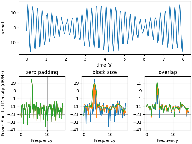
Below we'll show a slightly more complex example that demonstrates how padding affects the resulting PSD.
dt = np.pi / 100.
fs = 1. / dt
t = np.arange(0, 8, dt)
y = 10. * np.sin(2 * np.pi * 4 * t) + 5. * np.sin(2 * np.pi * 4.25 * t)
y = y + np.random.randn(*t.shape)

# Plot the raw time series
fig = plt.figure(constrained_layout=True)
gs = gridspec.GridSpec(2, 3, figure=fig)
ax = fig.add_subplot(gs[0, :])
ax.plot(t, y)
ax.set_xlabel('time [s]')
ax.set_ylabel('signal')

# Plot the PSD with different amounts of zero padding. This uses the entire
# time series at once
ax2 = fig.add_subplot(gs[1, 0])
ax2.psd(y, NFFT=len(t), pad_to=len(t), Fs=fs)
ax2.psd(y, NFFT=len(t), pad_to=len(t) * 2, Fs=fs)
ax2.psd(y, NFFT=len(t), pad_to=len(t) * 4, Fs=fs)
ax2.set_title('zero padding')

# Plot the PSD with different block sizes, Zero pad to the length of the
# original data sequence.
ax3 = fig.add_subplot(gs[1, 1], sharex=ax2, sharey=ax2)
ax3.psd(y, NFFT=len(t), pad_to=len(t), Fs=fs)
ax3.psd(y, NFFT=len(t) // 2, pad_to=len(t), Fs=fs)
ax3.psd(y, NFFT=len(t) // 4, pad_to=len(t), Fs=fs)
ax3.set_ylabel('')
ax3.set_title('block size')

# Plot the PSD with different amounts of overlap between blocks
ax4 = fig.add_subplot(gs[1, 2], sharex=ax2, sharey=ax2)
ax4.psd(y, NFFT=len(t) // 2, pad_to=len(t), noverlap=0, Fs=fs)
ax4.psd(y, NFFT=len(t) // 2, pad_to=len(t),
        noverlap=int(0.05 * len(t) / 2.), Fs=fs)
ax4.psd(y, NFFT=len(t) // 2, pad_to=len(t),
        noverlap=int(0.2 * len(t) / 2.), Fs=fs)
ax4.set_ylabel('')
ax4.set_title('overlap')

plt.show()
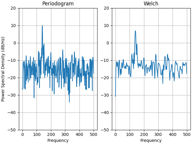
This is a ported version of a MATLAB example from the signal processing toolbox that showed some difference at one time between Matplotlib's and MATLAB's scaling of the PSD.
fs = 1000
t = np.linspace(0, 0.3, 301)
A = np.array([2, 8]).reshape(-1, 1)
f = np.array([150, 140]).reshape(-1, 1)
xn = (A * np.sin(2 * np.pi * f * t)).sum(axis=0)
xn += 5 * np.random.randn(*t.shape)

fig, (ax0, ax1) = plt.subplots(ncols=2, constrained_layout=True)

yticks = np.arange(-50, 30, 10)
yrange = (yticks[0], yticks[-1])
xticks = np.arange(0, 550, 100)

ax0.psd(xn, NFFT=301, Fs=fs, window=mlab.window_none, pad_to=1024,
        scale_by_freq=True)
ax0.set_title('Periodogram')
ax0.set_yticks(yticks)
ax0.set_xticks(xticks)
ax0.grid(True)
ax0.set_ylim(yrange)

ax1.psd(xn, NFFT=150, Fs=fs, window=mlab.window_none, pad_to=512, noverlap=75,
        scale_by_freq=True)
ax1.set_title('Welch')
ax1.set_xticks(xticks)
ax1.set_yticks(yticks)
ax1.set_ylabel('')  # overwrite the y-label added by `psd`
ax1.grid(True)
ax1.set_ylim(yrange)

plt.show()
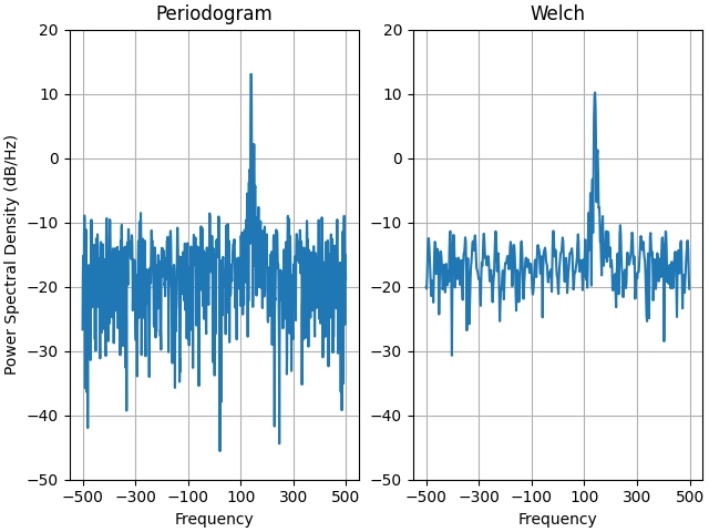
This is a ported version of a MATLAB example from the signal processing toolbox that showed some difference at one time between Matplotlib's and MATLAB's scaling of the PSD.
It uses a complex signal so we can see that complex PSD's work properly.
prng = np.random.RandomState(19680801)  # to ensure reproducibility

fs = 1000
t = np.linspace(0, 0.3, 301)
A = np.array([2, 8]).reshape(-1, 1)
f = np.array([150, 140]).reshape(-1, 1)
xn = (A * np.exp(2j * np.pi * f * t)).sum(axis=0) + 5 * prng.randn(*t.shape)

fig, (ax0, ax1) = plt.subplots(ncols=2, constrained_layout=True)

yticks = np.arange(-50, 30, 10)
yrange = (yticks[0], yticks[-1])
xticks = np.arange(-500, 550, 200)

ax0.psd(xn, NFFT=301, Fs=fs, window=mlab.window_none, pad_to=1024,
        scale_by_freq=True)
ax0.set_title('Periodogram')
ax0.set_yticks(yticks)
ax0.set_xticks(xticks)
ax0.grid(True)
ax0.set_ylim(yrange)

ax1.psd(xn, NFFT=150, Fs=fs, window=mlab.window_none, pad_to=512, noverlap=75,
        scale_by_freq=True)
ax1.set_title('Welch')
ax1.set_xticks(xticks)
ax1.set_yticks(yticks)
ax1.set_ylabel('')  # overwrite the y-label added by `psd`
ax1.grid(True)
ax1.set_ylim(yrange)

plt.show()
Total running time of the script: ( 0 minutes 3.374 seconds)
Keywords: matplotlib code example, codex, python plot, pyplot Gallery generated by Sphinx-Gallery