Note
Click here to download the full example code
Blend transparency with color in 2D images
Blend transparency with color to highlight parts of data with imshow.
A common use for matplotlib.pyplot.imshow is to plot a 2D statistical
map. The function makes it easy to visualize a 2D matrix as an image and add
transparency to the output. For example, one can plot a statistic (such as a
t-statistic) and color the transparency of each pixel according to its p-value.
This example demonstrates how you can achieve this effect.
First we will generate some data, in this case, we'll create two 2D "blobs" in a 2D grid. One blob will be positive, and the other negative.
import numpy as np
import matplotlib.pyplot as plt
from matplotlib.colors import Normalize
def normal_pdf(x, mean, var):
return np.exp(-(x - mean)**2 / (2*var))
# Generate the space in which the blobs will live
xmin, xmax, ymin, ymax = (0, 100, 0, 100)
n_bins = 100
xx = np.linspace(xmin, xmax, n_bins)
yy = np.linspace(ymin, ymax, n_bins)
# Generate the blobs. The range of the values is roughly -.0002 to .0002
means_high = [20, 50]
means_low = [50, 60]
var = [150, 200]
gauss_x_high = normal_pdf(xx, means_high[0], var[0])
gauss_y_high = normal_pdf(yy, means_high[1], var[0])
gauss_x_low = normal_pdf(xx, means_low[0], var[1])
gauss_y_low = normal_pdf(yy, means_low[1], var[1])
weights = (np.outer(gauss_y_high, gauss_x_high)
- np.outer(gauss_y_low, gauss_x_low))
# We'll also create a grey background into which the pixels will fade
greys = np.full((*weights.shape, 3), 70, dtype=np.uint8)
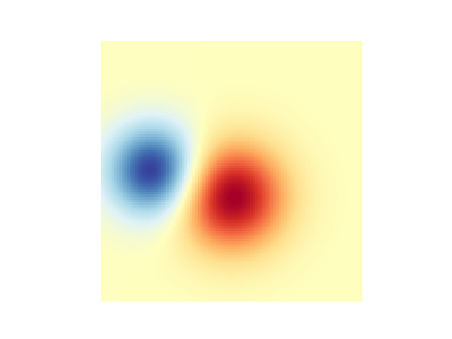
# First we'll plot these blobs using ``imshow`` without transparency.
vmax = np.abs(weights).max()
imshow_kwargs = {
'vmax': vmax,
'vmin': -vmax,
'cmap': 'RdYlBu',
'extent': (xmin, xmax, ymin, ymax),
}
fig, ax = plt.subplots()
ax.imshow(greys)
ax.imshow(weights, **imshow_kwargs)
ax.set_axis_off()
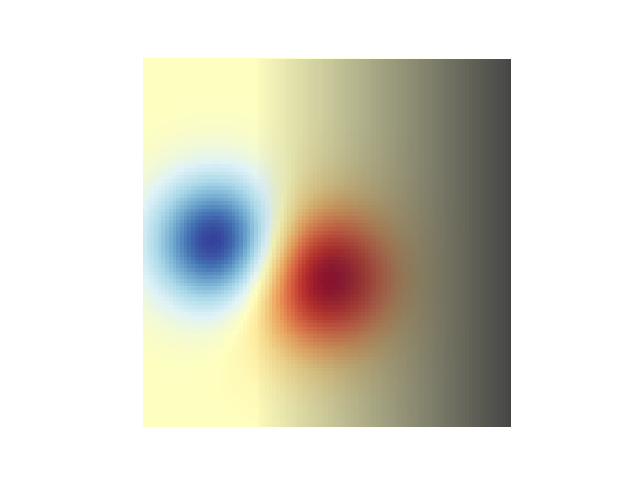
Blending in transparency
The simplest way to include transparency when plotting data with
matplotlib.pyplot.imshow is to pass an array matching the shape of
the data to the alpha argument. For example, we'll create a gradient
moving from left to right below.
# Create an alpha channel of linearly increasing values moving to the right.
alphas = np.ones(weights.shape)
alphas[:, 30:] = np.linspace(1, 0, 70)

# Create the figure and image
# Note that the absolute values may be slightly different
fig, ax = plt.subplots()
ax.imshow(greys)
ax.imshow(weights, alpha=alphas, **imshow_kwargs)
ax.set_axis_off()
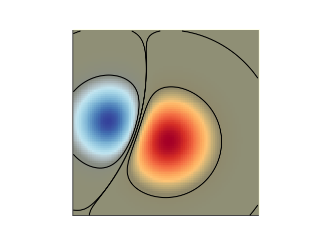
Using transparency to highlight values with high amplitude
Finally, we'll recreate the same plot, but this time we'll use transparency to highlight the extreme values in the data. This is often used to highlight data points with smaller p-values. We'll also add in contour lines to highlight the image values.
# Create an alpha channel based on weight values
# Any value whose absolute value is > .0001 will have zero transparency
alphas = Normalize(0, .3, clip=True)(np.abs(weights))
alphas = np.clip(alphas, .4, 1)  # alpha value clipped at the bottom at .4

# Create the figure and image
# Note that the absolute values may be slightly different
fig, ax = plt.subplots()
ax.imshow(greys)
ax.imshow(weights, alpha=alphas, **imshow_kwargs)

# Add contour lines to further highlight different levels.
ax.contour(weights[::-1], levels=[-.1, .1], colors='k', linestyles='-')
ax.set_axis_off()
plt.show()

ax.contour(weights[::-1], levels=[-.0001, .0001], colors='k', linestyles='-')
ax.set_axis_off()
plt.show()
References
The use of the following functions, methods, classes and modules is shown in this example:
Total running time of the script: ( 0 minutes 1.203 seconds)
Keywords: matplotlib code example, codex, python plot, pyplot Gallery generated by Sphinx-Gallery