Note
Click here to download the full example code
Time Series Histogram
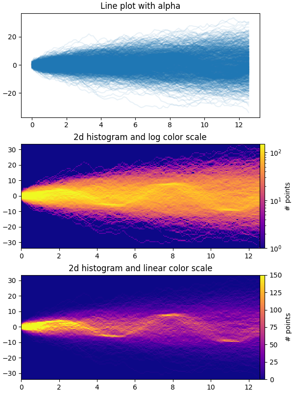
This example demonstrates how to efficiently visualize large numbers of time series in a way that could potentially reveal hidden substructure and patterns that are not immediately obvious, and display them in a visually appealing way.
In this example, we generate multiple sinusoidal "signal" series that are
buried under a larger number of random walk "noise/background" series. For an
unbiased Gaussian random walk with standard deviation of σ, the RMS deviation
from the origin after n steps is σ*sqrt(n). So in order to keep the sinusoids
visible on the same scale as the random walks, we scale the amplitude by the
random walk RMS. In addition, we also introduce a small random offset phi
to shift the sines left/right, and some additive random noise to shift
individual data points up/down to make the signal a bit more "realistic" (you
wouldn't expect a perfect sine wave to appear in your data).
The first plot shows the typical way of visualizing multiple time series by
overlaying them on top of each other with plt.plot and a small value of
alpha. The second and third plots show how to reinterpret the data as a 2d
histogram, with optional interpolation between data points, by using
np.histogram2d and plt.pcolormesh.
from copy import copy
import time

import numpy as np
import numpy.matlib
import matplotlib.pyplot as plt
from matplotlib.colors import LogNorm

fig, axes = plt.subplots(nrows=3, figsize=(6, 8), constrained_layout=True)

# Make some data; a 1D random walk + small fraction of sine waves
num_series = 1000
num_points = 100
SNR = 0.10  # Signal to Noise Ratio
x = np.linspace(0, 4 * np.pi, num_points)
# Generate unbiased Gaussian random walks
Y = np.cumsum(np.random.randn(num_series, num_points), axis=-1)
# Generate sinusoidal signals
num_signal = int(round(SNR * num_series))
phi = (np.pi / 8) * np.random.randn(num_signal, 1)  # small random offset
Y[-num_signal:] = (
    np.sqrt(np.arange(num_points))[None, :]  # random walk RMS scaling factor
    * (np.sin(x[None, :] - phi)
       + 0.05 * np.random.randn(num_signal, num_points))  # small random noise
)


# Plot series using `plot` and a small value of `alpha`. With this view it is
# very difficult to observe the sinusoidal behavior because of how many
# overlapping series there are. It also takes a bit of time to run because so
# many individual artists need to be generated.
tic = time.time()
axes[0].plot(x, Y.T, color="C0", alpha=0.1)
toc = time.time()
axes[0].set_title("Line plot with alpha")
print(f"{toc-tic:.3f} sec. elapsed")


# Now we will convert the multiple time series into a histogram. Not only will
# the hidden signal be more visible, but it is also a much quicker procedure.
tic = time.time()
# Linearly interpolate between the points in each time series
num_fine = 800
x_fine = np.linspace(x.min(), x.max(), num_fine)
y_fine = np.empty((num_series, num_fine), dtype=float)
for i in range(num_series):
    y_fine[i, :] = np.interp(x_fine, x, Y[i, :])
y_fine = y_fine.flatten()
x_fine = np.matlib.repmat(x_fine, num_series, 1).flatten()


# Plot (x, y) points in 2d histogram with log colorscale
# It is pretty evident that there is some kind of structure under the noise
# You can tune vmax to make signal more visible
cmap = copy(plt.cm.plasma)
cmap.set_bad(cmap(0))
h, xedges, yedges = np.histogram2d(x_fine, y_fine, bins=[400, 100])
pcm = axes[1].pcolormesh(xedges, yedges, h.T, cmap=cmap,
                         norm=LogNorm(vmax=1.5e2), rasterized=True)
fig.colorbar(pcm, ax=axes[1], label="# points", pad=0)
axes[1].set_title("2d histogram and log color scale")

# Same data but on linear color scale
pcm = axes[2].pcolormesh(xedges, yedges, h.T, cmap=cmap,
                         vmax=1.5e2, rasterized=True)
fig.colorbar(pcm, ax=axes[2], label="# points", pad=0)
axes[2].set_title("2d histogram and linear color scale")

toc = time.time()
print(f"{toc-tic:.3f} sec. elapsed")
plt.show()
Out:
0.221 sec. elapsed
0.075 sec. elapsed
References
The use of the following functions, methods, classes and modules is shown in this example:
Total running time of the script: ( 0 minutes 2.894 seconds)
Keywords: matplotlib code example, codex, python plot, pyplot Gallery generated by Sphinx-Gallery