Note
Click here to download the full example code
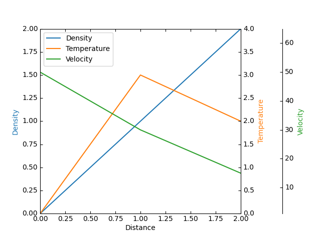
Parasite axis demo
This example demonstrates the use of parasite axis to plot multiple datasets onto one single plot.
Notice how in this example, par1 and par2 are both obtained by calling
twinx(), which ties their x-limits with the host's x-axis. From there, each
of those two axis behave separately from each other: different datasets can be
plotted, and the y-limits are adjusted separately.
Note that this approach uses the mpl_toolkits.axes_grid1.parasite_axes'
host_subplot and
mpl_toolkits.axisartist.axislines.Axes. An alternative approach using the
parasite_axes's
HostAxes and
ParasiteAxes is the
Parasite Axes demo example.
An alternative approach using the usual Matplotlib subplots is shown in
the Multiple Yaxis With Spines example.
from mpl_toolkits.axes_grid1 import host_subplot
from mpl_toolkits import axisartist
import matplotlib.pyplot as plt

host = host_subplot(111, axes_class=axisartist.Axes)
plt.subplots_adjust(right=0.75)

par1 = host.twinx()
par2 = host.twinx()

par2.axis["right"] = par2.new_fixed_axis(loc="right", offset=(60, 0))

par1.axis["right"].toggle(all=True)
par2.axis["right"].toggle(all=True)

p1, = host.plot([0, 1, 2], [0, 1, 2], label="Density")
p2, = par1.plot([0, 1, 2], [0, 3, 2], label="Temperature")
p3, = par2.plot([0, 1, 2], [50, 30, 15], label="Velocity")

host.set_xlim(0, 2)
host.set_ylim(0, 2)
par1.set_ylim(0, 4)
par2.set_ylim(1, 65)

host.set_xlabel("Distance")
host.set_ylabel("Density")
par1.set_ylabel("Temperature")
par2.set_ylabel("Velocity")

host.legend()

host.axis["left"].label.set_color(p1.get_color())
par1.axis["right"].label.set_color(p2.get_color())
par2.axis["right"].label.set_color(p3.get_color())

plt.show()
Keywords: matplotlib code example, codex, python plot, pyplot Gallery generated by Sphinx-Gallery