Note
Click here to download the full example code
Scatter plot with histograms
Show the marginal distributions of a scatter as histograms at the sides of the plot.
For a nice alignment of the main axes with the marginals, two options are shown below.
the axes positions are defined in terms of rectangles in figure coordinates
the axes positions are defined via a gridspec
An alternative method to produce a similar figure using the axes_grid1
toolkit is shown in the
Scatter Histogram (Locatable Axes) example.
Let us first define a function that takes x and y data as input, as well as three axes, the main axes for the scatter, and two marginal axes. It will then create the scatter and histograms inside the provided axes.
import numpy as np
import matplotlib.pyplot as plt

# Fixing random state for reproducibility
np.random.seed(19680801)

# some random data
x = np.random.randn(1000)
y = np.random.randn(1000)


def scatter_hist(x, y, ax, ax_histx, ax_histy):
    # no labels
    ax_histx.tick_params(axis="x", labelbottom=False)
    ax_histy.tick_params(axis="y", labelleft=False)

    # the scatter plot:
    ax.scatter(x, y)

    # now determine nice limits by hand:
    binwidth = 0.25
    xymax = max(np.max(np.abs(x)), np.max(np.abs(y)))
    lim = (int(xymax/binwidth) + 1) * binwidth

    bins = np.arange(-lim, lim + binwidth, binwidth)
    ax_histx.hist(x, bins=bins)
    ax_histy.hist(y, bins=bins, orientation='horizontal')
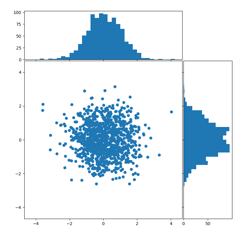
Axes in figure coordinates
To define the axes positions, Figure.add_axes is provided with a rectangle
[left, bottom, width, height] in figure coordinates. The marginal axes
share one dimension with the main axes.
# definitions for the axes
left, width = 0.1, 0.65
bottom, height = 0.1, 0.65
spacing = 0.005


rect_scatter = [left, bottom, width, height]
rect_histx = [left, bottom + height + spacing, width, 0.2]
rect_histy = [left + width + spacing, bottom, 0.2, height]

# start with a square Figure
fig = plt.figure(figsize=(8, 8))

ax = fig.add_axes(rect_scatter)
ax_histx = fig.add_axes(rect_histx, sharex=ax)
ax_histy = fig.add_axes(rect_histy, sharey=ax)

# use the previously defined function
scatter_hist(x, y, ax, ax_histx, ax_histy)

plt.show()
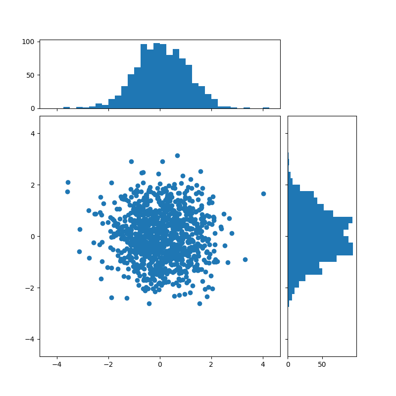
Using a gridspec
We may equally define a gridspec with unequal width- and height-ratios to achieve desired layout. Also see the Customizing Figure Layouts Using GridSpec and Other Functions tutorial.
# start with a square Figure
fig = plt.figure(figsize=(8, 8))

# Add a gridspec with two rows and two columns and a ratio of 2 to 7 between
# the size of the marginal axes and the main axes in both directions.
# Also adjust the subplot parameters for a square plot.
gs = fig.add_gridspec(2, 2,  width_ratios=(7, 2), height_ratios=(2, 7),
                      left=0.1, right=0.9, bottom=0.1, top=0.9,
                      wspace=0.05, hspace=0.05)

ax = fig.add_subplot(gs[1, 0])
ax_histx = fig.add_subplot(gs[0, 0], sharex=ax)
ax_histy = fig.add_subplot(gs[1, 1], sharey=ax)

# use the previously defined function
scatter_hist(x, y, ax, ax_histx, ax_histy)

plt.show()
References
The use of the following functions, methods, classes and modules is shown in this example:
Total running time of the script: ( 0 minutes 1.774 seconds)
Keywords: matplotlib code example, codex, python plot, pyplot Gallery generated by Sphinx-Gallery