Note
Click here to download the full example code
Fixing too many ticks#
One common cause for unexpected tick behavior is passing a list of strings instead of numbers or datetime objects. This can easily happen without notice when reading in a comma-delimited text file. Matplotlib treats lists of strings as categorical variables (Plotting categorical variables), and by default puts one tick per category, and plots them in the order in which they are supplied. If this is not desired, the solution is to convert the strings to a numeric type as in the following examples.
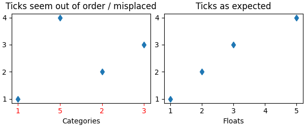
Example 1: Strings can lead to an unexpected order of number ticks#
import matplotlib.pyplot as plt
import numpy as np

fig, ax = plt.subplots(1, 2, constrained_layout=True, figsize=(6, 2.5))
x = ['1', '5', '2', '3']
y = [1, 4, 2, 3]
ax[0].plot(x, y, 'd')
ax[0].tick_params(axis='x', color='r', labelcolor='r')
ax[0].set_xlabel('Categories')
ax[0].set_title('Ticks seem out of order / misplaced')

# convert to numbers:
x = np.asarray(x, dtype='float')
ax[1].plot(x, y, 'd')
ax[1].set_xlabel('Floats')
ax[1].set_title('Ticks as expected')
Out:
Text(0.5, 1.0, 'Ticks as expected')
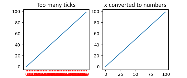
Example 2: Strings can lead to very many ticks#
If x has 100 elements, all strings, then we would have 100 (unreadable) ticks, and again the solution is to convert the strings to floats:
fig, ax = plt.subplots(1, 2, figsize=(6, 2.5))
x = [f'{xx}' for xx in np.arange(100)]
y = np.arange(100)
ax[0].plot(x, y)
ax[0].tick_params(axis='x', color='r', labelcolor='r')
ax[0].set_title('Too many ticks')
ax[0].set_xlabel('Categories')

ax[1].plot(np.asarray(x, float), y)
ax[1].set_title('x converted to numbers')
ax[1].set_xlabel('Floats')
Out:
Text(0.5, -3.555555555555568, 'Floats')
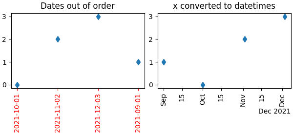
Example 3: Strings can lead to an unexpected order of datetime ticks#
A common case is when dates are read from a CSV file, they need to be converted from strings to datetime objects to get the proper date locators and formatters.
fig, ax = plt.subplots(1, 2, constrained_layout=True, figsize=(6, 2.75))
x = ['2021-10-01', '2021-11-02', '2021-12-03', '2021-09-01']
y = [0, 2, 3, 1]
ax[0].plot(x, y, 'd')
ax[0].tick_params(axis='x', labelrotation=90, color='r', labelcolor='r')
ax[0].set_title('Dates out of order')

# convert to datetime64
x = np.asarray(x, dtype='datetime64[s]')
ax[1].plot(x, y, 'd')
ax[1].tick_params(axis='x', labelrotation=90)
ax[1].set_title('x converted to datetimes')

plt.show()
Total running time of the script: ( 0 minutes 1.285 seconds)
Keywords: matplotlib code example, codex, python plot, pyplot Gallery generated by Sphinx-Gallery