Note
Click here to download the full example code
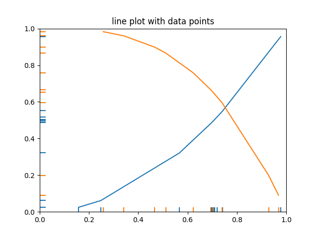
EventCollection Demo#
Plot two curves, then use EventCollections to mark the locations of the x and y data points on the respective axes for each curve
import matplotlib.pyplot as plt
from matplotlib.collections import EventCollection
import numpy as np

# Fixing random state for reproducibility
np.random.seed(19680801)

# create random data
xdata = np.random.random([2, 10])

# split the data into two parts
xdata1 = xdata[0, :]
xdata2 = xdata[1, :]

# sort the data so it makes clean curves
xdata1.sort()
xdata2.sort()

# create some y data points
ydata1 = xdata1 ** 2
ydata2 = 1 - xdata2 ** 3

# plot the data
fig = plt.figure()
ax = fig.add_subplot(1, 1, 1)
ax.plot(xdata1, ydata1, color='tab:blue')
ax.plot(xdata2, ydata2, color='tab:orange')

# create the events marking the x data points
xevents1 = EventCollection(xdata1, color='tab:blue', linelength=0.05)
xevents2 = EventCollection(xdata2, color='tab:orange', linelength=0.05)

# create the events marking the y data points
yevents1 = EventCollection(ydata1, color='tab:blue', linelength=0.05,
                           orientation='vertical')
yevents2 = EventCollection(ydata2, color='tab:orange', linelength=0.05,
                           orientation='vertical')

# add the events to the axis
ax.add_collection(xevents1)
ax.add_collection(xevents2)
ax.add_collection(yevents1)
ax.add_collection(yevents2)

# set the limits
ax.set_xlim([0, 1])
ax.set_ylim([0, 1])

ax.set_title('line plot with data points')

# display the plot
plt.show()
Keywords: matplotlib code example, codex, python plot, pyplot Gallery generated by Sphinx-Gallery