Note
Click here to download the full example code
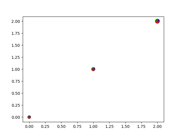
Scatter plot with pie chart markers#
This example makes custom 'pie charts' as the markers for a scatter plot.
Thanks to Manuel Metz for the example.
import numpy as np
import matplotlib.pyplot as plt

# first define the ratios
r1 = 0.2       # 20%
r2 = r1 + 0.4  # 40%

# define some sizes of the scatter marker
sizes = np.array([60, 80, 120])

# calculate the points of the first pie marker
# these are just the origin (0, 0) + some (cos, sin) points on a circle
x1 = np.cos(2 * np.pi * np.linspace(0, r1))
y1 = np.sin(2 * np.pi * np.linspace(0, r1))
xy1 = np.row_stack([[0, 0], np.column_stack([x1, y1])])
s1 = np.abs(xy1).max()

x2 = np.cos(2 * np.pi * np.linspace(r1, r2))
y2 = np.sin(2 * np.pi * np.linspace(r1, r2))
xy2 = np.row_stack([[0, 0], np.column_stack([x2, y2])])
s2 = np.abs(xy2).max()

x3 = np.cos(2 * np.pi * np.linspace(r2, 1))
y3 = np.sin(2 * np.pi * np.linspace(r2, 1))
xy3 = np.row_stack([[0, 0], np.column_stack([x3, y3])])
s3 = np.abs(xy3).max()

fig, ax = plt.subplots()
ax.scatter(range(3), range(3), marker=xy1, s=s1**2 * sizes, facecolor='blue')
ax.scatter(range(3), range(3), marker=xy2, s=s2**2 * sizes, facecolor='green')
ax.scatter(range(3), range(3), marker=xy3, s=s3**2 * sizes, facecolor='red')

plt.show()
References
The use of the following functions, methods, classes and modules is shown in this example:
Keywords: matplotlib code example, codex, python plot, pyplot Gallery generated by Sphinx-Gallery