Introduction to Axes (or Subplots)#
Matplotlib Axes are the gateway to creating your data visualizations.
Once an Axes is placed on a figure there are many methods that can be used to
add data to the Axes. An Axes typically has a pair of Axis
Artists that define the data coordinate system, and include methods to add
annotations like x- and y-labels, titles, and legends.

Anatomy of a Figure#
In the picture above, the Axes object was created with ax = fig.subplots().
Everything else on the figure was created with methods on this ax object,
or can be accessed from it. If we want to change the label on the x-axis, we
call ax.set_xlabel('New Label'), if we want to plot some data we call
ax.plot(x, y). Indeed, in the figure above, the only Artist that is not
part of the Axes is the Figure itself, so the axes.Axes class is really the
gateway to much of Matplotlib's functionality.
Note that Axes are so fundamental to the operation of Matplotlib that a lot of material here is duplicate of that in Quick start guide.
Creating Axes#
import matplotlib.pyplot as plt
import numpy as np
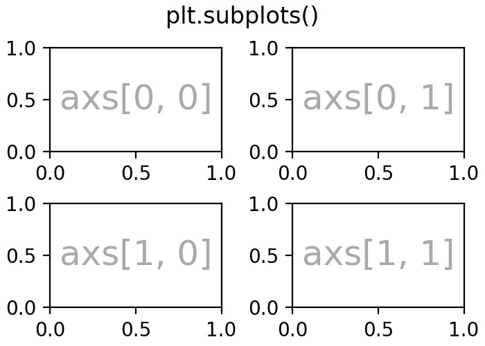
fig, axs = plt.subplots(ncols=2, nrows=2, figsize=(3.5, 2.5),
layout="constrained")
# for each Axes, add an artist, in this case a nice label in the middle...
for row in range(2):
for col in range(2):
axs[row, col].annotate(f'axs[{row}, {col}]', (0.5, 0.5),
transform=axs[row, col].transAxes,
ha='center', va='center', fontsize=18,
color='darkgrey')
fig.suptitle('plt.subplots()')
(Source code, 2x.png, png)

Axes are added using methods on Figure objects, or via the pyplot interface. These methods are discussed in more detail in Creating Figures and Arranging multiple Axes in a Figure. However, for instance add_axes will manually position an Axes on the page. In the example above subplots put a grid of subplots on the figure, and axs is a (2, 2) array of Axes, each of which can have data added to them.
There are a number of other methods for adding Axes to a Figure:
Figure.add_axes: manually position an Axes.fig.add_axes((0, 0, 1, 1))makes an Axes that fills the whole figure.pyplot.subplotsandFigure.subplots: add a grid of Axes as in the example above. The pyplot version returns both the Figure object and an array of Axes. Note thatfig, ax = plt.subplots()adds a single Axes to a Figure.pyplot.subplot_mosaicandFigure.subplot_mosaic: add a grid of named Axes and return a dictionary of axes. Forfig, axs = plt.subplot_mosaic([['left', 'right'], ['bottom', 'bottom']]),axs['left']is an Axes in the top row on the left, andaxs['bottom']is an Axes that spans both columns on the bottom.
See Arranging multiple Axes in a Figure for more detail on how to arrange grids of Axes on a Figure.
Axes plotting methods#
Most of the high-level plotting methods are accessed from the axes.Axes
class. See the API documentation for a full curated list, and
Plot types for examples. A basic example is axes.Axes.plot:
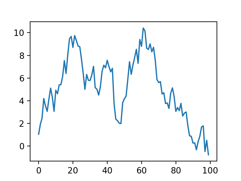
fig, ax = plt.subplots(figsize=(4, 3))
np.random.seed(19680801)
t = np.arange(100)
x = np.cumsum(np.random.randn(100))
lines = ax.plot(t, x)
(Source code, 2x.png, png)

Note that plot returns a list of lines Artists which can subsequently be
manipulated, as discussed in Introduction to Artists.
A very incomplete list of plotting methods is below. Again, see Plot types
for more examples, and axes.Axes for the full list of methods.
Axes labelling and annotation#
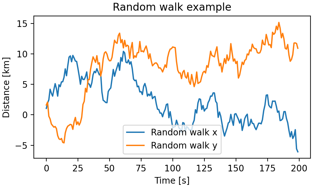
Usually we want to label the Axes with an xlabel, ylabel, and title, and often we want to have a legend to differentiate plot elements. The Axes class has a number of methods to create these annotations.
fig, ax = plt.subplots(figsize=(5, 3), layout='constrained')
np.random.seed(19680801)
t = np.arange(200)
x = np.cumsum(np.random.randn(200))
y = np.cumsum(np.random.randn(200))
linesx = ax.plot(t, x, label='Random walk x')
linesy = ax.plot(t, y, label='Random walk y')

ax.set_xlabel('Time [s]')
ax.set_ylabel('Distance [km]')
ax.set_title('Random walk example')
ax.legend()
(Source code, 2x.png, png)

These methods are relatively straight-forward, though there are a number of Text properties and layout that can be set on the text objects, like fontsize, fontname, horizontalalignment. Legends can be much more complicated; see Legend guide for more details.
Note that text can also be added to axes using text, and annotate. This can be quite sophisticated: see Text properties and layout and Annotations for more information.
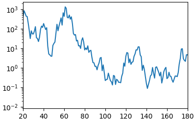
Axes limits, scales, and ticking#
Each Axes has two (or more) Axis objects, that can be accessed via matplotlib.axes.Axes.xaxis and matplotlib.axes.Axes.yaxis properties. These have substantial number of methods on them, and for highly customizable Axis-es it is useful to read the API at Axis. However, the Axes class offers a number of helpers for the most common of these methods. Indeed, the set_xlabel, discussed above, is a helper for the set_label_text.
Other important methods set the extent on the axes (set_xlim, set_ylim), or more fundamentally the scale of the axes. So for instance, we can make an Axis have a logarithmic scale, and zoom in on a sub-portion of the data:
fig, ax = plt.subplots(figsize=(4, 2.5), layout='constrained')
np.random.seed(19680801)
t = np.arange(200)
x = 2**np.cumsum(np.random.randn(200))
linesx = ax.plot(t, x)
ax.set_yscale('log')
ax.set_xlim(20, 180)
(Source code, 2x.png, png)

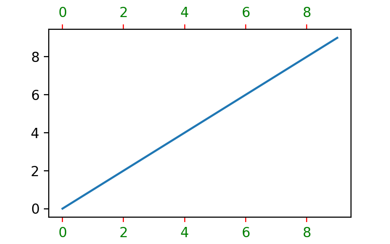
The Axes class also has helpers to deal with Axis ticks and their labels. Most straight-forward is set_xticks and set_yticks which manually set the tick locations and optionally their labels. Minor ticks can be toggled with minorticks_on or minorticks_off.
Many aspects of Axes ticks and tick labeling can be adjusted using tick_params. For instance, to label the top of the axes instead of the bottom,color the ticks red, and color the ticklabels green:
fig, ax = plt.subplots(figsize=(4, 2.5))
ax.plot(np.arange(10))
ax.tick_params(top=True, labeltop=True, color='red', axis='x',
               labelcolor='green')
(Source code, 2x.png, png)
More fine-grained control on ticks, setting scales, and controlling the Axis can be highly customized beyond these Axes-level helpers.
Axes layout#
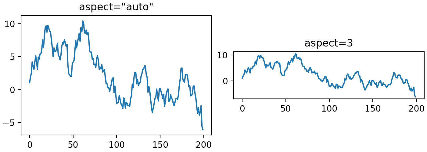
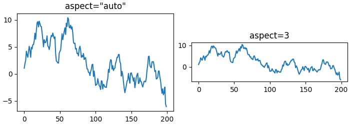
Sometimes it is important to set the aspect ratio of a plot in data space, which we can do with set_aspect:
fig, axs = plt.subplots(ncols=2, figsize=(7, 2.5), layout='constrained')
np.random.seed(19680801)
t = np.arange(200)
x = np.cumsum(np.random.randn(200))
axs[0].plot(t, x)
axs[0].set_title('aspect="auto"')

axs[1].plot(t, x)
axs[1].set_aspect(3)
axs[1].set_title('aspect=3')
(Source code, 2x.png, png)