What's new in Matplotlib 3.9.0 (May 15, 2024)#
For a list of all of the issues and pull requests since the last revision, see the GitHub statistics for 3.9.1 (Jul 04, 2024).
Plotting and Annotation improvements#
Axes.inset_axes is no longer experimental#
Axes.inset_axes is considered stable for use.
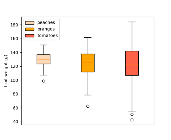
Legend support for Boxplot#
Boxplots now support a label parameter to create legend entries. Legend labels can be
passed as a list of strings to label multiple boxes in a single Axes.boxplot call:
np.random.seed(19680801)
fruit_weights = [
    np.random.normal(130, 10, size=100),
    np.random.normal(125, 20, size=100),
    np.random.normal(120, 30, size=100),
]
labels = ['peaches', 'oranges', 'tomatoes']
colors = ['peachpuff', 'orange', 'tomato']

fig, ax = plt.subplots()
ax.set_ylabel('fruit weight (g)')

bplot = ax.boxplot(fruit_weights,
                   patch_artist=True,  # fill with color
                   label=labels)

# fill with colors
for patch, color in zip(bplot['boxes'], colors):
    patch.set_facecolor(color)

ax.set_xticks([])
ax.legend()
(Source code, 2x.png, png)
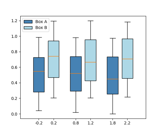
Or as a single string to each individual Axes.boxplot:
fig, ax = plt.subplots()

data_A = np.random.random((100, 3))
data_B = np.random.random((100, 3)) + 0.2
pos = np.arange(3)

ax.boxplot(data_A, positions=pos - 0.2, patch_artist=True, label='Box A',
           boxprops={'facecolor': 'steelblue'})
ax.boxplot(data_B, positions=pos + 0.2, patch_artist=True, label='Box B',
           boxprops={'facecolor': 'lightblue'})

ax.legend()
(Source code, 2x.png, png)
Percent sign in pie labels auto-escaped with usetex=True#
It is common, with Axes.pie, to specify labels that include a percent sign (%),
which denotes a comment for LaTeX. When enabling LaTeX with rcParams["text.usetex"] (default: False) or passing
textprops={"usetex": True}, this used to cause the percent sign to disappear.
Now, the percent sign is automatically escaped (by adding a preceding backslash) so that
it appears regardless of the usetex setting. If you have pre-escaped the percent
sign, this will be detected, and remain as is.
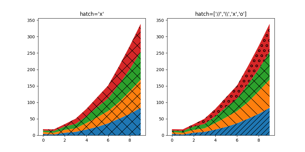
hatch parameter for stackplot#
The stackplot hatch parameter now accepts a list of strings describing
hatching styles that will be applied sequentially to the layers in the stack:
fig, (ax1, ax2) = plt.subplots(ncols=2, figsize=(10,5))

cols = 10
rows = 4
data = (
np.reshape(np.arange(0, cols, 1), (1, -1)) ** 2
+ np.reshape(np.arange(0, rows), (-1, 1))
+ np.random.random((rows, cols))*5
)
x = range(data.shape[1])
ax1.stackplot(x, data, hatch="x")
ax2.stackplot(x, data, hatch=["//","\\","x","o"])

ax1.set_title("hatch='x'")
ax2.set_title("hatch=['//','\\\\','x','o']")

plt.show()
(Source code, 2x.png, png)
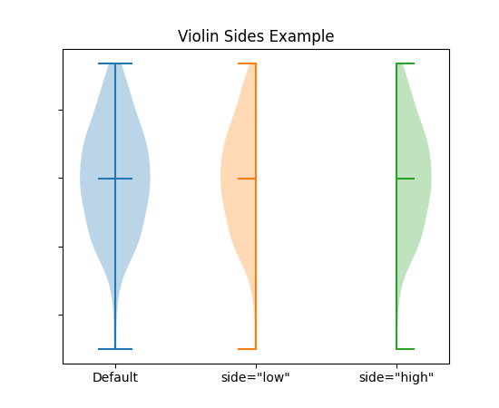
Add option to plot only one half of violin plot#
Setting the parameter side to 'low' or 'high' allows to only plot one half of the
Axes.violinplot.
# Fake data with reproducible random state.
np.random.seed(19680801)
data = np.random.normal(0, 8, size=100)

fig, ax = plt.subplots()

ax.violinplot(data, [0], showmeans=True, showextrema=True)
ax.violinplot(data, [1], showmeans=True, showextrema=True, side='low')
ax.violinplot(data, [2], showmeans=True, showextrema=True, side='high')

ax.set_title('Violin Sides Example')
ax.set_xticks([0, 1, 2], ['Default', 'side="low"', 'side="high"'])
ax.set_yticklabels([])
(Source code, 2x.png, png)
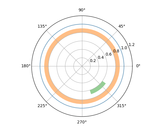
axhline and axhspan on polar axes#
... now draw circles and circular arcs (axhline) or annuli and wedges
(axhspan).
fig = plt.figure()
ax = fig.add_subplot(projection="polar")
ax.set_rlim(0, 1.2)

ax.axhline(1, c="C0", alpha=.5)
ax.axhspan(.8, .9, fc="C1", alpha=.5)
ax.axhspan(.6, .7, .8, .9, fc="C2", alpha=.5)
(Source code, 2x.png, png)
Subplot titles can now be automatically aligned#
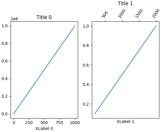
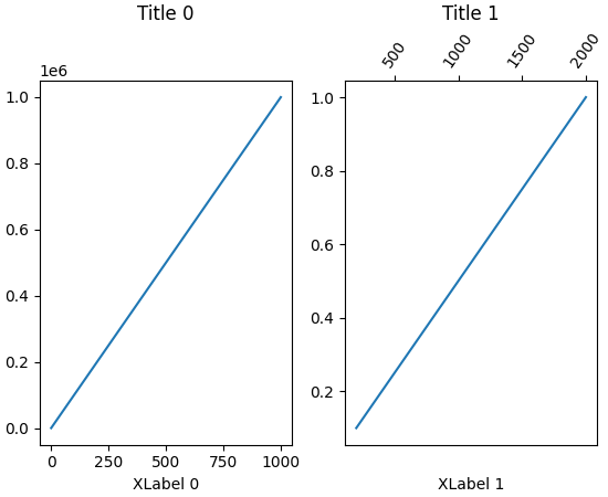
Subplot axes titles can be misaligned vertically if tick labels or xlabels are placed at
the top of one subplot. The new align_titles method on the Figure class
will now align the titles vertically.
fig, axs = plt.subplots(1, 2, layout='constrained')

axs[0].plot(np.arange(0, 1e6, 1000))
axs[0].set_title('Title 0')
axs[0].set_xlabel('XLabel 0')

axs[1].plot(np.arange(1, 0, -0.1) * 2000, np.arange(1, 0, -0.1))
axs[1].set_title('Title 1')
axs[1].set_xlabel('XLabel 1')
axs[1].xaxis.tick_top()
axs[1].tick_params(axis='x', rotation=55)
(Source code, 2x.png, png)
fig, axs = plt.subplots(1, 2, layout='constrained')

axs[0].plot(np.arange(0, 1e6, 1000))
axs[0].set_title('Title 0')
axs[0].set_xlabel('XLabel 0')

axs[1].plot(np.arange(1, 0, -0.1) * 2000, np.arange(1, 0, -0.1))
axs[1].set_title('Title 1')
axs[1].set_xlabel('XLabel 1')
axs[1].xaxis.tick_top()
axs[1].tick_params(axis='x', rotation=55)

fig.align_labels()
fig.align_titles()
(Source code, 2x.png, png)
axisartist can now be used together with standard Formatters#
... instead of being limited to axisartist-specific ones.
Toggle minorticks on Axis#
Minor ticks on an Axis can be displayed or removed using
minorticks_on and minorticks_off; e.g.,
ax.xaxis.minorticks_on(). See also minorticks_on.
StrMethodFormatter now respects axes.unicode_minus#
When formatting negative values, StrMethodFormatter will now use unicode minus signs
if rcParams["axes.unicode_minus"] (default: True) is set.
>>> from matplotlib.ticker import StrMethodFormatter
>>> with plt.rc_context({'axes.unicode_minus': False}):
...     formatter = StrMethodFormatter('{x}')
...     print(formatter.format_data(-10))
-10
>>> with plt.rc_context({'axes.unicode_minus': True}):
...     formatter = StrMethodFormatter('{x}')
...     print(formatter.format_data(-10))
−10
Figure, Axes, and Legend Layout#
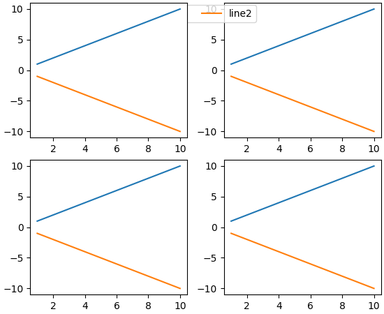
Subfigures now have controllable zorders#
Previously, setting the zorder of a subfigure had no effect, and those were plotted on top of any figure-level artists (i.e for example on top of fig-level legends). Now, subfigures behave like any other artists, and their zorder can be controlled, with default a zorder of 0.
x = np.linspace(1, 10, 10)
y1, y2 = x, -x
fig = plt.figure(constrained_layout=True)
subfigs = fig.subfigures(nrows=1, ncols=2)
for subfig in subfigs:
    axarr = subfig.subplots(2, 1)
    for ax in axarr.flatten():
        (l1,) = ax.plot(x, y1, label="line1")
        (l2,) = ax.plot(x, y2, label="line2")
subfigs[0].set_zorder(6)
l = fig.legend(handles=[l1, l2], loc="upper center", ncol=2)
(Source code, 2x.png, png)
Getters for xmargin, ymargin and zmargin#
Axes.get_xmargin, Axes.get_ymargin and Axes3D.get_zmargin methods have been
added to return the margin values set by Axes.set_xmargin, Axes.set_ymargin and
Axes3D.set_zmargin, respectively.
Mathtext improvements#
mathtext documentation improvements#
The documentation is updated to take information directly from the parser. This means that (almost) all supported symbols, operators, etc. are shown at Writing mathematical expressions.
mathtext spacing corrections#
As consequence of the updated documentation, the spacing on a number of relational and operator symbols were correctly classified and therefore will be spaced properly.
Widget Improvements#
3D plotting improvements#
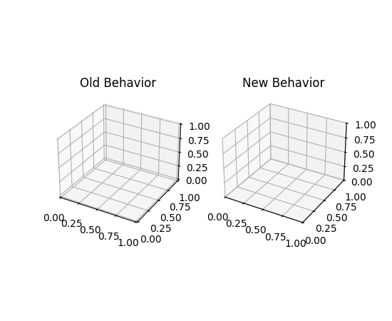
Setting 3D axis limits now set the limits exactly#
Previously, setting the limits of a 3D axis would always add a small margin to the
limits. Limits are now set exactly by default. The newly introduced rcparam
axes3d.automargin can be used to revert to the old behavior where margin is
automatically added.
fig, axs = plt.subplots(1, 2, subplot_kw={'projection': '3d'})

plt.rcParams['axes3d.automargin'] = True
axs[0].set(xlim=(0, 1), ylim=(0, 1), zlim=(0, 1), title='Old Behavior')

plt.rcParams['axes3d.automargin'] = False  # the default in 3.9.0
axs[1].set(xlim=(0, 1), ylim=(0, 1), zlim=(0, 1), title='New Behavior')
(Source code, 2x.png, png)
Other improvements#
BackendRegistry#
New BackendRegistry class is the single source of
truth for available backends. The singleton instance is
matplotlib.backends.backend_registry. It is used internally by Matplotlib, and also
IPython (and therefore Jupyter) starting with IPython 8.24.0.
There are three sources of backends: built-in (source code is within the Matplotlib
repository), explicit module://some.backend syntax (backend is obtained by loading
the module), or via an entry point (self-registering backend in an external package).
To obtain a list of all registered backends use:
>>> from matplotlib.backends import backend_registry
>>> backend_registry.list_all()
Add widths, heights and angles setter to EllipseCollection#
The widths, heights and angles values of the
EllipseCollection can now be changed after the collection has
been created.
from matplotlib.collections import EllipseCollection

rng = np.random.default_rng(0)

widths = (2, )
heights = (3, )
angles = (45, )
offsets = rng.random((10, 2)) * 10

fig, ax = plt.subplots()

ec = EllipseCollection(
    widths=widths,
    heights=heights,
    angles=angles,
    offsets=offsets,
    units='x',
    offset_transform=ax.transData,
    )

ax.add_collection(ec)
ax.set_xlim(-2, 12)
ax.set_ylim(-2, 12)

new_widths = rng.random((10, 2)) * 2
new_heights = rng.random((10, 2)) * 3
new_angles = rng.random((10, 2)) * 180

ec.set(widths=new_widths, heights=new_heights, angles=new_angles)
(Source code, 2x.png, png)
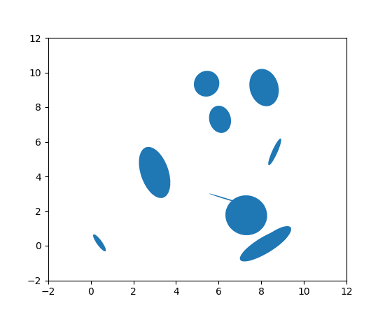
image.interpolation_stage rcParam#
This new rcParam controls whether image interpolation occurs in "data" space or in "rgba" space.
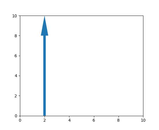
Arrow patch position is now modifiable#
A setter method has been added that allows updating the position of the patches.Arrow
object without requiring a full re-draw.
from matplotlib import animation
from matplotlib.patches import Arrow

fig, ax = plt.subplots()
ax.set_xlim(0, 10)
ax.set_ylim(0, 10)

a = Arrow(2, 0, 0, 10)
ax.add_patch(a)


# code for modifying the arrow
def update(i):
    a.set_data(x=.5, dx=i, dy=6, width=2)


ani = animation.FuncAnimation(fig, update, frames=15, interval=90, blit=False)

plt.show()
(Source code, 2x.png, png)
NonUniformImage now has mouseover support#
When mousing over a NonUniformImage, the data values are now
displayed.