Note
Go to the end to download the full example code.
Labeling pie charts#
This example illustrates some features of the pie_label
method, which adds labels to an existing pie chart created with
pie.
The simplest option is to provide a list of strings to label each slice of the pie.

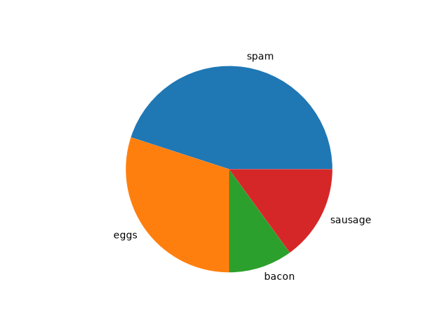
If you want the labels outside the pie, set a distance greater than 1. This is the distance from the center of the pie as a fraction of its radius.
fig, ax = plt.subplots()
pie = ax.pie(data)
ax.pie_label(pie, labels, distance=1.1)
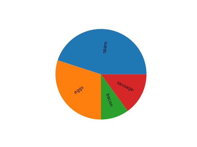
You can also rotate the labels so they are oriented away from the pie center.
fig, ax = plt.subplots()
pie = ax.pie(data)
ax.pie_label(pie, labels, rotate=True)
Instead of explicit labels, pass a format string to label slices with their values...
fig, ax = plt.subplots()
pie = ax.pie(data)
ax.pie_label(pie, '{absval:.1f}')

...or with their percentages...
fig, ax = plt.subplots()
pie = ax.pie(data)
ax.pie_label(pie, '{frac:.1%}')

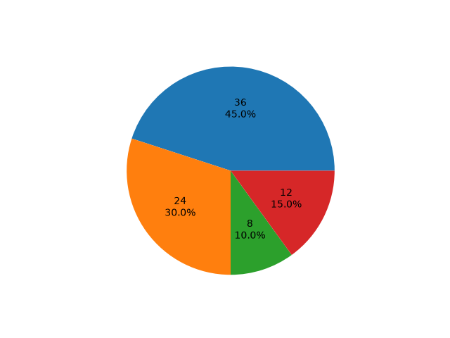
...or both.
fig, ax = plt.subplots()
pie = ax.pie(data)
ax.pie_label(pie, '{absval:d}\n{frac:.1%}')
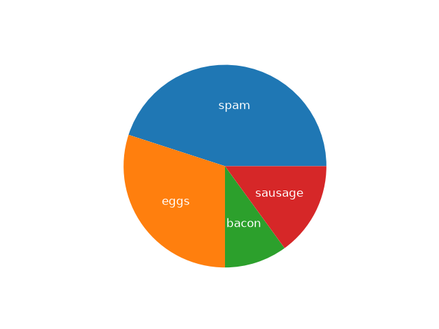
Font styling can be configured by passing a dictionary to the textprops parameter.
fig, ax = plt.subplots()
pie = ax.pie(data)
ax.pie_label(pie, labels, textprops={'fontsize': 'large', 'color': 'white'})
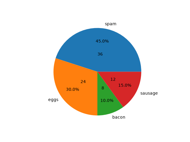
pie_label can be called repeatedly to add multiple sets
of labels.
fig, ax = plt.subplots()
pie = ax.pie(data)

ax.pie_label(pie, labels, distance=1.1)
ax.pie_label(pie, '{frac:.1%}', distance=0.7)
ax.pie_label(pie, '{absval:d}', distance=0.4)

plt.show()
References
The use of the following functions, methods, classes and modules is shown in this example:
Total running time of the script: (0 minutes 1.856 seconds)