Note
Go to the end to download the full example code.
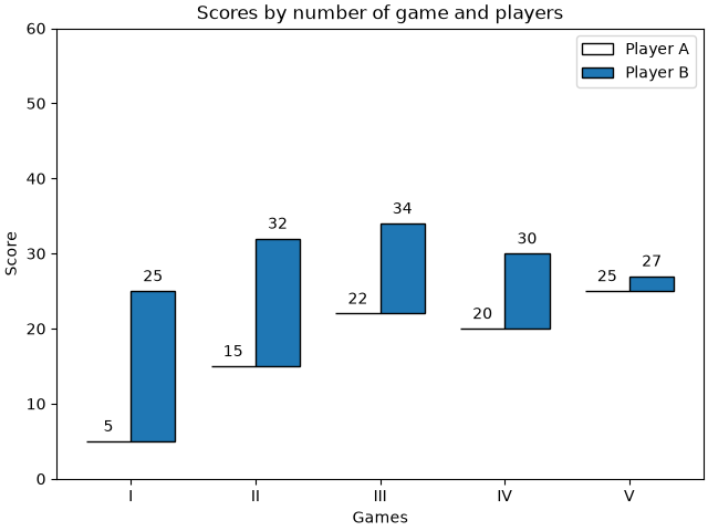
Hat graph#
This example shows how to create a hat graph and how to annotate it with labels.
import matplotlib.pyplot as plt
import numpy as np


def hat_graph(ax, xlabels, values, group_labels):
    """
    Create a hat graph.

    Parameters
    ----------
    ax : matplotlib.axes.Axes
        The Axes to plot into.
    xlabels : list of str
        The category names to be displayed on the x-axis.
    values : (M, N) array-like
        The data values.
        Rows are the groups (len(group_labels) == M).
        Columns are the categories (len(xlabels) == N).
    group_labels : list of str
        The group labels displayed in the legend.
    """

    values = np.asarray(values)
    color_cycle_colors = plt.rcParams['axes.prop_cycle'].by_key()['color']

    # Draw the hats
    bars = ax.grouped_bar(
        (values - values[0]).T, bottom=values[0], tick_labels=xlabels,
        labels=group_labels, edgecolor='black', group_spacing=0.8,
        colors=['none'] + color_cycle_colors)

    # Attach a text label on top of each bar
    for bc, heights in zip(bars.bar_containers, values):
        ax.bar_label(bc, heights, padding=4)


# Initialise labels and a numpy array make sure you have
# N labels of N number of values in the array
xlabels = ['I', 'II', 'III', 'IV', 'V']
playerA = np.array([5, 15, 22, 20, 25])
playerB = np.array([25, 32, 34, 30, 27])

fig, ax = plt.subplots(layout='constrained')

hat_graph(ax, xlabels, [playerA, playerB], ['Player A', 'Player B'])

# Add some text for labels, title and custom x-axis tick labels, etc.
ax.set_xlabel('Games')
ax.set_ylabel('Score')
ax.set_ylim(0, 60)
ax.set_title('Scores by number of game and players')
ax.legend()

plt.show()
References
The use of the following functions, methods, classes and modules is shown in this example: