Note
Go to the end to download the full example code.
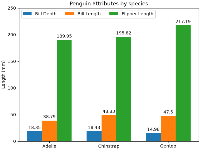
Grouped bar chart with labels#
This example shows a how to create a grouped bar chart and how to annotate bars with labels.
# data from https://allisonhorst.github.io/palmerpenguins/

import matplotlib.pyplot as plt

species = ("Adelie", "Chinstrap", "Gentoo")
penguin_means = {
    'Bill Depth': (18.35, 18.43, 14.98),
    'Bill Length': (38.79, 48.83, 47.50),
    'Flipper Length': (189.95, 195.82, 217.19),
}

fig, ax = plt.subplots(layout='constrained')

res = ax.grouped_bar(penguin_means, tick_labels=species, group_spacing=1)
for container in res.bar_containers:
    ax.bar_label(container, padding=3)

# Add some text for labels, title, etc.
ax.set_ylabel('Length (mm)')
ax.set_title('Penguin attributes by species')
ax.legend(loc='upper left', ncols=3)
ax.set_ylim(0, 250)

plt.show()
References
The use of the following functions, methods, classes and modules is shown in this example: