Note
Go to the end to download the full example code.
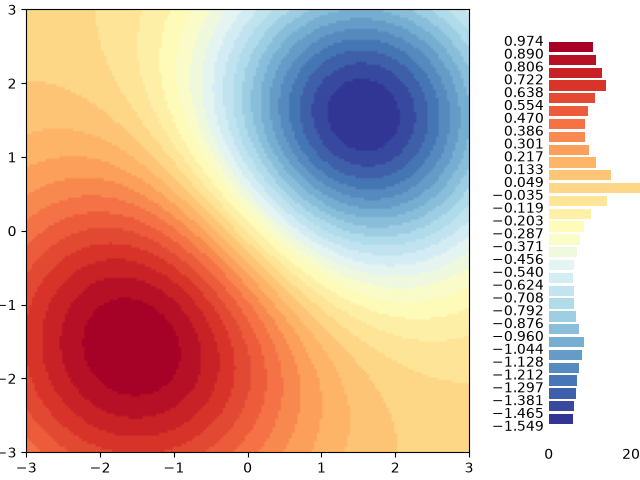
Histogram as colorbar#
This example demonstrates how to use a colored histogram instead of a colorbar to not only show the color-to-value mapping, but also visualize the distribution of values.
import matplotlib.pyplot as plt
import numpy as np

import matplotlib.colors as mcolors

# surface data
delta = 0.025
x = y = np.arange(-2.0, 2.0, delta)
X, Y = np.meshgrid(x, y)
Z1 = np.exp(-(((X + 1) * 1.3) ** 2) - ((Y + 1) * 1.3) ** 2)
Z2 = 2.5 * np.exp(-((X - 1) ** 2) - (Y - 1) ** 2)
Z = Z1**0.25 - Z2**0.5

# colormap & normalization
bins = 30
cmap = plt.get_cmap("RdYlBu_r")
bin_edges = np.linspace(Z.min(), Z.max(), bins + 1)
norm = mcolors.BoundaryNorm(bin_edges, cmap.N)

# main plot
fig, ax = plt.subplots(layout="constrained")
im = ax.imshow(Z, cmap=cmap, origin="lower", extent=[-3, 3, -3, 3], norm=norm)

# inset histogram
cax = ax.inset_axes([1.18, 0.02, 0.25, 0.95])  # left, bottom, width, height

# plot histogram
counts, _ = np.histogram(Z, bins=bin_edges)
midpoints = (bin_edges[:-1] + bin_edges[1:]) / 2
distance = midpoints[1] - midpoints[0]
cax.barh(midpoints, counts, height=0.8 * distance, color=cmap(norm(midpoints)))

# styling
cax.spines[:].set_visible(False)
cax.set_yticks(bin_edges)
cax.tick_params(axis="both", which="both", length=0)

plt.show()