Note
Click here to download the full example code
Quick start guide#
This tutorial covers some basic usage patterns and best practices to help you get started with Matplotlib.
import matplotlib as mpl
import matplotlib.pyplot as plt
import numpy as np
A simple example#
Matplotlib graphs your data on Figures (e.g., windows, Jupyter
widgets, etc.), each of which can contain one or more Axes, an
area where points can be specified in terms of x-y coordinates (or theta-r
in a polar plot, x-y-z in a 3D plot, etc.). The simplest way of
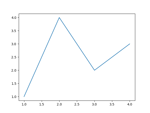
creating a Figure with an Axes is using pyplot.subplots. We can then use
Axes.plot to draw some data on the Axes:
fig, ax = plt.subplots()  # Create a figure containing a single axes.
ax.plot([1, 2, 3, 4], [1, 4, 2, 3])  # Plot some data on the axes.
Parts of a Figure#
Here are the components of a Matplotlib Figure.
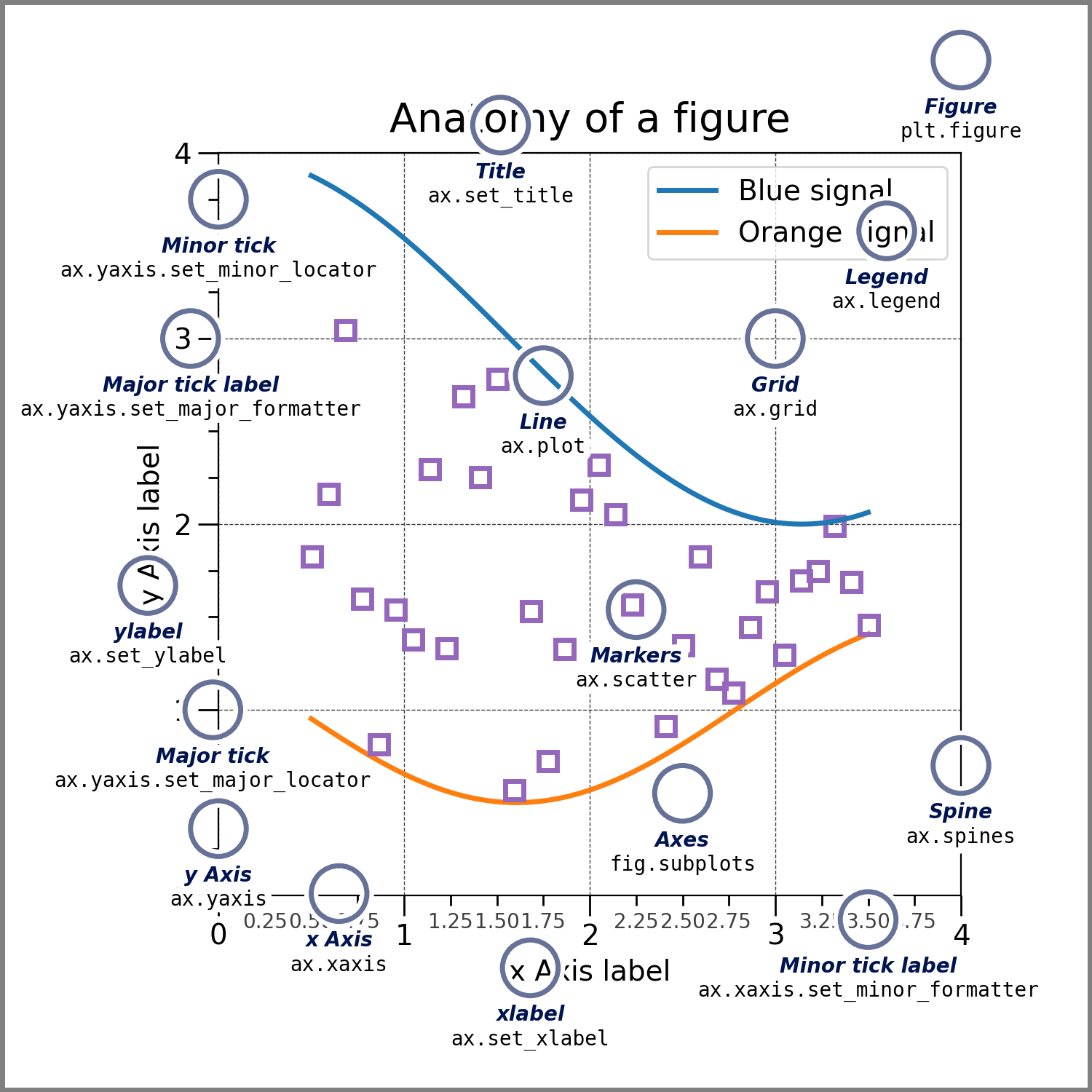
Figure#
The whole figure. The Figure keeps
track of all the child Axes, a group of
'special' Artists (titles, figure legends, colorbars, etc), and
even nested subfigures.
The easiest way to create a new Figure is with pyplot:
fig = plt.figure()  # an empty figure with no Axes
fig, ax = plt.subplots()  # a figure with a single Axes
fig, axs = plt.subplots(2, 2)  # a figure with a 2x2 grid of Axes
It is often convenient to create the Axes together with the Figure, but you can also manually add Axes later on. Note that many Matplotlib backends support zooming and panning on figure windows.
Axes#
An Axes is an Artist attached to a Figure that contains a region for
plotting data, and usually includes two (or three in the case of 3D)
Axis objects (be aware of the difference
between Axes and Axis) that provide ticks and tick labels to
provide scales for the data in the Axes. Each Axes also
has a title
(set via set_title()), an x-label (set via
set_xlabel()), and a y-label set via
set_ylabel()).
The Axes class and its member functions are the primary
entry point to working with the OOP interface, and have most of the
plotting methods defined on them (e.g. ax.plot(), shown above, uses
the plot method)
Axis#
These objects set the scale and limits and generate ticks (the marks
on the Axis) and ticklabels (strings labeling the ticks). The location
of the ticks is determined by a Locator object and the
ticklabel strings are formatted by a Formatter. The
combination of the correct Locator and Formatter gives very fine
control over the tick locations and labels.
Artist#
Basically, everything visible on the Figure is an Artist (even
Figure, Axes, and Axis objects). This includes
Text objects, Line2D objects, collections objects, Patch
objects, etc. When the Figure is rendered, all of the
Artists are drawn to the canvas. Most Artists are tied to an Axes; such
an Artist cannot be shared by multiple Axes, or moved from one to another.
Types of inputs to plotting functions#
Plotting functions expect numpy.array or numpy.ma.masked_array as
input, or objects that can be passed to numpy.asarray.
Classes that are similar to arrays ('array-like') such as pandas
data objects and numpy.matrix may not work as intended. Common convention
is to convert these to numpy.array objects prior to plotting.
For example, to convert a numpy.matrix
b = np.matrix([[1, 2], [3, 4]])
b_asarray = np.asarray(b)
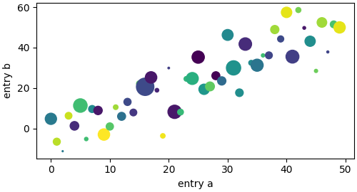
Most methods will also parse an addressable object like a dict, a
numpy.recarray, or a pandas.DataFrame. Matplotlib allows you to
provide the data keyword argument and generate plots passing the
strings corresponding to the x and y variables.
np.random.seed(19680801)  # seed the random number generator.
data = {'a': np.arange(50),
        'c': np.random.randint(0, 50, 50),
        'd': np.random.randn(50)}
data['b'] = data['a'] + 10 * np.random.randn(50)
data['d'] = np.abs(data['d']) * 100

fig, ax = plt.subplots(figsize=(5, 2.7), layout='constrained')
ax.scatter('a', 'b', c='c', s='d', data=data)
ax.set_xlabel('entry a')
ax.set_ylabel('entry b')
Coding styles#
The explicit and the implicit interfaces#
As noted above, there are essentially two ways to use Matplotlib:
Explicitly create Figures and Axes, and call methods on them (the "object-oriented (OO) style").
Rely on pyplot to implicitly create and manage the Figures and Axes, and use pyplot functions for plotting.
See Matplotlib Application Interfaces (APIs) for an explanation of the tradeoffs between the implicit and explicit interfaces.
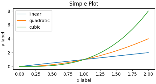
So one can use the OO-style
x = np.linspace(0, 2, 100)  # Sample data.

# Note that even in the OO-style, we use `.pyplot.figure` to create the Figure.
fig, ax = plt.subplots(figsize=(5, 2.7), layout='constrained')
ax.plot(x, x, label='linear')  # Plot some data on the axes.
ax.plot(x, x**2, label='quadratic')  # Plot more data on the axes...
ax.plot(x, x**3, label='cubic')  # ... and some more.
ax.set_xlabel('x label')  # Add an x-label to the axes.
ax.set_ylabel('y label')  # Add a y-label to the axes.
ax.set_title("Simple Plot")  # Add a title to the axes.
ax.legend()  # Add a legend.
or the pyplot-style:
x = np.linspace(0, 2, 100)  # Sample data.

plt.figure(figsize=(5, 2.7), layout='constrained')
plt.plot(x, x, label='linear')  # Plot some data on the (implicit) axes.
plt.plot(x, x**2, label='quadratic')  # etc.
plt.plot(x, x**3, label='cubic')
plt.xlabel('x label')
plt.ylabel('y label')
plt.title("Simple Plot")
plt.legend()

(In addition, there is a third approach, for the case when embedding Matplotlib in a GUI application, which completely drops pyplot, even for figure creation. See the corresponding section in the gallery for more info: Embedding Matplotlib in graphical user interfaces.)
Matplotlib's documentation and examples use both the OO and the pyplot styles. In general, we suggest using the OO style, particularly for complicated plots, and functions and scripts that are intended to be reused as part of a larger project. However, the pyplot style can be very convenient for quick interactive work.
Note
You may find older examples that use the pylab interface,
via from pylab import *. This approach is strongly deprecated.
Making a helper functions#
If you need to make the same plots over and over again with different data sets, or want to easily wrap Matplotlib methods, use the recommended signature function below.
which you would then use twice to populate two subplots:
Note that if you want to install these as a python package, or any other customizations you could use one of the many templates on the web; Matplotlib has one at mpl-cookiecutter
Styling Artists#
Most plotting methods have styling options for the Artists, accessible either
when a plotting method is called, or from a "setter" on the Artist. In the
plot below we manually set the color, linewidth, and linestyle of the
Artists created by plot, and we set the linestyle of the second line
after the fact with set_linestyle.
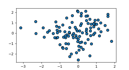
Colors#
Matplotlib has a very flexible array of colors that are accepted for most
Artists; see the colors tutorial for a
list of specifications. Some Artists will take multiple colors. i.e. for
a scatter plot, the edge of the markers can be different colors
from the interior:
fig, ax = plt.subplots(figsize=(5, 2.7))
ax.scatter(data1, data2, s=50, facecolor='C0', edgecolor='k')
Linewidths, linestyles, and markersizes#
Line widths are typically in typographic points (1 pt = 1/72 inch) and available for Artists that have stroked lines. Similarly, stroked lines can have a linestyle. See the linestyles example.
Marker size depends on the method being used. plot specifies
markersize in points, and is generally the "diameter" or width of the
marker. scatter specifies markersize as approximately
proportional to the visual area of the marker. There is an array of
markerstyles available as string codes (see markers), or
users can define their own MarkerStyle (see
Marker reference):
Labelling plots#
Axes labels and text#
set_xlabel, set_ylabel, and set_title are used to
add text in the indicated locations (see Text in Matplotlib Plots
for more discussion). Text can also be directly added to plots using
text:
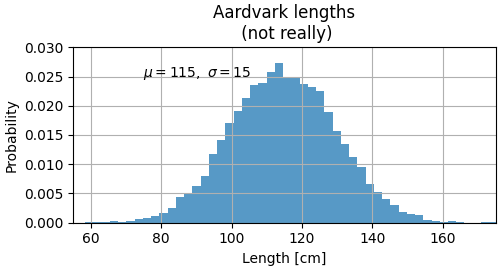
mu, sigma = 115, 15
x = mu + sigma * np.random.randn(10000)
fig, ax = plt.subplots(figsize=(5, 2.7), layout='constrained')
# the histogram of the data
n, bins, patches = ax.hist(x, 50, density=True, facecolor='C0', alpha=0.75)

ax.set_xlabel('Length [cm]')
ax.set_ylabel('Probability')
ax.set_title('Aardvark lengths\n (not really)')
ax.text(75, .025, r'$\mu=115,\ \sigma=15$')
ax.axis([55, 175, 0, 0.03])
ax.grid(True)
All of the text functions return a matplotlib.text.Text
instance. Just as with lines above, you can customize the properties by
passing keyword arguments into the text functions:
t = ax.set_xlabel('my data', fontsize=14, color='red')
These properties are covered in more detail in Text properties and layout.
Using mathematical expressions in text#
Matplotlib accepts TeX equation expressions in any text expression. For example to write the expression \(\sigma_i=15\) in the title, you can write a TeX expression surrounded by dollar signs:
ax.set_title(r'$\sigma_i=15$')
where the r preceding the title string signifies that the string is a
raw string and not to treat backslashes as python escapes.
Matplotlib has a built-in TeX expression parser and
layout engine, and ships its own math fonts – for details see
Writing mathematical expressions. You can also use LaTeX directly to format
your text and incorporate the output directly into your display figures or
saved postscript – see Text rendering with LaTeX.
Annotations#
We can also annotate points on a plot, often by connecting an arrow pointing to xy, to a piece of text at xytext:
fig, ax = plt.subplots(figsize=(5, 2.7))

t = np.arange(0.0, 5.0, 0.01)
s = np.cos(2 * np.pi * t)
line, = ax.plot(t, s, lw=2)

ax.annotate('local max', xy=(2, 1), xytext=(3, 1.5),
            arrowprops=dict(facecolor='black', shrink=0.05))

ax.set_ylim(-2, 2)
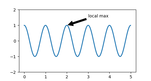
In this basic example, both xy and xytext are in data coordinates. There are a variety of other coordinate systems one can choose -- see Basic annotation and Advanced annotation for details. More examples also can be found in Annotating Plots.
Legends#
Often we want to identify lines or markers with a Axes.legend:
Legends in Matplotlib are quite flexible in layout, placement, and what Artists they can represent. They are discussed in detail in Legend guide.
Axis scales and ticks#
Each Axes has two (or three) Axis objects representing the x- and
y-axis. These control the scale of the Axis, the tick locators and the
tick formatters. Additional Axes can be attached to display further Axis
objects.
Scales#
In addition to the linear scale, Matplotlib supplies non-linear scales,
such as a log-scale. Since log-scales are used so much there are also
direct methods like loglog, semilogx, and
semilogy. There are a number of scales (see
Scales for other examples). Here we set the scale
manually:
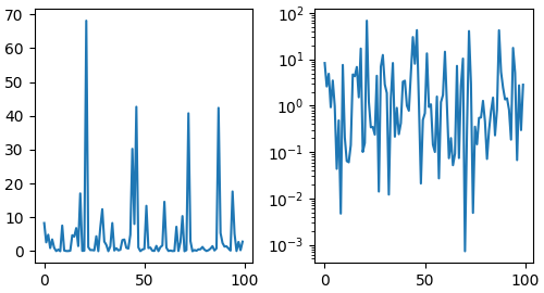
The scale sets the mapping from data values to spacing along the Axis. This happens in both directions, and gets combined into a transform, which is the way that Matplotlib maps from data coordinates to Axes, Figure, or screen coordinates. See Transformations Tutorial.
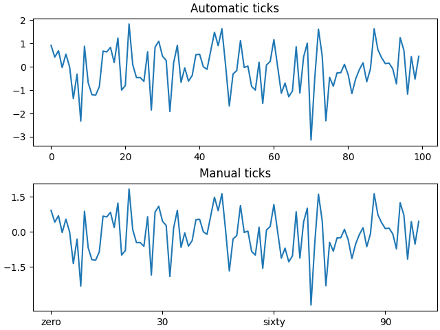
Tick locators and formatters#
Each Axis has a tick locator and formatter that choose where along the
Axis objects to put tick marks. A simple interface to this is
set_xticks:
fig, axs = plt.subplots(2, 1, layout='constrained')
axs[0].plot(xdata, data1)
axs[0].set_title('Automatic ticks')

axs[1].plot(xdata, data1)
axs[1].set_xticks(np.arange(0, 100, 30), ['zero', '30', 'sixty', '90'])
axs[1].set_yticks([-1.5, 0, 1.5])  # note that we don't need to specify labels
axs[1].set_title('Manual ticks')
Different scales can have different locators and formatters; for instance
the log-scale above uses LogLocator and LogFormatter. See
Tick locators and
Tick formatters for other formatters and
locators and information for writing your own.
Plotting dates and strings#
Matplotlib can handle plotting arrays of dates and arrays of strings, as well as floating point numbers. These get special locators and formatters as appropriate. For dates:
fig, ax = plt.subplots(figsize=(5, 2.7), layout='constrained')
dates = np.arange(np.datetime64('2021-11-15'), np.datetime64('2021-12-25'),
                  np.timedelta64(1, 'h'))
data = np.cumsum(np.random.randn(len(dates)))
ax.plot(dates, data)
cdf = mpl.dates.ConciseDateFormatter(ax.xaxis.get_major_locator())
ax.xaxis.set_major_formatter(cdf)
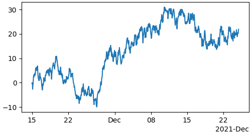
For more information see the date examples (e.g. Date tick labels)
For strings, we get categorical plotting (see: Plotting categorical variables).
fig, ax = plt.subplots(figsize=(5, 2.7), layout='constrained')
categories = ['turnips', 'rutabaga', 'cucumber', 'pumpkins']

ax.bar(categories, np.random.rand(len(categories)))
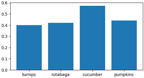
One caveat about categorical plotting is that some methods of parsing text files return a list of strings, even if the strings all represent numbers or dates. If you pass 1000 strings, Matplotlib will think you meant 1000 categories and will add 1000 ticks to your plot!
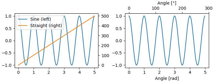
Additional Axis objects#
Plotting data of different magnitude in one chart may require
an additional y-axis. Such an Axis can be created by using
twinx to add a new Axes with an invisible x-axis and a y-axis
positioned at the right (analogously for twiny). See
Plots with different scales for another example.
Similarly, you can add a secondary_xaxis or
secondary_yaxis having a different scale than the main Axis to
represent the data in different scales or units. See
Secondary Axis for further
examples.
fig, (ax1, ax3) = plt.subplots(1, 2, figsize=(7, 2.7), layout='constrained')
l1, = ax1.plot(t, s)
ax2 = ax1.twinx()
l2, = ax2.plot(t, range(len(t)), 'C1')
ax2.legend([l1, l2], ['Sine (left)', 'Straight (right)'])

ax3.plot(t, s)
ax3.set_xlabel('Angle [rad]')
ax4 = ax3.secondary_xaxis('top', functions=(np.rad2deg, np.deg2rad))
ax4.set_xlabel('Angle [°]')
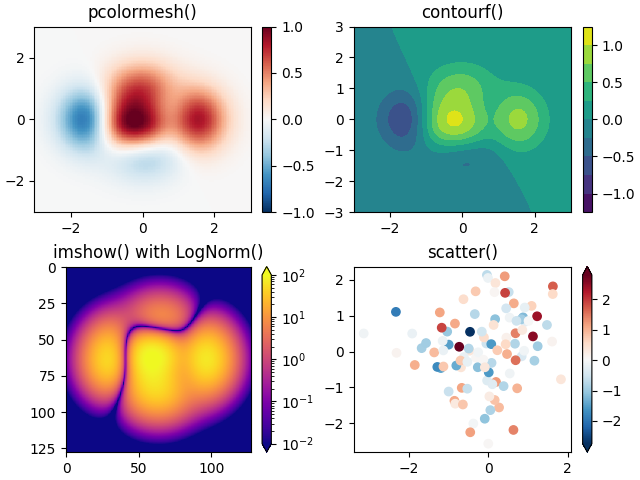
Color mapped data#
Often we want to have a third dimension in a plot represented by a colors in a colormap. Matplotlib has a number of plot types that do this:
X, Y = np.meshgrid(np.linspace(-3, 3, 128), np.linspace(-3, 3, 128))
Z = (1 - X/2 + X**5 + Y**3) * np.exp(-X**2 - Y**2)
fig, axs = plt.subplots(2, 2, layout='constrained')
pc = axs[0, 0].pcolormesh(X, Y, Z, vmin=-1, vmax=1, cmap='RdBu_r')
fig.colorbar(pc, ax=axs[0, 0])
axs[0, 0].set_title('pcolormesh()')
co = axs[0, 1].contourf(X, Y, Z, levels=np.linspace(-1.25, 1.25, 11))
fig.colorbar(co, ax=axs[0, 1])
axs[0, 1].set_title('contourf()')
pc = axs[1, 0].imshow(Z**2 * 100, cmap='plasma',
norm=mpl.colors.LogNorm(vmin=0.01, vmax=100))
fig.colorbar(pc, ax=axs[1, 0], extend='both')
axs[1, 0].set_title('imshow() with LogNorm()')
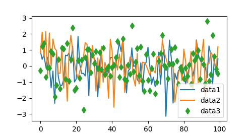
pc = axs[1, 1].scatter(data1, data2, c=data3, cmap='RdBu_r')
fig.colorbar(pc, ax=axs[1, 1], extend='both')
axs[1, 1].set_title('scatter()')
Colormaps#
These are all examples of Artists that derive from ScalarMappable
objects. They all can set a linear mapping between vmin and vmax into
the colormap specified by cmap. Matplotlib has many colormaps to choose
from (Choosing Colormaps in Matplotlib) you can make your
own (Creating Colormaps in Matplotlib) or download as
third-party packages.
Normalizations#
Sometimes we want a non-linear mapping of the data to the colormap, as
in the LogNorm example above. We do this by supplying the
ScalarMappable with the norm argument instead of vmin and vmax.
More normalizations are shown at Colormap Normalization.
Colorbars#
Adding a colorbar gives a key to relate the color back to the
underlying data. Colorbars are figure-level Artists, and are attached to
a ScalarMappable (where they get their information about the norm and
colormap) and usually steal space from a parent Axes. Placement of
colorbars can be complex: see
Placing Colorbars for
details. You can also change the appearance of colorbars with the
extend keyword to add arrows to the ends, and shrink and aspect to
control the size. Finally, the colorbar will have default locators
and formatters appropriate to the norm. These can be changed as for
other Axis objects.
Working with multiple Figures and Axes#
You can open multiple Figures with multiple calls to
fig = plt.figure() or fig2, ax = plt.subplots(). By keeping the
object references you can add Artists to either Figure.
Multiple Axes can be added a number of ways, but the most basic is
plt.subplots() as used above. One can achieve more complex layouts,
with Axes objects spanning columns or rows, using subplot_mosaic.
Matplotlib has quite sophisticated tools for arranging Axes: See Arranging multiple Axes in a Figure and Complex and semantic figure composition (subplot_mosaic).
More reading#
For more plot types see Plot types and the API reference, in particular the Axes API.
Total running time of the script: ( 0 minutes 7.334 seconds)