Note
Click here to download the full example code
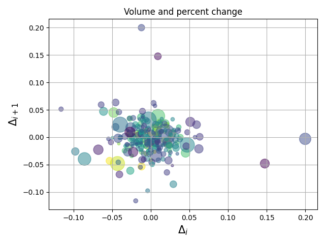
Scatter Demo2#
Demo of scatter plot with varying marker colors and sizes.
import numpy as np
import matplotlib.pyplot as plt
import matplotlib.cbook as cbook

# Load a numpy record array from yahoo csv data with fields date, open, high,
# low, close, volume, adj_close from the mpl-data/sample_data directory. The
# record array stores the date as an np.datetime64 with a day unit ('D') in
# the date column.
price_data = (cbook.get_sample_data('goog.npz', np_load=True)['price_data']
              .view(np.recarray))
price_data = price_data[-250:]  # get the most recent 250 trading days

delta1 = np.diff(price_data.adj_close) / price_data.adj_close[:-1]

# Marker size in units of points^2
volume = (15 * price_data.volume[:-2] / price_data.volume[0])**2
close = 0.003 * price_data.close[:-2] / 0.003 * price_data.open[:-2]

fig, ax = plt.subplots()
ax.scatter(delta1[:-1], delta1[1:], c=close, s=volume, alpha=0.5)

ax.set_xlabel(r'$\Delta_i$', fontsize=15)
ax.set_ylabel(r'$\Delta_{i+1}$', fontsize=15)
ax.set_title('Volume and percent change')

ax.grid(True)
fig.tight_layout()

plt.show()