Version 3.0.0
Note
Click here to download the full example code
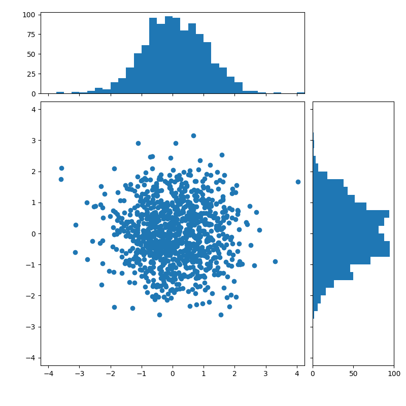
Creates histogram from scatter plot and adds them to the sides of the plot.
import numpy as np
import matplotlib.pyplot as plt
from matplotlib.ticker import NullFormatter

# Fixing random state for reproducibility
np.random.seed(19680801)


# the random data
x = np.random.randn(1000)
y = np.random.randn(1000)

nullfmt = NullFormatter()         # no labels

# definitions for the axes
left, width = 0.1, 0.65
bottom, height = 0.1, 0.65
bottom_h = left_h = left + width + 0.02

rect_scatter = [left, bottom, width, height]
rect_histx = [left, bottom_h, width, 0.2]
rect_histy = [left_h, bottom, 0.2, height]

# start with a rectangular Figure
plt.figure(1, figsize=(8, 8))

axScatter = plt.axes(rect_scatter)
axHistx = plt.axes(rect_histx)
axHisty = plt.axes(rect_histy)

# no labels
axHistx.xaxis.set_major_formatter(nullfmt)
axHisty.yaxis.set_major_formatter(nullfmt)

# the scatter plot:
axScatter.scatter(x, y)

# now determine nice limits by hand:
binwidth = 0.25
xymax = max(np.max(np.abs(x)), np.max(np.abs(y)))
lim = (int(xymax/binwidth) + 1) * binwidth

axScatter.set_xlim((-lim, lim))
axScatter.set_ylim((-lim, lim))

bins = np.arange(-lim, lim + binwidth, binwidth)
axHistx.hist(x, bins=bins)
axHisty.hist(y, bins=bins, orientation='horizontal')

axHistx.set_xlim(axScatter.get_xlim())
axHisty.set_ylim(axScatter.get_ylim())

plt.show()
Keywords: matplotlib code example, codex, python plot, pyplot Gallery generated by Sphinx-Gallery