A closer look at probability plots
Overview
The probscale.probplot function let’s you do a couple of things.
They are:
- Creating percentile, quantile, or probability plots.
- Placing your probability scale either axis.
- Specifying an arbitrary distribution for your probability scale.
- Drawing a best-fit line line in linear-probability or log-probability space.
- Computing the plotting positions of your data anyway you want.
- Using probability axes on seaborn
FacetGrids
We’ll go over all of these options in this tutorial.
%matplotlib inline
import warnings
warnings.simplefilter('ignore')

import numpy
from matplotlib import pyplot
import seaborn

import probscale
clear_bkgd = {'axes.facecolor':'none', 'figure.facecolor':'none'}
seaborn.set(style='ticks', context='talk', color_codes=True, rc=clear_bkgd)

# load up some example data from the seaborn package
tips = seaborn.load_dataset("tips")
iris = seaborn.load_dataset("iris")
Different plot types
In general, there are three plot types:
- Percentile, a.k.a. P-P plots
- Quantile, a.k.a. Q-Q plots
- Probability, a.k.a. Prob Plots
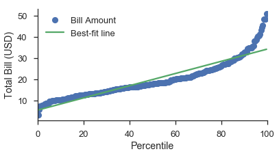
Percentile plots
Percentile plots are the simplest plots. You simply plot the data against their plotting positions. The plotting positions are shown on a linear scale, but the data can be scaled as appropriate.
If you were doing that from scratch, it would look like this:
position, bill = probscale.plot_pos(tips['total_bill'])
position *= 100
fig, ax = pyplot.subplots(figsize=(6, 3))
ax.plot(position, bill, marker='.', linestyle='none', label='Bill amount')
ax.set_xlabel('Percentile')
ax.set_ylabel('Total Bill (USD)')
ax.set_yscale('log')
ax.set_ylim(bottom=1, top=100)
seaborn.despine()
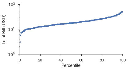
Using the probplot function with plottype='pp', it becomes:
fig, ax = pyplot.subplots(figsize=(6, 3))
fig = probscale.probplot(tips['total_bill'], ax=ax, plottype='pp', datascale='log',
                         problabel='Percentile', datalabel='Total Bill (USD)',
                         scatter_kws=dict(marker='.', linestyle='none', label='Bill Amount'))
ax.set_ylim(bottom=1, top=100)
seaborn.despine()
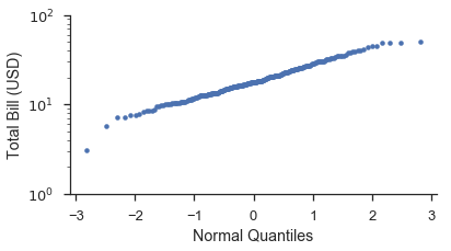
Quantile plots
Quantile plots are similar to propbabilty plots. The main differences is that plotting positions are converted into quantiles or \(Z\)-scores based on a probability distribution. The default distribution is the standard-normal distribution. Using a different distribution is covered further down.
Usings the same dataset as a above let’s make a quantile plot. Like
above, we’ll do it from scratch and then using probplot.
from scipy import stats

position, bill = probscale.plot_pos(tips['total_bill'])
quantile = stats.norm.ppf(position)

fig, ax = pyplot.subplots(figsize=(6, 3))
ax.plot(quantile, bill, marker='.', linestyle='none', label='Bill amount')
ax.set_xlabel('Normal Quantiles')
ax.set_ylabel('Total Bill (USD)')
ax.set_yscale('log')
ax.set_ylim(bottom=1, top=100)
seaborn.despine()
Using probplot:
fig, ax = pyplot.subplots(figsize=(6, 3))
fig = probscale.probplot(tips['total_bill'], ax=ax, plottype='qq', datascale='log',
                         problabel='Standard Normal Quantiles', datalabel='Total Bill (USD)',
                         scatter_kws=dict(marker='.', linestyle='none', label='Bill Amount'))

ax.set_ylim(bottom=1, top=100)
seaborn.despine()
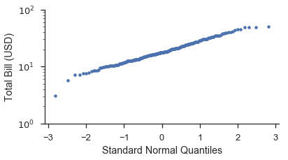
You’ll notice that the shape of the data is straighter on the Q-Q plot
than the P-P plot. This is due to the transformation that takes place
when converting the plotting positions to a distribution’s quantiles.
The plot below hopefully illustrates this more clearly. Additionally,
we’ll show how use the probax option to flip the plot so that the
P-P/Q-Q/Probability axis is on the y-scale.
fig, (ax1, ax2) = pyplot.subplots(figsize=(6, 6), ncols=2, sharex=True)
markers = dict(marker='.', linestyle='none', label='Bill Amount')

fig = probscale.probplot(tips['total_bill'], ax=ax1, plottype='pp', probax='y',
                         datascale='log', problabel='Percentiles',
                         datalabel='Total Bill (USD)', scatter_kws=markers)

fig = probscale.probplot(tips['total_bill'], ax=ax2, plottype='qq', probax='y',
                         datascale='log', problabel='Standard Normal Quantiles',
                         datalabel='Total Bill (USD)', scatter_kws=markers)

ax1.set_xlim(left=1, right=100)
fig.tight_layout()
seaborn.despine()
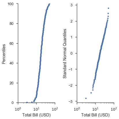
In these case of P-P plots and simple Q-Q plots, the probplot
function doesn’t offer much convencience compared to writing raw
matplotlib commands. However, this changes when you start making
probability plots and using more advanced options.
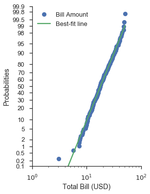
Probability plots
Visually, the curve of plots on probability and quantile scales should be the same. The difference is that the axis ticks are placed and labeled based on non-exceedance probailities rather than the more abstract quantiles of the distribution.
Unsurprisingly, a picture explains this much better. Let’s build off of the previos plot:
fig, (ax1, ax2, ax3) = pyplot.subplots(figsize=(9, 6), ncols=3, sharex=True)
common_opts = dict(
    probax='y',
    datascale='log',
    datalabel='Total Bill (USD)',
    scatter_kws=dict(marker='.', linestyle='none')
)

fig = probscale.probplot(tips['total_bill'], ax=ax1, plottype='pp',
                         problabel='Percentiles',  **common_opts)

fig = probscale.probplot(tips['total_bill'], ax=ax2, plottype='qq',
                         problabel='Standard Normal Quantiles',  **common_opts)

fig = probscale.probplot(tips['total_bill'], ax=ax3, plottype='prob',
                         problabel='Standard Normal Probabilities',  **common_opts)

ax3.set_xlim(left=1, right=100)
ax3.set_ylim(bottom=0.13, top=99.87)
fig.tight_layout()
seaborn.despine()
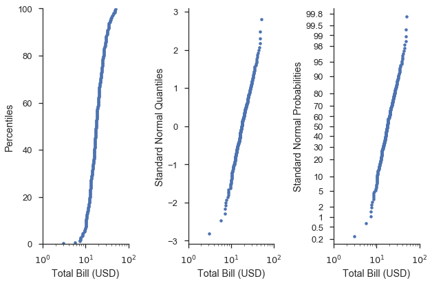
Visually, shapes of the curves on the right-most plots are identical. The difference is that the y-axis ticks and labels are more “human” readable.
In other words, the probability (right) axis gives us the ease of finding e.g. the 75th percentile found on percentile (left) axis, and illustrates how well the data fit a given distribution like the quantile (middle) axes.
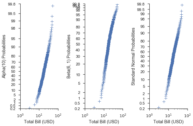
Using different distributions for your scales
When using quantile or probability scales, you can pass a distribution
from the scipy.stats module to the probplot function. When a
distribution is not provided to the dist parameter, a standard
normal distribution is used.
common_opts = dict(
    plottype='prob',
    probax='y',
    datascale='log',
    datalabel='Total Bill (USD)',
    scatter_kws=dict(marker='+', linestyle='none', mew=1)
)

alpha = stats.alpha(10)
beta = stats.beta(6, 3)

fig, (ax1, ax2, ax3) = pyplot.subplots(figsize=(9, 6), ncols=3, sharex=True)
fig = probscale.probplot(tips['total_bill'], ax=ax1, dist=alpha,
                         problabel='Alpha(10) Probabilities', **common_opts)

fig = probscale.probplot(tips['total_bill'], ax=ax2, dist=beta,
                         problabel='Beta(6, 1) Probabilities', **common_opts)

fig = probscale.probplot(tips['total_bill'], ax=ax3, dist=None,
                         problabel='Standard Normal Probabilities', **common_opts)

ax3.set_xlim(left=1, right=100)
for ax in [ax1, ax2, ax3]:
    ax.set_ylim(bottom=0.2, top=99.8)
seaborn.despine()
fig.tight_layout()
This can also be done for QQ scales:
common_opts = dict(
    plottype='qq',
    probax='y',
    datascale='log',
    datalabel='Total Bill (USD)',
    scatter_kws=dict(marker='+', linestyle='none', mew=1)
)

alpha = stats.alpha(10)
beta = stats.beta(6, 3)

fig, (ax1, ax2, ax3) = pyplot.subplots(figsize=(9, 6), ncols=3, sharex=True)
fig = probscale.probplot(tips['total_bill'], ax=ax1, dist=alpha,
                         problabel='Alpha(10) Quantiles', **common_opts)

fig = probscale.probplot(tips['total_bill'], ax=ax2, dist=beta,
                         problabel='Beta(6, 3) Quantiles', **common_opts)

fig = probscale.probplot(tips['total_bill'], ax=ax3, dist=None,
                         problabel='Standard Normal Quantiles', **common_opts)

ax1.set_xlim(left=1, right=100)
seaborn.despine()
fig.tight_layout()

Using a specific distribution with a quantile scale can give us an idea
of how well the data fit that distribution. For instance, let’s say we
have a hunch that the values of the total_bill column in our dataset
are normally distributed and their mean and standard deviation are 19.8
and 8.9, respectively. We could investigate that by create a
scipy.stat.norm distribution with those parameters and use that
distribution in the Q-Q plot.
def equality_line(ax, label=None):
    limits = [
        numpy.min([ax.get_xlim(), ax.get_ylim()]),
        numpy.max([ax.get_xlim(), ax.get_ylim()]),
    ]
    ax.set_xlim(limits)
    ax.set_ylim(limits)
    ax.plot(limits, limits, 'k-', alpha=0.75, zorder=0, label=label)

norm = stats.norm(loc=21, scale=8)
fig, ax = pyplot.subplots(figsize=(5, 5))
ax.set_aspect('equal')

common_opts = dict(
    plottype='qq',
    probax='x',
    problabel='Theoretical Quantiles',
    datalabel='Emperical Quantiles',
    scatter_kws=dict(label='Bill amounts')
)

fig = probscale.probplot(tips['total_bill'], ax=ax, dist=norm, **common_opts)

equality_line(ax, label='Guessed Normal Distribution')
ax.legend(loc='lower right')
seaborn.despine()
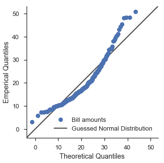
Hmm. That doesn’t look too good. Let’s use scipy’s fitting functionality to try out a lognormal distribution.
lognorm_params = stats.lognorm.fit(tips['total_bill'], floc=0)
lognorm = stats.lognorm(*lognorm_params)
fig, ax = pyplot.subplots(figsize=(5, 5))
ax.set_aspect('equal')

fig = probscale.probplot(tips['total_bill'], ax=ax, dist=lognorm, **common_opts)

equality_line(ax, label='Fit Lognormal Distribution')
ax.legend(loc='lower right')
seaborn.despine()

That’s a little bit better.
Finding the best distribution is left as an exercise to the reader.
Best-fit lines
Adding a best-fit line to a probability plot can provide insight as to whether or not a dataset can be characterized by a distribution.
This is simply done with the bestfit=True option in probplot.
Behind the scenes, probplot transforms both the x- and y-data of fed
to the regression based on the plot type and scale of the data axis
(controlled via datascale).
Visual attributes of the line can be controled with the line_kws
parameter. If you want label the best-fit line, that is where you
specify its label.
Simple examples
The most trivial case is a P-P plot with a linear data axis
fig, ax = pyplot.subplots(figsize=(6, 3))
fig = probscale.probplot(tips['total_bill'], ax=ax, plottype='pp', bestfit=True,
                         problabel='Percentile', datalabel='Total Bill (USD)',
                         scatter_kws=dict(label='Bill Amount'),
                         line_kws=dict(label='Best-fit line'))
ax.legend(loc='upper left')
seaborn.despine()
The least trivial case is a probability plot with a log-scaled data axes.
As suggested by the section on quantile plots with custom distributions, using a normal probability scale with a lognormal data scale provides a decent fit (visually speaking).
Note that you still put the probability scale on either the x- or y-axis.
fig, ax = pyplot.subplots(figsize=(4, 6))
fig = probscale.probplot(tips['total_bill'], ax=ax, plottype='prob', probax='y', bestfit=True,
                         datascale='log', problabel='Probabilities', datalabel='Total Bill (USD)',
                         scatter_kws=dict(label='Bill Amount'),
                         line_kws=dict(label='Best-fit line'))
ax.legend(loc='upper left')
ax.set_ylim(bottom=0.1, top=99.9)
ax.set_xlim(left=1, right=100)
seaborn.despine()
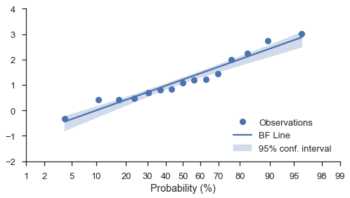
Bootstrapped confidence intervals
Regardless of the scales of the plot (linear, log, or prob), you can add
bootstrapped confidence intervals around the best-fit line. Simply use
the estimate_ci=True option along with bestfit=True:
N = 15
numpy.random.seed(0)
x = numpy.random.normal(size=N) + numpy.random.uniform(size=N)
fig, ax = pyplot.subplots(figsize=(8, 4))
fig = probscale.probplot(x, ax=ax, bestfit=True, estimate_ci=True,
                         line_kws={'label': 'BF Line', 'color': 'b'},
                         scatter_kws={'label': 'Observations'},
                         problabel='Probability (%)')
ax.legend(loc='lower right')
ax.set_ylim(bottom=-2, top=4)
seaborn.despine(fig)
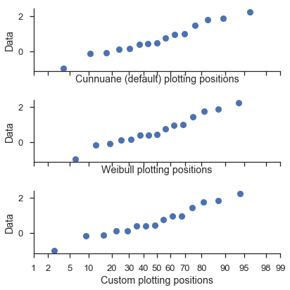
Tuning the plotting positions
The probplot function calls the viz.plot_plos() function to compute each dataset’s plotting positions.
You should read that function’s docstring for more detailed information.
But the high-level overview is that there are a couple of parameters (alpha and beta) that you can tweak in the plotting positions calculation.
The most common values can be selected via the postype parameter.
These are controlled via the pp_kws parameter in probplot and are discussed in much more detail in the next tutorial.
common_opts = dict(
    plottype='prob',
    probax='x',
    datalabel='Data',
)

numpy.random.seed(0)
x = numpy.random.normal(size=15)

fig, (ax1, ax2, ax3) = pyplot.subplots(figsize=(6, 6), nrows=3,
                                       sharey=True, sharex=True)
fig = probscale.probplot(x, ax=ax1, problabel='Cunnuane (default) plotting positions',
                         **common_opts)

fig = probscale.probplot(x, ax=ax2, problabel='Weibull plotting positions',
                         pp_kws=dict(postype='weibull'), **common_opts)

fig = probscale.probplot(x, ax=ax3, problabel='Custom plotting positions',
                         pp_kws=dict(alpha=0.6, beta=0.1), **common_opts)
ax1.set_xlim(left=1, right=99)
seaborn.despine()
fig.tight_layout()
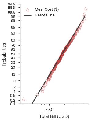
Controlling the aesthetics of the plot elements
As it has been hinted in the examples above, the probplot function
takes two dictionaries to customize the data series and the best-fit
line (scatter_kws and line_kws, respectively. These dictionaries
are passed directly to the plot method of current axes.
By default, the data series assumes that linestyle='none' and
marker='o'. These can be overwritten through scatter_kws
Revisting the previous example, we can customize it like so:
scatter_options = dict(
    marker='^',
    markerfacecolor='none',
    markeredgecolor='firebrick',
    markeredgewidth=1.25,
    linestyle='none',
    alpha=0.35,
    zorder=5,
    label='Meal Cost ($)'
)

line_options = dict(
    dashes=(10,2,5,2,10,2),
    color='0.25',
    linewidth=3,
    zorder=10,
    label='Best-fit line'
)

fig, ax = pyplot.subplots(figsize=(4, 6))
fig = probscale.probplot(tips['total_bill'], ax=ax, plottype='prob', probax='y', bestfit=True,
                         datascale='log', problabel='Probabilities', datalabel='Total Bill (USD)',
                         scatter_kws=scatter_options, line_kws=line_options)
ax.legend(loc='upper left')
ax.set_ylim(bottom=0.1, top=99.9)
seaborn.despine()
Note
The probplot function can take two additional aesthetic parameters:
color and label. If provided, color will override the marker face color
and line color options of the scatter_kws and line_kws parameters, respectively.
Similarly, the label of the scatter series will be overridden by the explicit parameter.
It is not recommended that color and label are used. They exist primarily for
compatibility with the seaborn package.
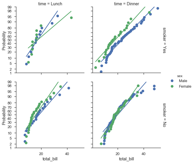
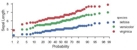
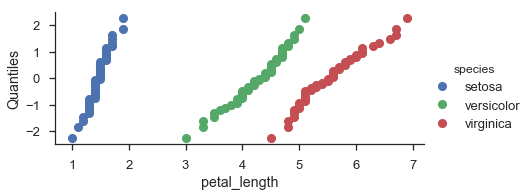
Mapping probability plots to seaborn FacetGrids
In general, probplot was written with FacetGrids in mind. All
you need to do is specify the data column and other options in the call
to FacetGrid.map.
Unfortunately the labels don’t work out exactly like I want, but it’s a work in progress.
fg = (
    seaborn.FacetGrid(data=iris, hue='species', aspect=2)
        .map(probscale.probplot, 'sepal_length')
        .set_axis_labels(x_var='Probability', y_var='Sepal Length')
        .add_legend()
)
fg = (
    seaborn.FacetGrid(data=iris, hue='species', aspect=2)
        .map(probscale.probplot, 'petal_length', plottype='qq', probax='y')
        .set_ylabels('Quantiles')
        .add_legend()
)
fg = (
    seaborn.FacetGrid(data=tips, hue='sex', row='smoker', col='time', margin_titles=True, size=4)
        .map(probscale.probplot, 'total_bill', probax='y', bestfit=True)
        .set_ylabels('Probability')
        .add_legend()
)