Using different formulations of plotting positions
Computing plotting positions
When drawing a percentile, quantile, or probability plot, the potting positions of ordered data must be computed.
For a sample \(X\) with population size \(n\), the plotting position of of the \(j^\mathrm{th}\) element is defined as:
In this equation, α and β can take on several values. Common values are described below:
- “type 4” (α=0, β=1)
- Linear interpolation of the empirical CDF.
- “type 5” or “hazen” (α=0.5, β=0.5)
- Piecewise linear interpolation.
- “type 6” or “weibull” (α=0, β=0)
- Weibull plotting positions. Unbiased exceedance probability for all distributions. Recommended for hydrologic applications.
- “type 7” (α=1, β=1)
- The default values in R. Not recommended with probability scales as the min and max data points get plotting positions of 0 and 1, respectively, and therefore cannot be shown.
- “type 8” (α=1/3, β=1/3)
- Approximately median-unbiased.
- “type 9” or “blom” (α=0.375, β=0.375)
- Approximately unbiased positions if the data are normally distributed.
- “median” (α=0.3175, β=0.3175)
- Median exceedance probabilities for all distributions (used in
scipy.stats.probplot).- “apl” or “pwm” (α=0.35, β=0.35)
- Used with probability-weighted moments.
- “cunnane” (α=0.4, β=0.4)
- Nearly unbiased quantiles for normally distributed data. This is the default value.
- “gringorten” (α=0.44, β=0.44)
- Used for Gumble distributions.
The purpose of this tutorial is to show how the selected α and β can alter the shape of a probability plot.
First let’s get some analytical setup out of the way...
%matplotlib inline
import warnings
warnings.simplefilter('ignore')

import numpy
from matplotlib import pyplot
from scipy import stats
import seaborn

clear_bkgd = {'axes.facecolor':'none', 'figure.facecolor':'none'}
seaborn.set(style='ticks', context='talk', color_codes=True, rc=clear_bkgd)

import probscale


def format_axes(ax1, ax2):
    """ Sets axes labels and grids """
    for ax in (ax1, ax2):
        if ax is not None:
            ax.set_ylim(bottom=1, top=99)
            ax.set_xlabel('Values of Data')
            seaborn.despine(ax=ax)
            ax.yaxis.grid(True)

    ax1.legend(loc='upper left', numpoints=1, frameon=False)
    ax1.set_ylabel('Normal Probability Scale')
    if ax2 is not None:
        ax2.set_ylabel('Weibull Probability Scale')
Normal vs Weibull scales and Cunnane vs Weibull plotting positions
Here we’ll generate some fake, normally distributed data and define a Weibull distribution from scipy to use for a probability scale.
numpy.random.seed(0)  # reproducible
data = numpy.random.normal(loc=5, scale=1.25, size=37)

# simple weibull distribution
weibull = stats.weibull_min(2)
Now let’s create probability plots on both Weibull and normal probability scales. Additionally, we’ll compute the plotting positions two different but commone ways for each plot.
First, in blue circles, we’ll show the data with Weibull (α=0, β=0) plotting positions. Weibull plotting positions are commonly use in fields such as hydrology and water resources engineering.
In green squares, we’ll use Cunnane (α=0.4, β=0.4) plotting positions. Cunnane plotting positions are good for normally distributed data and are the default values.
w_opts = {'label': 'Weibull (α=0, β=0)',     'marker': 'o', 'markeredgecolor': 'b'}
c_opts = {'label': 'Cunnane (α=0.4, β=0.4)', 'marker': 's', 'markeredgecolor': 'g'}

common_opts = {
    'markerfacecolor': 'none',
    'markeredgewidth': 1.25,
    'linestyle': 'none'
}

fig, (ax1, ax2) = pyplot.subplots(figsize=(10, 8), ncols=2, sharex=True, sharey=False)

for dist, ax in zip([None, weibull], [ax1, ax2]):
    for opts, postype in zip([w_opts, c_opts,], ['weibull', 'cunnane']):
        probscale.probplot(data, ax=ax, dist=dist, probax='y',
                           scatter_kws={**opts, **common_opts},
                           pp_kws={'postype': postype})

format_axes(ax1, ax2)
fig.tight_layout()
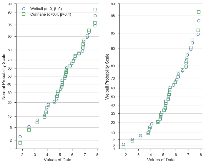
This demostrates that the different formulations of the plotting positions vary most at the extreme values of the dataset.
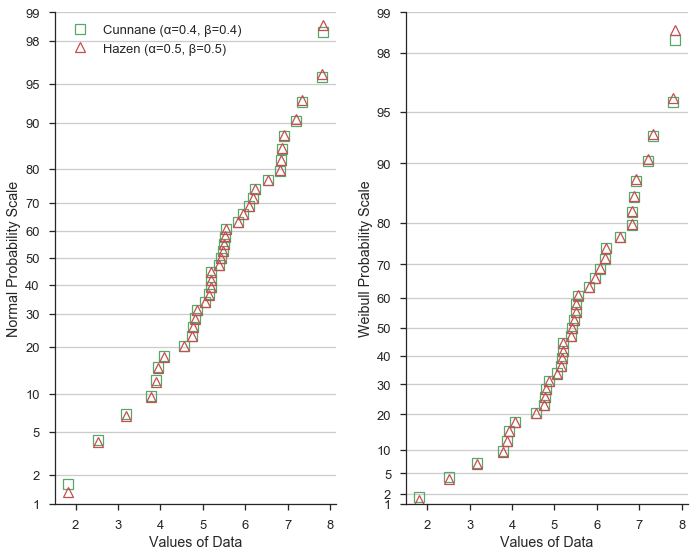
Hazen plotting positions
Next, let’s compare the Hazen/Type 5 (α=0.5, β=0.5) formulation to Cunnane. Hazen plotting positions (shown as red triangles) represet a piece-wise linear interpolation of the emperical cumulative distribution function of the dataset.
Given the values of α and β=0.5 vary only slightly from the Cunnane values, the plotting position predictably are similar.
h_opts = {'label': 'Hazen (α=0.5, β=0.5)', 'marker': '^', 'markeredgecolor': 'r'}
fig, (ax1, ax2) = pyplot.subplots(figsize=(10, 8), ncols=2, sharex=True, sharey=False)

for dist, ax in zip([None, weibull], [ax1, ax2]):
    for opts, postype in zip([c_opts, h_opts,], ['cunnane', 'Hazen']):
        probscale.probplot(data, ax=ax, dist=dist, probax='y',
                           scatter_kws={**opts, **common_opts},
                           pp_kws={'postype': postype})

format_axes(ax1, ax2)
fig.tight_layout()
Summary
At the risk of showing a very cluttered and hard to read figure, let’s throw all three on the same normal probability scale:
fig, ax1 = pyplot.subplots(figsize=(6, 8))

for opts, postype in zip([w_opts, c_opts, h_opts,], ['weibull', 'cunnane', 'hazen']):
    probscale.probplot(data, ax=ax1, dist=None, probax='y',
                       scatter_kws={**opts, **common_opts},
                       pp_kws={'postype': postype})

format_axes(ax1, None)
fig.tight_layout()
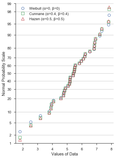
Again, the different values of α and β don’t significantly alter the shape of the probability plot near between – say – the lower and upper quartiles. Beyond the quartiles, however, the difference is more obvious.
The cell below computes the plotting positions with the three sets of α and β values that we’ve investigated and prints the first ten value for easy comparison.
# weibull plotting positions and sorted data
w_probs, _ = probscale.plot_pos(data, postype='weibull')

# normal plotting positions, returned "data" is identical to above
c_probs, _ = probscale.plot_pos(data, postype='cunnane')

# type 4 plot positions
h_probs, _ = probscale.plot_pos(data, postype='hazen')

# convert to percentages
w_probs *= 100
c_probs *= 100
h_probs *= 100

print('Weibull: ', numpy.round(w_probs[:10], 2))
print('Cunnane: ', numpy.round(c_probs[:10], 2))
print('Hazen:   ', numpy.round(h_probs[:10], 2))
Weibull:  [  2.63   5.26   7.89  10.53  13.16  15.79  18.42  21.05  23.68  26.32]
Cunnane:  [  1.61   4.3    6.99   9.68  12.37  15.05  17.74  20.43  23.12  25.81]
Hazen:    [  1.35   4.05   6.76   9.46  12.16  14.86  17.57  20.27  22.97  25.68]