How-to
Contents
- How-to
- How-to: Plotting
- Plot
numpy.datetime64values - Check whether a figure is empty
- Find all objects in a figure of a certain type
- How to prevent ticklabels from having an offset
- Save transparent figures
- Save multiple plots to one pdf file
- Move the edge of an axes to make room for tick labels
- Automatically make room for tick labels
- Configure the tick widths
- Align my ylabels across multiple subplots
- Skip dates where there is no data
- Control the depth of plot elements
- Make the aspect ratio for plots equal
- Multiple y-axis scales
- Generate images without having a window appear
- Use
show() - Interpreting box plots and violin plots
- Working with threads
- Plot
- How-to: Contributing
- How to use Matplotlib in a web application server
- How-to: Plotting
How-to: Plotting
Plot numpy.datetime64 values
As of Matplotlib 2.2, numpy.datetime64 objects are handled the same way
as datetime.datetime objects.
If you prefer the pandas converters and locators, you can register them. This is done automatically when calling a pandas plot function and may be unnecessary when using pandas instead of Matplotlib directly.
from pandas.plotting import register_matplotlib_converters
register_matplotlib_converters()
Check whether a figure is empty
Empty can actually mean different things. Does the figure contain any artists?
Does a figure with an empty Axes still count as empty? Is the figure
empty if it was rendered pure white (there may be artists present, but they
could be outside the drawing area or transparent)?
For the purpose here, we define empty as: "The figure does not contain any
artists except it's background patch." The exception for the background is
necessary, because by default every figure contains a Rectangle as it's
background patch. This definition could be checked via:
def is_empty(figure):
    """
    Return whether the figure contains no Artists (other than the default
    background patch).
    """
    contained_artists = figure.get_children()
    return len(contained_artists) <= 1
We've decided not to include this as a figure method because this is only one way of defining empty, and checking the above is only rarely necessary. Usually the user or program handling the figure know if they have added something to the figure.
Checking whether a figure would render empty cannot be reliably checked except by actually rendering the figure and investigating the rendered result.
Find all objects in a figure of a certain type
Every Matplotlib artist (see Artist tutorial) has a method
called findobj() that can be used to
recursively search the artist for any artists it may contain that meet
some criteria (e.g., match all Line2D
instances or match some arbitrary filter function). For example, the
following snippet finds every object in the figure which has a
set_color property and makes the object blue:
def myfunc(x):
    return hasattr(x, 'set_color')

for o in fig.findobj(myfunc):
    o.set_color('blue')
You can also filter on class instances:
import matplotlib.text as text
for o in fig.findobj(text.Text):
    o.set_fontstyle('italic')
How to prevent ticklabels from having an offset
The default formatter will use an offset to reduce the length of the ticklabels. To turn this feature off on a per-axis basis:
ax.get_xaxis().get_major_formatter().set_useOffset(False)
set rcParams["axes.formatter.useoffset"] (default: True), or use a different
formatter. See ticker for details.
Save transparent figures
The savefig() command has a keyword argument
transparent which, if 'True', will make the figure and axes
backgrounds transparent when saving, but will not affect the displayed
image on the screen.
If you need finer grained control, e.g., you do not want full transparency
or you want to affect the screen displayed version as well, you can set
the alpha properties directly. The figure has a
Rectangle instance called patch
and the axes has a Rectangle instance called patch. You can set
any property on them directly (facecolor, edgecolor, linewidth,
linestyle, alpha). e.g.:
fig = plt.figure()
fig.patch.set_alpha(0.5)
ax = fig.add_subplot(111)
ax.patch.set_alpha(0.5)
If you need all the figure elements to be transparent, there is currently no global alpha setting, but you can set the alpha channel on individual elements, e.g.:
ax.plot(x, y, alpha=0.5)
ax.set_xlabel('volts', alpha=0.5)
Save multiple plots to one pdf file
Many image file formats can only have one image per file, but some formats support multi-page files. Currently only the pdf backend has support for this. To make a multi-page pdf file, first initialize the file:
from matplotlib.backends.backend_pdf import PdfPages
pp = PdfPages('multipage.pdf')
You can give the PdfPages
object to savefig(), but you have to specify
the format:
plt.savefig(pp, format='pdf')
An easier way is to call
PdfPages.savefig:
pp.savefig()
Finally, the multipage pdf object has to be closed:
pp.close()
The same can be done using the pgf backend:
from matplotlib.backends.backend_pgf import PdfPages
Move the edge of an axes to make room for tick labels
For subplots, you can control the default spacing on the left, right,
bottom, and top as well as the horizontal and vertical spacing between
multiple rows and columns using the
matplotlib.figure.Figure.subplots_adjust() method (in pyplot it
is subplots_adjust()). For example, to move
the bottom of the subplots up to make room for some rotated x tick
labels:
fig = plt.figure()
fig.subplots_adjust(bottom=0.2)
ax = fig.add_subplot(111)
You can control the defaults for these parameters in your
matplotlibrc file; see Customizing Matplotlib with style sheets and rcParams. For
example, to make the above setting permanent, you would set:
figure.subplot.bottom : 0.2 # the bottom of the subplots of the figure
The other parameters you can configure are, with their defaults
- left = 0.125
- the left side of the subplots of the figure
- right = 0.9
- the right side of the subplots of the figure
- bottom = 0.1
- the bottom of the subplots of the figure
- top = 0.9
- the top of the subplots of the figure
- wspace = 0.2
- the amount of width reserved for space between subplots, expressed as a fraction of the average axis width
- hspace = 0.2
- the amount of height reserved for space between subplots, expressed as a fraction of the average axis height
If you want additional control, you can create an
Axes using the
axes() command (or equivalently the figure
add_axes() method), which allows you to
specify the location explicitly:
ax = fig.add_axes([left, bottom, width, height])
where all values are in fractional (0 to 1) coordinates. See Axes Demo for an example of placing axes manually.
Automatically make room for tick labels
Note
This is now easier to handle than ever before.
Calling tight_layout() or alternatively using
constrained_layout=True argument in subplots()
can fix many common layout issues. See the
Tight Layout guide and
Constrained Layout Guide for more details.
The information below is kept here in case it is useful for other purposes.
In most use cases, it is enough to simply change the subplots adjust
parameters as described in Move the edge of an axes to make room for tick labels. But in some
cases, you don't know ahead of time what your tick labels will be, or
how large they will be (data and labels outside your control may be
being fed into your graphing application), and you may need to
automatically adjust your subplot parameters based on the size of the
tick labels. Any Text instance can report
its extent in window coordinates (a negative x coordinate is outside
the window), but there is a rub.
The RendererBase instance, which is
used to calculate the text size, is not known until the figure is
drawn (draw()). After the window is
drawn and the text instance knows its renderer, you can call
get_window_extent(). One way to solve
this chicken and egg problem is to wait until the figure is draw by
connecting
(mpl_connect()) to the
"on_draw" signal (DrawEvent) and
get the window extent there, and then do something with it, e.g., move
the left of the canvas over; see Event handling and picking.
Here is an example that gets a bounding box in relative figure coordinates (0..1) of each of the labels and uses it to move the left of the subplots over so that the tick labels fit in the figure:
Auto Subplots Adjust
Configure the tick widths
Wherever possible, it is recommended to use the tick_params()
or set_tick_params() methods to modify tick properties:
import matplotlib.pyplot as plt

fig, ax = plt.subplots()
ax.plot(range(10))

ax.tick_params(width=10)

plt.show()
For more control of tick properties that are not provided by the above methods,
it is important to know that in Matplotlib, the ticks are markers. All
Line2D objects support a line (solid, dashed, etc)
and a marker (circle, square, tick). The tick width is controlled by the
"markeredgewidth" property, so the above effect can also be achieved by:
import matplotlib.pyplot as plt

fig, ax = plt.subplots()
ax.plot(range(10))

for line in ax.get_xticklines() + ax.get_yticklines():
    line.set_markeredgewidth(10)

plt.show()
The other properties that control the tick marker, and all markers,
are markerfacecolor, markeredgecolor, markeredgewidth,
markersize. For more information on configuring ticks, see
Axis containers and Tick containers.
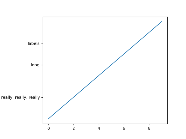
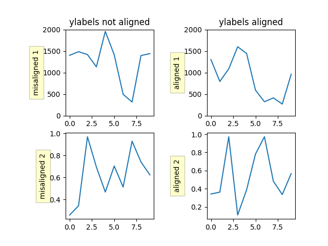
Align my ylabels across multiple subplots
If you have multiple subplots over one another, and the y data have different scales, you can often get ylabels that do not align vertically across the multiple subplots, which can be unattractive. By default, Matplotlib positions the x location of the ylabel so that it does not overlap any of the y ticks. You can override this default behavior by specifying the coordinates of the label. The example below shows the default behavior in the left subplots, and the manual setting in the right subplots.
Align Ylabels
Skip dates where there is no data
When plotting time series, e.g., financial time series, one often wants to leave out days on which there is no data, e.g., weekends. By passing in dates on the x-xaxis, you get large horizontal gaps on periods when there is not data. The solution is to pass in some proxy x-data, e.g., evenly sampled indices, and then use a custom formatter to format these as dates. Custom tick formatter for time series demonstrates how to use an 'index formatter' to achieve the desired plot.
Control the depth of plot elements
Within an axes, the order that the various lines, markers, text,
collections, etc appear is determined by the
set_zorder() property. The default
order is patches, lines, text, with collections of lines and
collections of patches appearing at the same level as regular lines
and patches, respectively:
line, = ax.plot(x, y, zorder=10)
See Zorder Demo for a complete example.
You can also use the Axes property
set_axisbelow() to control whether the grid
lines are placed above or below your other plot elements.
Make the aspect ratio for plots equal
The Axes property set_aspect() controls the
aspect ratio of the axes. You can set it to be 'auto', 'equal', or
some ratio which controls the ratio:
ax = fig.add_subplot(111, aspect='equal')
See Axis Equal Demo for a complete example.
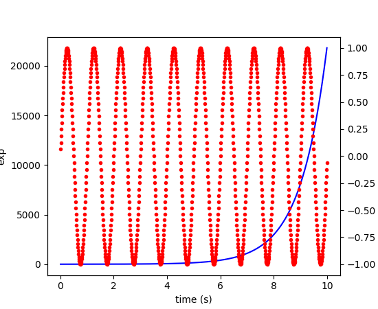
Multiple y-axis scales
A frequent request is to have two scales for the left and right
y-axis, which is possible using twinx() (more
than two scales are not currently supported, though it is on the wish
list). This works pretty well, though there are some quirks when you
are trying to interactively pan and zoom, because both scales do not get
the signals.
The approach uses twinx() (and its sister
twiny()) to use 2 different axes,
turning the axes rectangular frame off on the 2nd axes to keep it from
obscuring the first, and manually setting the tick locs and labels as
desired. You can use separate matplotlib.ticker formatters and
locators as desired because the two axes are independent.
(Source code, png, pdf)

See Plots with different scales for a complete example.
Generate images without having a window appear
Simply do not call show, and directly save the figure to
the desired format:
import matplotlib.pyplot as plt
plt.plot([1, 2, 3])
plt.savefig('myfig.png')
See also
How to use Matplotlib in a web application server for information about running matplotlib inside of a web application.
Use show()
When you want to view your plots on your display,
the user interface backend will need to start the GUI mainloop.
This is what show() does. It tells
Matplotlib to raise all of the figure windows created so far and start
the mainloop. Because this mainloop is blocking by default (i.e., script
execution is paused), you should only call this once per script, at the end.
Script execution is resumed after the last window is closed. Therefore, if
you are using Matplotlib to generate only images and do not want a user
interface window, you do not need to call show (see Generate images without having a window appear
and What is a backend?).
Note
Because closing a figure window unregisters it from pyplot, you must call
savefig before calling show if you wish to save
the figure as well as view it.
Whether show blocks further execution of the script or the python
interpreter depends on whether Matplotlib is set to use interactive mode.
In non-interactive mode (the default setting), execution is paused
until the last figure window is closed. In interactive mode, the execution
is not paused, which allows you to create additional figures (but the script
won't finish until the last figure window is closed).
Because it is expensive to draw, you typically will not want Matplotlib to redraw a figure many times in a script such as the following:
plot([1, 2, 3])          # draw here?
xlabel('time')           # and here?
ylabel('volts')          # and here?
title('a simple plot')   # and here?
show()
However, it is possible to force Matplotlib to draw after every command,
which might be what you want when working interactively at the
python console (see Interactive Figures), but in a script you want to
defer all drawing until the call to show. This is especially
important for complex figures that take some time to draw.
show() is designed to tell Matplotlib that
you're all done issuing commands and you want to draw the figure now.
Note
show() should typically only be called at
most once per script and it should be the last line of your
script. At that point, the GUI takes control of the interpreter.
If you want to force a figure draw, use
draw() instead.
New in version v1.0.0: Matplotlib 1.0.0 and 1.0.1 added support for calling show multiple times
per script, and harmonized the behavior of interactive mode, across most
backends.
Interpreting box plots and violin plots
Tukey's box plots (Robert McGill, John W. Tukey and Wayne A. Larsen: "The American Statistician" Vol. 32, No. 1, Feb., 1978, pp. 12-16) are statistical plots that provide useful information about the data distribution such as skewness. However, bar plots with error bars are still the common standard in most scientific literature, and thus, the interpretation of box plots can be challenging for the unfamiliar reader. The figure below illustrates the different visual features of a box plot.
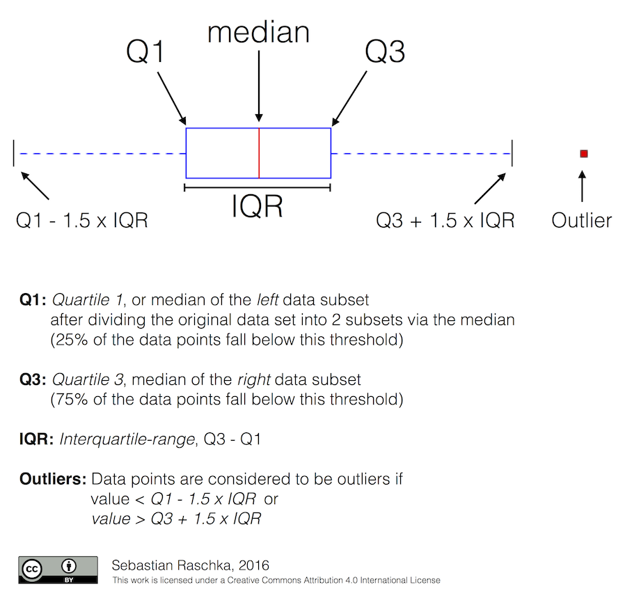
Violin plots are closely related to box plots but add useful information such as the distribution of the sample data (density trace). Violin plots were added in Matplotlib 1.4.
Working with threads
Matplotlib is not thread-safe: in fact, there are known race conditions that affect certain artists. Hence, if you work with threads, it is your responsibility to set up the proper locks to serialize access to Matplotlib artists.
You may be able to work on separate figures from separate threads. However, you must in that case use a non-interactive backend (typically Agg), because most GUI backends require being run from the main thread as well.
How-to: Contributing
Request a new feature
Is there a feature you wish Matplotlib had? Then ask! The best way to get started is to email the developer mailing list for discussion. This is an open source project developed primarily in the contributors free time, so there is no guarantee that your feature will be added. The best way to get the feature you need added is to contribute it your self.
Reporting a bug or submitting a patch
The development of Matplotlib is organized through github. If you would like to report a bug or submit a patch please use that interface.
To report a bug create an issue on github (this requires having a github account). Please include a Short, Self Contained, Correct (Compilable), Example demonstrating what the bug is. Including a clear, easy to test example makes it easy for the developers to evaluate the bug. Expect that the bug reports will be a conversation. If you do not want to register with github, please email bug reports to the mailing list.
The easiest way to submit patches to Matplotlib is through pull requests on github. Please see the The Matplotlib Developers' Guide for the details.
Contribute to Matplotlib documentation
Matplotlib is a big library, which is used in many ways, and the documentation has only scratched the surface of everything it can do. So far, the place most people have learned all these features are through studying the Gallery, which is a recommended and great way to learn, but it would be nice to have more official narrative documentation guiding people through all the dark corners. This is where you come in.
There is a good chance you know more about Matplotlib usage in some
areas, the stuff you do every day, than many of the core developers
who wrote most of the documentation. Just pulled your hair out
compiling Matplotlib for Windows? Write a FAQ or a section for the
Installation page. Are you a digital signal processing wizard?
Write a tutorial on the signal analysis plotting functions like
xcorr(), psd() and
specgram(). Do you use Matplotlib with
django or other popular web
application servers? Write a FAQ or tutorial and we'll find a place
for it in the User's Guide. And so on... I think you get the
idea.
Matplotlib is documented using the sphinx extensions to restructured text (ReST). sphinx is an extensible python framework for documentation projects which generates HTML and PDF, and is pretty easy to write; you can see the source for this document or any page on this site by clicking on the Show Source link at the end of the page in the sidebar.
The sphinx website is a good resource for learning sphinx, but we have put together a cheat-sheet at Writing documentation which shows you how to get started, and outlines the Matplotlib conventions and extensions, e.g., for including plots directly from external code in your documents.
Once your documentation contributions are working (and hopefully tested by actually building the docs) you can submit them as a patch against git. See Install git and Reporting a bug or submitting a patch. Looking for something to do? Search for TODO or look at the open issues on github.
How to use Matplotlib in a web application server
In general, the simplest solution when using Matplotlib in a web server is
to completely avoid using pyplot (pyplot maintains references to the opened
figures to make show work, but this will cause memory
leaks unless the figures are properly closed). Since Matplotlib 3.1, one
can directly create figures using the Figure constructor and save them to
in-memory buffers. The following example uses Flask, but other frameworks
work similarly:
import base64
from io import BytesIO

from flask import Flask
from matplotlib.figure import Figure

app = Flask(__name__)

@app.route("/")
def hello():
   # Generate the figure **without using pyplot**.
   fig = Figure()
   ax = fig.subplots()
   ax.plot([1, 2])
   # Save it to a temporary buffer.
   buf = BytesIO()
   fig.savefig(buf, format="png")
   # Embed the result in the html output.
   data = base64.b64encode(buf.getbuffer()).decode("ascii")
   return f"<img src='data:image/png;base64,{data}'/>"
When using Matplotlib versions older than 3.1, it is necessary to explicitly instantiate an Agg canvas; see e.g. CanvasAgg demo.
Clickable images for HTML
Andrew Dalke of Dalke Scientific has written a nice article on how to make html click maps with Matplotlib agg PNGs. We would also like to add this functionality to SVG. If you are interested in contributing to these efforts that would be great.