Note
Click here to download the full example code
Fill Between and Alpha
The fill_between() function generates a
shaded region between a min and max boundary that is useful for
illustrating ranges. It has a very handy where argument to
combine filling with logical ranges, e.g., to just fill in a curve over
some threshold value.
At its most basic level, fill_between can be use to enhance a
graphs visual appearance. Let's compare two graphs of a financial
times with a simple line plot on the left and a filled line on the
right.
import matplotlib.pyplot as plt
import numpy as np
import matplotlib.cbook as cbook

# load up some sample financial data
with cbook.get_sample_data('goog.npz') as datafile:
    r = np.load(datafile)['price_data'].view(np.recarray)
# Matplotlib prefers datetime instead of np.datetime64.
date = r.date.astype('O')
# create two subplots with the shared x and y axes
fig, (ax1, ax2) = plt.subplots(1, 2, sharex=True, sharey=True)

pricemin = r.close.min()

ax1.plot(date, r.close, lw=2)
ax2.fill_between(date, pricemin, r.close, facecolor='blue', alpha=0.5)

for ax in ax1, ax2:
    ax.grid(True)

ax1.set_ylabel('price')
for label in ax2.get_yticklabels():
    label.set_visible(False)

fig.suptitle('Google (GOOG) daily closing price')
fig.autofmt_xdate()
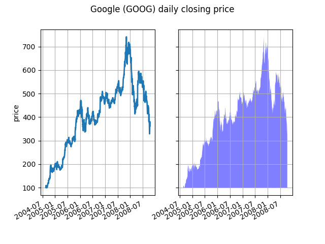
The alpha channel is not necessary here, but it can be used to soften colors for more visually appealing plots. In other examples, as we'll see below, the alpha channel is functionally useful as the shaded regions can overlap and alpha allows you to see both. Note that the postscript format does not support alpha (this is a postscript limitation, not a matplotlib limitation), so when using alpha save your figures in PNG, PDF or SVG.
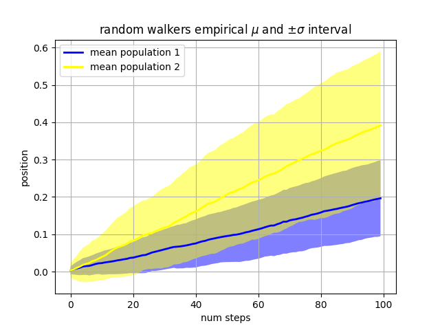
Our next example computes two populations of random walkers with a different mean and standard deviation of the normal distributions from which the steps are drawn. We use shared regions to plot +/- one standard deviation of the mean position of the population. Here the alpha channel is useful, not just aesthetic.
Nsteps, Nwalkers = 100, 250
t = np.arange(Nsteps)

# an (Nsteps x Nwalkers) array of random walk steps
S1 = 0.002 + 0.01*np.random.randn(Nsteps, Nwalkers)
S2 = 0.004 + 0.02*np.random.randn(Nsteps, Nwalkers)

# an (Nsteps x Nwalkers) array of random walker positions
X1 = S1.cumsum(axis=0)
X2 = S2.cumsum(axis=0)


# Nsteps length arrays empirical means and standard deviations of both
# populations over time
mu1 = X1.mean(axis=1)
sigma1 = X1.std(axis=1)
mu2 = X2.mean(axis=1)
sigma2 = X2.std(axis=1)

# plot it!
fig, ax = plt.subplots(1)
ax.plot(t, mu1, lw=2, label='mean population 1', color='blue')
ax.plot(t, mu2, lw=2, label='mean population 2', color='yellow')
ax.fill_between(t, mu1+sigma1, mu1-sigma1, facecolor='blue', alpha=0.5)
ax.fill_between(t, mu2+sigma2, mu2-sigma2, facecolor='yellow', alpha=0.5)
ax.set_title(r'random walkers empirical $\mu$ and $\pm \sigma$ interval')
ax.legend(loc='upper left')
ax.set_xlabel('num steps')
ax.set_ylabel('position')
ax.grid()
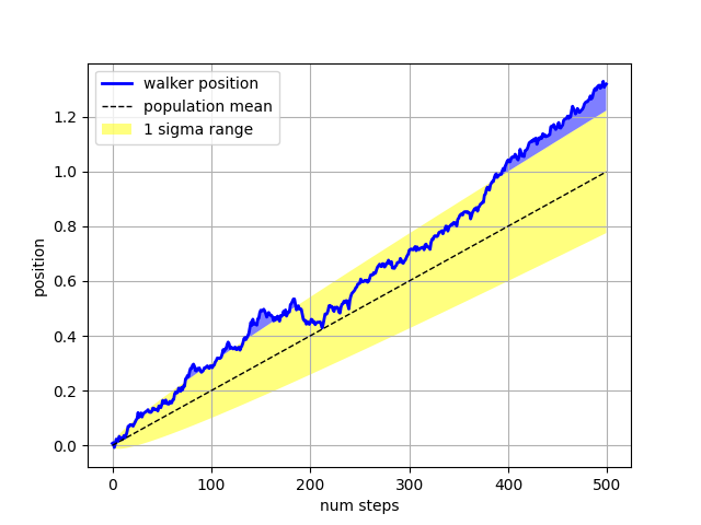
The where keyword argument is very handy for highlighting certain
regions of the graph. where takes a boolean mask the same length
as the x, ymin and ymax arguments, and only fills in the region where
the boolean mask is True. In the example below, we simulate a single
random walker and compute the analytic mean and standard deviation of
the population positions. The population mean is shown as the black
dashed line, and the plus/minus one sigma deviation from the mean is
shown as the yellow filled region. We use the where mask
X > upper_bound to find the region where the walker is above the one
sigma boundary, and shade that region blue.
Nsteps = 500
t = np.arange(Nsteps)

mu = 0.002
sigma = 0.01

# the steps and position
S = mu + sigma*np.random.randn(Nsteps)
X = S.cumsum()

# the 1 sigma upper and lower analytic population bounds
lower_bound = mu*t - sigma*np.sqrt(t)
upper_bound = mu*t + sigma*np.sqrt(t)

fig, ax = plt.subplots(1)
ax.plot(t, X, lw=2, label='walker position', color='blue')
ax.plot(t, mu*t, lw=1, label='population mean', color='black', ls='--')
ax.fill_between(t, lower_bound, upper_bound, facecolor='yellow', alpha=0.5,
                label='1 sigma range')
ax.legend(loc='upper left')

# here we use the where argument to only fill the region where the
# walker is above the population 1 sigma boundary
ax.fill_between(t, upper_bound, X, where=X > upper_bound, facecolor='blue',
                alpha=0.5)
ax.set_xlabel('num steps')
ax.set_ylabel('position')
ax.grid()
Another handy use of filled regions is to highlight horizontal or
vertical spans of an axes -- for that matplotlib has some helper
functions axhspan() and
axvspan() and example
axhspan Demo.
plt.show()
Keywords: matplotlib code example, codex, python plot, pyplot Gallery generated by Sphinx-Gallery