Version 3.1.2
Note
Click here to download the full example code
Out:
mean=7.50, std=1.94, r=0.82
mean=7.50, std=1.94, r=0.82
mean=7.50, std=1.94, r=0.82
mean=7.50, std=1.94, r=0.82
"""
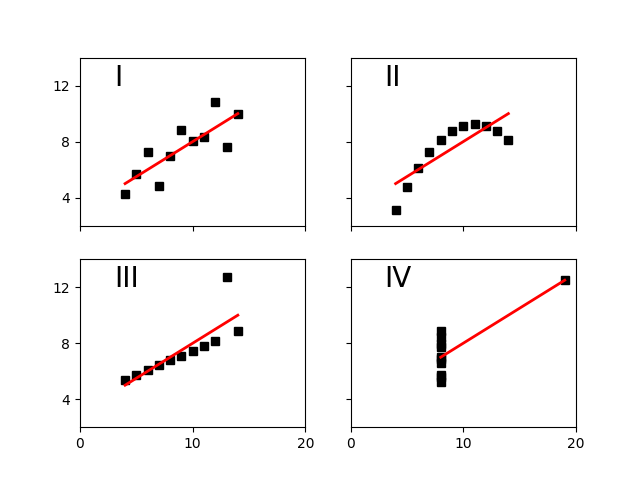
Edward Tufte uses this example from Anscombe to show 4 datasets of x
and y that have the same mean, standard deviation, and regression
line, but which are qualitatively different.
"""
import matplotlib.pyplot as plt
import numpy as np
x = [10, 8, 13, 9, 11, 14, 6, 4, 12, 7, 5]
y1 = [8.04, 6.95, 7.58, 8.81, 8.33, 9.96, 7.24, 4.26, 10.84, 4.82, 5.68]
y2 = [9.14, 8.14, 8.74, 8.77, 9.26, 8.10, 6.13, 3.10, 9.13, 7.26, 4.74]
y3 = [7.46, 6.77, 12.74, 7.11, 7.81, 8.84, 6.08, 5.39, 8.15, 6.42, 5.73]
x4 = [8, 8, 8, 8, 8, 8, 8, 19, 8, 8, 8]
y4 = [6.58, 5.76, 7.71, 8.84, 8.47, 7.04, 5.25, 12.50, 5.56, 7.91, 6.89]
def fit(x):
return 3 + 0.5 * x
fig, axs = plt.subplots(2, 2, sharex=True, sharey=True)
axs[0, 0].set(xlim=(0, 20), ylim=(2, 14))
axs[0, 0].set(xticks=(0, 10, 20), yticks=(4, 8, 12))
xfit = np.array([np.min(x), np.max(x)])
axs[0, 0].plot(x, y1, 'ks', xfit, fit(xfit), 'r-', lw=2)
axs[0, 1].plot(x, y2, 'ks', xfit, fit(xfit), 'r-', lw=2)
axs[1, 0].plot(x, y3, 'ks', xfit, fit(xfit), 'r-', lw=2)
xfit = np.array([np.min(x4), np.max(x4)])
axs[1, 1].plot(x4, y4, 'ks', xfit, fit(xfit), 'r-', lw=2)
for ax, label in zip(axs.flat, ['I', 'II', 'III', 'IV']):
ax.label_outer()
ax.text(3, 12, label, fontsize=20)
# verify the stats
pairs = (x, y1), (x, y2), (x, y3), (x4, y4)
for x, y in pairs:
print('mean=%1.2f, std=%1.2f, r=%1.2f' % (np.mean(y), np.std(y),
np.corrcoef(x, y)[0][1]))
plt.show()
Keywords: matplotlib code example, codex, python plot, pyplot Gallery generated by Sphinx-Gallery