Version 3.1.0
Note
Click here to download the full example code
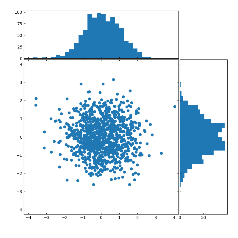
Create a scatter plot with histograms to its sides.
import numpy as np
import matplotlib.pyplot as plt

# Fixing random state for reproducibility
np.random.seed(19680801)

# the random data
x = np.random.randn(1000)
y = np.random.randn(1000)

# definitions for the axes
left, width = 0.1, 0.65
bottom, height = 0.1, 0.65
spacing = 0.005


rect_scatter = [left, bottom, width, height]
rect_histx = [left, bottom + height + spacing, width, 0.2]
rect_histy = [left + width + spacing, bottom, 0.2, height]

# start with a rectangular Figure
plt.figure(figsize=(8, 8))

ax_scatter = plt.axes(rect_scatter)
ax_scatter.tick_params(direction='in', top=True, right=True)
ax_histx = plt.axes(rect_histx)
ax_histx.tick_params(direction='in', labelbottom=False)
ax_histy = plt.axes(rect_histy)
ax_histy.tick_params(direction='in', labelleft=False)

# the scatter plot:
ax_scatter.scatter(x, y)

# now determine nice limits by hand:
binwidth = 0.25
lim = np.ceil(np.abs([x, y]).max() / binwidth) * binwidth
ax_scatter.set_xlim((-lim, lim))
ax_scatter.set_ylim((-lim, lim))

bins = np.arange(-lim, lim + binwidth, binwidth)
ax_histx.hist(x, bins=bins)
ax_histy.hist(y, bins=bins, orientation='horizontal')

ax_histx.set_xlim(ax_scatter.get_xlim())
ax_histy.set_ylim(ax_scatter.get_ylim())

plt.show()
Keywords: matplotlib code example, codex, python plot, pyplot Gallery generated by Sphinx-Gallery