Version 3.0.0
Note
Click here to download the full example code
It is often desirable to show data which depends on two independent
variables as a color coded image plot. This is often referred to as a
heatmap. If the data is categorical, this would be called a categorical
heatmap.
Matplotlib's imshow function makes
production of such plots particularly easy.
The following examples show how to create a heatmap with annotations. We will start with an easy example and expand it to be usable as a universal function.
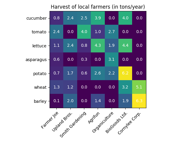
We may start by defining some data. What we need is a 2D list or array
which defines the data to color code. We then also need two lists or arrays
of categories; of course the number of elements in those lists
need to match the data along the respective axes.
The heatmap itself is an imshow plot
with the labels set to the categories we have.
Note that it is important to set both, the tick locations
(set_xticks) as well as the
tick labels (set_xticklabels),
otherwise they would become out of sync. The locations are just
the ascending integer numbers, while the ticklabels are the labels to show.
Finally we can label the data itself by creating a
Text within each cell showing the value of
that cell.
import numpy as np
import matplotlib
import matplotlib.pyplot as plt
# sphinx_gallery_thumbnail_number = 2

vegetables = ["cucumber", "tomato", "lettuce", "asparagus",
              "potato", "wheat", "barley"]
farmers = ["Farmer Joe", "Upland Bros.", "Smith Gardening",
           "Agrifun", "Organiculture", "BioGoods Ltd.", "Cornylee Corp."]

harvest = np.array([[0.8, 2.4, 2.5, 3.9, 0.0, 4.0, 0.0],
                    [2.4, 0.0, 4.0, 1.0, 2.7, 0.0, 0.0],
                    [1.1, 2.4, 0.8, 4.3, 1.9, 4.4, 0.0],
                    [0.6, 0.0, 0.3, 0.0, 3.1, 0.0, 0.0],
                    [0.7, 1.7, 0.6, 2.6, 2.2, 6.2, 0.0],
                    [1.3, 1.2, 0.0, 0.0, 0.0, 3.2, 5.1],
                    [0.1, 2.0, 0.0, 1.4, 0.0, 1.9, 6.3]])


fig, ax = plt.subplots()
im = ax.imshow(harvest)

# We want to show all ticks...
ax.set_xticks(np.arange(len(farmers)))
ax.set_yticks(np.arange(len(vegetables)))
# ... and label them with the respective list entries
ax.set_xticklabels(farmers)
ax.set_yticklabels(vegetables)

# Rotate the tick labels and set their alignment.
plt.setp(ax.get_xticklabels(), rotation=45, ha="right",
         rotation_mode="anchor")

# Loop over data dimensions and create text annotations.
for i in range(len(vegetables)):
    for j in range(len(farmers)):
        text = ax.text(j, i, harvest[i, j],
                       ha="center", va="center", color="w")

ax.set_title("Harvest of local farmers (in tons/year)")
fig.tight_layout()
plt.show()
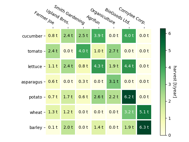
As discussed in the Coding styles one might want to reuse such code to create some kind of heatmap for different input data and/or on different axes. We create a function that takes the data and the row and column labels as input, and allows arguments that are used to customize the plot
Here, in addition to the above we also want to create a colorbar and position the labels above of the heatmap instead of below it. The annotations shall get different colors depending on a threshold for better contrast against the pixel color. Finally, we turn the surrounding axes spines off and create a grid of white lines to separate the cells.
def heatmap(data, row_labels, col_labels, ax=None,
            cbar_kw={}, cbarlabel="", **kwargs):
    """
    Create a heatmap from a numpy array and two lists of labels.

    Arguments:
        data       : A 2D numpy array of shape (N,M)
        row_labels : A list or array of length N with the labels
                     for the rows
        col_labels : A list or array of length M with the labels
                     for the columns
    Optional arguments:
        ax         : A matplotlib.axes.Axes instance to which the heatmap
                     is plotted. If not provided, use current axes or
                     create a new one.
        cbar_kw    : A dictionary with arguments to
                     :meth:`matplotlib.Figure.colorbar`.
        cbarlabel  : The label for the colorbar
    All other arguments are directly passed on to the imshow call.
    """

    if not ax:
        ax = plt.gca()

    # Plot the heatmap
    im = ax.imshow(data, **kwargs)

    # Create colorbar
    cbar = ax.figure.colorbar(im, ax=ax, **cbar_kw)
    cbar.ax.set_ylabel(cbarlabel, rotation=-90, va="bottom")

    # We want to show all ticks...
    ax.set_xticks(np.arange(data.shape[1]))
    ax.set_yticks(np.arange(data.shape[0]))
    # ... and label them with the respective list entries.
    ax.set_xticklabels(col_labels)
    ax.set_yticklabels(row_labels)

    # Let the horizontal axes labeling appear on top.
    ax.tick_params(top=True, bottom=False,
                   labeltop=True, labelbottom=False)

    # Rotate the tick labels and set their alignment.
    plt.setp(ax.get_xticklabels(), rotation=-30, ha="right",
             rotation_mode="anchor")

    # Turn spines off and create white grid.
    for edge, spine in ax.spines.items():
        spine.set_visible(False)

    ax.set_xticks(np.arange(data.shape[1]+1)-.5, minor=True)
    ax.set_yticks(np.arange(data.shape[0]+1)-.5, minor=True)
    ax.grid(which="minor", color="w", linestyle='-', linewidth=3)
    ax.tick_params(which="minor", bottom=False, left=False)

    return im, cbar


def annotate_heatmap(im, data=None, valfmt="{x:.2f}",
                     textcolors=["black", "white"],
                     threshold=None, **textkw):
    """
    A function to annotate a heatmap.

    Arguments:
        im         : The AxesImage to be labeled.
    Optional arguments:
        data       : Data used to annotate. If None, the image's data is used.
        valfmt     : The format of the annotations inside the heatmap.
                     This should either use the string format method, e.g.
                     "$ {x:.2f}", or be a :class:`matplotlib.ticker.Formatter`.
        textcolors : A list or array of two color specifications. The first is
                     used for values below a threshold, the second for those
                     above.
        threshold  : Value in data units according to which the colors from
                     textcolors are applied. If None (the default) uses the
                     middle of the colormap as separation.

    Further arguments are passed on to the created text labels.
    """

    if not isinstance(data, (list, np.ndarray)):
        data = im.get_array()

    # Normalize the threshold to the images color range.
    if threshold is not None:
        threshold = im.norm(threshold)
    else:
        threshold = im.norm(data.max())/2.

    # Set default alignment to center, but allow it to be
    # overwritten by textkw.
    kw = dict(horizontalalignment="center",
              verticalalignment="center")
    kw.update(textkw)

    # Get the formatter in case a string is supplied
    if isinstance(valfmt, str):
        valfmt = matplotlib.ticker.StrMethodFormatter(valfmt)

    # Loop over the data and create a `Text` for each "pixel".
    # Change the text's color depending on the data.
    texts = []
    for i in range(data.shape[0]):
        for j in range(data.shape[1]):
            kw.update(color=textcolors[im.norm(data[i, j]) > threshold])
            text = im.axes.text(j, i, valfmt(data[i, j], None), **kw)
            texts.append(text)

    return texts
The above now allows us to keep the actual plot creation pretty compact.
fig, ax = plt.subplots()

im, cbar = heatmap(harvest, vegetables, farmers, ax=ax,
                   cmap="YlGn", cbarlabel="harvest [t/year]")
texts = annotate_heatmap(im, valfmt="{x:.1f} t")

fig.tight_layout()
plt.show()
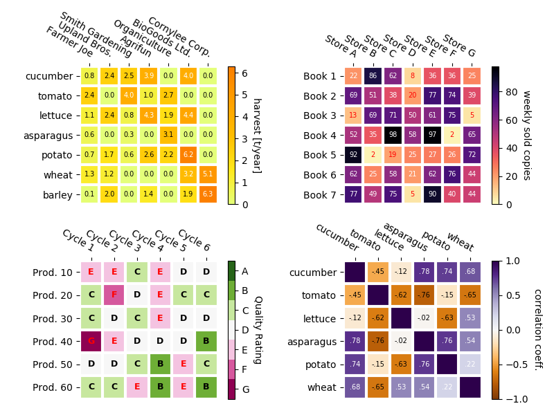
In the following we show the versitality of the previously created functions by applying it in different cases and using different arguments.
np.random.seed(19680801)

fig, ((ax, ax2), (ax3, ax4)) = plt.subplots(2, 2, figsize=(8, 6))

# Replicate the above example with a different font size and colormap.

im, _ = heatmap(harvest, vegetables, farmers, ax=ax,
                cmap="Wistia", cbarlabel="harvest [t/year]")
annotate_heatmap(im, valfmt="{x:.1f}", size=7)

# Create some new data, give further arguments to imshow (vmin),
# use an integer format on the annotations and provide some colors.

data = np.random.randint(2, 100, size=(7, 7))
y = ["Book {}".format(i) for i in range(1, 8)]
x = ["Store {}".format(i) for i in list("ABCDEFG")]
im, _ = heatmap(data, y, x, ax=ax2, vmin=0,
                cmap="magma_r", cbarlabel="weekly sold copies")
annotate_heatmap(im, valfmt="{x:d}", size=7, threshold=20,
                 textcolors=["red", "white"])

# Sometimes even the data itself is categorical. Here we use a
# :class:`matplotlib.colors.BoundaryNorm` to get the data into classes
# and use this to colorize the plot, but also to obtain the class
# labels from an array of classes.

data = np.random.randn(6, 6)
y = ["Prod. {}".format(i) for i in range(10, 70, 10)]
x = ["Cycle {}".format(i) for i in range(1, 7)]

qrates = np.array(list("ABCDEFG"))
norm = matplotlib.colors.BoundaryNorm(np.linspace(-3.5, 3.5, 8), 7)
fmt = matplotlib.ticker.FuncFormatter(lambda x, pos: qrates[::-1][norm(x)])

im, _ = heatmap(data, y, x, ax=ax3,
                cmap=plt.get_cmap("PiYG", 7), norm=norm,
                cbar_kw=dict(ticks=np.arange(-3, 4), format=fmt),
                cbarlabel="Quality Rating")

annotate_heatmap(im, valfmt=fmt, size=9, fontweight="bold", threshold=-1,
                 textcolors=["red", "black"])

# We can nicely plot a correlation matrix. Since this is bound by -1 and 1,
# we use those as vmin and vmax. We may also remove leading zeros and hide
# the diagonal elements (which are all 1) by using a
# :class:`matplotlib.ticker.FuncFormatter`.

corr_matrix = np.corrcoef(np.random.rand(6, 5))
im, _ = heatmap(corr_matrix, vegetables, vegetables, ax=ax4,
                cmap="PuOr", vmin=-1, vmax=1,
                cbarlabel="correlation coeff.")


def func(x, pos):
    return "{:.2f}".format(x).replace("0.", ".").replace("1.00", "")

annotate_heatmap(im, valfmt=matplotlib.ticker.FuncFormatter(func), size=7)


plt.tight_layout()
plt.show()
The usage of the following functions and methods is shown in this example:
Keywords: matplotlib code example, codex, python plot, pyplot Gallery generated by Sphinx-Gallery