Version 2.2.5
Note
Click here to download the full example code
Introduction to plotting and working with text in Matplotlib.
Matplotlib has extensive text support, including support for mathematical expressions, truetype support for raster and vector outputs, newline separated text with arbitrary rotations, and unicode support.
Because it embeds fonts directly in output documents, e.g., for postscript
or PDF, what you see on the screen is what you get in the hardcopy.
FreeType support
produces very nice, antialiased fonts, that look good even at small
raster sizes. matplotlib includes its own
matplotlib.font_manager (thanks to Paul Barrett), which
implements a cross platform, W3C
compliant font finding algorithm.
The user has a great deal of control over text properties (font size, font
weight, text location and color, etc.) with sensible defaults set in
the rc file.
And significantly, for those interested in mathematical
or scientific figures, matplotlib implements a large number of TeX
math symbols and commands, supporting mathematical expressions anywhere in your figure.
The following commands are used to create text in the pyplot interface and the object-oriented API:
pyplot API |
OO API | description |
|---|---|---|
text |
text |
Add text at an arbitrary location of
the Axes. |
annotate |
annotate |
Add an annotation, with an optional
arrow, at an arbitrary location of the
Axes. |
xlabel |
set_xlabel |
Add a label to the
Axes's x-axis. |
ylabel |
set_ylabel |
Add a label to the
Axes's y-axis. |
title |
set_title |
Add a title to the
Axes. |
figtext |
text |
Add text at an arbitrary location of
the Figure. |
suptitle |
suptitle |
Add a title to the Figure. |
All of these functions create and return a Text instance, which can be
configured with a variety of font and other properties. The example below
shows all of these commands in action, and more detail is provided in the
sections that follow.
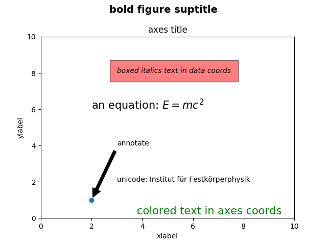
import matplotlib
import matplotlib.pyplot as plt

fig = plt.figure()
fig.suptitle('bold figure suptitle', fontsize=14, fontweight='bold')

ax = fig.add_subplot(111)
fig.subplots_adjust(top=0.85)
ax.set_title('axes title')

ax.set_xlabel('xlabel')
ax.set_ylabel('ylabel')

ax.text(3, 8, 'boxed italics text in data coords', style='italic',
        bbox={'facecolor': 'red', 'alpha': 0.5, 'pad': 10})

ax.text(2, 6, r'an equation: $E=mc^2$', fontsize=15)

ax.text(3, 2, u'unicode: Institut für Festkörperphysik')

ax.text(0.95, 0.01, 'colored text in axes coords',
        verticalalignment='bottom', horizontalalignment='right',
        transform=ax.transAxes,
        color='green', fontsize=15)


ax.plot([2], [1], 'o')
ax.annotate('annotate', xy=(2, 1), xytext=(3, 4),
            arrowprops=dict(facecolor='black', shrink=0.05))

ax.axis([0, 10, 0, 10])

plt.show()
Specifying the labels for the x- and y-axis is strightforward, via the
set_xlabel and
set_ylabel methods.
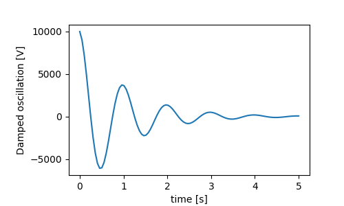
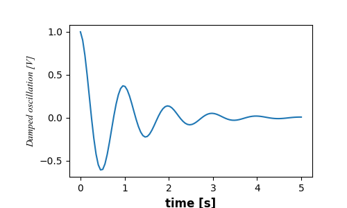
The x- and y-labels are automatically placed so that they clear the x- and y-ticklabels. Compare the plot below with that above, and note the y-label is to the left of the one above.
If you want to move the labels, you can specify the labelpad kyeword argument, where the value is points (1/72", the same unit used to specify fontsizes).
Or, the labels accept all the Text keyword arguments, including
position, via which we can manually specify the label positions. Here we
put the xlabel to the far left of the axis. Note, that the y-coordinate of
this position has no effect - to adjust the y-position we need to use the
labelpad kwarg.
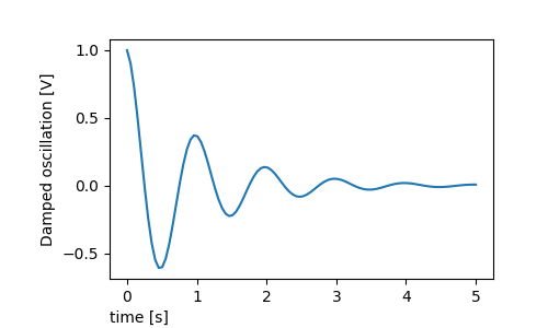
All the labelling in this tutorial can be changed by manipulating the
matplotlib.font_manager.FontProperties method, or by named kwargs to
set_xlabel
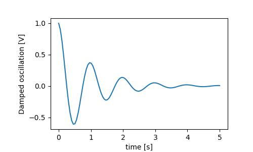
from matplotlib.font_manager import FontProperties

font = FontProperties()
font.set_family('serif')
font.set_name('Times New Roman')
font.set_style('italic')

fig, ax = plt.subplots(figsize=(5, 3))
fig.subplots_adjust(bottom=0.15, left=0.2)
ax.plot(x1, y1)
ax.set_xlabel('time [s]', fontsize='large', fontweight='bold')
ax.set_ylabel('Damped oscillation [V]', fontproperties=font)

plt.show()
Finally, we can use native TeX rendering in all text objects and have multiple lines:
Subplot titles are set in much the same way as labels, but there is
the loc keyword arguments that can change the position and justification
from the default value of loc=center.
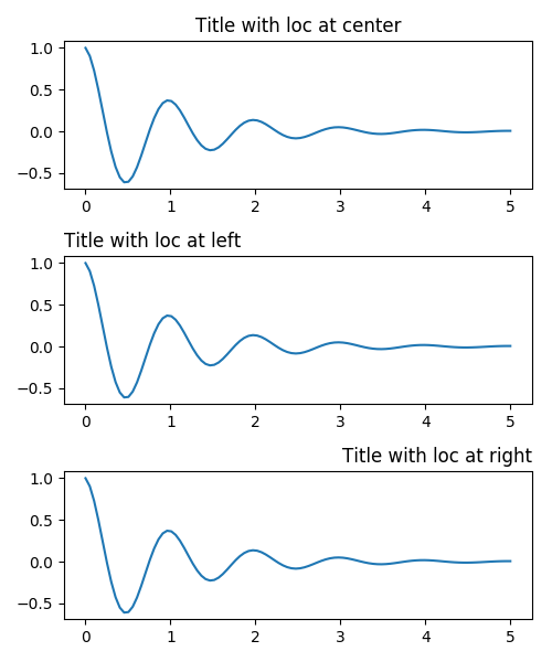
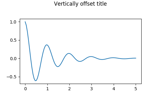
Vertical spacing for titles is controlled via rcParams[axes.titlepad],
which defaults to 5 points. Setting to a different value moves the title.
Placing ticks and ticklabels is a very tricky aspect of making a figure. Matplotlib does the best it can automatically, but it also offers a very flexible framework for determining the choices for tick locations, and how they are labelled.
Axes have an matplotlib.axis object for the ax.xaxis
and ax.yaxis that
contain the information about how the labels in the axis are laid out.
The axis API is explained in detail in the documentation to
axis.
An Axis object has major and minor ticks. The Axis has a
matplotlib.xaxis.set_major_locator and
matplotlib.xaxis.set_minor_locator methods that use the data being plotted
to determine
the location of major and minor ticks. There are also
matplotlib.xaxis.set_major_formatter and
matplotlib.xaxis.set_minor_formatters methods that format the tick labels.
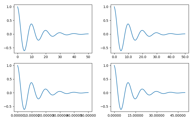
It often is convenient to simply define the tick values, and sometimes the tick labels, overriding the default locators and formatters. This is discouraged because it breaks itneractive navigation of the plot. It also can reset the axis limits: note that the second plot has the ticks we asked for, including ones that are well outside the automatic view limits.
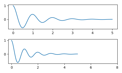
We can of course fix this after the fact, but it does highlight a weakness of hard-coding the ticks. This example also changes the format of the ticks:
fig, axs = plt.subplots(2, 1, figsize=(5, 3), tight_layout=True)
axs[0].plot(x1, y1)
axs[1].plot(x1, y1)
ticks = np.arange(0., 8.1, 2.)
# list comprehension to get all tick labels...
tickla = ['%1.2f' % tick for tick in ticks]
axs[1].xaxis.set_ticks(ticks)
axs[1].xaxis.set_ticklabels(tickla)
axs[1].set_xlim(axs[0].get_xlim())
plt.show()
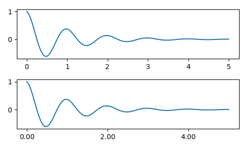
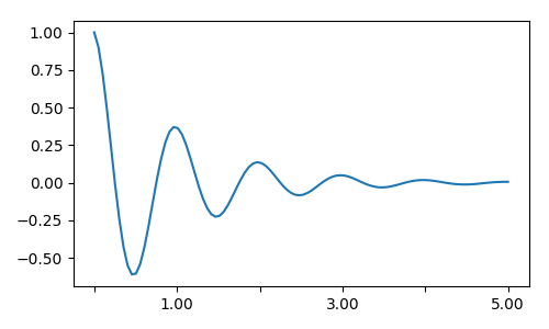
Instead of making a list of all the tickalbels, we could have
used a matplotlib.ticker.FormatStrFormatter and passed it to the
ax.xaxis
fig, axs = plt.subplots(2, 1, figsize=(5, 3), tight_layout=True)
axs[0].plot(x1, y1)
axs[1].plot(x1, y1)
ticks = np.arange(0., 8.1, 2.)
# list comprehension to get all tick labels...
formatter = matplotlib.ticker.StrMethodFormatter('{x:1.1f}')
axs[1].xaxis.set_ticks(ticks)
axs[1].xaxis.set_major_formatter(formatter)
axs[1].set_xlim(axs[0].get_xlim())
plt.show()

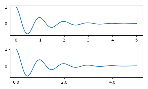
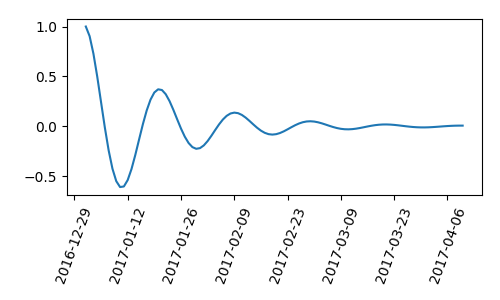
And of course we could have used a non-default locator to set the tick locations. Note we still pass in the tick values, but the x-limit fix used above is not needed.
fig, axs = plt.subplots(2, 1, figsize=(5, 3), tight_layout=True)
axs[0].plot(x1, y1)
axs[1].plot(x1, y1)
formatter = matplotlib.ticker.FormatStrFormatter('%1.1f')
locator = matplotlib.ticker.FixedLocator(ticks)
axs[1].xaxis.set_major_locator(locator)
axs[1].xaxis.set_major_formatter(formatter)
plt.show()
The default formatter is the matplotlib.ticker.MaxNLocator called as
ticker.MaxNLocator(self, nbins='auto', steps=[1, 2, 2.5, 5, 10])
The steps keyword contains a list of multiples that can be used for
tick values. i.e. in this case, 2, 4, 6 would be acceptable ticks,
as would 20, 40, 60 or 0.2, 0.4, 0.6. However, 3, 6, 9 would not be
acceptable because 3 doesn't appear in the list of steps.
nbins=auto uses an algorithm to determine how many ticks will
be acceptable based on how long the axis is. The fontsize of the
ticklabel is taken into account, but the length of the tick string
is not (because its not yet known.) In the bottom row, the
ticklabels are quite large, so we set nbins=4 to make the
labels fit in the right-hand plot.
fig, axs = plt.subplots(2, 2, figsize=(8, 5), tight_layout=True)
axs = axs.flatten()
for n, ax in enumerate(axs):
    ax.plot(x1*10., y1)

formatter = matplotlib.ticker.FormatStrFormatter('%1.1f')
locator = matplotlib.ticker.MaxNLocator(nbins='auto', steps=[1, 4, 10])
axs[1].xaxis.set_major_locator(locator)
axs[1].xaxis.set_major_formatter(formatter)

formatter = matplotlib.ticker.FormatStrFormatter('%1.5f')
locator = matplotlib.ticker.AutoLocator()
axs[2].xaxis.set_major_formatter(formatter)
axs[2].xaxis.set_major_locator(locator)

formatter = matplotlib.ticker.FormatStrFormatter('%1.5f')
locator = matplotlib.ticker.MaxNLocator(nbins=4)
axs[3].xaxis.set_major_formatter(formatter)
axs[3].xaxis.set_major_locator(locator)

plt.show()
Finally, we can specify functions for the formatter using
matplotlib.ticker.FuncFormatter.
def formatoddticks(x, pos):
    """Format odd tick positions
    """
    if x % 2:
        return '%1.2f' % x
    else:
        return ''

fig, ax = plt.subplots(figsize=(5, 3), tight_layout=True)
ax.plot(x1, y1)
formatter = matplotlib.ticker.FuncFormatter(formatoddticks)
locator = matplotlib.ticker.MaxNLocator(nbins=6)
ax.xaxis.set_major_formatter(formatter)
ax.xaxis.set_major_locator(locator)

plt.show()
Matplotlib can accept datetime.datetime and numpy.datetime64
objects as plotting arguments. Dates and times require special
formatting, which can often benefit from manual intervention. In
order to help, dates have spectial Locators and Formatters,
defined in the matplotlib.dates module.
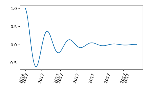
A simple example is as follows. Note how we have to rotate the tick labels so that they don't over-run each other.
import datetime

fig, ax = plt.subplots(figsize=(5, 3), tight_layout=True)
base = datetime.datetime(2017, 1, 1, 0, 0, 1)
time = [base + datetime.timedelta(days=x) for x in range(len(y1))]

ax.plot(time, y1)
ax.tick_params(axis='x', rotation=70)
plt.show()
Maybe the format of the labels above is acceptable, but the choices is
rather idiosyncratic. We can make the ticks fall on the start of the month
by modifying matplotlib.dates.AutoDateLocator
import matplotlib.dates as mdates

locator = mdates.AutoDateLocator(interval_multiples=True)

fig, ax = plt.subplots(figsize=(5, 3), tight_layout=True)
ax.xaxis.set_major_locator(locator)
ax.plot(time, y1)
ax.tick_params(axis='x', rotation=70)
plt.show()
However, this changes the tick labels. The easiest fix is to pass a format
to matplotlib.dates.DateFormatter. Also note that the 29th and the
next month are very close together. We can fix this by using the
dates.DayLocator class, which allows us to specify a list of days of the
month to use. Similar formatters are listed in the matplotlib.dates module.
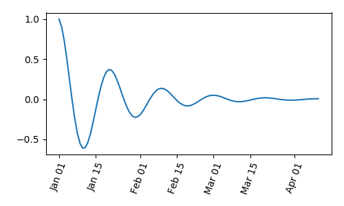
locator = mdates.DayLocator(bymonthday=[1, 15])
formatter = mdates.DateFormatter('%b %d')

fig, ax = plt.subplots(figsize=(5, 3), tight_layout=True)
ax.xaxis.set_major_locator(locator)
ax.xaxis.set_major_formatter(formatter)
ax.plot(time, y1)
ax.tick_params(axis='x', rotation=70)
plt.show()
- Legends: Legend guide
- Annotations: Annotations
Keywords: matplotlib code example, codex, python plot, pyplot Gallery generated by Sphinx-Gallery