Bar charts of many shapes and sizes with Matplotlib.
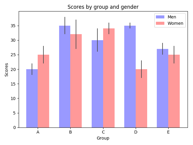
Bar charts are useful for visualizing counts, or summary statistics with error bars. These examples show a few ways to do this with Matplotlib.
# Credit: Josh Hemann

import numpy as np
import matplotlib.pyplot as plt
from matplotlib.ticker import MaxNLocator
from collections import namedtuple


n_groups = 5

means_men = (20, 35, 30, 35, 27)
std_men = (2, 3, 4, 1, 2)

means_women = (25, 32, 34, 20, 25)
std_women = (3, 5, 2, 3, 3)

fig, ax = plt.subplots()

index = np.arange(n_groups)
bar_width = 0.35

opacity = 0.4
error_config = {'ecolor': '0.3'}

rects1 = ax.bar(index, means_men, bar_width,
                alpha=opacity, color='b',
                yerr=std_men, error_kw=error_config,
                label='Men')

rects2 = ax.bar(index + bar_width, means_women, bar_width,
                alpha=opacity, color='r',
                yerr=std_women, error_kw=error_config,
                label='Women')

ax.set_xlabel('Group')
ax.set_ylabel('Scores')
ax.set_title('Scores by group and gender')
ax.set_xticks(index + bar_width / 2)
ax.set_xticklabels(('A', 'B', 'C', 'D', 'E'))
ax.legend()

fig.tight_layout()
plt.show()
This example comes from an application in which grade school gym teachers wanted to be able to show parents how their child did across a handful of fitness tests, and importantly, relative to how other children did. To extract the plotting code for demo purposes, we’ll just make up some data for little Johnny Doe…
Student = namedtuple('Student', ['name', 'grade', 'gender'])
Score = namedtuple('Score', ['score', 'percentile'])

# GLOBAL CONSTANTS
testNames = ['Pacer Test', 'Flexed Arm\n Hang', 'Mile Run', 'Agility',
             'Push Ups']
testMeta = dict(zip(testNames, ['laps', 'sec', 'min:sec', 'sec', '']))


def attach_ordinal(num):
    """helper function to add ordinal string to integers

    1 -> 1st
    56 -> 56th
    """
    suffixes = dict((str(i), v) for i, v in
                    enumerate(['th', 'st', 'nd', 'rd', 'th',
                               'th', 'th', 'th', 'th', 'th']))

    v = str(num)
    # special case early teens
    if v in {'11', '12', '13'}:
        return v + 'th'
    return v + suffixes[v[-1]]


def format_score(scr, test):
    """
    Build up the score labels for the right Y-axis by first
    appending a carriage return to each string and then tacking on
    the appropriate meta information (i.e., 'laps' vs 'seconds'). We
    want the labels centered on the ticks, so if there is no meta
    info (like for pushups) then don't add the carriage return to
    the string
    """
    md = testMeta[test]
    if md:
        return '{0}\n{1}'.format(scr, md)
    else:
        return scr


def format_ycursor(y):
    y = int(y)
    if y < 0 or y >= len(testNames):
        return ''
    else:
        return testNames[y]


def plot_student_results(student, scores, cohort_size):
    #  create the figure
    fig, ax1 = plt.subplots(figsize=(9, 7))
    fig.subplots_adjust(left=0.115, right=0.88)
    fig.canvas.set_window_title('Eldorado K-8 Fitness Chart')

    pos = np.arange(len(testNames))

    rects = ax1.barh(pos, [scores[k].percentile for k in testNames],
                     align='center',
                     height=0.5, color='m',
                     tick_label=testNames)

    ax1.set_title(student.name)

    ax1.set_xlim([0, 100])
    ax1.xaxis.set_major_locator(MaxNLocator(11))
    ax1.xaxis.grid(True, linestyle='--', which='major',
                   color='grey', alpha=.25)

    # Plot a solid vertical gridline to highlight the median position
    ax1.axvline(50, color='grey', alpha=0.25)
    # set X-axis tick marks at the deciles
    cohort_label = ax1.text(.5, -.07, 'Cohort Size: {0}'.format(cohort_size),
                            horizontalalignment='center', size='small',
                            transform=ax1.transAxes)

    # Set the right-hand Y-axis ticks and labels
    ax2 = ax1.twinx()

    scoreLabels = [format_score(scores[k].score, k) for k in testNames]

    # set the tick locations
    ax2.set_yticks(pos)
    # make sure that the limits are set equally on both yaxis so the
    # ticks line up
    ax2.set_ylim(ax1.get_ylim())

    # set the tick labels
    ax2.set_yticklabels(scoreLabels)

    ax2.set_ylabel('Test Scores')

    ax2.set_xlabel(('Percentile Ranking Across '
                    '{grade} Grade {gender}s').format(
                        grade=attach_ordinal(student.grade),
                        gender=student.gender.title()))

    rect_labels = []
    # Lastly, write in the ranking inside each bar to aid in interpretation
    for rect in rects:
        # Rectangle widths are already integer-valued but are floating
        # type, so it helps to remove the trailing decimal point and 0 by
        # converting width to int type
        width = int(rect.get_width())

        rankStr = attach_ordinal(width)
        # The bars aren't wide enough to print the ranking inside
        if (width < 5):
            # Shift the text to the right side of the right edge
            xloc = width + 1
            # Black against white background
            clr = 'black'
            align = 'left'
        else:
            # Shift the text to the left side of the right edge
            xloc = 0.98*width
            # White on magenta
            clr = 'white'
            align = 'right'

        # Center the text vertically in the bar
        yloc = rect.get_y() + rect.get_height()/2.0
        label = ax1.text(xloc, yloc, rankStr, horizontalalignment=align,
                         verticalalignment='center', color=clr, weight='bold',
                         clip_on=True)
        rect_labels.append(label)

    # make the interactive mouse over give the bar title
    ax2.fmt_ydata = format_ycursor
    # return all of the artists created
    return {'fig': fig,
            'ax': ax1,
            'ax_right': ax2,
            'bars': rects,
            'perc_labels': rect_labels,
            'cohort_label': cohort_label}

student = Student('Johnny Doe', 2, 'boy')
scores = dict(zip(testNames,
                  (Score(v, p) for v, p in
                   zip(['7', '48', '12:52', '17', '14'],
                       np.round(np.random.uniform(0, 1,
                                                  len(testNames))*100, 0)))))
cohort_size = 62  # The number of other 2nd grade boys

arts = plot_student_results(student, scores, cohort_size)
plt.show()
Total running time of the script: ( 0 minutes 0.079 seconds)
