Generating images with pcolor.
Pcolor allows you to generate 2-D image-style plots. Below we will show how to do so in Matplotlib.
import matplotlib.pyplot as plt
import numpy as np
from matplotlib.colors import LogNorm
from matplotlib.mlab import bivariate_normal
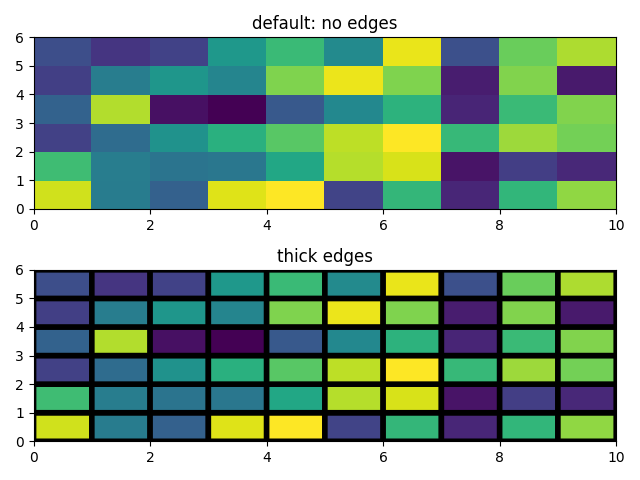
Z = np.random.rand(6, 10)

fig, (ax0, ax1) = plt.subplots(2, 1)

c = ax0.pcolor(Z)
ax0.set_title('default: no edges')

c = ax1.pcolor(Z, edgecolors='k', linewidths=4)
ax1.set_title('thick edges')

fig.tight_layout()
plt.show()
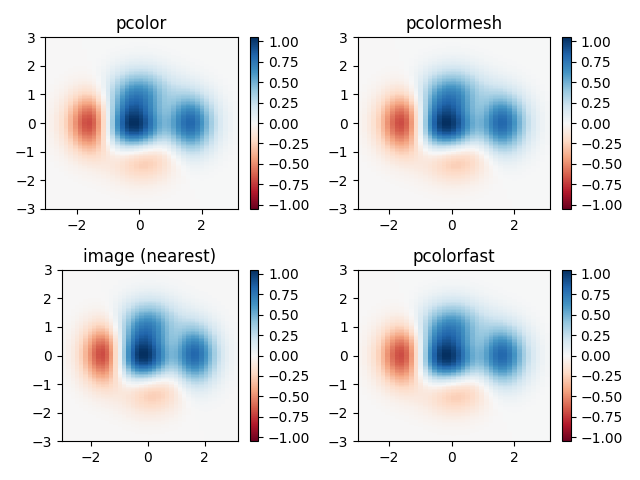
Demonstrates similarities between pcolor, pcolormesh, imshow and pcolorfast for drawing quadrilateral grids.
# make these smaller to increase the resolution
dx, dy = 0.15, 0.05

# generate 2 2d grids for the x & y bounds
y, x = np.mgrid[slice(-3, 3 + dy, dy),
                slice(-3, 3 + dx, dx)]
z = (1 - x / 2. + x ** 5 + y ** 3) * np.exp(-x ** 2 - y ** 2)
# x and y are bounds, so z should be the value *inside* those bounds.
# Therefore, remove the last value from the z array.
z = z[:-1, :-1]
z_min, z_max = -np.abs(z).max(), np.abs(z).max()

fig, axs = plt.subplots(2, 2)

ax = axs[0, 0]
c = ax.pcolor(x, y, z, cmap='RdBu', vmin=z_min, vmax=z_max)
ax.set_title('pcolor')
# set the limits of the plot to the limits of the data
ax.axis([x.min(), x.max(), y.min(), y.max()])
fig.colorbar(c, ax=ax)

ax = axs[0, 1]
c = ax.pcolormesh(x, y, z, cmap='RdBu', vmin=z_min, vmax=z_max)
ax.set_title('pcolormesh')
# set the limits of the plot to the limits of the data
ax.axis([x.min(), x.max(), y.min(), y.max()])
fig.colorbar(c, ax=ax)

ax = axs[1, 0]
c = ax.imshow(z, cmap='RdBu', vmin=z_min, vmax=z_max,
              extent=[x.min(), x.max(), y.min(), y.max()],
              interpolation='nearest', origin='lower')
ax.set_title('image (nearest)')
fig.colorbar(c, ax=ax)

ax = axs[1, 1]
c = ax.pcolorfast(x, y, z, cmap='RdBu', vmin=z_min, vmax=z_max)
ax.set_title('pcolorfast')
fig.colorbar(c, ax=ax)

fig.tight_layout()
plt.show()
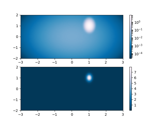
The following shows pcolor plots with a log scale.
N = 100
X, Y = np.mgrid[-3:3:complex(0, N), -2:2:complex(0, N)]

# A low hump with a spike coming out of the top right.
# Needs to have z/colour axis on a log scale so we see both hump and spike.
# linear scale only shows the spike.
Z1 = (bivariate_normal(X, Y, 0.1, 0.2, 1.0, 1.0) +
      0.1 * bivariate_normal(X, Y, 1.0, 1.0, 0.0, 0.0))

fig, (ax0, ax1) = plt.subplots(2, 1)

c = ax0.pcolor(X, Y, Z1,
               norm=LogNorm(vmin=Z1.min(), vmax=Z1.max()), cmap='PuBu_r')
fig.colorbar(c, ax=ax0)

c = ax1.pcolor(X, Y, Z1, cmap='PuBu_r')
fig.colorbar(c, ax=ax1)

plt.show()
Total running time of the script: ( 0 minutes 0.814 seconds)
