

numpy.datetime64 valuesshow()Contents
numpy.datetime64 valuesshow()numpy.datetime64 values¶For Matplotlib to plot dates (or any scalar with units) a converter
to float needs to be registered with the matplolib.units module. The
current best converters for datetime64 values are in pandas. Simply
importing pandas
import pandas as pd
should be sufficient as pandas will try to install the converters
on import. If that does not work, or you need to reset munits.registry
you can explicitly install the pandas converters by
from pandas.tseries import converter as pdtc
pdtc.register()
If you only want to use the pandas converter for datetime64 values
from pandas.tseries import converter as pdtc
import matplotlib.units as munits
import numpy as np

munits.registry[np.datetime64] = pdtc.DatetimeConverter()
Every Matplotlib artist (see Artist tutorial) has a method
called findobj() that can be used to
recursively search the artist for any artists it may contain that meet
some criteria (e.g., match all Line2D
instances or match some arbitrary filter function). For example, the
following snippet finds every object in the figure which has a
set_color property and makes the object blue:
def myfunc(x):
    return hasattr(x, 'set_color')

for o in fig.findobj(myfunc):
    o.set_color('blue')
You can also filter on class instances:
import matplotlib.text as text
for o in fig.findobj(text.Text):
    o.set_fontstyle('italic')
The default formatter will use an offset to reduce the length of the ticklabels. To turn this feature off on a per-axis basis:
ax.get_xaxis().get_major_formatter().set_useOffset(False)
set the rcParam axes.formatter.useoffset, or use a different
formatter. See ticker for details.
The savefig() command has a keyword argument
transparent which, if ‘True’, will make the figure and axes
backgrounds transparent when saving, but will not affect the displayed
image on the screen.
If you need finer grained control, e.g., you do not want full transparency
or you want to affect the screen displayed version as well, you can set
the alpha properties directly. The figure has a
Rectangle instance called patch
and the axes has a Rectangle instance called patch. You can set
any property on them directly (facecolor, edgecolor, linewidth,
linestyle, alpha). e.g.:
fig = plt.figure()
fig.patch.set_alpha(0.5)
ax = fig.add_subplot(111)
ax.patch.set_alpha(0.5)
If you need all the figure elements to be transparent, there is currently no global alpha setting, but you can set the alpha channel on individual elements, e.g.:
ax.plot(x, y, alpha=0.5)
ax.set_xlabel('volts', alpha=0.5)
Many image file formats can only have one image per file, but some formats support multi-page files. Currently only the pdf backend has support for this. To make a multi-page pdf file, first initialize the file:
from matplotlib.backends.backend_pdf import PdfPages
pp = PdfPages('multipage.pdf')
You can give the PdfPages
object to savefig(), but you have to specify
the format:
plt.savefig(pp, format='pdf')
An easier way is to call
PdfPages.savefig:
pp.savefig()
Finally, the multipage pdf object has to be closed:
pp.close()
For subplots, you can control the default spacing on the left, right,
bottom, and top as well as the horizontal and vertical spacing between
multiple rows and columns using the
matplotlib.figure.Figure.subplots_adjust() method (in pyplot it
is subplots_adjust()). For example, to move
the bottom of the subplots up to make room for some rotated x tick
labels:
fig = plt.figure()
fig.subplots_adjust(bottom=0.2)
ax = fig.add_subplot(111)
You can control the defaults for these parameters in your
matplotlibrc file; see Customizing matplotlib. For
example, to make the above setting permanent, you would set:
figure.subplot.bottom : 0.2 # the bottom of the subplots of the figure
The other parameters you can configure are, with their defaults
If you want additional control, you can create an
Axes using the
axes() command (or equivalently the figure
add_axes() method), which allows you to
specify the location explicitly:
ax = fig.add_axes([left, bottom, width, height])
where all values are in fractional (0 to 1) coordinates. See pylab_examples example code: axes_demo.py for an example of placing axes manually.
Note
This is now easier to handle than ever before.
Calling tight_layout() can fix many common
layout issues. See the Tight Layout guide.
The information below is kept here in case it is useful for other purposes.
In most use cases, it is enough to simply change the subplots adjust
parameters as described in Move the edge of an axes to make room for tick labels. But in some
cases, you don’t know ahead of time what your tick labels will be, or
how large they will be (data and labels outside your control may be
being fed into your graphing application), and you may need to
automatically adjust your subplot parameters based on the size of the
tick labels. Any Text instance can report
its extent in window coordinates (a negative x coordinate is outside
the window), but there is a rub.
The RendererBase instance, which is
used to calculate the text size, is not known until the figure is
drawn (draw()). After the window is
drawn and the text instance knows its renderer, you can call
get_window_extent(). One way to solve
this chicken and egg problem is to wait until the figure is draw by
connecting
(mpl_connect()) to the
“on_draw” signal (DrawEvent) and
get the window extent there, and then do something with it, e.g., move
the left of the canvas over; see Event handling and picking.
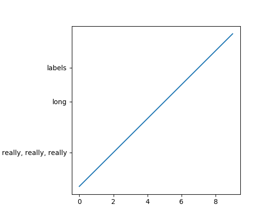
Here is an example that gets a bounding box in relative figure coordinates (0..1) of each of the labels and uses it to move the left of the subplots over so that the tick labels fit in the figure
import matplotlib.pyplot as plt
import matplotlib.transforms as mtransforms
fig = plt.figure()
ax = fig.add_subplot(111)
ax.plot(range(10))
ax.set_yticks((2,5,7))
labels = ax.set_yticklabels(('really, really, really', 'long', 'labels'))

def on_draw(event):
   bboxes = []
   for label in labels:
       bbox = label.get_window_extent()
       # the figure transform goes from relative coords->pixels and we
       # want the inverse of that
       bboxi = bbox.inverse_transformed(fig.transFigure)
       bboxes.append(bboxi)

   # this is the bbox that bounds all the bboxes, again in relative
   # figure coords
   bbox = mtransforms.Bbox.union(bboxes)
   if fig.subplotpars.left < bbox.width:
       # we need to move it over
       fig.subplots_adjust(left=1.1*bbox.width) # pad a little
       fig.canvas.draw()
   return False

fig.canvas.mpl_connect('draw_event', on_draw)

plt.show()
(Source code, png, pdf)

In Matplotlib, the ticks are markers. All
Line2D objects support a line (solid,
dashed, etc) and a marker (circle, square, tick). The tick linewidth
is controlled by the “markeredgewidth” property:
import matplotlib.pyplot as plt
fig = plt.figure()
ax = fig.add_subplot(111)
ax.plot(range(10))

for line in ax.get_xticklines() + ax.get_yticklines():
    line.set_markersize(10)

plt.show()
The other properties that control the tick marker, and all markers,
are markerfacecolor, markeredgecolor, markeredgewidth,
markersize. For more information on configuring ticks, see
Axis containers and Tick containers.
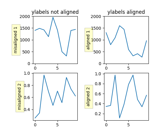
If you have multiple subplots over one another, and the y data have different scales, you can often get ylabels that do not align vertically across the multiple subplots, which can be unattractive. By default, Matplotlib positions the x location of the ylabel so that it does not overlap any of the y ticks. You can override this default behavior by specifying the coordinates of the label. The example below shows the default behavior in the left subplots, and the manual setting in the right subplots.
import numpy as np
import matplotlib.pyplot as plt

box = dict(facecolor='yellow', pad=5, alpha=0.2)

fig = plt.figure()
fig.subplots_adjust(left=0.2, wspace=0.6)

# Fixing random state for reproducibility
np.random.seed(19680801)

ax1 = fig.add_subplot(221)
ax1.plot(2000*np.random.rand(10))
ax1.set_title('ylabels not aligned')
ax1.set_ylabel('misaligned 1', bbox=box)
ax1.set_ylim(0, 2000)
ax3 = fig.add_subplot(223)
ax3.set_ylabel('misaligned 2',bbox=box)
ax3.plot(np.random.rand(10))


labelx = -0.3  # axes coords

ax2 = fig.add_subplot(222)
ax2.set_title('ylabels aligned')
ax2.plot(2000*np.random.rand(10))
ax2.set_ylabel('aligned 1', bbox=box)
ax2.yaxis.set_label_coords(labelx, 0.5)
ax2.set_ylim(0, 2000)

ax4 = fig.add_subplot(224)
ax4.plot(np.random.rand(10))
ax4.set_ylabel('aligned 2', bbox=box)
ax4.yaxis.set_label_coords(labelx, 0.5)


plt.show()
(Source code, png, pdf)

When plotting time series, e.g., financial time series, one often wants to leave out days on which there is no data, e.g., weekends. By passing in dates on the x-xaxis, you get large horizontal gaps on periods when there is not data. The solution is to pass in some proxy x-data, e.g., evenly sampled indices, and then use a custom formatter to format these as dates. The example below shows how to use an ‘index formatter’ to achieve the desired plot:
import numpy as np
import matplotlib.pyplot as plt
import matplotlib.mlab as mlab
import matplotlib.ticker as ticker

r = mlab.csv2rec('../data/aapl.csv')
r.sort()
r = r[-30:]  # get the last 30 days

N = len(r)
ind = np.arange(N)  # the evenly spaced plot indices

def format_date(x, pos=None):
    thisind = np.clip(int(x+0.5), 0, N-1)
    return r.date[thisind].strftime('%Y-%m-%d')

fig = plt.figure()
ax = fig.add_subplot(111)
ax.plot(ind, r.adj_close, 'o-')
ax.xaxis.set_major_formatter(ticker.FuncFormatter(format_date))
fig.autofmt_xdate()

plt.show()
Within an axes, the order that the various lines, markers, text,
collections, etc appear is determined by the
set_zorder() property. The default
order is patches, lines, text, with collections of lines and
collections of patches appearing at the same level as regular lines
and patches, respectively:
line, = ax.plot(x, y, zorder=10)
You can also use the Axes property
set_axisbelow() to control whether the grid
lines are placed above or below your other plot elements.
The Axes property set_aspect() controls the
aspect ratio of the axes. You can set it to be ‘auto’, ‘equal’, or
some ratio which controls the ratio:
ax = fig.add_subplot(111, aspect='equal')
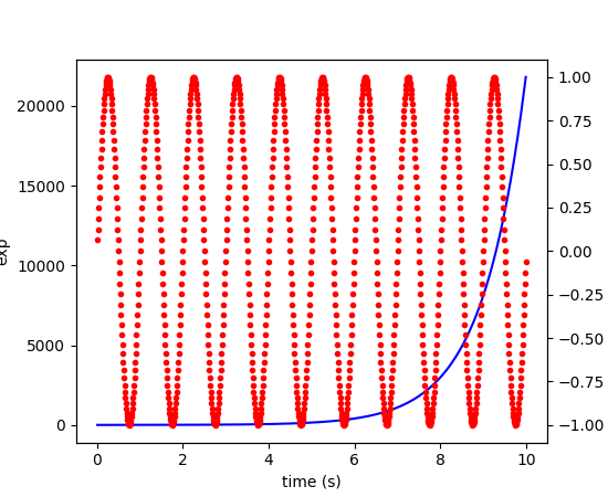
A frequent request is to have two scales for the left and right
y-axis, which is possible using twinx() (more
than two scales are not currently supported, though it is on the wish
list). This works pretty well, though there are some quirks when you
are trying to interactively pan and zoom, because both scales do not get
the signals.
The approach uses twinx() (and its sister
twiny()) to use 2 different axes,
turning the axes rectangular frame off on the 2nd axes to keep it from
obscuring the first, and manually setting the tick locs and labels as
desired. You can use separate matplotlib.ticker formatters and
locators as desired because the two axes are independent.
(Source code, png, pdf)
The easiest way to do this is use a non-interactive backend (see
What is a backend?) such as Agg (for PNGs), PDF, SVG or PS. In
your figure-generating script, just call the
matplotlib.use() directive before importing pylab or
pyplot:
import matplotlib
matplotlib.use('Agg')
import matplotlib.pyplot as plt
plt.plot([1,2,3])
plt.savefig('myfig')
See also
Matplotlib in a web application server for information about running matplotlib inside of a web application.
show()¶When you want to view your plots on your display,
the user interface backend will need to start the GUI mainloop.
This is what show() does. It tells
Matplotlib to raise all of the figure windows created so far and start
the mainloop. Because this mainloop is blocking by default (i.e., script
execution is paused), you should only call this once per script, at the end.
Script execution is resumed after the last window is closed. Therefore, if
you are using Matplotlib to generate only images and do not want a user
interface window, you do not need to call show (see Generate images without having a window appear
and What is a backend?).
Note
Because closing a figure window invokes the destruction of its plotting
elements, you should call savefig() before
calling show if you wish to save the figure as well as view it.
New in version v1.0.0: show now starts the GUI mainloop only if it isn’t already running.
Therefore, multiple calls to show are now allowed.
Having show block further execution of the script or the python
interpreter depends on whether Matplotlib is set for interactive mode
or not. In non-interactive mode (the default setting), execution is paused
until the last figure window is closed. In interactive mode, the execution
is not paused, which allows you to create additional figures (but the script
won’t finish until the last figure window is closed).
Note
Support for interactive/non-interactive mode depends upon the backend. Until version 1.0.0 (and subsequent fixes for 1.0.1), the behavior of the interactive mode was not consistent across backends. As of v1.0.1, only the macosx backend differs from other backends because it does not support non-interactive mode.
Because it is expensive to draw, you typically will not want Matplotlib to redraw a figure many times in a script such as the following:
plot([1,2,3])            # draw here ?
xlabel('time')           # and here ?
ylabel('volts')          # and here ?
title('a simple plot')   # and here ?
show()
However, it is possible to force Matplotlib to draw after every command,
which might be what you want when working interactively at the
python console (see Using matplotlib in a python shell), but in a script you want to
defer all drawing until the call to show. This is especially
important for complex figures that take some time to draw.
show() is designed to tell Matplotlib that
you’re all done issuing commands and you want to draw the figure now.
Note
show() should typically only be called at
most once per script and it should be the last line of your
script. At that point, the GUI takes control of the interpreter.
If you want to force a figure draw, use
draw() instead.
Many users are frustrated by show because they want it to be a
blocking call that raises the figure, pauses the script until they
close the figure, and then allow the script to continue running until
the next figure is created and the next show is made. Something like
this:
# WARNING : illustrating how NOT to use show
for i in range(10):
    # make figure i
    show()
This is not what show does and unfortunately, because doing blocking calls across user interfaces can be tricky, is currently unsupported, though we have made significant progress towards supporting blocking events.
New in version v1.0.0: As noted earlier, this restriction has been relaxed to allow multiple
calls to show. In most backends, you can now expect to be
able to create new figures and raise them in a subsequent call to
show after closing the figures from a previous call to show.
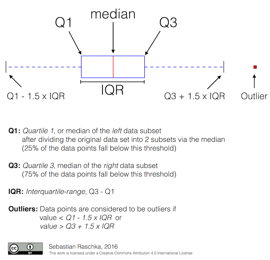
Tukey’s box plots (Robert McGill, John W. Tukey and Wayne A. Larsen: “The American Statistician” Vol. 32, No. 1, Feb., 1978, pp. 12-16) are statistical plots that provide useful information about the data distribution such as skewness. However, bar plots with error bars are still the common standard in most scientific literature, and thus, the interpretation of box plots can be challenging for the unfamiliar reader. The figure below illustrates the different visual features of a box plot.
Violin plots are closely related to box plots but add useful information such as the distribution of the sample data (density trace). Violin plots were added in Matplotlib 1.4.
Is there a feature you wish Matplotlib had? Then ask! The best way to get started is to email the developer mailing list for discussion. This is an open source project developed primarily in the contributors free time, so there is no guarantee that your feature will be added. The best way to get the feature you need added is to contribute it your self.
The development of Matplotlib is organized through github. If you would like to report a bug or submit a patch please use that interface.
To report a bug create an issue on github (this requires having a github account). Please include a Short, Self Contained, Correct (Compilable), Example demonstrating what the bug is. Including a clear, easy to test example makes it easy for the developers to evaluate the bug. Expect that the bug reports will be a conversation. If you do not want to register with github, please email bug reports to the mailing list.
The easiest way to submit patches to Matplotlib is through pull requests on github. Please see the The Matplotlib Developers’ Guide for the details.
Matplotlib is a big library, which is used in many ways, and the documentation has only scratched the surface of everything it can do. So far, the place most people have learned all these features are through studying the examples (Search examples), which is a recommended and great way to learn, but it would be nice to have more official narrative documentation guiding people through all the dark corners. This is where you come in.
There is a good chance you know more about Matplotlib usage in some
areas, the stuff you do every day, than many of the core developers
who wrote most of the documentation. Just pulled your hair out
compiling Matplotlib for windows? Write a FAQ or a section for the
Installation page. Are you a digital signal processing wizard?
Write a tutorial on the signal analysis plotting functions like
xcorr(), psd() and
specgram(). Do you use Matplotlib with
django or other popular web
application servers? Write a FAQ or tutorial and we’ll find a place
for it in the User’s Guide. Bundle Matplotlib in a
py2exe app? ... I think you get the idea.
Matplotlib is documented using the sphinx extensions to restructured text (ReST). sphinx is an extensible python framework for documentation projects which generates HTML and PDF, and is pretty easy to write; you can see the source for this document or any page on this site by clicking on the Show Source link at the end of the page in the sidebar.
The sphinx website is a good resource for learning sphinx, but we have put together a cheat-sheet at Developer’s tips for documenting matplotlib which shows you how to get started, and outlines the Matplotlib conventions and extensions, e.g., for including plots directly from external code in your documents.
Once your documentation contributions are working (and hopefully tested by actually building the docs) you can submit them as a patch against git. See Install git and Reporting a bug or submitting a patch. Looking for something to do? Search for TODO or look at the open issues on github.
Many users report initial problems trying to use maptlotlib in web application servers, because by default Matplotlib ships configured to work with a graphical user interface which may require an X11 connection. Since many barebones application servers do not have X11 enabled, you may get errors if you don’t configure Matplotlib for use in these environments. Most importantly, you need to decide what kinds of images you want to generate (PNG, PDF, SVG) and configure the appropriate default backend. For 99% of users, this will be the Agg backend, which uses the C++ antigrain rendering engine to make nice PNGs. The Agg backend is also configured to recognize requests to generate other output formats (PDF, PS, EPS, SVG). The easiest way to configure Matplotlib to use Agg is to call:
# do this before importing pylab or pyplot
import matplotlib
matplotlib.use('Agg')
import matplotlib.pyplot as plt
For more on configuring your backend, see What is a backend?.
Alternatively, you can avoid pylab/pyplot altogether, which will give you a little more control, by calling the API directly as shown in api example code: agg_oo.py.
You can either generate hardcopy on the filesystem by calling savefig:
# do this before importing pylab or pyplot
import matplotlib
matplotlib.use('Agg')
import matplotlib.pyplot as plt
fig = plt.figure()
ax = fig.add_subplot(111)
ax.plot([1,2,3])
fig.savefig('test.png')
or by saving to a file handle:
import sys
fig.savefig(sys.stdout)
Here is an example using Pillow. First, the figure is saved to a BytesIO object which is then fed to Pillow for further processing:
from io import BytesIO
from PIL import Image
imgdata = BytesIO()
fig.savefig(imgdata, format='png')
imgdata.seek(0)  # rewind the data
im = Image.open(imgdata)
TODO; see Contribute to Matplotlib documentation.
TODO; see Contribute to Matplotlib documentation.
TODO; see Contribute to Matplotlib documentation.
Andrew Dalke of Dalke Scientific has written a nice article on how to make html click maps with Matplotlib agg PNGs. We would also like to add this functionality to SVG. If you are interested in contributing to these efforts that would be great.
The nearly 300 code Matplotlib Examples included with the Matplotlib
source distribution are full-text searchable from the Search Page
page, but sometimes when you search, you get a lot of results from the
The Matplotlib API or other documentation that you may not be interested
in if you just want to find a complete, free-standing, working piece
of example code. To facilitate example searches, we have tagged every
code example page with the keyword codex for code example which
shouldn’t appear anywhere else on this site except in the FAQ.
So if you want to search for an example that uses an
ellipse, Search Page for codex ellipse.
If you want to refer to Matplotlib in a publication, you can use “Matplotlib: A 2D Graphics Environment” by J. D. Hunter In Computing in Science & Engineering, Vol. 9, No. 3. (2007), pp. 90-95 (see this reference page):
@article{Hunter:2007,
        Address = {10662 LOS VAQUEROS CIRCLE, PO BOX 3014, LOS ALAMITOS, CA 90720-1314 USA},
        Author = {Hunter, John D.},
        Date-Added = {2010-09-23 12:22:10 -0700},
        Date-Modified = {2010-09-23 12:22:10 -0700},
        Isi = {000245668100019},
        Isi-Recid = {155389429},
        Journal = {Computing In Science \& Engineering},
        Month = {May-Jun},
        Number = {3},
        Pages = {90--95},
        Publisher = {IEEE COMPUTER SOC},
        Times-Cited = {21},
        Title = {Matplotlib: A 2D graphics environment},
        Type = {Editorial Material},
        Volume = {9},
        Year = {2007},
        Abstract = {Matplotlib is a 2D graphics package used for Python for application
                    development, interactive scripting, and publication-quality image
                    generation across user interfaces and operating systems.},
        Bdsk-Url-1 = {http://gateway.isiknowledge.com/gateway/Gateway.cgi?GWVersion=2&SrcAuth=Alerting&SrcApp=Alerting&DestApp=WOS&DestLinkType=FullRecord;KeyUT=000245668100019}}