

(Source code, png, pdf)

'''
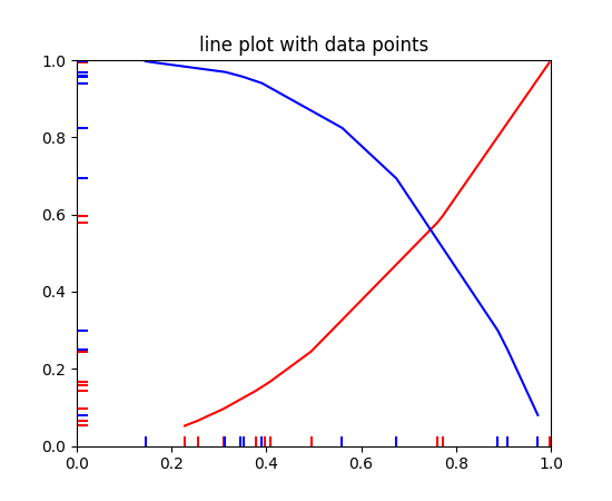
Plot two curves, then use EventCollections to mark the locations of the x
and y data points on the respective axes for each curve
'''
import matplotlib.pyplot as plt
from matplotlib.collections import EventCollection
import numpy as np
# create random data
np.random.seed(50)
xdata = np.random.random([2, 10])
# split the data into two parts
xdata1 = xdata[0, :]
xdata2 = xdata[1, :]
# sort the data so it makes clean curves
xdata1.sort()
xdata2.sort()
# create some y data points
ydata1 = xdata1 ** 2
ydata2 = 1 - xdata2 ** 3
# plot the data
fig = plt.figure()
ax = fig.add_subplot(1, 1, 1)
ax.plot(xdata1, ydata1, 'r', xdata2, ydata2, 'b')
# create the events marking the x data points
xevents1 = EventCollection(xdata1, color=[1, 0, 0], linelength=0.05)
xevents2 = EventCollection(xdata2, color=[0, 0, 1], linelength=0.05)
# create the events marking the y data points
yevents1 = EventCollection(ydata1, color=[1, 0, 0], linelength=0.05,
orientation='vertical')
yevents2 = EventCollection(ydata2, color=[0, 0, 1], linelength=0.05,
orientation='vertical')
# add the events to the axis
ax.add_collection(xevents1)
ax.add_collection(xevents2)
ax.add_collection(yevents1)
ax.add_collection(yevents2)
# set the limits
ax.set_xlim([0, 1])
ax.set_ylim([0, 1])
ax.set_title('line plot with data points')
# display the plot
plt.show()
Keywords: python, matplotlib, pylab, example, codex (see Search examples)