Learn what to expect in the new updates

(Source code, png, hires.png, pdf)

"""
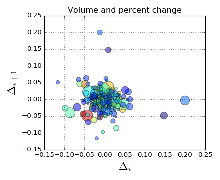
Demo of scatter plot with varying marker colors and sizes.
"""
import numpy as np
import matplotlib.pyplot as plt
import matplotlib.cbook as cbook

# Load a numpy record array from yahoo csv data with fields date,
# open, close, volume, adj_close from the mpl-data/example directory.
# The record array stores python datetime.date as an object array in
# the date column
datafile = cbook.get_sample_data('goog.npy')
try:
    # Python3 cannot load python2 .npy files with datetime(object) arrays
    # unless the encoding is set to bytes. Hovever this option was
    # not added until numpy 1.10 so this example will only work with
    # python 2 or with numpy 1.10 and later
    price_data = np.load(datafile, encoding='bytes').view(np.recarray)
except TypeError:
    price_data = np.load(datafile).view(np.recarray)
price_data = price_data[-250:]  # get the most recent 250 trading days

delta1 = np.diff(price_data.adj_close)/price_data.adj_close[:-1]

# Marker size in units of points^2
volume = (15 * price_data.volume[:-2] / price_data.volume[0])**2
close = 0.003 * price_data.close[:-2] / 0.003 * price_data.open[:-2]

fig, ax = plt.subplots()
ax.scatter(delta1[:-1], delta1[1:], c=close, s=volume, alpha=0.5)

ax.set_xlabel(r'$\Delta_i$', fontsize=20)
ax.set_ylabel(r'$\Delta_{i+1}$', fontsize=20)
ax.set_title('Volume and percent change')

ax.grid(True)
fig.tight_layout()

plt.show()
Keywords: python, matplotlib, pylab, example, codex (see Search examples)