
Here you will find a host of example figures with the code that generated them
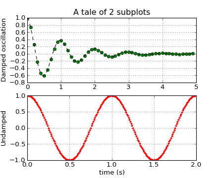
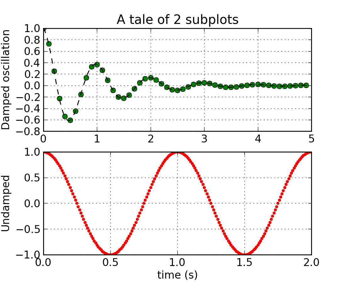
Multiple regular axes (numrows by numcolumns) are created with the subplot() command.
(Source code, png, hires.png, pdf)
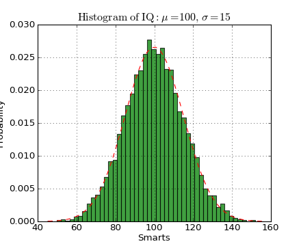
The hist() command automatically generates histograms and will return the bin counts or probabilities
(Source code, png, hires.png, pdf)
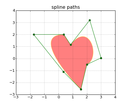
You can add aribitrary paths in matplotlib as of release 0.98. See the matplotlib.path.
(Source code, png, hires.png, pdf)

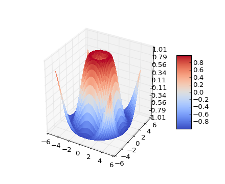
The mplot3d toolkit (see mplot3d tutorial and mplot3d Examples) has support for simple 3d graphs including surface, wireframe, scatter, and bar charts (added in matlpotlib-0.99). Thanks to John Porter, Jonathon Taylor and Reinier Heeres for the mplot3d toolkit. The toolkit is included with all standard matplotlib installs.
(Source code, png, hires.png, pdf)
In support of the Phoenix mission to Mars, which used matplotlib in ground tracking of the spacecraft, Michael Droettboom built on work by Charlie Moad to provide an extremely accurate 8-spline approximation to elliptical arcs (see Arc) in the viewport. This provides a scale free, accurate graph of the arc regardless of zoom level
(Source code, png, hires.png, pdf)

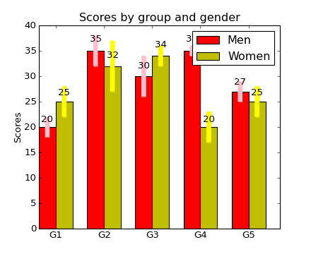
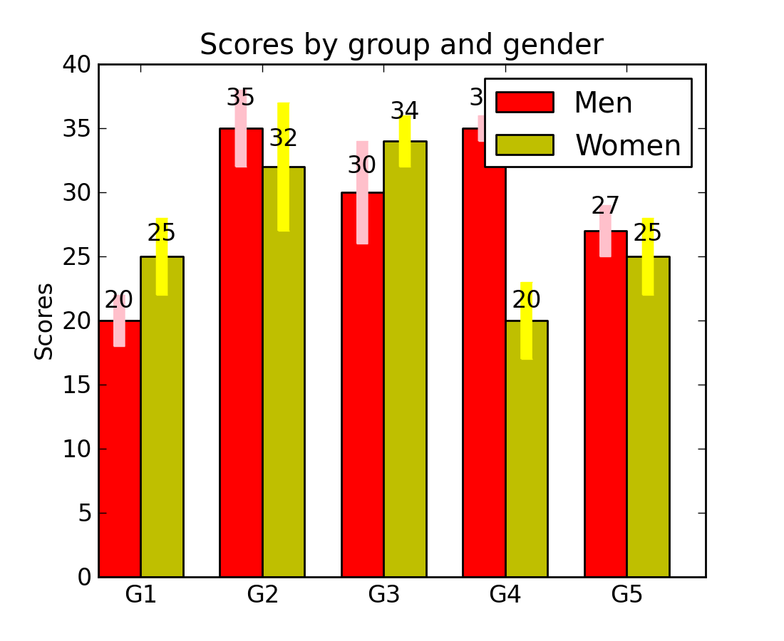
The bar() command takes error bars as an optional argument. You can also use up and down bars, stacked bars, candlestick bars, etc, ... See bar_stacked.py for another example. You can make horizontal bar charts with the barh() command.
(Source code, png, hires.png, pdf)

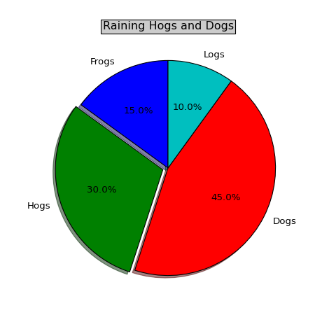
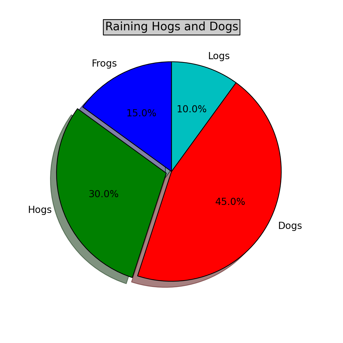
The pie() command uses a MATLAB compatible syntax to produce pie charts. Optional features include auto-labeling the percentage of area, exploding one or more wedges out from the center of the pie, and a shadow effect. Take a close look at the attached code that produced this figure; nine lines of code.
(Source code, png, hires.png, pdf)

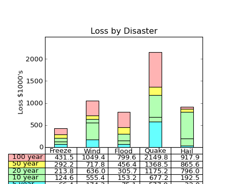
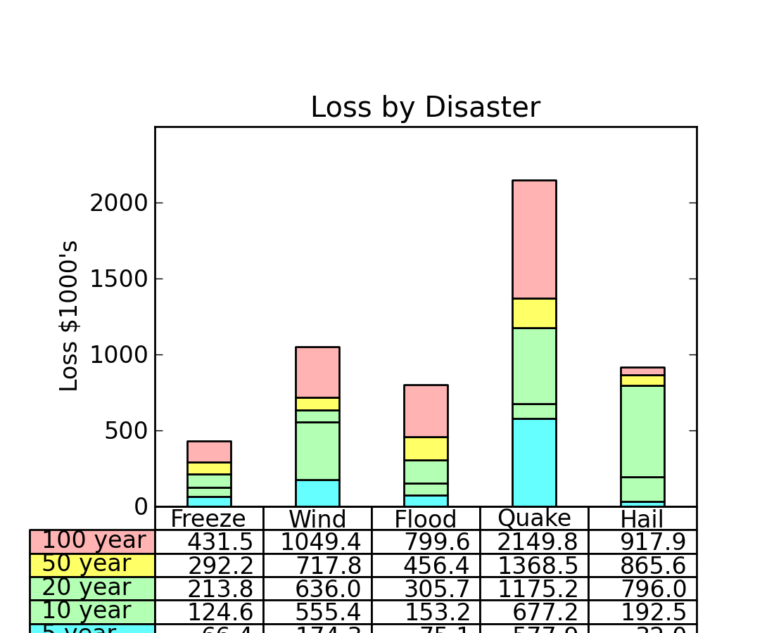
The table() command will place a text table on the axes
(Source code, png, hires.png, pdf)

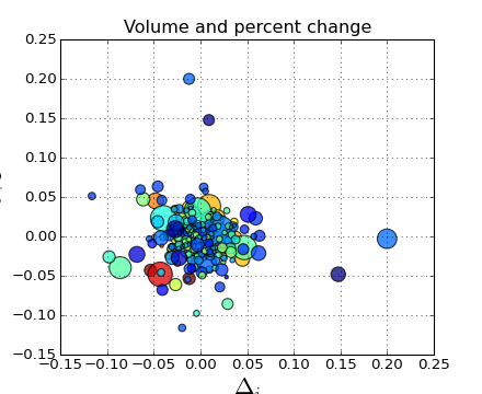
The scatter() command makes a scatter plot with (optional) size and color arguments. This example plots changes in Google stock price from one day to the next with the sizes coding trading volume and the colors coding price change in day i. Here the alpha attribute is used to make semitransparent circle markers with the Agg backend (see What is a backend?)
(Source code, png, hires.png, pdf)

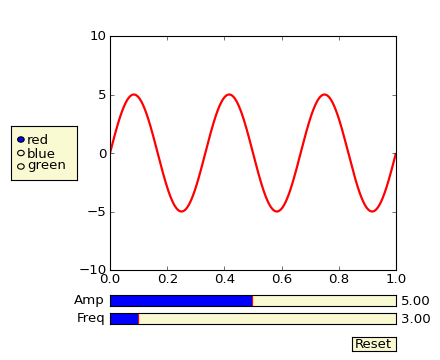
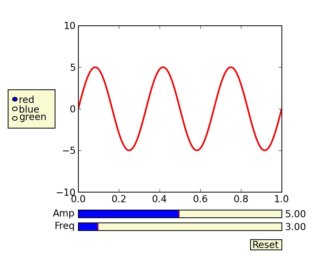
Matplotlib has basic GUI widgets that are independent of the graphical user interface you are using, allowing you to write cross GUI figures and widgets. See matplotlib.widgets and the widget examples
(Source code, png, hires.png, pdf)

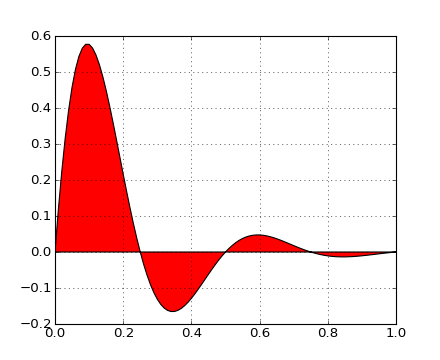
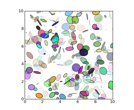
The fill() command lets you plot filled polygons. Thanks to Andrew Straw for providing this function
(Source code, png, hires.png, pdf)
You can plot date data with major and minor ticks and custom tick formatters for both the major and minor ticks; see matplotlib.ticker and matplotlib.dates for details and usage.
(Source code, png, hires.png, pdf)

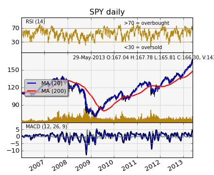
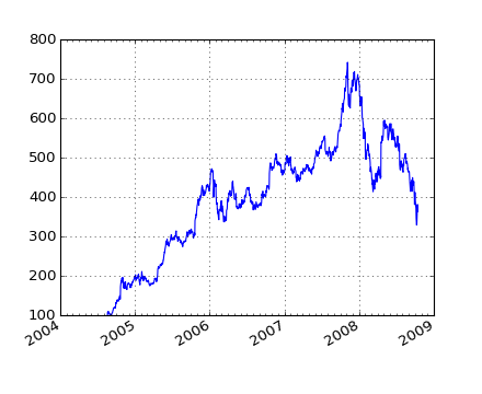
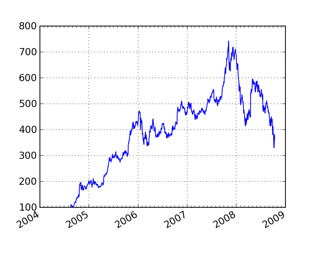
You can make much more sophisticated financial plots. This example emulates one of the ChartDirector financial plots. Some of the data in the plot, are real financial data, some are random traces that I used since the goal was to illustrate plotting techniques, not market analysis!
(Source code, png, hires.png, pdf)
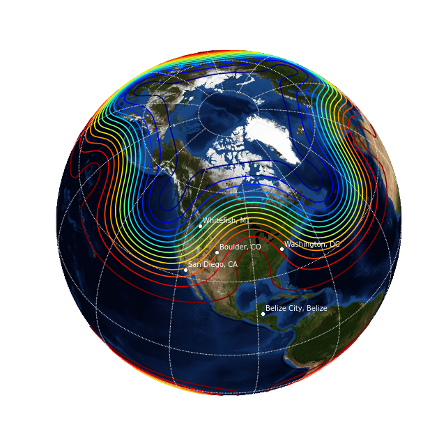
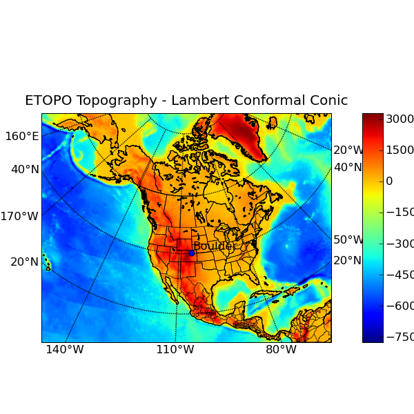
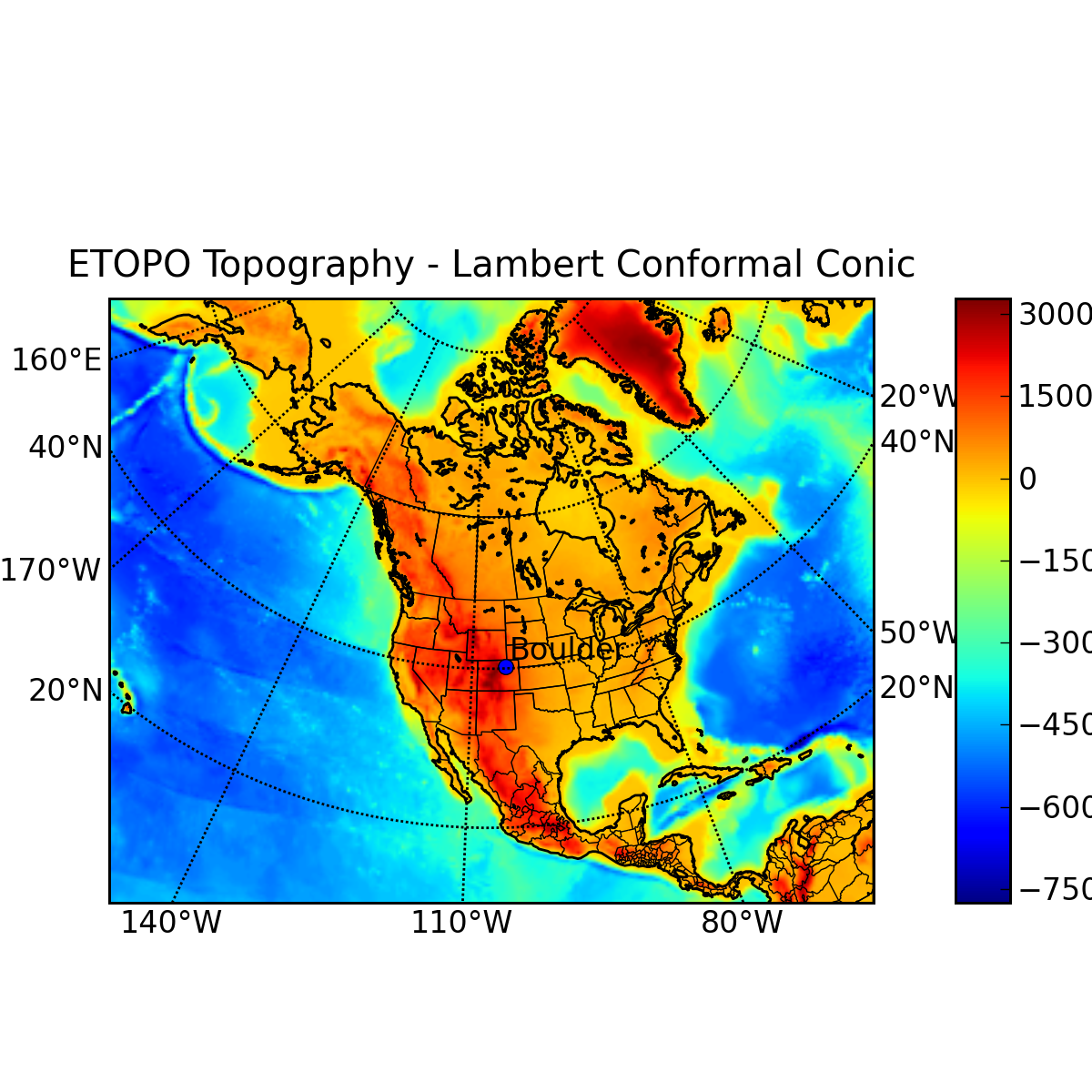
Jeff Whitaker’s Basemap add-on toolkit makes it possible to plot data on many different map projections. This example shows how to plot contours, markers and text on an orthographic projection, with NASA’s “blue marble” satellite image as a background.
(Source code, png, hires.png, pdf)
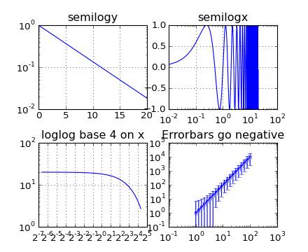
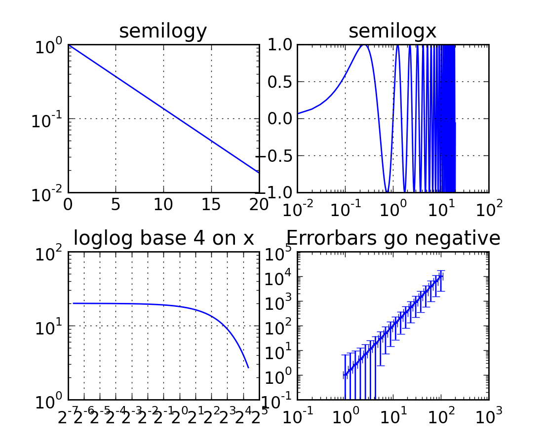
The semilogx(), semilogy() and loglog() functions generate log scaling on the respective axes. The lower subplot uses a base10 log on the xaxis and a base 4 log on the yaxis. Thanks to Andrew Straw, Darren Dale and Gregory Lielens for contributions to the log scaling infrastructure.
(Source code, png, hires.png, pdf)
The legend() command automatically generates figure legends, with MATLAB compatible legend placement commands. Thanks to Charles Twardy for input on the legend command
(Source code, png, hires.png, pdf)

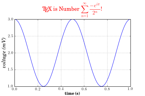
A sampling of the many TeX expressions now supported by matplotlib’s internal mathtext engine. The mathtext module provides TeX style mathematical expressions using freetype2 and the BaKoMa computer modern or STIX fonts. See the matplotlib.mathtext module for additional. matplotlib mathtext is an independent implementation, and does not required TeX or any external packages installed on your computer. See the tutorial at Writing mathematical expressions.
(Source code, png, hires.png, pdf)

Although matplotlib’s internal math rendering engine is quite powerful, sometimes you need TeX, and matplotlib supports external TeX rendering of strings with the usetex option.
(Source code, png, hires.png, pdf)
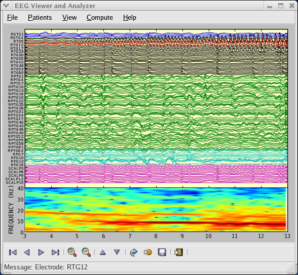
You can embed matplotlib into pygtk, wxpython, Tk, FLTK or Qt applications. Here is a screenshot of an eeg viewer called pbrain which is part of the NeuroImaging in Python suite NIPY. Pbrain is written in pygtk using matplotlib. The lower axes uses specgram() to plot the spectrogram of one of the EEG channels. For an example of how to use the navigation toolbar in your applications, see user_interfaces example code: embedding_in_gtk2.py. If you want to use matplotlib in a wx application, see user_interfaces example code: embedding_in_wx2.py. If you want to work with glade, see user_interfaces example code: mpl_with_glade.py.
