The Python Graph Gallery: hundreds of python charts with reproducible code.
Posted
Data visualization is a key step in a data science pipeline. Python offers great possibilities when it comes to representing some data graphically, but it can be hard and time-consuming to create the appropriate chart.
The Python Graph Gallery is here to help. It displays many examples, always providing the reproducible code. It allows to build the desired chart in minutes.
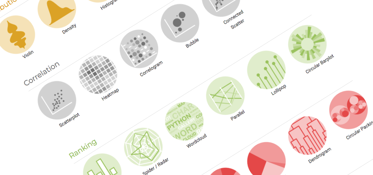
About 400 charts in 40 sections
The gallery currently provides more than 400 chart examples. Those examples are organized in 40 sections, one for each chart types: scatterplot, boxplot, barplot, treemap and so on. Those chart types are organized in 7 big families as suggested by data-to-viz.com: one for each visualization purpose.
It is important to note that not only the most common chart types are covered. Lesser known charts like chord diagrams, streamgraphs or bubble maps are also available.
Master the basics
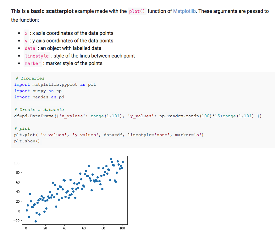
Each section always starts with some very basic examples. It allows to understand how to build a chart type in a few seconds. Hopefully applying the same technique on another dataset will thus be very quick.
For instance, the scatterplot section starts with this matplotlib example. It shows how to create a dataset with pandas and plot it with the plot() function. The main graph argument like linestyle and marker are described to make sure the code is understandable.
Matplotlib customization
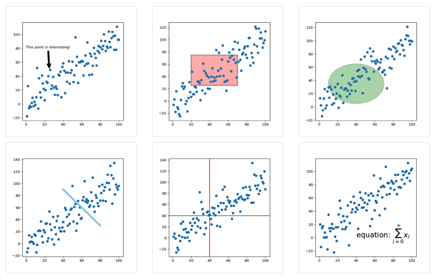
The gallery uses several libraries like seaborn or plotly to produce its charts, but is mainly focus on matplotlib. Matplotlib comes with great flexibility and allows to build any kind of chart without limits.
A whole page is dedicated to matplotlib. It describes how to solve recurring issues like customizing axes or titles, adding annotations (see below) or even using custom fonts.
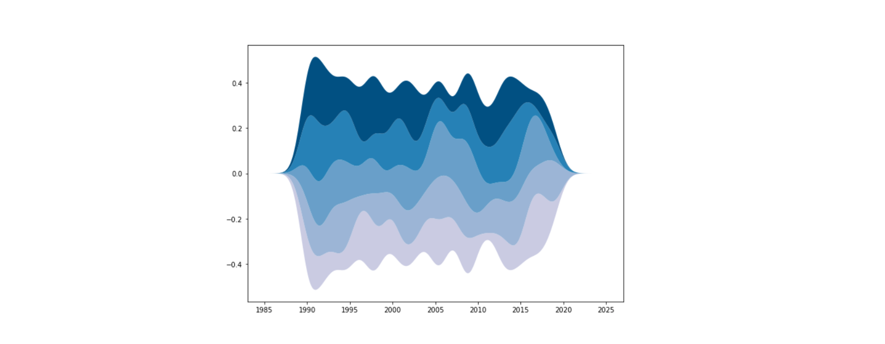
The gallery is also full of non-straightforward examples. For instance, it has a tutorial explaining how to build a streamchart with matplotlib. It is based on the stackplot() function and adds some smoothing to it:
Last but not least, the gallery also displays some publication ready charts. They usually involve a lot of matplotlib code, but showcase the fine grain control one has over a plot.
Here is an example with a post inspired by Tuo Wang‘s work for the tidyTuesday project. (Code translated from R available here)
Contributing
The python graph gallery is an ever growing project. It is open-source, with all its related code hosted on github.
Contributions are very welcome to the gallery. Each blogpost is just a jupyter notebook so suggestion should be very easy to do through issues or pull requests!
Conclusion
The python graph gallery is a project developed by Yan Holtz in his free time. It can help you improve your technical skills when it comes to visualizing data with python.
The gallery belongs to an ecosystem of educative websites. Data to viz describes best practices in data visualization, the R, python and d3.js graph galleries provide technical help to build charts with the 3 most common tools.
For any question regarding the project, please say hi on twitter at @R_Graph_Gallery!