Matplotlib in Data Driven SEO
Posted
Search Engine Optimization (SEO) is a process that aims to increase quantity and quality of website traffic by ensuring a website can be found in search engines for phrases that are relevant to what the site is offering. Google is the most popular search engine in the world and presence in top search results is invaluable for any online business since click rates drop exponentially with ranking position. Since the beginning, specialized entities have been decoding signals that influence position in search engine result page (SERP) focusing on e.g. number of outlinks, presence of keywords or content length. Developed practices typically resulted in better visibility, but needed to be constantly challenged because search engines introduce changes to their algorithms even every day. Since the rapid advancements in Big Data and machine learning finding significant ranking factors became increasingly more difficult. Thus, the whole SEO field required a shift where recommendations are backed up by large scale studies based on real data rather than old-fashioned practices. Whites Agency focuses strongly on Data-Driven SEO. We run many Big Data analyses which give us insights into multiple optimization opportunities.
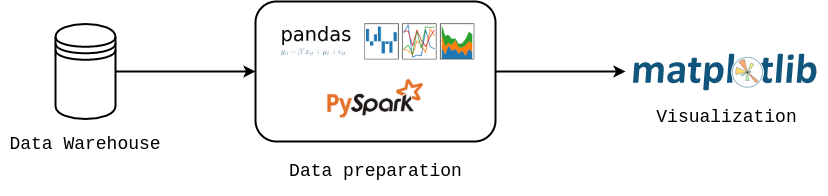
Majority of cases we are dealing with right now focus on data harvesting and analysis. Data presentation plays an important part and since the beginning, we needed a tool that would allow us to experiment with different forms of visualizations. Because our organization is Python driven, Matplotlib was a straightforward choice for us. It is a mature project that offers flexibility and control. Among other features, Matplotlib figures can be easily exported not only to raster graphic formats (PNG, JPG) but also to vector ones (SVG, PDF, EPS), creating high-quality images that can be embedded in HTML code, LaTeX or utilized by graphic designers. In one of our projects, Matplotlib was a part of the Python processing pipeline that automatically generated PDF summaries from an HTML template for individual clients. Every data visualization project has the same core presented in the figure below, where data is loaded from the database, processed in pandas or PySpark and finally visualized with Matplotlib.
In what follows, we would like to share two insights from our studies. All figures were prepared in Matplotlib and in each case we set up a global style (overwritten if necessary):
import matplotlib.pyplot as plt
from cycler import cycler

colors = ['#00b2b8', '#fa5e00', '#404040', '#78A3B3', '#008F8F', '#ADC9D6']

plt.rc('axes', grid=True, labelcolor='k', linewidth=0.8, edgecolor='#696969',
    labelweight='medium', labelsize=18)
plt.rc('axes.spines', left=False, right=False, top=False, bottom=True)
plt.rc('axes.formatter', use_mathtext=True)

plt.rcParams['axes.prop_cycle'] = cycler('color', colors)

plt.rc('grid', alpha=1.0, color='#B2B2B2', linestyle='dotted', linewidth=1.0)
plt.rc('xtick.major', top=False, width=0.8, size=8.0)
plt.rc('ytick', left=False, color='k')
plt.rcParams['xtick.color'] = 'k'
plt.rc('font',family='Montserrat')
plt.rcParams['font.weight'] = 'medium'
plt.rcParams['xtick.labelsize'] = 13
plt.rcParams['ytick.labelsize'] = 13
plt.rcParams['lines.linewidth'] = 2.0
Case 1: Website Speed Performance
Our R&D department analyzed a set of 10,000 potential customer intent phrases from the Electronics (eCommerce) and News domains (5000 phrases each). They scraped data from the Google ranking in a specific location (London, United Kingdom) both for mobile and desktop results [full study available here]. Based on those data, we distinguished TOP 20 results that appeared in SERPs. Next, each page was audited with the Google Lighthouse tool. Google Lighthouse is an open-source, automated tool for improving the quality of web pages, that among other collects information about website loading time. A single sample from our analysis which shows variations of Time to First Byte (TTFB) as a function of Google position (grouped in threes) is presented below. TTFB measures the time it takes for a user's browser to receive the first byte of page content. Regardless of the device, TTFB score is the lowest for websites that occurred in TOP 3 positions. The difference is significant, especially between TOP 3 and 4-6 results. Therefore, Google favors websites that respond fast and therefore it is advised to invest in website speed optimization.
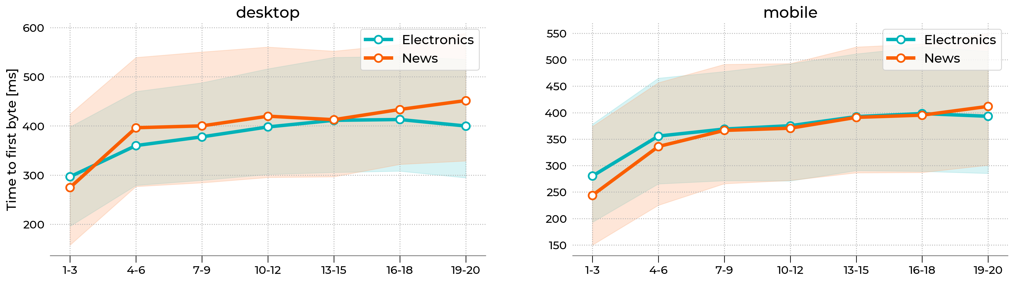
The figure above uses fill_between function from Matplotlib library to draw colored shade that represents the 40-60th percentile range. A simple line plot with circle markers denotes the median (50th percentile). X-axis labels were assigned manually. The whole style is wrapped into a custom function that allows us to reproduce the whole figure in a single line of code. A sample is presented below:
import matplotlib.pyplot as plt
from matplotlib.colors import LinearSegmentedColormap

# --------------------------------------------
# Set double column layout
# --------------------------------------------
fig, axx = plt.subplots(figsize=(20,6), ncols=2)

# --------------------------------------------
# Plot 50th percentile
# --------------------------------------------
line_kws = {
   'lw': 4.0,
   'marker': 'o',
   'ms': 9,
   'markerfacecolor': 'w',
   'markeredgewidth': 2,
   'c': '#00b2b8'
}

# just demonstration
axx[0].plot(x, y, label='Electronics', **line_kws)

# --------------------------------------------
# Plot 40-60th percentile
# --------------------------------------------
# make color lighter
cmap = LinearSegmentedColormap.from_list('whites', ['#FFFFFF', '#00b2b8'])

# just demonstration
axx[0].fill_between(
   x, yl, yu,
   color=cmap(0.5),
   label='_nolegend_'
)

# ---------------------------------------------
# Add x-axis labels
# ---------------------------------------------
# done automatically
xtick_labels = ['1-3','4-6','7-9','10-12','13-15','16-18','19-20']
for ax in axx:
   ax.set_xticklabels(xtick_labels)

# ----------------------------------------------
# Export figure
# ----------------------------------------------
fig.savefig("lighthouse.png", bbox_inches='tight', dpi=250)
Case 2: Google Ads ranking
Another example let us draw insights from Google's paid campaigns (Ads). Our R&D department scraped the first page in Google for more than 7600 queries and analyzed the ads that were present [study available only in Polish]. The queries were narrowed down to Travel category. At the moment of writing this post, each SERP can have up to 4 ads at the top and up to 3 ads at the bottom. Each ad is associated with a domain and has a headline, description, and optional extensions. Below we present TOP 25 domains with the highest visibility on desktop computers. The Y-axis shows the name of a domain and the X-axis indicates how many ads is linked with particular domain, in total. We repeated the study 3 times and aggregated the counts that is why the scale is much larger than 7600. In this project, the type of plot below allows us to summarize different brands’ ads campaign strategies and their advertising market shares. For example, itaka and wakacje have the strongest presence both on mobile and desktop and most of their ads appear at the top. The neckermann positions itself are very high, but most of their ads appear at the bottom of search results.
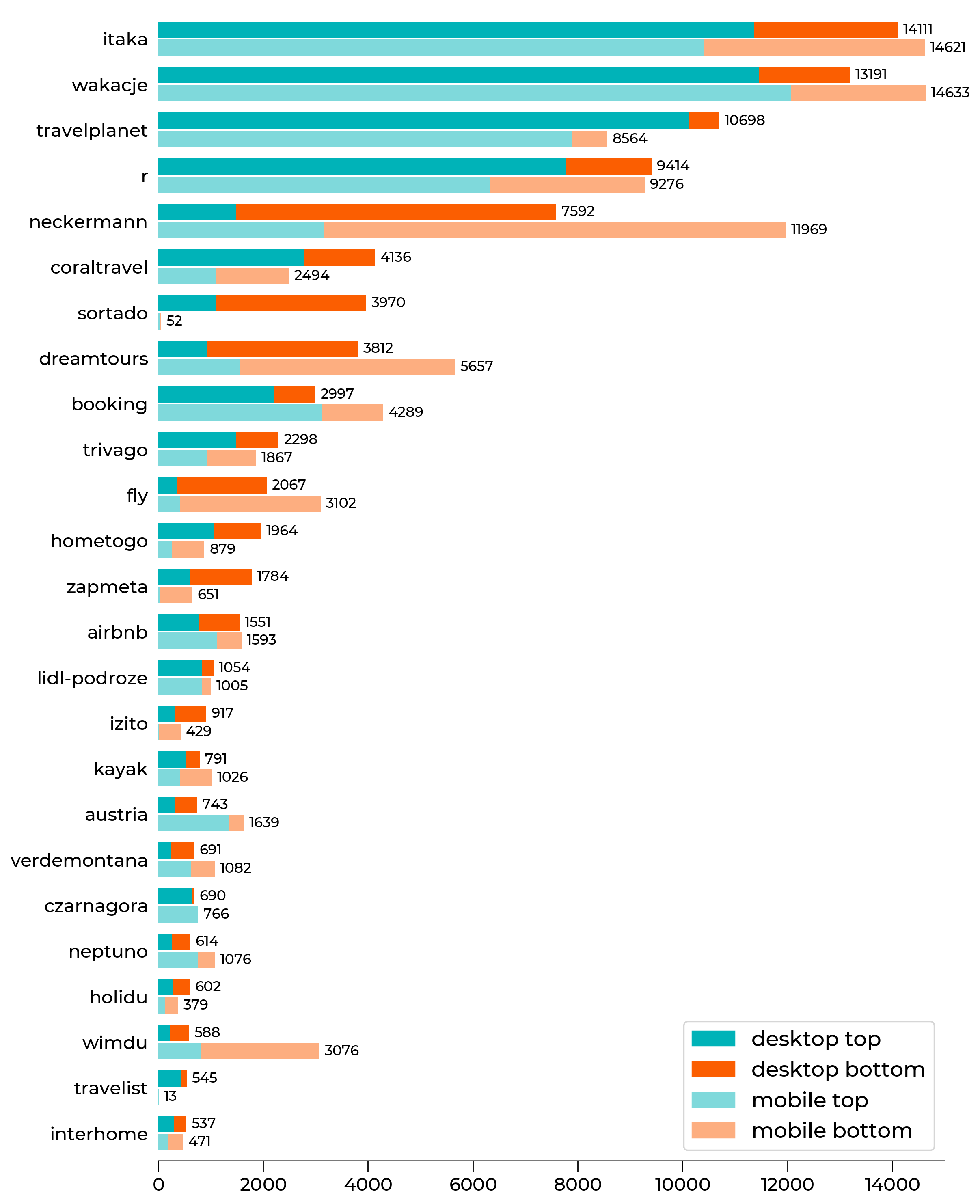
The figure above is a standard horizontal bar plot that can be reproduced with barh function in Matplotlib. Each y-tick has 4 different pieces (see legend). We also added automatically generated count numbers at the end of each bar for better readability. The code snippet is shown below:
import matplotlib.pyplot as plt
import matplotlib.patches as mpatches
from matplotlib.colors import LinearSegmentedColormap, PowerNorm

# -----------------------------
# Set default colors
# -----------------------------
blues = LinearSegmentedColormap.from_list(name='WhitesBlues', colors=['#FFFFFF', '#00B3B8'], gamma=1.0)
oranges = LinearSegmentedColormap.from_list(name='WhitesOranges', colors=['#FFFFFF', '#FB5E01'], gamma=1.0)

# colors
desktop_top = blues(1.0)
desktop_bottom = oranges(1.0)
mobile_top = blues(0.5)
mobile_bottom = oranges(0.5)

# -----------------------------
# Prepare Figure
# -----------------------------
fig, ax = plt.subplots(figsize=(10,15))
ax.grid(False)

# -----------------------------
# Plot bars
# -----------------------------
# just demonstration

for name in yticklabels:
    # tmp_desktop - DataFrame with desktop data
    # tmp_mobile - DataFrame with mobile data

    ax.barh(cnt, tmp_desktop['top'], color=desktop_top, height=0.9)
    ax.barh(cnt, tmp_desktop['bottom'], left=tmp_desktop['top'], color=desktop_bottom, height=0.9)
    # text counter
    ax.text(tmp_desktop['all']+100, cnt, "%d" % tmp_desktop['all'], horizontalalignment='left',
            verticalalignment='center', fontsize=10)

    ax.barh(cnt-1, tmp_mobile['top'], color=mobile_top, height=0.9)
    ax.barh(cnt-1, tmp_mobile['bottom'], left=tmp_mobile['top'], color=mobile_bottom, height=0.9)
    ax.text(tmp_mobile['all']+100, cnt-1, "%d" % tmp_mobile['all'], horizontalalignment='left',
            verticalalignment='center', fontsize=10)


    yticks.append(cnt)

    cnt = cnt - 2.5

# -----------------------------
# set labels
# -----------------------------
ax.set_yticks(yticks)
ax.set_yticklabels(yticklabels)

# -----------------------------
# Add legend manually
# -----------------------------
legend_elements = [
    mpatches.Patch(color=desktop_top, label='desktop top'),
    mpatches.Patch(color=desktop_bottom, label='desktop bottom'),
    mpatches.Patch(color=mobile_top, label='mobile top'),
    mpatches.Patch(color=mobile_bottom, label='mobile bottom')
]

ax.legend(handles=legend_elements, fontsize=15)
Summary
This is just a sample from our studies and more can be found on our website. The Matplotlib library meets our needs in terms of visual capabilities and flexibility. It allows us to create standard plots in a single line of code, as well as experiment with different forms of graphs thanks to its lower level features. Thanks to opportunities offered by Matplotlib we may present the complicated data in a simple and reader-friendly way.