Visualizing Code-Switching with Step Charts
Posted
Introduction
Code-switching is the practice of alternating between two or more languages in the context of a single conversation, either consciously or unconsciously. As someone who grew up bilingual and is currently learning other languages, I find code-switching a fascinating facet of communication from not only a purely linguistic perspective, but also a social one. In particular, I've personally found that code-switching often helps build a sense of community and familiarity in a group and that the unique ways in which speakers code-switch with each other greatly contribute to shaping group dynamics.
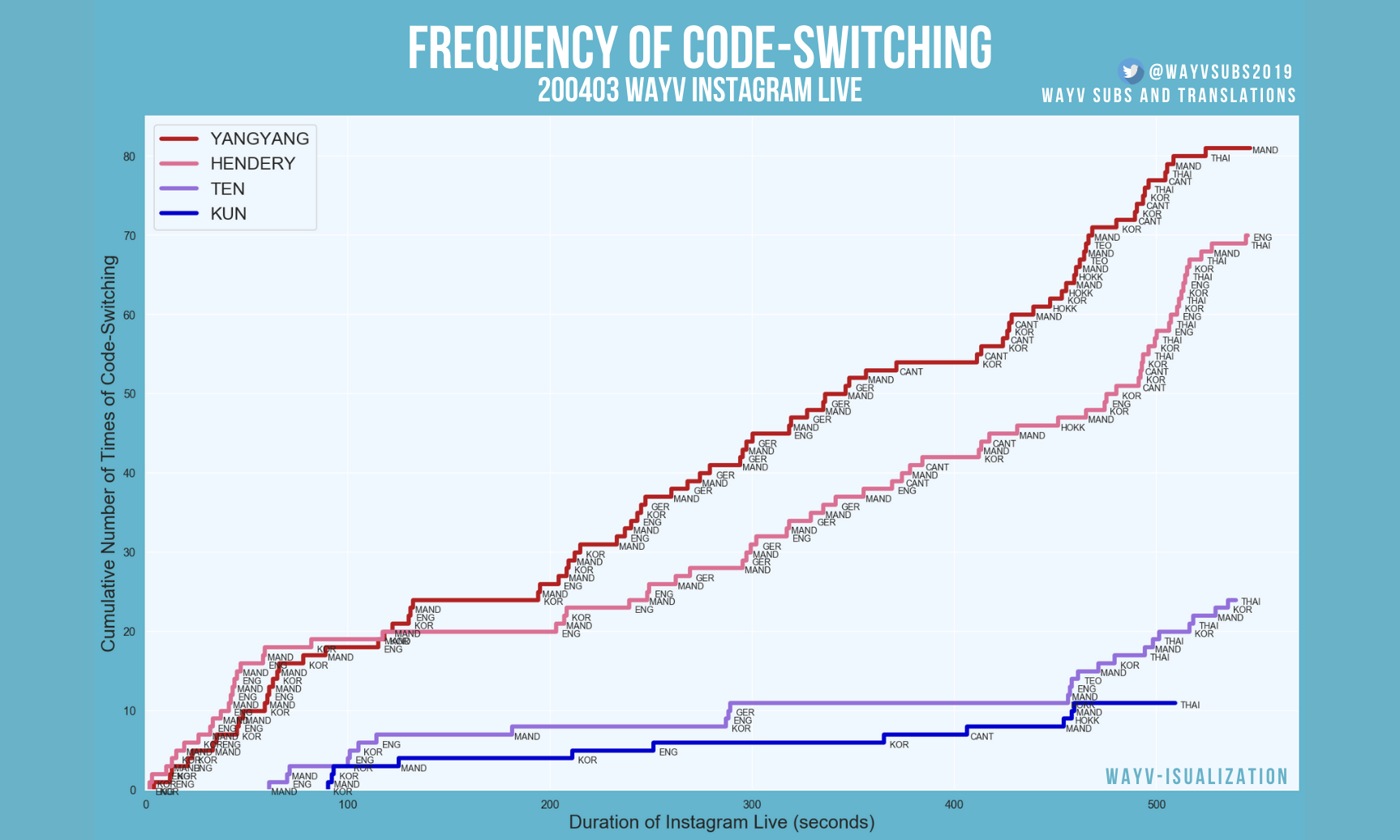
This is something that's evident in seven-member pop boy group WayV. Aside from their discography, artistry, and group chemistry, WayV is well-known among fans and many non-fans alike for their multilingualism and code-switching, which many fans have affectionately coined as “WayV language.” Every member in the group is fluent in both Mandarin and Korean, and at least one member in the group is fluent in one or more of the following: English, Cantonese, Thai, Wenzhounese, and German. It's an impressive trait that's become a trademark of WayV as they've quickly drawn a global audience since their debut in January 2019. Their multilingualism is reflected in their music as well. On top of their regular album releases in Mandarin, WayV has also released singles in Korean and English, with their latest single “Bad Alive (English Ver.)” being a mix of English, Korean, and Mandarin.
As an independent translator who translates WayV content into English, I've become keenly aware of the true extent and rate of WayV's code-switching when communicating with each other. In a lot of their content, WayV frequently switches between three or more languages every couple of seconds, a phenomenon that can make translating quite challenging at times, but also extremely rewarding and fun. I wanted to be able to present this aspect of WayV in a way that would both highlight their linguistic skills and present this dimension of their group dynamic in a more concrete, quantitative, and visually intuitive manner, beyond just stating that “they code-switch a lot.” This prompted me to make step charts - perfect for displaying data that changes at irregular intervals but remains constant between the changes - in hopes of enriching the viewer's experience and helping make a potentially abstract concept more understandable and readily consumable. With a step chart, it becomes more apparent to the viewer the extent of how a group communicates, and cross-sections of the graph allow a rudimentary look into how multilinguals influence each other in code-switching.
Tutorial
This tutorial on creating step charts uses one of WayV's livestreams as an example. There were four members in this livestream and a total of eight languages/dialects spoken. I will go through the basic steps of creating a step chart that depicts the frequency of code-switching for just one member. A full code chunk that shows how to layer two or more step chart lines in one graph to depict code-switching for multiple members can be found near the end.
Dataset
First, we import the required libraries and load the data into a Pandas dataframe.
import pandas as pd
import matplotlib.pyplot as plt
import seaborn as sns
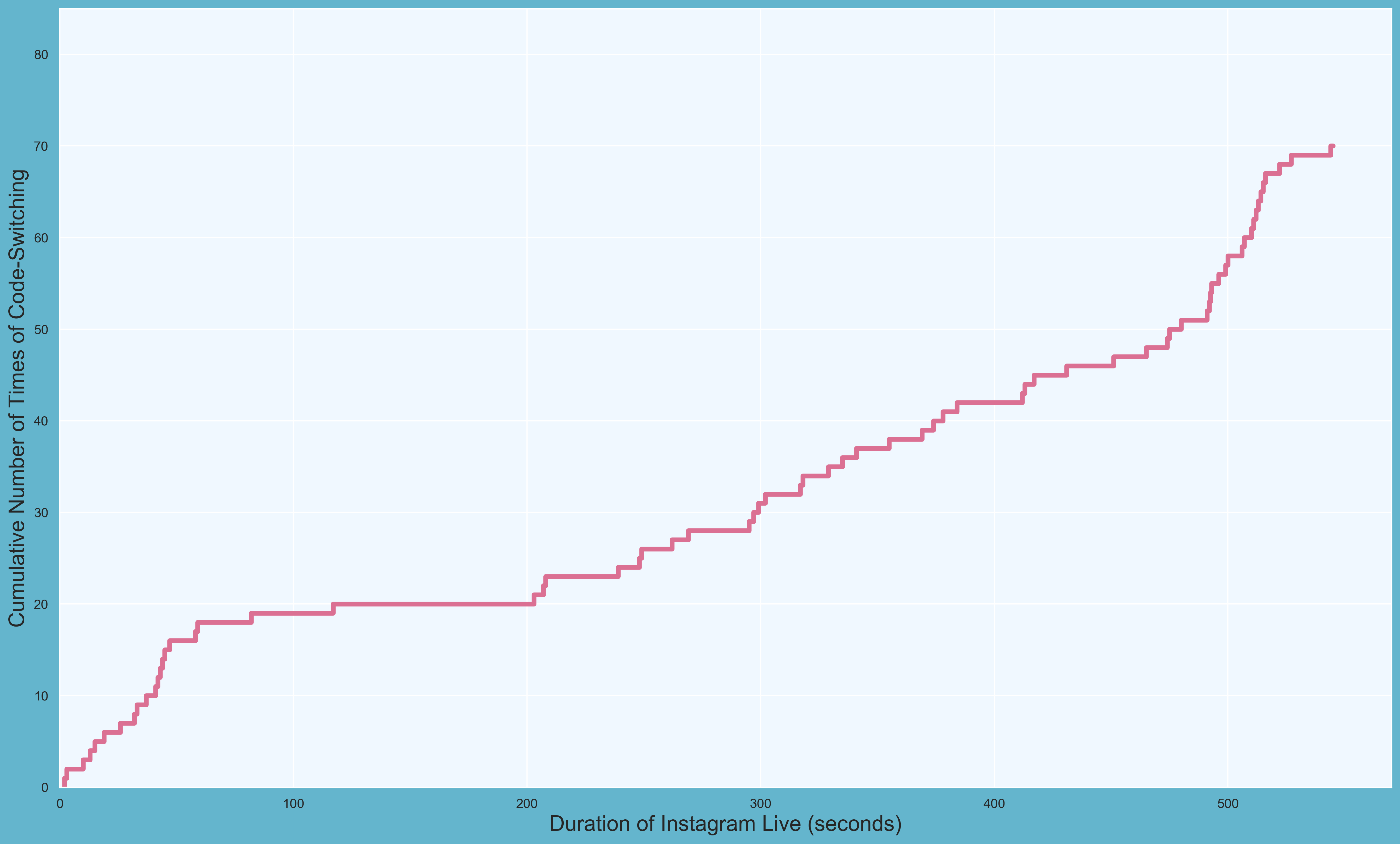
This dataset includes the timestamp of every switch (in seconds) and the language of switch for one speaker.
df_h = pd.read_csv("WayVHendery.csv")
HENDERY = df_h.reset_index()
HENDERY.head()
| index | time | lang |
|---|---|---|
| 0 | 2 | ENG |
| 1 | 3 | KOR |
| 2 | 10 | ENG |
| 3 | 13 | MAND |
| 4 | 15 | ENG |
Plotting
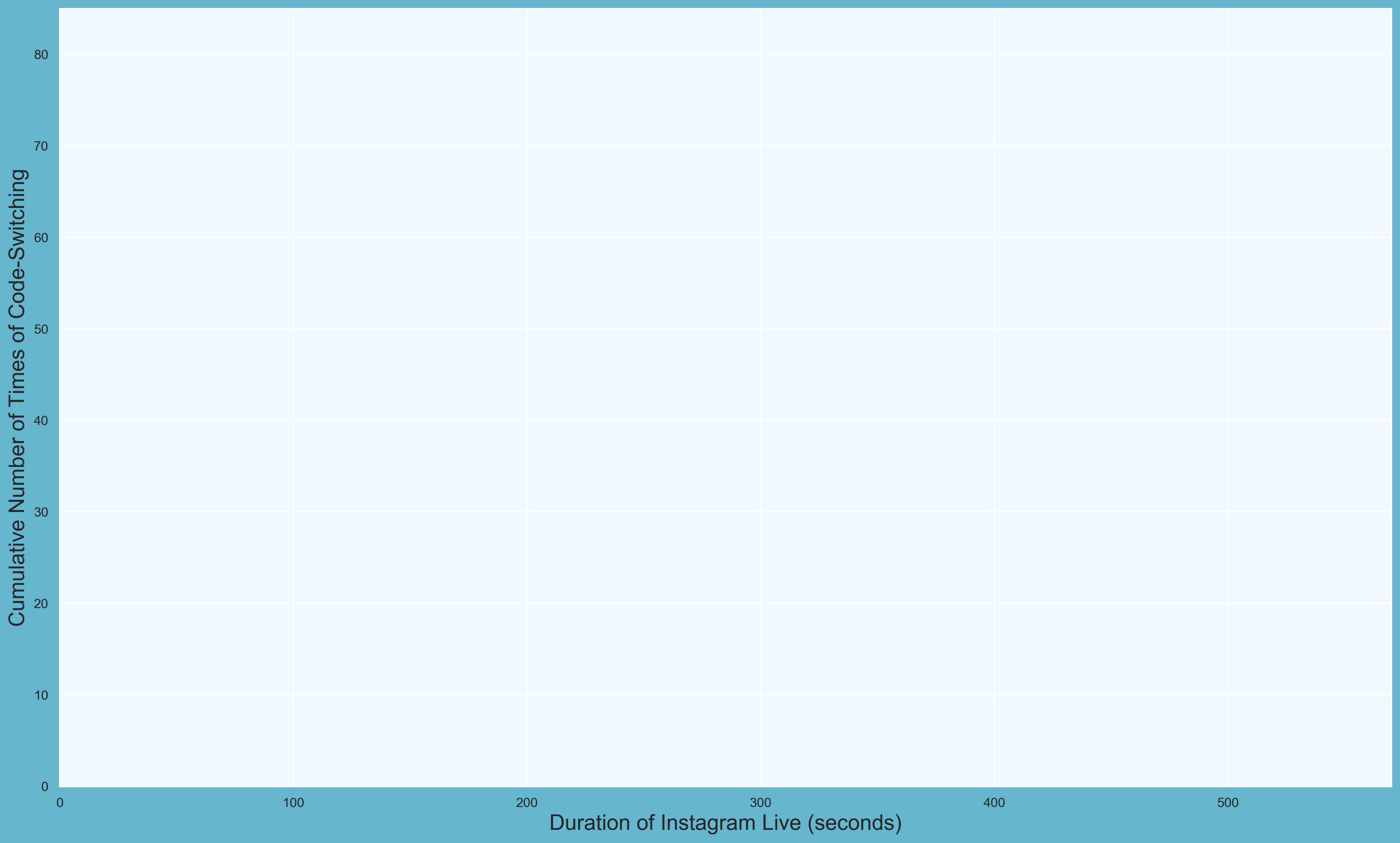
With the dataset loaded, we can now set up our graph in terms of determining the size of the figure, dpi, font size, and axes limits. We can also play around with the aesthetics, such as modifying the colors of our plot. These few simple steps easily transform the default all-white graph into a more visually appealing one.
Without Customization
fig, ax = plt.subplots(figsize = (20,12))
With Customization
sns.set(rc={'axes.facecolor':'aliceblue', 'figure.facecolor':'c'})
fig, ax = plt.subplots(figsize = (20,12), dpi = 300)

plt.xlabel("Duration of Instagram Live (seconds)", fontsize = 18)
plt.ylabel("Cumulative Number of Times of Code-Switching", fontsize = 18)

plt.xlim(0, 570)
plt.ylim(0, 85)
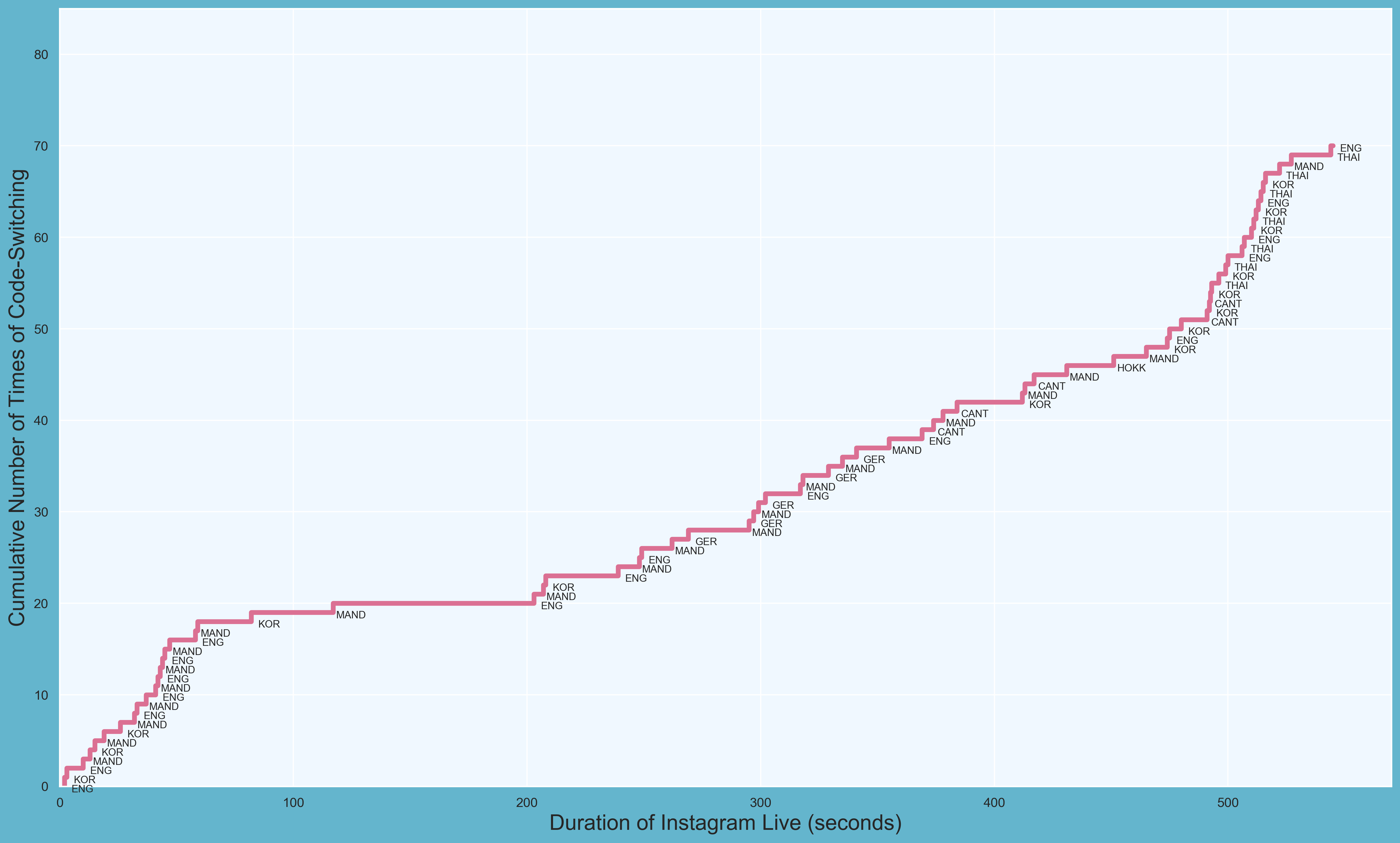
Following this, we can make our step chart line easily with matplotlib.pyplot.step, in which we plot the x and y values and determine the text of the legend, color of the step chart line, and width of the step chart line.
ax.step(HENDERY.time, HENDERY.index, label = "HENDERY", color = "palevioletred", linewidth = 4)
Labeling
Of course, we want to know not only how many switches there were and when they occurred, but also to what language the member switched. For this, we can write a for loop that labels each switch with its respective language as recorded in our dataset.
for x,y,z in zip(HENDERY["time"], HENDERY["index"], HENDERY["lang"]):
    label = z
    ax.annotate(label, #text
                 (x,y), #label coordinate
                 textcoords = "offset points", #how to position text
                 xytext = (15,-5), #distance from text to coordinate (x,y)
                 ha = "center", #alignment
                 fontsize = 8.5) #font size of text
Final Touches
Now add a title, save the graph, and there you have it!
plt.title("WayV Livestream Code-Switching", fontsize = 35)

fig.savefig("wayv_codeswitching.png", bbox_inches = "tight", facecolor = fig.get_facecolor())
Below is the complete code for layering step chart lines for multiple speakers in one graph. You can see how easy it is to take the code for visualizing the code-switching of one speaker and adapt it to visualizing that of multiple speakers. In addition, you can see that I've intentionally left the title blank so I can incorporate external graphic adjustments after I created the chart in Matplotlib, such as the addition of my social media handle and the use of a specific font I wanted, which you can see in the final graph. With visualizations being all about communicating information, I believe using Matplotlib in conjunction with simple elements of graphic design can be another way to make whatever you're presenting that little bit more effective and personal, especially when you're doing so on social media platforms.
Complete Code for Step Chart of Multiple Speakers
# Initialize graph color and size
sns.set(rc={'axes.facecolor':'aliceblue', 'figure.facecolor':'c'})

fig, ax = plt.subplots(figsize = (20,12), dpi = 120)

# Set up axes and labels
plt.xlabel("Duration of Instagram Live (seconds)", fontsize = 18)
plt.ylabel("Cumulative Number of Times of Code-Switching", fontsize = 18)

plt.xlim(0, 570)
plt.ylim(0, 85)

# Layer step charts for each speaker
ax.step(YANGYANG.time, YANGYANG.index, label = "YANGYANG", color = "firebrick", linewidth = 4)
ax.step(HENDERY.time, HENDERY.index, label = "HENDERY", color = "palevioletred", linewidth = 4)
ax.step(TEN.time, TEN.index, label = "TEN", color = "mediumpurple", linewidth = 4)
ax.step(KUN.time, KUN.index, label = "KUN", color = "mediumblue", linewidth = 4)

# Add legend
ax.legend(fontsize = 17)

# Label each data point with the language switch
for i in (KUN, TEN, HENDERY, YANGYANG): #for each dataset
    for x,y,z in zip(i["time"], i["index"], i["lang"]): #looping within the dataset
        label = z
        ax.annotate(label, #text
                     (x,y), #label coordinate
                     textcoords = "offset points", #how to position text
                     xytext = (15,-5), #distance from text to coordinate (x,y)
                     ha = "center", #alignment
                     fontsize = 8.5) #font size of text

# Add title (blank to leave room for external graphics)
plt.title("\n\n", fontsize = 35)

# Save figure
fig.savefig("wayv_codeswitching.png", bbox_inches = "tight", facecolor = fig.get_facecolor())
Languages/dialects: Korean (KOR), English (ENG), Mandarin (MAND), German (GER), Cantonese (CANT), Hokkien (HOKK), Teochew (TEO), Thai (THAI)
186 total switches! That's approximately one code-switch in the group every 2.95 seconds.
And voilà! There you have it: a brief guide on how to make step charts. While I utilized step charts here to visualize code-switching, you can use them to visualize whatever data you would like. Please feel free to contact me here if you have any questions or comments. I hope you enjoyed this tutorial, and thank you so much for reading!