Animated polar plot with oceanographic data
Posted
The ocean is a key component of the Earth climate system. It thus needs a continuous real-time monitoring to help scientists better understand its dynamic and predict its evolution. All around the world, oceanographers have managed to join their efforts and set up a Global Ocean Observing System among which Argo is a key component. Argo is a global network of nearly 4000 autonomous probes or floats measuring pressure, temperature and salinity from the surface to 2000m depth every 10 days. The localisation of these floats is nearly random between the 60th parallels (see live coverage here). All data are collected by satellite in real-time, processed by several data centers and finally merged in a single dataset (collecting more than 2 millions of vertical profiles data) made freely available to anyone.
In this particular case, we want to plot temperature (surface and 1000m deep) data measured by those floats, for the period 2010-2020 and for the Mediterranean sea. We want this plot to be circular and animated, now you start to get the title of this post: Animated polar plot.
First we need some data to work with. To retrieve our temperature values from Argo, we use Argopy, which is a Python library that aims to ease Argo data access, manipulation and visualization for standard users, as well as Argo experts and operators. Argopy returns xarray dataset objects, which make our analysis much easier.
import pandas as pd
import numpy as np
from argopy import DataFetcher as ArgoDataFetcher
argo_loader = ArgoDataFetcher(cache=True)
#

# Query surface and 1000m temp in Med sea with argopy

df1 = argo_loader.region([-1.2,29.,28.,46.,0,10.,'2009-12','2020-01']).to_xarray()
df2 = argo_loader.region([-1.2,29.,28.,46.,975.,1025.,'2009-12','2020-01']).to_xarray()
#
Here we create some arrays we'll use for plotting, we set up a date array and extract day of the year and year itself that will be usefull. Then to build our temperature array, we use xarray very usefull methods : where() and mean(). Then we build a pandas Dataframe, because it's prettier!
# Weekly date array

daterange=np.arange('2010-01-01','2020-01-03',dtype='datetime64[7D]')
dayoftheyear=pd.DatetimeIndex(np.array(daterange,dtype='datetime64[D]')+3).dayofyear # middle of the week

activeyear=pd.DatetimeIndex(np.array(daterange,dtype='datetime64[D]')+3).year # extract year


# Init final arrays

tsurf=np.zeros(len(daterange))
t1000=np.zeros(len(daterange))

# Filling arrays

for i in range(len(daterange)):
    i1=(df1['TIME']>=daterange[i])&(df1['TIME']<daterange[i]+7)
    i2=(df2['TIME']>=daterange[i])&(df2['TIME']<daterange[i]+7)
    tsurf[i]=df1.where(i1,drop=True)['TEMP'].mean().values
    t1000[i]=df2.where(i2,drop=True)['TEMP'].mean().values

# Creating dataframe

d = {'date': np.array(daterange,dtype='datetime64[D]'), 'tsurf': tsurf, 't1000': t1000}
ndf = pd.DataFrame(data=d)
ndf.head()

	date 	tsurf 	t1000
0 	2009-12-31 	15.725000 	13.306133
1 	2010-01-07 	15.530414 	13.315658
2 	2010-01-14 	15.307378 	13.300347
3 	2010-01-21 	14.954195 	13.300647
4 	2010-01-28 	14.708816 	13.300274
Then it's time to plot, for that we first need to import what we need, and set some usefull variables.
import matplotlib.pyplot as plt
import matplotlib
plt.rcParams['xtick.major.pad']='17'
plt.rcParams["axes.axisbelow"] = False
matplotlib.rc('axes',edgecolor='w')
from matplotlib.lines import Line2D
from matplotlib.animation import FuncAnimation
from IPython.display import HTML

big_angle= 360/12  # How we split our polar space

date_angle=((360/365)*dayoftheyear)*np.pi/180  # For a day, a corresponding angle

# inner and outer ring limit values

inner=10
outer=30
# setting our color values

ocean_color = ["#ff7f50","#004752"]
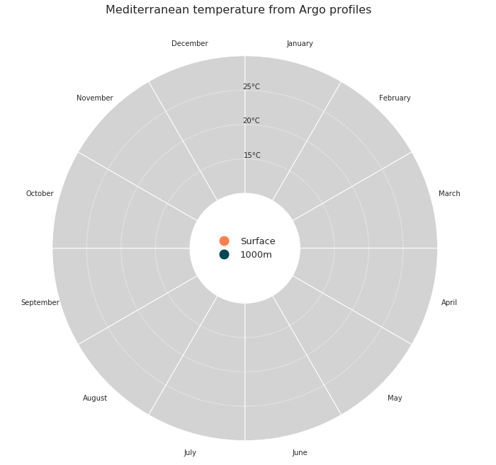
Now we want to make our axes like we want, for that we build a function dress_axes that will be called during the animation process. Here we plot some bars with an offset (combination of bottom and ylim after). Those bars are actually our background, and the offset allows us to plot a legend in the middle of the plot.
def dress_axes(ax):
    ax.set_facecolor('w')
    ax.set_theta_zero_location("N")
    ax.set_theta_direction(-1)
    # Here is how we position the months labels

    middles=np.arange(big_angle/2 ,360, big_angle)*np.pi/180
    ax.set_xticks(middles)
    ax.set_xticklabels(['January', 'February', 'March', 'April', 'May', 'June', 'July', 'August','September','October','November','December'])
    ax.set_yticks([15,20,25])
    ax.set_yticklabels(['15°C','20°C','25°C'])
    # Changing radial ticks angle

    ax.set_rlabel_position(359)
    ax.tick_params(axis='both',color='w')
    plt.grid(None,axis='x')
    plt.grid(axis='y',color='w', linestyle=':', linewidth=1)
    # Here is the bar plot that we use as background

    bars = ax.bar(middles, outer, width=big_angle*np.pi/180, bottom=inner, color='lightgray', edgecolor='w',zorder=0)
    plt.ylim([2,outer])
    # Custom legend

    legend_elements = [Line2D([0], [0], marker='o', color='w', label='Surface', markerfacecolor=ocean_color[0], markersize=15),
                       Line2D([0], [0], marker='o', color='w', label='1000m', markerfacecolor=ocean_color[1], markersize=15),
                       ]
    ax.legend(handles=legend_elements, loc='center', fontsize=13, frameon=False)
    # Main title for the figure

    plt.suptitle('Mediterranean temperature from Argo profiles',fontsize=16,horizontalalignment='center')
From there we can plot the frame of our plot.
fig = plt.figure(figsize=(10,10))
ax = fig.add_subplot(111, polar=True)
dress_axes(ax)
plt.show()
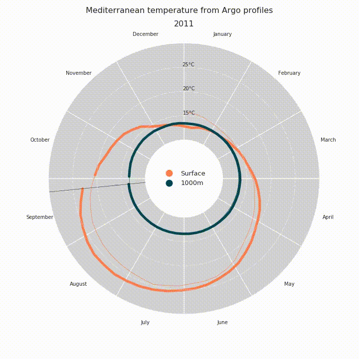
Then it's finally time to plot our data. Since we want to animated the plot, we'll build a function that will be called in FuncAnimation later on. Since the state of the plot changes on every time stamp, we have to redress the axes for each frame, easy with our dress_axes function. Then we plot our temperature data using basic plot(): thin lines for historical measurements, thicker lines for the current year.
def draw_data(i):
    # Clear

    ax.cla()
    # Redressing axes

    dress_axes(ax)
    # Limit between thin lines and thick line, this is current date minus 51 weeks basically.

    # why 51 and not 52 ? That create a small gap before the current date, which is prettier

    i0=np.max([i-51,0])

    ax.plot(date_angle[i0:i+1], ndf['tsurf'][i0:i+1],'-',color=ocean_color[0],alpha=1.0,linewidth=5)
    ax.plot(date_angle[0:i+1], ndf['tsurf'][0:i+1],'-',color=ocean_color[0],linewidth=0.7)

    ax.plot(date_angle[i0:i+1], ndf['t1000'][i0:i+1],'-',color=ocean_color[1],alpha=1.0,linewidth=5)
    ax.plot(date_angle[0:i+1], ndf['t1000'][0:i+1],'-',color=ocean_color[1],linewidth=0.7)

    # Plotting a line to spot the current date easily

    ax.plot([date_angle[i],date_angle[i]],[inner,outer],'k-',linewidth=0.5)
    # Display the current year as a title, just beneath the suptitle

    plt.title(str(activeyear[i]),fontsize=16,horizontalalignment='center')

# Test it

draw_data(322)
plt.show()
Finally it's time to animate, using FuncAnimation. Then we save it as a mp4 file or we display it in our notebook with HTML(anim.to_html5_video()).
anim = FuncAnimation(fig, draw_data, interval=40, frames=len(daterange)-1, repeat=False)
#anim.save('ArgopyUseCase_MedTempAnimation.mp4')

HTML(anim.to_html5_video())