mpl_data_containers Documentation#
This is prototype development for the next generation of data structures for Matplotlib. This is the version “to throw away”. Everything in this repository should be considered experimental and used at you own risk.
Source : matplotlib/data-prototype
Examples#
Examples#
Examples used in the rapid prototyping of this project.

An simple scatter plot using PathCollectionWrapper
Note
Go to the end to download the full example code.
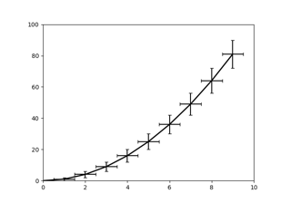
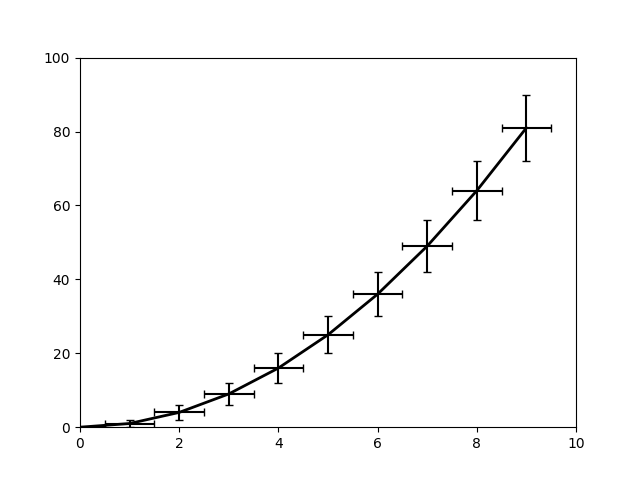
Errorbar graph#
Using containers.ArrayContainer and wrappers.ErrorbarWrapper
to plot a graph with error bars.
import matplotlib.pyplot as plt
import numpy as np


from mpl_data_containers.wrappers import ErrorbarWrapper
from mpl_data_containers.containers import ArrayContainer

x = np.arange(10)
y = x**2
yupper = y + np.sqrt(y)
ylower = y - np.sqrt(y)
xupper = x + 0.5
xlower = x - 0.5

ac = ArrayContainer(
    x=x, y=y, yupper=yupper, ylower=ylower, xlower=xlower, xupper=xupper
)


fig, ax = plt.subplots()

ew = ErrorbarWrapper(ac)
ax.add_artist(ew)
ax.set_xlim(0, 10)
ax.set_ylim(0, 100)
plt.show()
Note
Go to the end to download the full example code.
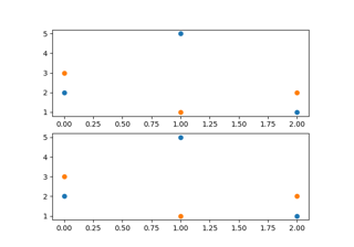
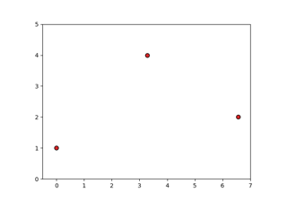
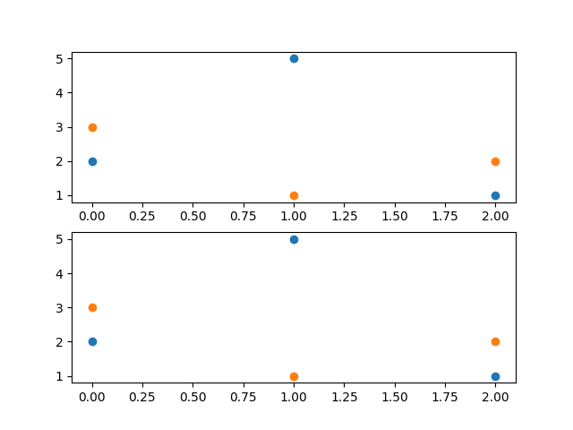
An simple scatter plot using ax.scatter#
This is a quick comparison between the current Matplotlib scatter and
the version in mpl_data_containers/axes.py, which uses data containers
and a conversion pipeline.
This is here to show what does work and what does not work with the current implementation of container-based artist drawing.
import mpl_data_containers.axes  # side-effect registers projection # noqa

import matplotlib.pyplot as plt

fig = plt.figure()
newstyle = fig.add_subplot(2, 1, 1, projection="mpl-data-containers")
oldstyle = fig.add_subplot(2, 1, 2)

newstyle.scatter([0, 1, 2], [2, 5, 1])
oldstyle.scatter([0, 1, 2], [2, 5, 1])
newstyle.scatter([0, 1, 2], [3, 1, 2])
oldstyle.scatter([0, 1, 2], [3, 1, 2])


# Autoscaling not working
newstyle.set_xlim(oldstyle.get_xlim())
newstyle.set_ylim(oldstyle.get_ylim())

plt.show()
Note
Go to the end to download the full example code.
Circle#
Example of directly creating a Patch artist that is defined by a x, y, and path codes.

import matplotlib.pyplot as plt


from mpl_data_containers.artist import CompatibilityAxes
from mpl_data_containers.patches import Patch
from mpl_data_containers.containers import ArrayContainer

from matplotlib.path import Path

c = Path.unit_circle()

sc = ArrayContainer(None, x=c.vertices[:, 0], y=c.vertices[:, 1], codes=c.codes)
lw2 = Patch(sc, linewidth=3, linestyle=":", edgecolor="C5", alpha=1, hatch=None)

fig, nax = plt.subplots()
nax.set_aspect("equal")
ax = CompatibilityAxes(nax)
nax.add_artist(ax)
ax.add_artist(lw2, 2)
ax.set_xlim(-1.1, 1.1)
ax.set_ylim(-1.1, 1.1)

plt.show()
Note
Go to the end to download the full example code.
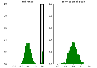
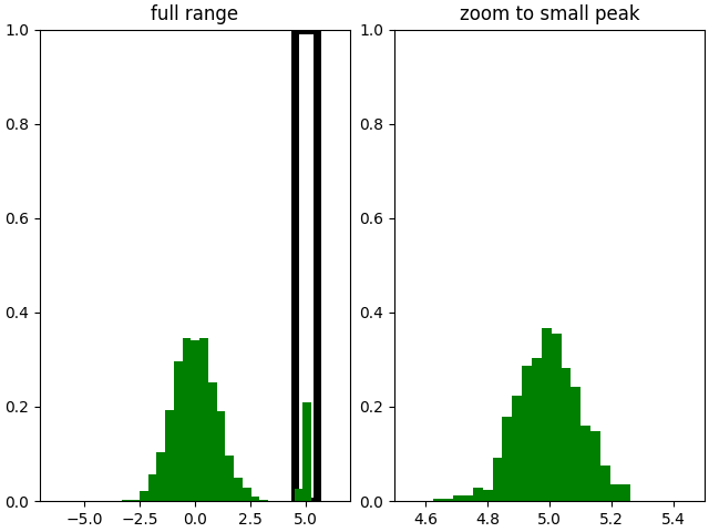
A re-binning histogram#
A containers.HistContainer which is used with wrappers.StepWrapper
to provide a histogram which recomputes the bins based on a range selected.
import matplotlib.pyplot as plt
import numpy as np

from mpl_data_containers.wrappers import StepWrapper
from mpl_data_containers.containers import HistContainer

hc = HistContainer(
    np.concatenate([np.random.randn(5000), 0.1 * np.random.randn(500) + 5]), 25
)


fig, (ax1, ax2) = plt.subplots(1, 2, layout="constrained")
for ax in (ax1, ax2):
    ax.add_artist(StepWrapper(hc, lw=0, color="green"))
    ax.set_ylim(0, 1)

ax1.set_xlim(-7, 7)
ax1.axvspan(4.5, 5.5, facecolor="none", zorder=-1, lw=5, edgecolor="k")
ax1.set_title("full range")

ax2.set_xlim(4.5, 5.5)
ax2.set_title("zoom to small peak")


plt.show()
Note
Go to the end to download the full example code.
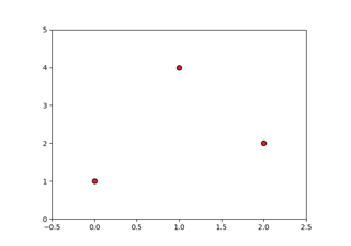
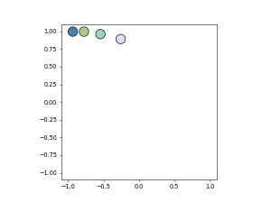
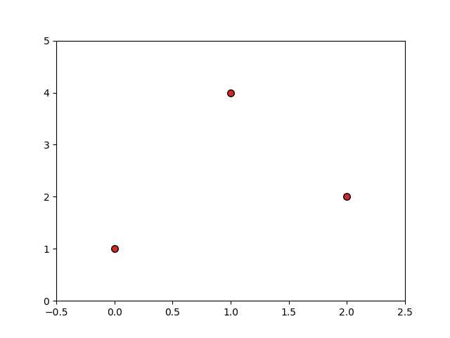
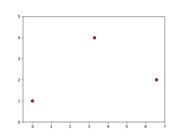
An simple scatter plot using PathCollectionWrapper#
A quick scatter plot using containers.ArrayContainer and
wrappers.PathCollectionWrapper.
import numpy as np

import matplotlib.pyplot as plt
import matplotlib.markers as mmarkers

from mpl_data_containers.containers import ArrayContainer

from mpl_data_containers.wrappers import PathCollectionWrapper

marker_obj = mmarkers.MarkerStyle("o")

cont = ArrayContainer(
    x=np.array([0, 1, 2]),
    y=np.array([1, 4, 2]),
    paths=np.array([marker_obj.get_path()]),
    sizes=np.array([12]),
    edgecolors=np.array(["k"]),
    facecolors=np.array(["C3"]),
)

fig, ax = plt.subplots()
ax.set_xlim(-0.5, 2.5)
ax.set_ylim(0, 5)
lw = PathCollectionWrapper(cont, offset_transform=ax.transData)
ax.add_artist(lw)
plt.show()
Note
Go to the end to download the full example code.
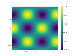
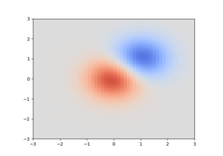
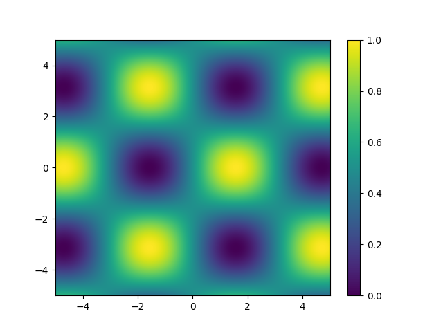
A functional 2D image#
A 2D image generated using containers.FuncContainer and
wrappers.ImageWrapper.
import matplotlib.pyplot as plt
import numpy as np

from mpl_data_containers.artist import CompatibilityAxes
from mpl_data_containers.image import Image
from mpl_data_containers.containers import FuncContainer

from matplotlib.colors import Normalize


fc = FuncContainer(
    {},
    xyfuncs={
        "x": ((2,), lambda x, y: [x[0], x[-1]]),
        "y": ((2,), lambda x, y: [y[0], y[-1]]),
        "image": (
            ("N", "M"),
            lambda x, y: np.sin(x).reshape(1, -1) * np.cos(y).reshape(-1, 1),
        ),
    },
)
norm = Normalize(vmin=-1, vmax=1)
im = Image(fc, norm=norm)

fig, nax = plt.subplots()
ax = CompatibilityAxes(nax)
nax.add_artist(ax)

ax.add_artist(im)
ax.set_xlim(-5, 5)
ax.set_ylim(-5, 5)
# fig.colorbar(im, ax=nax)
plt.show()
Note
Go to the end to download the full example code.
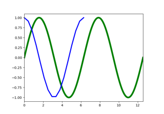
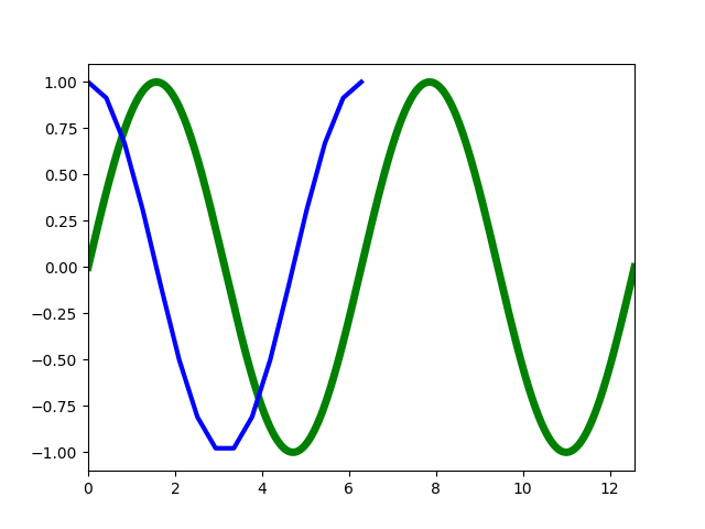
A functional line#
Demonstrating the differences between containers.FuncContainer and
containers.SeriesContainer using artist.Line.
import matplotlib.pyplot as plt
import numpy as np
import pandas as pd

from mpl_data_containers.artist import CompatibilityAxes
from mpl_data_containers.line import Line
from mpl_data_containers.containers import FuncContainer, SeriesContainer


fc = FuncContainer({"x": (("N",), lambda x: x), "y": (("N",), lambda x: np.sin(1 / x))})
lw = Line(fc, linewidth=5, color="green", label="sin(1/x) (function)")

th = np.linspace(0, 2 * np.pi, 16)
sc = SeriesContainer(pd.Series(index=th, data=np.cos(th)), index_name="x", col_name="y")
lw2 = Line(
    sc,
    linewidth=3,
    linestyle=":",
    color="C0",
    label="cos (pandas)",
    marker=".",
    markersize=12,
)

fig, nax = plt.subplots()
ax = CompatibilityAxes(nax)
nax.add_artist(ax)
ax.add_artist(lw, 3)
ax.add_artist(lw2, 2)
ax.set_xlim(0, np.pi * 4)
ax.set_ylim(-1.1, 1.1)

plt.show()
Note
Go to the end to download the full example code.
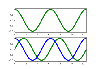
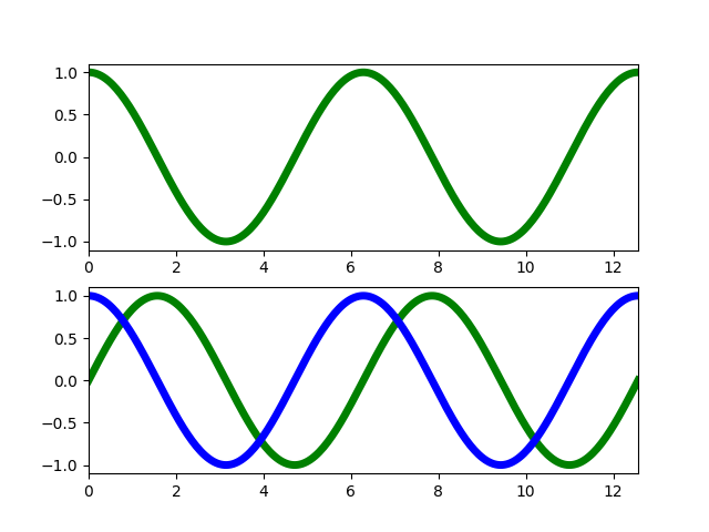
Show data frame#
Wrapping a pandas.DataFrame using containers.DataFrameContainer
and artist.Line.
import matplotlib.pyplot as plt
import numpy as np
import pandas as pd

from mpl_data_containers.artist import CompatibilityArtist as CA
from mpl_data_containers.line import Line
from mpl_data_containers.containers import DataFrameContainer

th = np.linspace(0, 4 * np.pi, 256)

dc1 = DataFrameContainer(
    pd.DataFrame({"x": th, "y": np.cos(th)}), index_name=None, col_names=lambda n: n
)

df = pd.DataFrame(
    {
        "cos": np.cos(th),
        "sin": np.sin(th),
    },
    index=th,
)


dc2 = DataFrameContainer(df, index_name="x", col_names={"sin": "y"})
dc3 = DataFrameContainer(df, index_name="x", col_names={"cos": "y"})


fig, (ax1, ax2) = plt.subplots(2, 1)
ax1.add_artist(CA(Line(dc1, linewidth=5, color="green", label="sin")))
ax2.add_artist(CA(Line(dc2, linewidth=5, color="green", label="sin")))
ax2.add_artist(CA(Line(dc3, linewidth=5, color="blue", label="cos")))
for ax in (ax1, ax2):
    ax.set_xlim(0, np.pi * 4)
    ax.set_ylim(-1.1, 1.1)

plt.show()
Note
Go to the end to download the full example code.
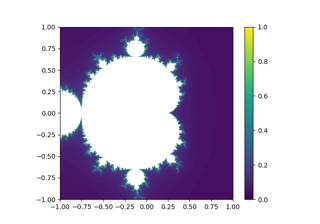
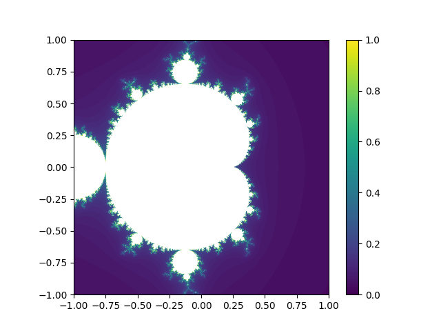
(Infinitly) Zoomable Mandelbrot Set#
A mandelbrot set which is computed using a containers.FuncContainer
and represented using a wrappers.ImageWrapper.
The mandelbrot recomputes as it is zoomed in and/or panned.
import matplotlib.pyplot as plt
import numpy as np

from mpl_data_containers.artist import CompatibilityAxes
from mpl_data_containers.image import Image
from mpl_data_containers.containers import FuncContainer

from matplotlib.colors import Normalize

maxiter = 75


def mandelbrot_set(X, Y, maxiter, *, horizon=3, power=2):
    C = X + Y[:, None] * 1j
    N = np.zeros_like(C, dtype=int)
    Z = np.zeros_like(C)
    for n in range(maxiter):
        mask = abs(Z) < horizon
        N += mask
        Z[mask] = Z[mask] ** power + C[mask]
    N[N == maxiter] = -1
    return Z, N


fc = FuncContainer(
    {},
    xyfuncs={
        "x": ((2,), lambda x, y: [x[0], x[-1]]),
        "y": ((2,), lambda x, y: [y[0], y[-1]]),
        "image": (("N", "M"), lambda x, y: mandelbrot_set(x, y, maxiter)[1]),
    },
)
cmap = plt.get_cmap()
cmap.set_under("w")
im = Image(fc, norm=Normalize(0, maxiter), cmap=cmap)

fig, nax = plt.subplots()
ax = CompatibilityAxes(nax)
nax.add_artist(ax)
ax.add_artist(im)
ax.set_xlim(-1, 1)
ax.set_ylim(-1, 1)

nax.set_aspect("equal")  # No equivalent yet

plt.show()
Total running time of the script: (0 minutes 1.369 seconds)
Note
Go to the end to download the full example code.
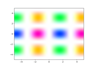
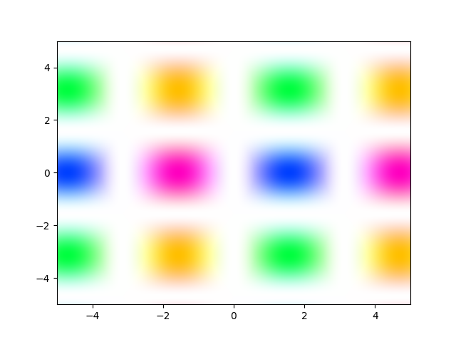
Custom bivariate colormap#
Using nu functions to account for two values when computing the color
of each pixel.
import matplotlib.pyplot as plt
import numpy as np

from mpl_data_containers.image import Image
from mpl_data_containers.artist import CompatibilityAxes
from mpl_data_containers.description import Desc
from mpl_data_containers.containers import FuncContainer
from mpl_data_containers.conversion_edge import FuncEdge

from matplotlib.colors import hsv_to_rgb


def func(x, y):
    return (
        (np.sin(x).reshape(1, -1) * np.cos(y).reshape(-1, 1)) ** 2,
        np.arctan2(np.cos(y).reshape(-1, 1), np.sin(x).reshape(1, -1)),
    )


def image_nu(image):
    saturation, angle = image
    hue = (angle + np.pi) / (2 * np.pi)
    value = np.ones_like(hue)
    return np.clip(hsv_to_rgb(np.stack([hue, saturation, value], axis=2)), 0, 1)


fc = FuncContainer(
    {},
    xyfuncs={
        "x": ((2,), lambda x, y: [x[0], x[-1]]),
        "y": ((2,), lambda x, y: [y[0], y[-1]]),
        "image": (("N", "M", 2), func),
    },
)

image_edges = FuncEdge.from_func(
    "image",
    image_nu,
    {"image": Desc(("M", "N", 2), "auto")},
    {"image": Desc(("M", "N", 3), "rgb")},
)

im = Image(fc, [image_edges])

fig, nax = plt.subplots()
ax = CompatibilityAxes(nax)
nax.add_artist(ax)
ax.add_artist(im)
ax.set_xlim(-5, 5)
ax.set_ylim(-5, 5)
plt.show()
Note
Go to the end to download the full example code.
Using pint units with PathCollectionWrapper#
Using third party units functionality in conjunction with Matplotlib Axes
import numpy as np
from collections import defaultdict

import matplotlib.pyplot as plt
import matplotlib.markers as mmarkers

from mpl_data_containers.artist import CompatibilityAxes
from mpl_data_containers.containers import ArrayContainer
from mpl_data_containers.conversion_edge import FuncEdge
from mpl_data_containers.description import Desc

from mpl_data_containers.line import Line

import pint

ureg = pint.UnitRegistry()
ureg.setup_matplotlib()

marker_obj = mmarkers.MarkerStyle("o")


coords = defaultdict(lambda: "auto")
coords["x"] = coords["y"] = "units"
cont = ArrayContainer(
    coords,
    x=np.array([0, 1, 2]) * ureg.m,
    y=np.array([1, 4, 2]) * ureg.m,
    paths=np.array([marker_obj.get_path()]),
    sizes=np.array([12]),
    edgecolors=np.array(["k"]),
    facecolors=np.array(["C3"]),
)

fig, nax = plt.subplots()
ax = CompatibilityAxes(nax)
nax.add_artist(ax)
ax.set_xlim(-0.5, 7)
ax.set_ylim(0, 5)

scalar = Desc((), "units")
unit_vector = Desc(("N",), "units")

xconv = FuncEdge.from_func(
    "xconv",
    lambda x, xunits: x.to(xunits).magnitude,
    {"x": unit_vector, "xunits": scalar},
    {"x": Desc(("N",), "data")},
)
yconv = FuncEdge.from_func(
    "yconv",
    lambda y, yunits: y.to(yunits).magnitude,
    {"y": unit_vector, "yunits": scalar},
    {"y": Desc(("N",), "data")},
)
lw = Line(cont, [xconv, yconv])

ax.add_artist(lw)
nax.xaxis.set_units(ureg.ft)
nax.yaxis.set_units(ureg.m)

plt.show()
Note
Go to the end to download the full example code.
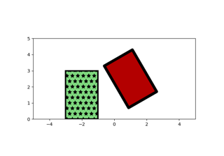
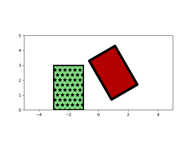
Simple patch artists#
Draw two fully specified rectangle patches.
Demonstrates patches.RectangleWrapper using
containers.ArrayContainer.
import numpy as np

import matplotlib.pyplot as plt
import matplotlib.patches as mpatches

from mpl_data_containers.containers import ArrayContainer
from mpl_data_containers.artist import CompatibilityAxes

from mpl_data_containers.patches import Rectangle

cont1 = ArrayContainer(
    lower_left_x=np.array(-3),
    lower_left_y=np.array(0),
    upper_right_x=np.array(-1),
    upper_right_y=np.array(3),
    edgecolor=np.array([0, 0, 0]),
    facecolor="green",
    linewidth=3,
    linestyle="-",
    antialiased=np.array([True]),
    fill=np.array([True]),
    capstyle=np.array(["round"]),
    joinstyle=np.array(["miter"]),
    alpha=np.array(0.5),
)

cont2 = ArrayContainer(
    lower_left_x=0,
    lower_left_y=np.array(1),
    upper_right_x=np.array(2),
    upper_right_y=np.array(5),
    angle=30,
    rotation_point_x=np.array(1),
    rotation_point_y=np.array(3.5),
    edgecolor=np.array([0.5, 0.2, 0]),
    facecolor="red",
    linewidth=6,
    linestyle="-",
    antialiased=np.array([True]),
    fill=np.array([True]),
    capstyle=np.array(["round"]),
    joinstyle=np.array(["miter"]),
)

fig, nax = plt.subplots()
ax = CompatibilityAxes(nax)
nax.add_artist(ax)
nax.set_xlim(-5, 5)
nax.set_ylim(0, 5)

rect = mpatches.Rectangle((4, 1), 2, 3, linewidth=6, edgecolor="black", angle=30)
nax.add_artist(rect)

rect1 = Rectangle(cont1, {})
rect2 = Rectangle(cont2, {})
ax.add_artist(rect1)
ax.add_artist(rect2)
nax.set_aspect(1)
plt.show()
Note
Go to the end to download the full example code.
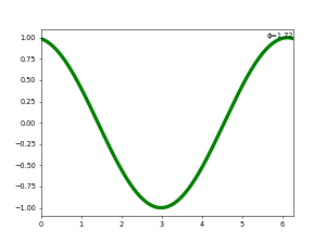
An animated line#
An animated line using a custom container class,
wrappers.LineWrapper, and wrappers.FormattedText.
import time
from typing import Dict, Tuple, Any, Union
from functools import partial

import numpy as np

import matplotlib.pyplot as plt
from matplotlib.animation import FuncAnimation

from mpl_data_containers.conversion_edge import Graph
from mpl_data_containers.description import Desc


from mpl_data_containers.artist import CompatibilityAxes
from mpl_data_containers.line import Line
from mpl_data_containers.text import Text
from mpl_data_containers.conversion_edge import FuncEdge


class SinOfTime:
    N = 1024
    # cycles per minutes
    scale = 10

    def describe(self):
        return {
            "x": Desc((self.N,)),
            "y": Desc((self.N,)),
            "phase": Desc(()),
            "time": Desc(()),
        }

    def query(
        self,
        graph: Graph,
        parent_coordinates: str = "axes",
    ) -> Tuple[Dict[str, Any], Union[str, int]]:
        th = np.linspace(0, 2 * np.pi, self.N)

        cur_time = time.time()

        phase = 2 * np.pi * (self.scale * cur_time % 60) / 60
        return {
            "x": th,
            "y": np.sin(th + phase),
            "phase": phase,
            "time": cur_time,
        }, hash(cur_time)


def update(frame, art):
    return art


sot_c = SinOfTime()
lw = Line(sot_c, linewidth=5, color="green", label="sin(time)")
fc = Text(
    sot_c,
    [
        FuncEdge.from_func(
            "text",
            lambda phase: f"ϕ={phase:.2f}",
            {"phase": Desc((), "auto")},
            {"text": Desc((), "display")},
        ),
    ],
    x=2 * np.pi,
    y=1,
    ha="right",
)
fig, nax = plt.subplots()
ax = CompatibilityAxes(nax)
nax.add_artist(ax)
ax.add_artist(lw)
ax.add_artist(fc)
ax.set_xlim(0, 2 * np.pi)
ax.set_ylim(-1.1, 1.1)
ani = FuncAnimation(
    fig,
    partial(update, art=(lw, fc)),
    frames=25,
    interval=1000 / 60,
    # TODO: blitting does not work because wrappers do not inherent from Artist
    # blit=True,
)

plt.show()
Total running time of the script: (0 minutes 3.453 seconds)
Note
Go to the end to download the full example code.
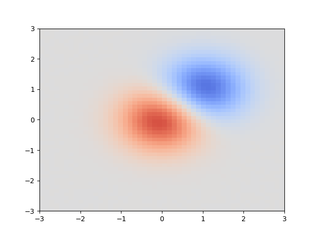
Dynamic Downsampling#
Generates a large image with three levels of detail.
When zoomed out, appears as a difference of 2D Gaussians. At medium zoom, a diagonal sinusoidal pattern is apparent. When zoomed in close, noise is visible.
The image is dynamically subsampled using a local mean which hides the finer details.
from typing import Tuple, Dict, Any, Union

import matplotlib as mpl
import matplotlib.pyplot as plt
from matplotlib.colors import Normalize

import numpy as np

from mpl_data_containers.description import Desc, desc_like
from mpl_data_containers.artist import CompatibilityArtist as CA
from mpl_data_containers.image import Image
from mpl_data_containers.containers import ArrayContainer

from skimage.transform import downscale_local_mean


x = y = np.linspace(-3, 3, 3000)
X, Y = np.meshgrid(x, y)
Z1 = np.exp(-(X**2) - Y**2) + 0.08 * np.sin(50 * (X + Y))
Z2 = np.exp(-((X - 1) ** 2) - (Y - 1) ** 2)
Z = (Z1 - Z2) * 2

Z += np.random.random(Z.shape) - 0.5


class Subsample:
    def describe(self):
        return {
            "x": Desc((2,)),
            "y": Desc((2,)),
            "image": Desc(("M", "N")),
        }

    def query(
        self,
        graph,
        parent_coordinates="axes",
    ) -> Tuple[Dict[str, Any], Union[str, int]]:
        desc = Desc(("N",), coordinates="data")
        xy = {"x": desc, "y": desc}
        data_lim = graph.evaluator(xy, desc_like(xy, coordinates="axes")).inverse

        pts = data_lim.evaluate({"x": (0, 1), "y": (0, 1)})
        x1, x2 = pts["x"]
        y1, y2 = pts["y"]

        xi1 = np.argmin(np.abs(x - x1))
        yi1 = np.argmin(np.abs(y - y1))
        xi2 = np.argmin(np.abs(x - x2))
        yi2 = np.argmin(np.abs(y - y2))

        xscale = int(np.ceil((xi2 - xi1) / 50))
        yscale = int(np.ceil((yi2 - yi1) / 50))

        return {
            "x": [x1, x2],
            "y": [y1, y2],
            "image": downscale_local_mean(Z[xi1:xi2, yi1:yi2], (xscale, yscale)),
        }, hash((x1, x2, y1, y2))


non_sub = ArrayContainer(**{"image": Z, "x": np.array([0, 1]), "y": np.array([0, 10])})

sub = Subsample()
cmap = mpl.colormaps["coolwarm"]
norm = Normalize(-2.2, 2.2)
im = Image(sub, cmap=cmap, norm=norm)

fig, ax = plt.subplots()
ax.add_artist(CA(im))
ax.set_xlim(-3, 3)
ax.set_ylim(-3, 3)
plt.show()
Note
Go to the end to download the full example code.
An animated lissajous ball#
Inspired by https://twitter.com/_brohrer_/status/1584681864648065027
An animated scatter plot using a custom container and wrappers.PathCollectionWrapper
import time
from typing import Dict, Tuple, Any, Union
from functools import partial

import numpy as np

import matplotlib.pyplot as plt
import matplotlib.markers as mmarkers
from matplotlib.animation import FuncAnimation

from mpl_data_containers.conversion_edge import Graph
from mpl_data_containers.description import Desc

from mpl_data_containers.wrappers import PathCollectionWrapper


class Lissajous:
    N = 1024
    # cycles per minutes
    scale = 2

    def describe(self):
        return {
            "x": Desc((self.N,)),
            "y": Desc((self.N,)),
            "time": Desc(()),
            "sizes": Desc(()),
            "paths": Desc(()),
            "edgecolors": Desc(()),
            "facecolors": Desc((self.N,)),
        }

    def query(
        self,
        graph: Graph,
        parent_coordinates: str = "axes",
    ) -> Tuple[Dict[str, Any], Union[str, int]]:
        def next_time():
            cur_time = time.time()
            cur_time = np.array(
                [cur_time, cur_time - 0.1, cur_time - 0.2, cur_time - 0.3]
            )

            phase = 15 * np.pi * (self.scale * cur_time % 60) / 150
            marker_obj = mmarkers.MarkerStyle("o")
            return {
                "x": np.cos(5 * phase),
                "y": np.sin(3 * phase),
                "sizes": np.array([256]),
                "paths": [
                    marker_obj.get_path().transformed(marker_obj.get_transform())
                ],
                "edgecolors": "k",
                "facecolors": ["#4682b4ff", "#82b446aa", "#46b48288", "#8246b433"],
                "time": cur_time[0],
            }, hash(cur_time[0])

        return next_time()


def update(frame, art):
    return art


sot_c = Lissajous()

fig, ax = plt.subplots()
ax.set_xlim(-1.1, 1.1)
ax.set_ylim(-1.1, 1.1)
lw = PathCollectionWrapper(sot_c, offset_transform=ax.transData)
ax.add_artist(lw)
# ax.set_xticks([])
# ax.set_yticks([])
ax.set_aspect(1)
ani = FuncAnimation(
    fig,
    partial(update, art=(lw,)),
    frames=60,
    interval=1000 / 100 * 15,
    # TODO: blitting does not work because wrappers do not inherent from Artist
    # blit=True,
)
plt.show()
Total running time of the script: (0 minutes 5.465 seconds)
Note
Go to the end to download the full example code.
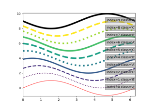
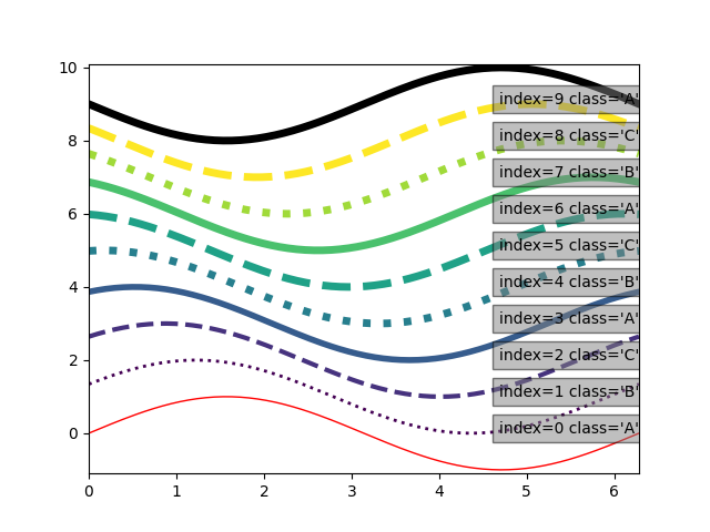
Mapping Line Properties#
Leveraging the converter functions to transform users space data to visualization data.
import matplotlib.pyplot as plt
import numpy as np

from matplotlib.colors import Normalize

from mpl_data_containers.artist import CompatibilityAxes
from mpl_data_containers.line import Line
from mpl_data_containers.containers import ArrayContainer
from mpl_data_containers.description import Desc
from mpl_data_containers.conversion_edge import FuncEdge
from mpl_data_containers.text import Text


cmap = plt.colormaps["viridis"]
cmap.set_over("k")
cmap.set_under("r")
norm = Normalize(1, 8)

line_edges = [
    FuncEdge.from_func(
        "lw",
        lambda lw: min(1 + lw, 5),
        {"lw": Desc((), "auto")},
        {"linewidth": Desc((), "display")},
    ),
    # Probably should separate out norm/cmap step
    # Slight lie about color being a string here, because of limitations in impl
    FuncEdge.from_func(
        "cmap",
        lambda j: cmap(norm(j)),
        {"j": Desc((), "auto")},
        {"color": Desc((), "display")},
    ),
    FuncEdge.from_func(
        "ls",
        lambda cat: {"A": "-", "B": ":", "C": "--"}[cat],
        {"cat": Desc((), "auto")},
        {"linestyle": Desc((), "display")},
    ),
]

text_edges = [
    FuncEdge.from_func(
        "text",
        lambda j, cat: f"index={j[()]} class={cat!r}",
        {"j": Desc((), "auto"), "cat": Desc((), "auto")},
        {"text": Desc((), "display")},
    ),
    FuncEdge.from_func(
        "y",
        lambda j: j,
        {"j": Desc((), "auto")},
        {"y": Desc((), "data")},
    ),
    FuncEdge.from_func(
        "x",
        lambda: 2 * np.pi,
        {},
        {"x": Desc((), "data")},
    ),
]


th = np.linspace(0, 2 * np.pi, 128)
delta = np.pi / 9

fig, nax = plt.subplots()

ax = CompatibilityAxes(nax)
nax.add_artist(ax)

for j in range(10):
    ac = ArrayContainer(
        **{
            "x": th,
            "y": np.sin(th + j * delta) + j,
            "j": np.asarray(j),
            "lw": np.asarray(j),
            "cat": {0: "A", 1: "B", 2: "C"}[j % 3],
        }
    )
    ax.add_artist(
        Line(
            ac,
            line_edges,
        )
    )
    ax.add_artist(
        Text(
            ac,
            text_edges,
            x=2 * np.pi,
            # ha="right",
            # bbox={"facecolor": "gray", "alpha": 0.5},
        )
    )
ax.set_xlim(0, np.pi * 2)
ax.set_ylim(-1.1, 10.1)

plt.show()
Note
Go to the end to download the full example code.
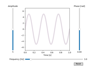
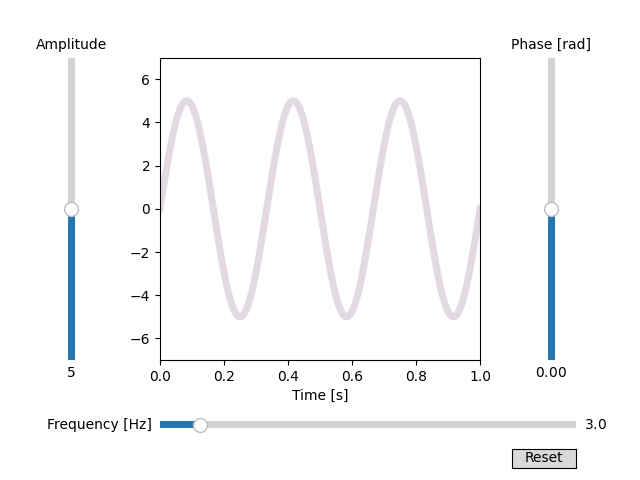
Slider#
In this example, sliders are used to control the frequency and amplitude of a sine wave.
import inspect

import numpy as np
import matplotlib.pyplot as plt
from matplotlib.widgets import Slider, Button

from mpl_data_containers.artist import CompatibilityArtist as CA
from mpl_data_containers.line import Line
from mpl_data_containers.containers import FuncContainer
from mpl_data_containers.description import Desc
from mpl_data_containers.conversion_edge import FuncEdge


class SliderContainer(FuncContainer):
    def __init__(self, xfuncs, /, **sliders):
        self._sliders = sliders
        for slider in sliders.values():
            slider.on_changed(
                lambda _, sld=slider: sld.ax.figure.canvas.draw_idle(),
            )

        def get_needed_keys(f, offset=1):
            return tuple(inspect.signature(f).parameters)[offset:]

        super().__init__(
            {
                k: (
                    s,
                    # this line binds the correct sliders to the functions
                    # and makes lambdas that match the API FuncContainer needs
                    lambda x, keys=get_needed_keys(f), f=f: f(
                        x, *(sliders[k].val for k in keys)
                    ),
                )
                for k, (s, f) in xfuncs.items()
            },
        )

    def _query_hash(self, graph, parent_coordinates):
        key = super()._query_hash(graph, parent_coordinates)
        # inject the slider values into the hashing logic
        return hash((key, tuple(s.val for s in self._sliders.values())))


# Define initial parameters
init_amplitude = 5
init_frequency = 3

# Create the figure and the line that we will manipulate
fig, ax = plt.subplots()
ax.set_xlim(0, 1)
ax.set_ylim(-7, 7)

ax.set_xlabel("Time [s]")

# adjust the main plot to make room for the sliders
fig.subplots_adjust(left=0.25, bottom=0.25, right=0.75)

# Make a horizontal slider to control the frequency.
axfreq = fig.add_axes([0.25, 0.1, 0.65, 0.03])
freq_slider = Slider(
    ax=axfreq,
    label="Frequency [Hz]",
    valmin=0.1,
    valmax=30,
    valinit=init_frequency,
)

# Make a vertically oriented slider to control the amplitude
axamp = fig.add_axes([0.1, 0.25, 0.0225, 0.63])
amp_slider = Slider(
    ax=axamp,
    label="Amplitude",
    valmin=0,
    valmax=10,
    valinit=init_amplitude,
    orientation="vertical",
)

# Make a vertically oriented slider to control the phase
axphase = fig.add_axes([0.85, 0.25, 0.0225, 0.63])
phase_slider = Slider(
    ax=axphase,
    label="Phase [rad]",
    valmin=-2 * np.pi,
    valmax=2 * np.pi,
    valinit=0,
    orientation="vertical",
)

# pick a cyclic color map
cmap = plt.get_cmap("twilight")

# set up the data container
fc = SliderContainer(
    {
        # the x data does not need the sliders values
        "x": (("N",), lambda t: t),
        "y": (
            ("N",),
            # the y data needs all three sliders
            lambda t, amplitude, frequency, phase: amplitude
            * np.sin(2 * np.pi * frequency * t + phase),
        ),
        # the color data has to take the x (because reasons), but just
        # needs the phase
        "color": ((1,), lambda _, phase: phase),
    },
    # bind the sliders to the data container
    amplitude=amp_slider,
    frequency=freq_slider,
    phase=phase_slider,
)
lw = Line(
    fc,
    # color map phase (scaled to 2pi and wrapped to [0, 1])
    [
        FuncEdge.from_func(
            "color",
            lambda color: cmap((color / (2 * np.pi)) % 1),
            {"color": Desc((1,))},
            {"color": Desc((), "display")},
        )
    ],
    linewidth=5.0,
    linestyle="-",
)
ax.add_artist(CA(lw))


# Create a `matplotlib.widgets.Button` to reset the sliders to initial values.
resetax = fig.add_axes([0.8, 0.025, 0.1, 0.04])
button = Button(resetax, "Reset", hovercolor="0.975")
button.on_clicked(
    lambda _: [sld.reset() for sld in (freq_slider, amp_slider, phase_slider)]
)

plt.show()
API#
Containers#
- class mpl_data_containers.containers.ArrayContainer(coordinates: dict[str, str] | None = None, /, **data)#
-
- update(**data)#
- class mpl_data_containers.containers.DataContainer(*args, **kwargs)#
-
- query(graph: Graph, parent_coordinates: str = 'axes', /) Tuple[Dict[str, Any], str | int]#
Query the data container for data.
We are given the data limits and the screen size so that we have an estimate of how finely (or not) we need to sample the data we wrapping.
- Parameters:
- coord_transformmatplotlib.transform.Transform
Must go from axes fraction space -> data space
- size2 integers
xpixels, ypixels
The size in screen / render units that we have to fill.
- Returns:
- dataDict[str, Any]
The values are really array-likes, but 🤷 how to spell that in typing given that the dimension and type will depend on the key / how it is set up and the size may depend on the input values
- cache_keystr
This is a key that clients can use to cache down-stream computations on this data.
- class mpl_data_containers.containers.DataFrameContainer(df: DataFrame, *, col_names: Callable[[str], str] | Dict[str, str], index_name: str | None = None)#
- class mpl_data_containers.containers.DataUnion(*data: DataContainer)#
- describe()#
- class mpl_data_containers.containers.FuncContainer(xfuncs: Dict[str, Tuple[Tuple[int | str, ...], Callable[[Any], Any]]] | None = None, yfuncs: Dict[str, Tuple[Tuple[int | str, ...], Callable[[Any], Any]]] | None = None, xyfuncs: Dict[str, Tuple[Tuple[int | str, ...], Callable[[Any, Any], Any]]] | None = None)#
- exception mpl_data_containers.containers.NoNewKeys#
- class mpl_data_containers.containers.RandomContainer(**shapes)#
- class mpl_data_containers.containers.ReNamer(data: DataContainer, mapping: Dict[str, str])#
- describe()#
Wrappers#
- class mpl_data_containers.wrappers.ErrorbarWrapper(data: DataContainer, converters=None, /, **kwargs)#
- draw(renderer)#
Draw the Artist (and its children) using the given renderer.
This has no effect if the artist is not visible (.Artist.get_visible returns False).
- Parameters:
- renderer~matplotlib.backend_bases.RendererBase subclass.
Notes
This method is overridden in the Artist subclasses.
- set(*, agg_filter=<UNSET>, alpha=<UNSET>, animated=<UNSET>, clip_box=<UNSET>, clip_on=<UNSET>, clip_path=<UNSET>, gid=<UNSET>, in_layout=<UNSET>, label=<UNSET>, mouseover=<UNSET>, path_effects=<UNSET>, picker=<UNSET>, rasterized=<UNSET>, sketch_params=<UNSET>, snap=<UNSET>, transform=<UNSET>, url=<UNSET>, visible=<UNSET>, zorder=<UNSET>)#
Set multiple properties at once.
Supported properties are
- Properties:
agg_filter: a filter function, which takes a (m, n, 3) float array and a dpi value, and returns a (m, n, 3) array and two offsets from the bottom left corner of the image alpha: float or None animated: unknown clip_box: unknown clip_on: bool clip_path: unknown figure: unknown gid: str in_layout: bool label: object mouseover: bool path_effects: list of .AbstractPathEffect picker: unknown rasterized: bool sketch_params: unknown snap: unknown transform: unknown url: str visible: bool zorder: float
- class mpl_data_containers.wrappers.FormattedText(data: DataContainer, converters=None, /, **kwargs)#
- draw(renderer)#
- class mpl_data_containers.wrappers.ImageWrapper(data: DataContainer, converters=None, /, cmap=None, norm=None, **kwargs)#
- draw(renderer)#
- class mpl_data_containers.wrappers.LineWrapper(data: DataContainer, converters=None, /, **kwargs)#
- draw(renderer)#
- class mpl_data_containers.wrappers.MultiProxyWrapper(data, converters: ConversionNode | list[ConversionNode] | None, **kwargs)#
- draw(renderer)#
Draw the Artist (and its children) using the given renderer.
This has no effect if the artist is not visible (.Artist.get_visible returns False).
- Parameters:
- renderer~matplotlib.backend_bases.RendererBase subclass.
Notes
This method is overridden in the Artist subclasses.
- get_children()#
Return a list of the child .Artists of this .Artist.
- set(*, agg_filter=<UNSET>, alpha=<UNSET>, animated=<UNSET>, clip_box=<UNSET>, clip_on=<UNSET>, clip_path=<UNSET>, gid=<UNSET>, in_layout=<UNSET>, label=<UNSET>, mouseover=<UNSET>, path_effects=<UNSET>, picker=<UNSET>, rasterized=<UNSET>, sketch_params=<UNSET>, snap=<UNSET>, transform=<UNSET>, url=<UNSET>, visible=<UNSET>, zorder=<UNSET>)#
Set multiple properties at once.
Supported properties are
- Properties:
agg_filter: a filter function, which takes a (m, n, 3) float array and a dpi value, and returns a (m, n, 3) array and two offsets from the bottom left corner of the image alpha: float or None animated: bool clip_box: ~matplotlib.transforms.BboxBase or None clip_on: bool clip_path: Patch or (Path, Transform) or None figure: ~matplotlib.figure.Figure or ~matplotlib.figure.SubFigure gid: str in_layout: bool label: object mouseover: bool path_effects: list of .AbstractPathEffect picker: None or bool or float or callable rasterized: bool sketch_params: (scale: float, length: float, randomness: float) snap: bool or None transform: ~matplotlib.transforms.Transform url: str visible: bool zorder: float
- set_animated(*args, **kwargs)#
broadcasts set_animated to children
- set_clip_box(*args, **kwargs)#
broadcasts set_clip_box to children
- set_clip_path(*args, **kwargs)#
broadcasts set_clip_path to children
- set_figure(*args, **kwargs)#
broadcasts set_figure to children
- set_picker(*args, **kwargs)#
broadcasts set_picker to children
- set_sketch_params(*args, **kwargs)#
broadcasts set_sketch_params to children
- set_snap(*args, **kwargs)#
broadcasts set_snap to children
- set_transform(*args, **kwargs)#
broadcasts set_transform to children
- class mpl_data_containers.wrappers.PathCollectionWrapper(data: DataContainer, converters=None, /, **kwargs)#
- draw(renderer)#
- class mpl_data_containers.wrappers.ProxyWrapper(data, converters: ConversionNode | list[ConversionNode] | None, **kwargs)#
- class mpl_data_containers.wrappers.ProxyWrapperBase(data, converters: ConversionNode | list[ConversionNode] | None, **kwargs)#
- axes: _Axes#
- data: DataContainer#
- draw(renderer)#
- class mpl_data_containers.wrappers.StepWrapper(data: DataContainer, converters=None, /, **kwargs)#
- draw(renderer)#
- class mpl_data_containers.patches.Patch(container, edges=None, **kwargs)#
- class mpl_data_containers.patches.PatchWrapper(data: DataContainer, converters=None, /, **kwargs)#
- draw(renderer)#
- class mpl_data_containers.patches.Rectangle(container, edges=None, **kwargs)#
- class mpl_data_containers.patches.RectangleContainer(*args, **kwargs)#
- class mpl_data_containers.patches.RectangleWrapper(data: DataContainer, converters=None, /, **kwargs)#
- class mpl_data_containers.patches.RegularPolygon(container, edges=None, **kwargs)#
Backmatter#
Installation#
At the command line:
$ pip install git+https://github.com/matplotlib/data-prototype.git@main
Release History#
Initial Release (YYYY-MM-DD)#
Minimum Version of Python and NumPy#
This project supports at least the minor versions of Python initially released 42 months prior to a planned project release date.
The project will always support at least the 2 latest minor versions of Python.
The project will support minor versions of
numpyinitially released in the 24 months prior to a planned project release date or the oldest version that supports the minimum Python version (whichever is higher).The project will always support at least the 3 latest minor versions of NumPy.
The minimum supported version of Python will be set to
python_requires in setup. All supported minor versions of
Python will be in the test matrix and have binary artifacts built
for releases.
The project should adjust upward the minimum Python and NumPy version support on every minor and major release, but never on a patch release.
This is consistent with NumPy NEP 29.