Beautiful colormaps for oceanography: cmocean
This package contains colormaps for commonly-used oceanographic variables. Most of the colormaps started from matplotlib colormaps, but have now been adjusted using the viscm tool to be perceptually uniform.
Note
This is a new version of cmocean with four new colormaps!
Note
We have a paper with guidelines to colormap selection for your application and a description of the cmocean colormaps:
Thyng, K. M., Greene, C. A., Hetland, R. D., Zimmerle, H. M., & DiMarco, S. F. (2016). True colors of oceanography. Oceanography, 29(3), 10.
link: http://tos.org/oceanography/assets/docs/29-3_thyng.pdf
Here is our gallery:
import cmocean
cmocean.plots.plot_gallery()
(Source code, png, hires.png, pdf)

These colormaps were chosen to be perceptually uniform and to reflect the data they are representing in terms of being sequential, divergent, or cyclic (phase colormap), and to be intuitive. For example, the algae colormap is shades of green which could represent chlorophyll.
Here is the lightness of the colormaps:
import cmocean
cmocean.plots.plot_lightness()
(Source code, png, hires.png, pdf)

It is probably better to think in cam02ucs colorspace, in which Euclidean distance is made to be equivalent to changes in human perception. Plots of these colormaps in this colorspace and with some other important properties are seen using the viscm tool.
Here are some properties from the haline colormap. We can see that the colormap prints nicely to grayscale, has consistent perceptual deltas across the colormap, and good viewability for people with color blindness. It has a smooth representation in its 3D colorspace, and detail in the images is clear.
import cmocean
cmocean.plots.wrap_viscm(cmocean.cm.haline, saveplot=False)
(Source code, png, hires.png, pdf)

All of the evaluations of the colormaps using the viscm tool are shown in the page cmocean colormaps in viscm tool.
Installation
To install:
pip install cmocean
To install with Anaconda:
conda install -c conda-forge cmocean
If you want to be able to use the plots submodule, you can instead install with:
pip install "cmocean[plots]"
which will also install viscm and colorspacious.
Capabilities
The colormaps are all available in cmocean.cm. They can be accessed, and simply plotted, as follows:
import cmocean
import matplotlib.pyplot as plt

fig = plt.figure(figsize=(8, 3))
ax = fig.add_subplot(1, 2, 1)
cmocean.plots.test(cmocean.cm.thermal, ax=ax)
ax = fig.add_subplot(1, 2, 2)
cmocean.plots.quick_plot(cmocean.cm.algae, ax=ax)
(Source code, png, hires.png, pdf)

All available colormap names can be accessed with cmocean.cm.cmapnames:
In [1]: import cmocean

In [2]: cmocean.cm.cmapnames
Out[2]:
['thermal',
 'haline',
 'solar',
 'ice',
 'gray',
 'oxy',
 'deep',
 'dense',
 'algae',
 'matter',
 'turbid',
 'speed',
 'amp',
 'tempo',
 'rain',
 'phase',
 'topo',
 'balance',
 'delta',
 'curl',
 'diff',
 'tarn']
The colormap instances can be accessed with:
In [3]: import cmocean

In [4]: cmaps = cmocean.cm.cmap_d;
Print all of the available colormaps to text files with 256 rgb entries with:
cmaps = cmocean.cm.cmap_d
cmocean.tools.print_colormaps(cmaps)
Output a dictionary to define a colormap with:
In [5]: import cmocean

In [6]: cmdict = cmocean.tools.get_dict(cmocean.cm.matter, N=9)

In [7]: print(cmdict)
{'red': [(0.0, 0.99429361496112023, 0.99429361496112023), (0.125, 0.97669801635856757, 0.97669801635856757), (0.25, 0.94873479766923496, 0.94873479766923496), (0.375, 0.90045567698531204, 0.90045567698531204), (0.5, 0.80852468744463613, 0.80852468744463613), (0.625, 0.67108411902889908, 0.67108411902889908), (0.75, 0.51122751026810531, 0.51122751026810531), (0.875, 0.34246319725680402, 0.34246319725680402), (1.0, 0.18517171283533682, 0.18517171283533682)], 'green': [(0.0, 0.93032779532320797, 0.93032779532320797), (0.125, 0.75576791099973906, 0.75576791099973906), (0.25, 0.58413112562241909, 0.58413112562241909), (0.375, 0.41389524263548055, 0.41389524263548055), (0.5, 0.26372603126828165, 0.26372603126828165), (0.625, 0.16249519232276352, 0.16249519232276352), (0.75, 0.10922326738769267, 0.10922326738769267), (0.875, 0.089677516287552023, 0.089677516287552023), (1.0, 0.05913348735199072, 0.05913348735199072)], 'blue': [(0.0, 0.69109690224984077, 0.69109690224984077), (0.125, 0.53031307900834646, 0.53031307900834646), (0.25, 0.40291681995676154, 0.40291681995676154), (0.375, 0.32938102171259315, 0.32938102171259315), (0.5, 0.33885361881305626, 0.33885361881305626), (0.625, 0.37820659039971588, 0.37820659039971588), (0.75, 0.38729596513525039, 0.38729596513525039), (0.875, 0.33739313395770171, 0.33739313395770171), (1.0, 0.24304267442183591, 0.24304267442183591)]}
Make a colormap instance with cmap = cmocean.tools.cmap(rgbin, N=10) given the rgb input array.
Reversed versions of all colormaps are available by appending “_r” to the colormap name, just as in matplotlib:
import cmocean
import matplotlib.pyplot as plt

fig = plt.figure(figsize=(8, 3))
ax = fig.add_subplot(1, 2, 1)
cmocean.plots.test(cmocean.cm.gray, ax=ax)
ax = fig.add_subplot(1, 2, 2)
cmocean.plots.test(cmocean.cm.gray_r, ax=ax)
fig.tight_layout()
(Source code, png, hires.png, pdf)

You can lighten a colormap using an alpha value below 1 with the cmocean.tools.lighten() function so that you can overlay contours and other lines that are more easily visible:
import cmocean
import cmocean.cm as cmo
import matplotlib.pyplot as plt

fig = plt.figure(figsize=(8, 3))
ax = fig.add_subplot(1, 2, 1)
Z = np.random.randn(10,10)
ax.pcolormesh(Z, cmap=cmo.matter)

ax = fig.add_subplot(1, 2, 2)
lightcmap = cmocean.tools.lighten(cmo.matter, 0.5)
ax.pcolormesh(Z, cmap=lightcmap)
fig.tight_layout()
(Source code, png, hires.png, pdf)

cmocean will register its colormaps with matplotlib so you can call them with, for example, ‘cmo.amp’:
import cmocean
import matplotlib.pyplot as plt

fig = plt.figure(figsize=(4, 3))
ax = fig.add_subplot(111)
Z = np.random.randn(10,10)
ax.pcolormesh(Z, cmap='cmo.amp')
(Source code, png, hires.png, pdf)

Clipping a colormap
You can clip off one or both ends of a colormap, either by the values you intend to plot with or by percent. For example, you can crop off both ends of a colormap by percent to reduce the lightness range and not have the very darkest values:
import cmocean
import matplotlib.pyplot as plt

cmap = cmocean.cm.tarn
fig, axes = plt.subplots(1, 2, figsize=(8,4))
A = np.random.randint(-5, 6, (10,10))
mappable = axes[0].pcolormesh(A, cmap=cmap)
axes[0].set_title('Full diverging colormap')
fig.colorbar(mappable, ax=axes[0])

newcmap = cmocean.tools.crop_by_percent(cmap, 30, which='both', N=None)
mappable = axes[1].pcolormesh(A, cmap=newcmap)
axes[1].set_title('Same colormap,\n30% removed from each end')
fig.colorbar(mappable, ax=axes[1])
(Source code, png, hires.png, pdf)

You can clip off one end of a colormap by percent. For example, you can crop the top part of the oxy colormap off, in case you are not considering super-saturated conditions (top 20% of the colormap), you can remove it from the colormap as follows:
import cmocean
import matplotlib.pyplot as plt

cmap = cmocean.cm.oxy
fig, axes = plt.subplots(1, 2, figsize=(8,4))
A = np.random.randint(0, 101, (10,10))
mappable = axes[0].pcolormesh(A, vmin=0, vmax=100, cmap=cmap)
axes[0].set_title('Values go to super-saturated')
fig.colorbar(mappable, ax=axes[0])

newcmap = cmocean.tools.crop_by_percent(cmap, 20, which='max', N=None)
A[A>80] = 80
mappable = axes[1].pcolormesh(A, vmin=0, vmax=80, cmap=newcmap)
axes[1].set_title('Values are all\nbelow super-saturated')
fig.colorbar(mappable, ax=axes[1])
(Source code, png, hires.png, pdf)

You can remove part of one end of a colormap by inputting the values you intend to use in your plot and let the function figure out how much to crop off the colormap. This could be particularly useful if you have combined bathymetry and topography (sea and land elevations) data to plot with the topo colormap, but you want the maximum magnitudes to be different for water and land, and have this reflected in the colormap.
import cmocean
import matplotlib.pyplot as plt

cmap = cmocean.cm.topo
fig, axes = plt.subplots(1, 2, figsize=(8,4))
A = np.random.randint(-50, 201, (10,10))
mappable = axes[0].pcolormesh(A, vmin=-200, vmax=200, cmap=cmap)
axes[0].set_title('No values<-50, but still\nshow possibility in colorbar')
fig.colorbar(mappable, ax=axes[0])

newcmap = cmocean.tools.crop(cmap, -50, 200, 0)
mappable = axes[1].pcolormesh(A, vmin=-50, vmax=200, cmap=newcmap)
axes[1].set_title('Colorbar only shows color\nrange used by data')
fig.colorbar(mappable, ax=axes[1])
(Source code, png, hires.png, pdf)

Colormap details
thermal
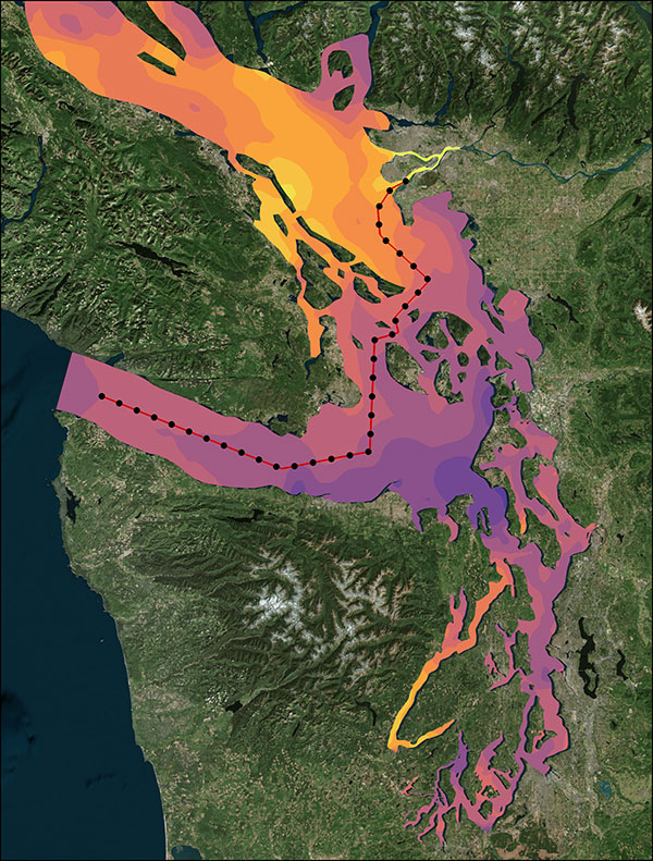
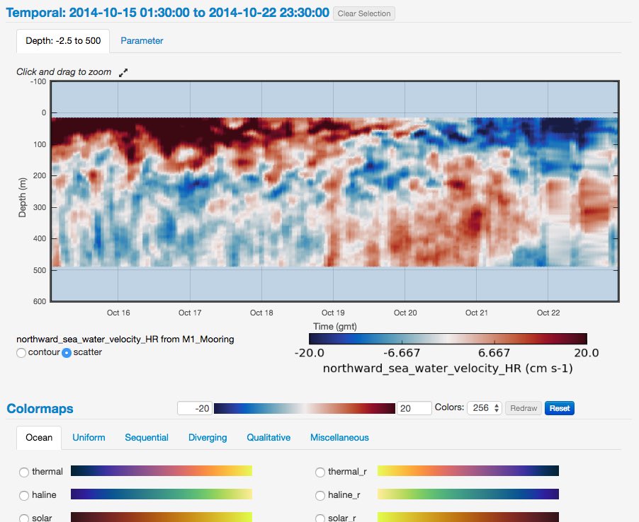
The thermal colormap is sequential with dark blue representing lower, cooler values and transitioning through reds to yellow representing increased warmer values.
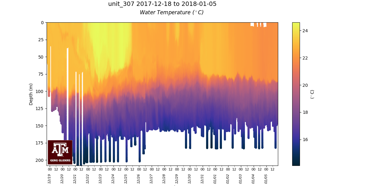
Glider data from Texas A&M’s Geochemical and Environmental Research Group (GERG).
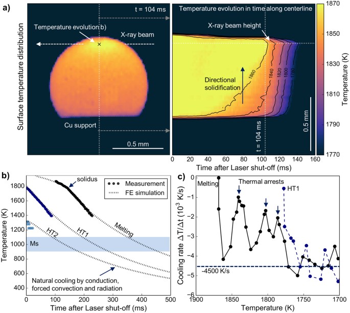
Data from publication: Kenel, C., Grolimund, D., Li, X., Panepucci, E., Samson, V. A., Sanchez, D. F., … & Leinenbach, C. (2017). In situ investigation of phase transformations in Ti-6Al-4V under additive manufacturing conditions combining laser melting and high-speed micro-X-ray diffraction. Scientific reports, 7(1), 16358.
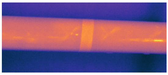
Usamentiaga, R., Ibarra-Castanedo, C., Klein, M., Maldague, X., Peeters, J., & Sanchez-Beato, A. (2017). Nondestructive evaluation of carbon fiber bicycle frames using infrared thermography. Sensors, 17(11), 2679.
Temperature plot of CTD data for the upper ocean; made by Luz Zarate Jimenez.

pH plot of full water depth bottle data, where the dots represent the depths where bottle water was collected; made by Luz Zarate Jimenez.

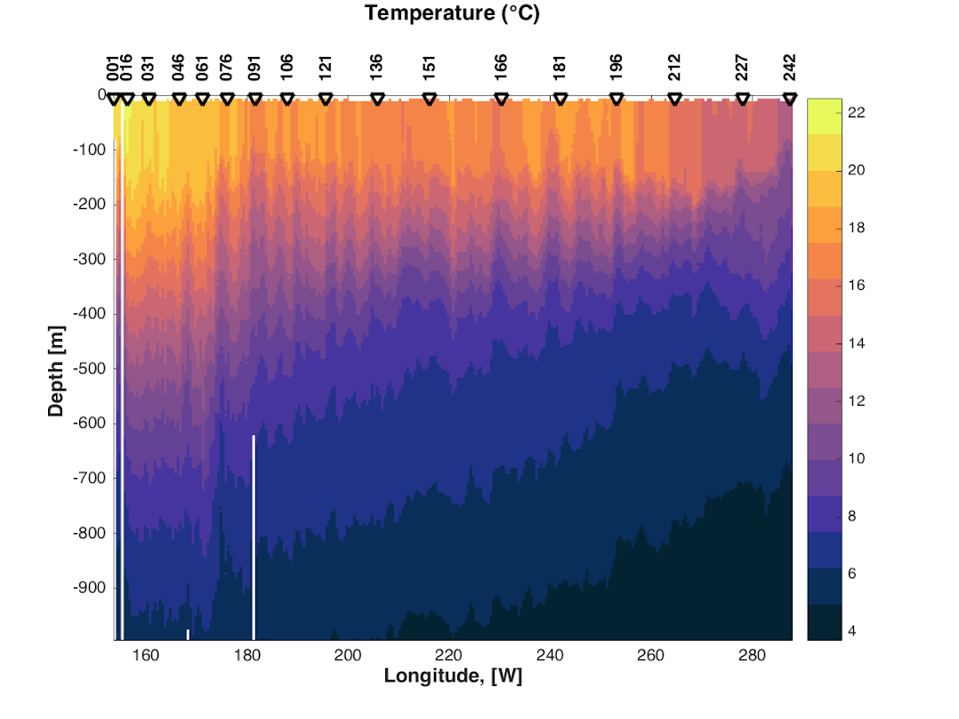
WUNSCH, C. (2018). Towards determining uncertainties in global oceanic mean values of heat, salt, and surface elevation. Tellus A: Dynamic Meteorology and Oceanography, 70(1), 1-14.
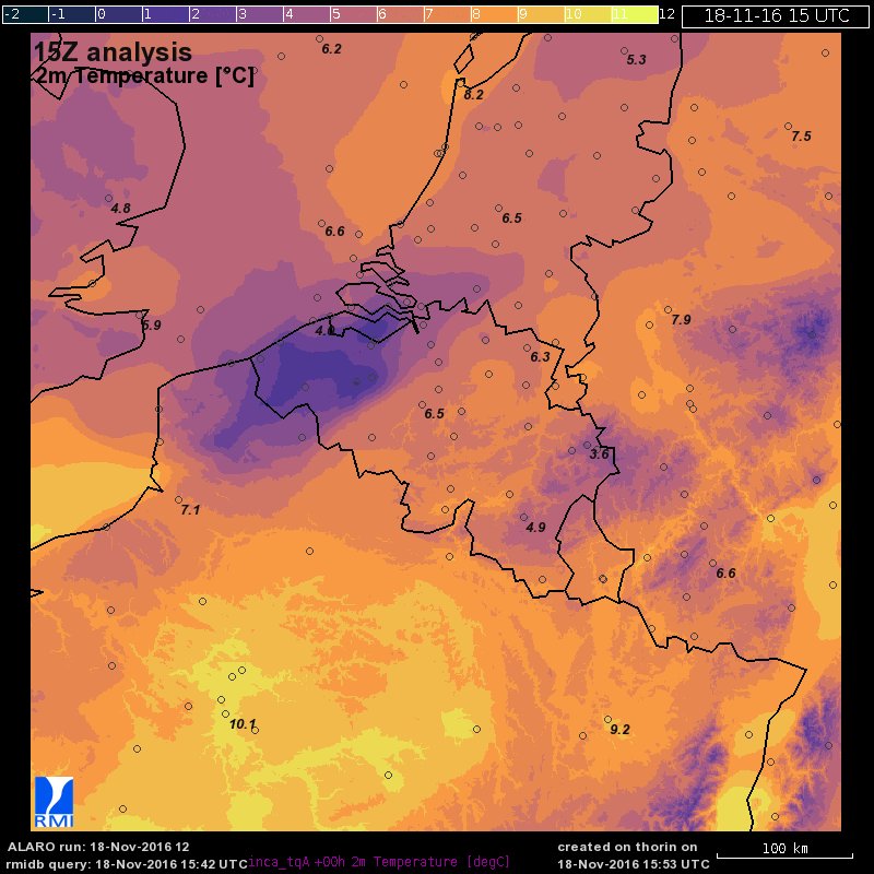
Showing temperature in meteorology work, by Maarten Reyniers.
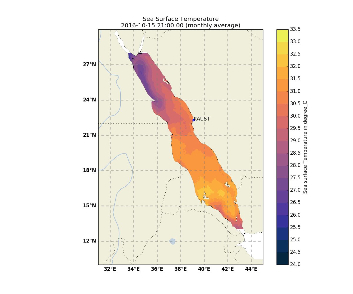
MODIS sea surface temperature from NASA OBPG, by Sebastian Steinke.

Glider data from Mid-Atlantic Regional Association Coastal Ocean Observing System (MARACOOS).
Ocean model visualization from tecplot.

Potter, H. (2018). The cold wake of typhoon Chaba (2010). Deep Sea Research Part I: Oceanographic Research Papers, 140, 136-141.
haline
The haline colormap is sequential, and might be used with dark blue representing lower salinity or fresher water, transitioning through greens to light yellow representing increased salinity or saltier water. This colormap is based on matplotlib’s YlGnBu, but was recreated from scratch using the viscm tool.
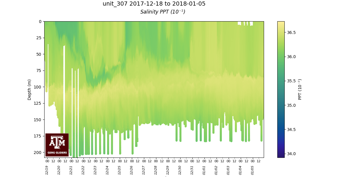
Glider data from Texas A&M’s Geochemical and Environmental Research Group (GERG).

Model output in the northwest Gulf of Mexico from the Physical Oceanography Numerical Group (PONG) at Texas A&M.

Plotting CTD data (temperature and salinity) with the R oce package, by Clark Richards

Alkalinity plot of full water depth bottle data, where the dots represent the depths where bottle water was collected; made by Luz Zarate Jimenez.

Salinity plot of CTD data for the upper ocean; made by Luz Zarate Jimenez.

Glider data from Mid-Atlantic Regional Association Coastal Ocean Observing System (MARACOOS).
solar
The solar colormap is sequential from dark brown for low values to increasingly bright yellow to potentially represent an increase in radiation in the water.
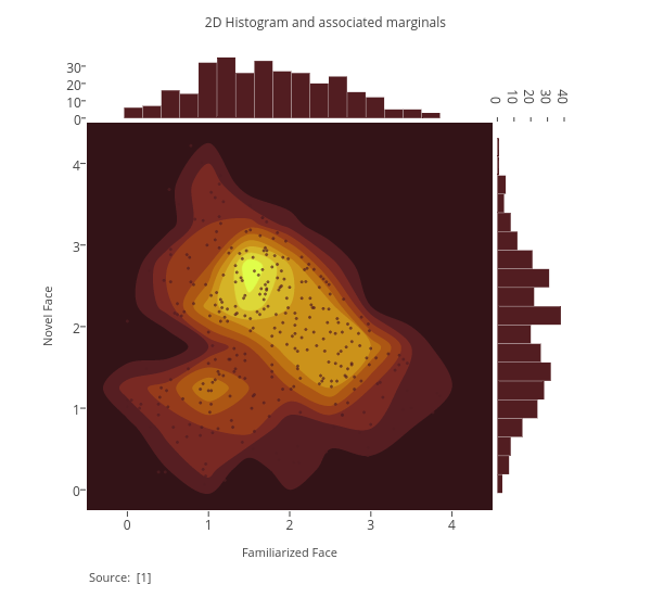
Histogram from plotly.
ice
The ice colormap is sequential from very dark blue (almost black) to very light blue (almost white). A use for this could be representations of sea ice.

An example is provided by Chad Greene showing sea ice concentration around Antarctica.

Arctic sea ice thickness by Nikolay Koldunov.
gray
The gray colormap is sequential from black to white, with uniform steps through perceptual colorspace. This colormap is generic to be used for any sequential dataset.
import cmocean
import matplotlib.pyplot as plt

fig = plt.figure(figsize=(8, 3))
ax = fig.add_subplot(1, 2, 1)
cmocean.plots.test(cmocean.cm.gray, ax=ax)
ax = fig.add_subplot(1, 2, 2)
cmocean.plots.quick_plot(cmocean.cm.gray, ax=ax)
(Source code, png, hires.png, pdf)

oxy
The oxy colormap is sequential for most of the colormap, representing the normal range of oxygen saturation in ocean water, and diverging 80% of the way into the colormap to represent a state of supersaturation. The bottom 20% of the colormap is colored reddish to highlight hypoxic or low oxygen water, but to still print relatively seamlessly into grayscale in case the red hue is not important for an application. The top 20% of the colormap, after the divergence, is colored yellow to highlight the supersaturated water. The minimum and maximum values of this colormap are meant to be controlled in order to properly place the low oxygen and supersaturated oxygen states properly. This colormap was developed for the Mississippi river plume area where both low and supersaturated conditions are regularly seen and monitored.

Model output in the northwest Gulf of Mexico from the Physical Oceanography Numerical Group (PONG) at Texas A&M. A simulation of bottom oxygen using a simple parameterization of bottom oxygen utilization reveals the complex structure of bottom oxygen. While the area affected by hypoxia stretches nearly 400 km along the shelf, variability on much smaller scales, down to a few kilometers, is also evident. The position of the Mississippi/Atchafalaya river plume, and instabilities present within the plume, determine the extent and structure of the hypoxic bottom waters. By Veronica Ruiz at Texas A&M.

Oxygen plot of CTD data for the upper ocean; made by Luz Zarate Jimenez.
deep
The deep colormap is sequential from light yellow to potentially represent shallower water through pale green to increasingly dark blue and purple to represent increasing depth.

Bathymetry plot, by Iury Sousa

Somov Sea bathymetry, by Josué Martinez Moreno, in blender
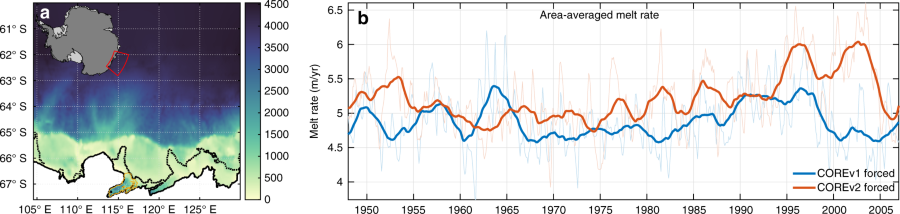
Gwyther, D. E., O’Kane, T. J., Galton-Fenzi, B. K., Monselesan, D. P., & Greenbaum, J. S. (2018). Intrinsic processes drive variability in basal melting of the Totten Glacier Ice Shelf. Nature communications, 9(1), 3141.
dense
The dense colormap is sequential with whitish-blue for low values and increasing in purple with increasing value, which could be used to represent an increase in water density. Two examples of this colormap are shown below, from Texas A&M University gliders. This colormap is based on matplotlib’s Purples, but was recreated from scratch using the viscm tool.
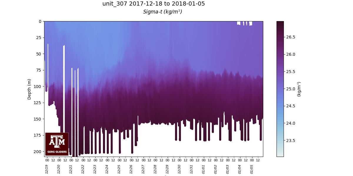

Potential density plot of CTD data for the upper ocean; made by Luz Zarate Jimenez.
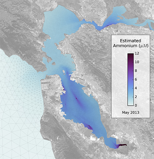
Estimated ammonium in San Francisco Bay by Rusty Holleman.
algae
The algae colormap is sequential with whitish-green for low values and increasing in green with increasing value, which could be used to represent an increase in chlorophyll in the water. Two examples of this colormap are shown below, from Texas A&M University gliders. This colormap is based on matplotlib’s Greens, but was recreated from scratch using the viscm tool.
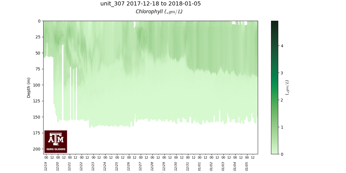
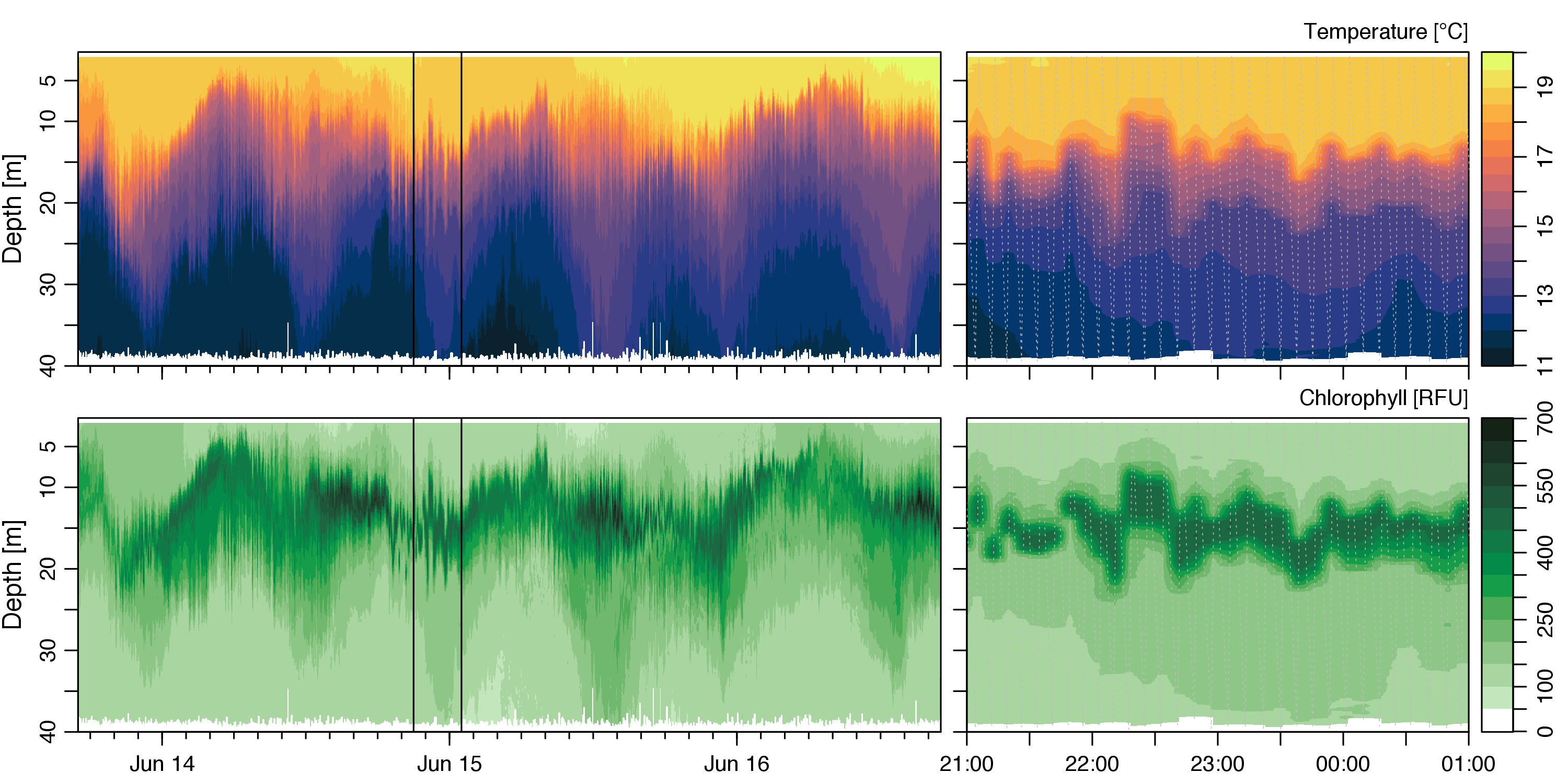
Example data from RBR’s Del Mar Oceanographic (DMO) Wirewalker, a wave-powered profiling system.
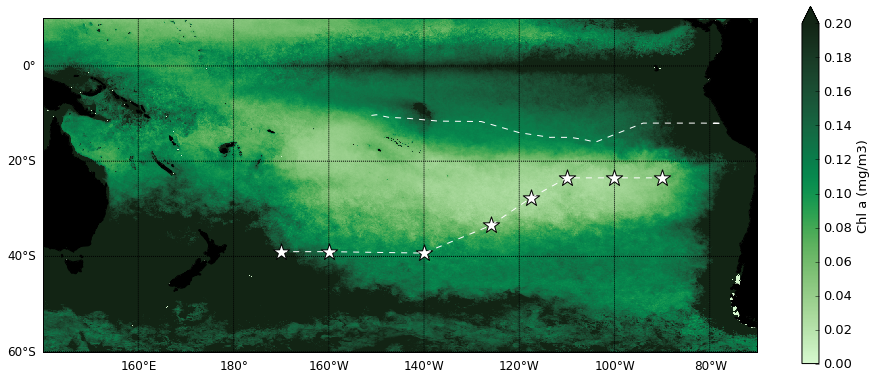
Satellite-derived Chl-a with sites indicated, by Frankie Pavia.
matter
The matter colormap is sequential with whitish-yellow for low values and increasing in pink with increasing value, and could be used to represent an increase in material in the water. Two examples of this colormap are shown below, from Texas A&M University gliders.
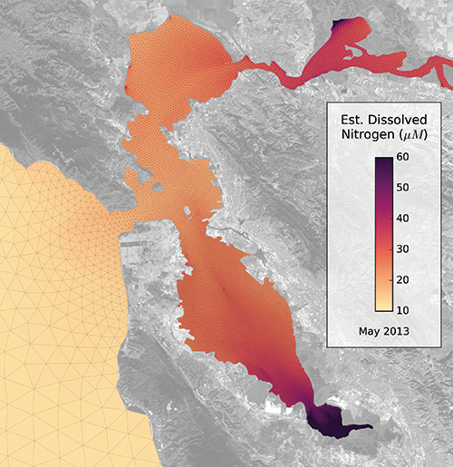
Estimated dissolved nitrogen in San Francisco Bay by Rusty Holleman.
turbid
The turbid colormap is sequential from light to dark brown and could be used to represent an increase in sediment in the water.

Data of Queensland, by Emilia P. (@mathinpython).
speed
The speed colormap is sequential from light greenish yellow representing low values to dark yellowish green representing large values. This colormap is the positive half of the delta colormap. An example of this colormap is from a numerical simulation of the Texas and Louisiana shelf.

amp
The amp colormap is sequential from whitish to dark red and could be used to represent an increase in wave height values. This colormap is the positive half of the balance colormap.

Earthquake magnitude, by Natalie Accardo using GMT.
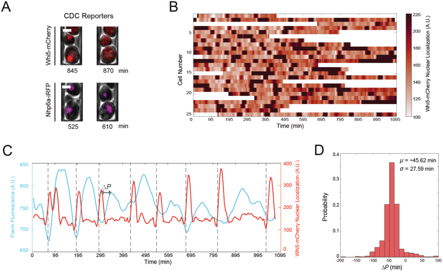
Baumgartner, B. L., O’Laughlin, R., Jin, M., Tsimring, L. S., Hao, N., & Hasty, J. (2018). Flavin-based metabolic cycles are integral features of growth and division in single yeast cells. Scientific reports, 8(1), 18045.
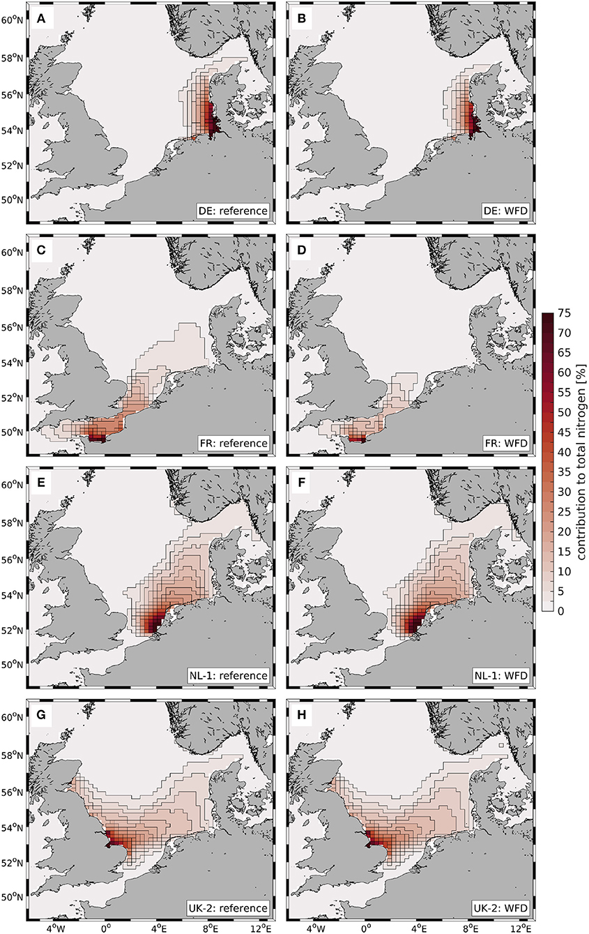
Lenhart, H. J., & Große, F. (2018). Assessing the effects of WFD nutrient reductions within an OSPAR frame using trans-boundary nutrient modeling. Frontiers in Marine Science, 5, 447.

Grunert, B. K., Brunner, S. L., Hamidi, S. A., Bravo, H. R., & Klump, J. V. (2018). Quantifying the influence of cold water intrusions in a shallow, coastal system across contrasting years: Green Bay, Lake Michigan. Journal of Great Lakes Research, 44(5), 851-863.
tempo
The tempo colormap is sequential from whitish to dark teal and could be used to represent an increase in wave period values. This colormap is the negative half of the curl colormap.
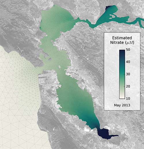
Estimated nitrate in San Francisco Bay by Rusty Holleman.
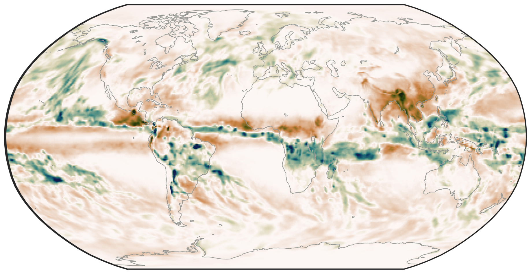
rain
The rain colormap is sequential from light, dry colors to blue, wet colors, and could be used to plot amounts of rainfall.

Rainfall, by Chad Greene.
phase
The phase colormap is circular, spanning all hues at a set lightness value. This map is intended to be used for properties such as wave phase and tidal phase which wrap around from 0˚ to 360˚ to 0˚ and should be represented without major perceptual jumps in the colormap.

Tidal phase in the North Atlantic ocean, by Kristen Thyng.
topo
The topo colormap has two distinct parts: one that is shades of blue and yellow to represent water depths (this is the deep colormap) and one that is shades of browns and greens to represent land elevation.
Bathymetry and topography, by Chad Greene.
balance
The balance colormap is diverging with dark blue to off-white to dark red representing negative to zero to positive values; this could be used to represent sea surface elevation, with deviations in the surface elevations as shades of color away from neutral off-white. In this case, shades of red have been chosen to represent sea surface elevation above the reference value (often mean sea level) to connect with warmer water typically being associated with an increase in the free surface, such as with the Loop Current in the Gulf of Mexico. An example of this colormap is from a numerical simulation of the Texas and Louisiana shelf. This colormap is based on matplotlib’s RdBu, but was recreated from scratch using the viscm tool.

Spatial Temporal Oceanographic Query System (STOQS)
delta
The delta colormap is diverging from darker blues to just off-white through shades of yellow green and could be used to represent diverging velocity values around a critical value (usually zero). This colormap was inspired by Francesca Samsel’s similar colormap, but generated from scratch using the viscm tool.

From plotly.

Model output in the northwest Gulf of Mexico from the Physical Oceanography Numerical Group (PONG) at Texas A&M.
curl
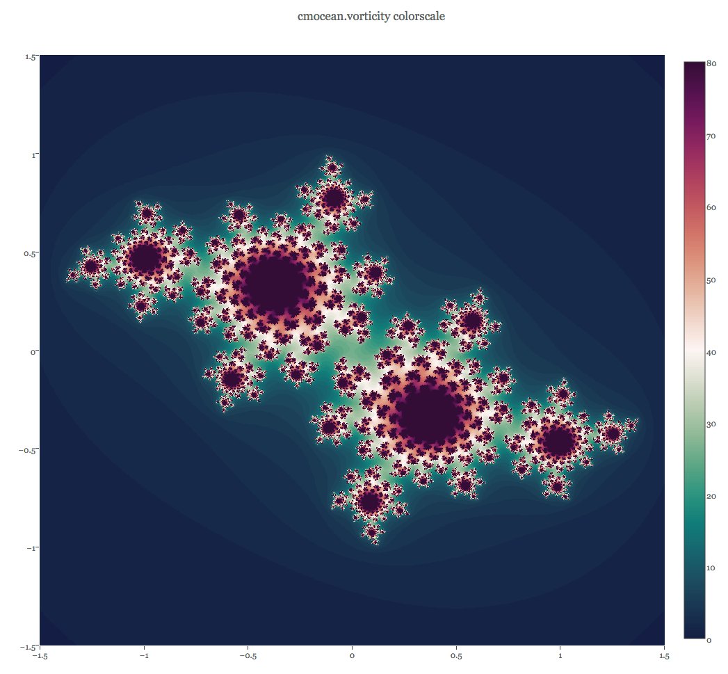
The curl colormap is diverging from darker teal to just off-white through shades of magenta and could be used to represent diverging vorticity values around a critical value (usually zero).

An example of this colormap is from a numerical simulation of the Texas and Louisiana shelf.
diff
The diff colormap is diverging, with one side shades of blues and one side shades of browns.

Surface pressure anomaly for December 2017, by Chad Greene.
tarn
The tarn colormap is diverging, with one side dry shades of browns and the other a range of greens and blues. The positive end of the colormap is meant to reflect the colors in rain and thus be a complementary colormap to rain for rain anomaly (around 0 or some other critical value).
Rain anomaly, by Chad Greene.
Resources
Here are some of my favorite resources.
cmocean available elsewhere!
- For MATLAB by Chad Greene
- For R: Oce oceanographic analysis package by Dan Kelley and Clark Richards
- For Ocean Data Viewer
- For Generic Mapping Tools (GMT) at cpt-city and on github
- For Paraview, inspired by Phillip Wolfram.
- In Plotly
- Chad Greene’s Antartic Mapping Tools in Matlab uses cmocean
- For Tableau as a preferences file on github
- For ImageJ as a preferences file on LUTs
- In iGOTM, which simulates a water column anywhere in the world.
- cmocean colormaps are included in the following packages:
Examples of beautiful visualizations:
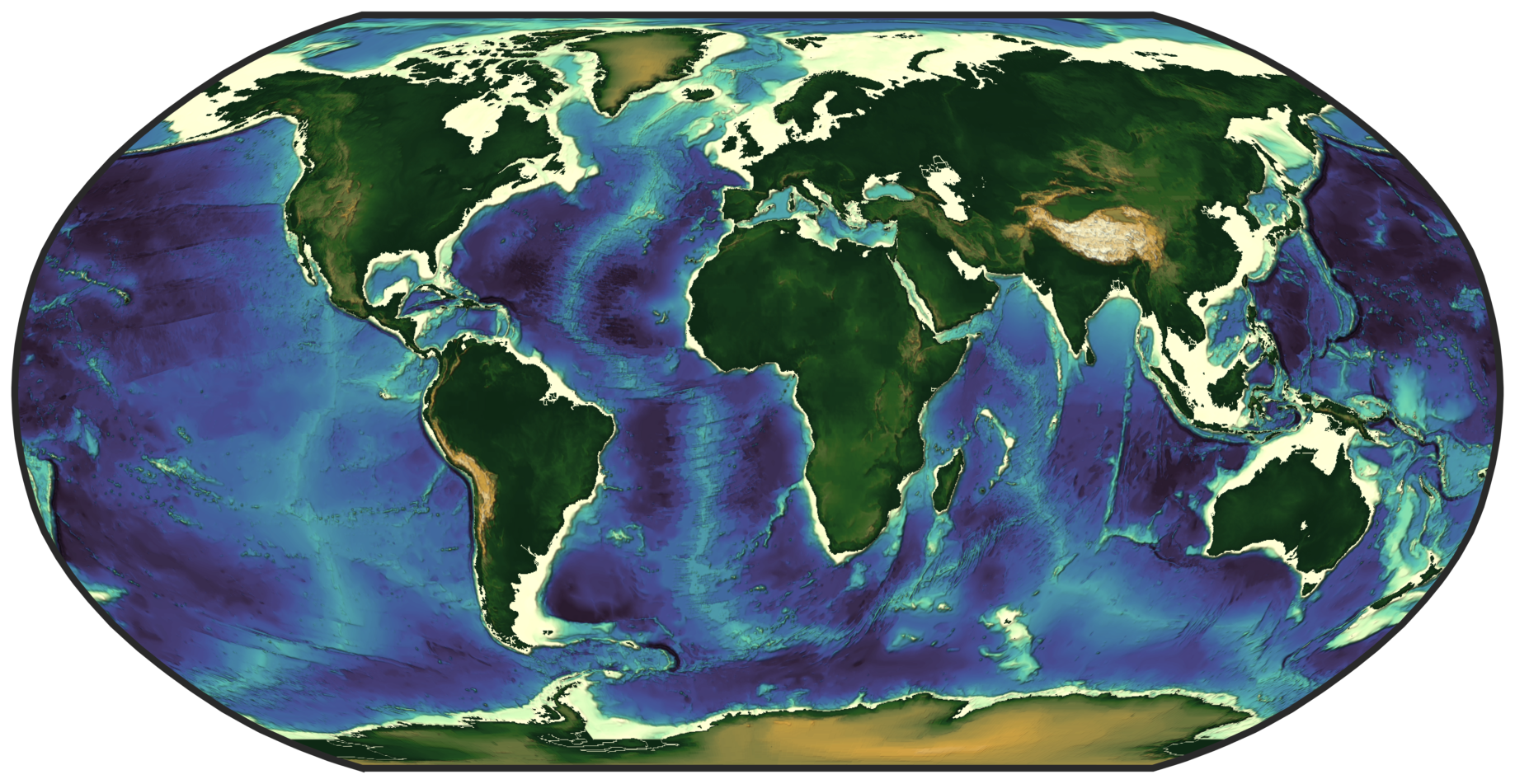
- Earth wind/currents/temperature/everything visualization: This is a wonderful visualization of worldwide wind and ocean dynamics and properties. It is also great for teaching, and seems to be continually under development and getting new fields as plotting options.
- This fall foliage map is easy to use, clear, and eye-catching. It is what we all aspire to!
- A clever visualization from The Upshot of political leaning depending on birth year. This is a perfect use of the diverging red to blue colormap.
Why jet is a bad colormap, and how to choose better:
- This is the article that started it all for me: Why Should Engineers and Scientists Be Worried About Color?
- An excellent series on jet and choosing colormaps that will really teach you what you need to know, by Matteo Niccoli
- Nice summary of arguments against jet by Jake Vanderplas
- A good summary in the Bulletin of the American Meteorological Society (BAMS) of visualization research and presentation of a tool for choosing good colormaps, aimed at atmospheric research but widely applicable.
- This tool will convert your (small file size) image to how it would look to someone with various kinds of color blindness so that you can make better decisions about the colors you use.
- Documentation from the matplotlib plotting package site for choosing colormaps.
- Tips for choosing a good scientific colormap
- The end of the rainbow, a plea to stop using jet.
- Research shows that jet is bad for your health!
- Reexamination of a previous study seems to show visual evidence indicating a front is really just an artifact of the jet colormap
There is a series of talks from the SciPy conference from 2014 and 2015 talking about colormaps:
- Damon McDougall introducing the problem with jet for representing data.
- Kristen Thyng following up with how to choose better colormaps, including using perceptually uniform colormaps and considering whether the information being represented is sequential or diverging in nature.
- Nathaniel Smith and Stéfan van der Walt explaining more about the jet colormap being bad, even bad for your health! They follow this up by proposing a new colormap for matplotlib, a Python plotting library.
- Kristen Thyng building off the work done by Nathaniel and Stéfan, a proposal of colormaps to plot typical oceanographic quantities (which led to cmocean!).
Other tips for making good figures:
- This link has a number of tips for choosing line color, colormaps, and using discrete vs. continuous colormaps.
- How to graph badly or what not to do has tips especially for line and bar plots and includes a summary of some of design guru Edward Tufte’s tips.
Contact
Kristen Thyng is the main developer of cmocean. Please email with questions, comments, and ideas. I’m collecting examples of the colormaps being used in action (see above) and also users of the colormaps, so I’d love to hear from you if you are using cmocean. kthyng at gmail.com or on twitter @thyngkm.