Note
Click here to download the full example code
pcolormesh
axes.Axes.pcolormesh allows you to generate 2D image-style plots. Note it
is faster than the similar pcolor.
import matplotlib.pyplot as plt
from matplotlib.colors import BoundaryNorm
from matplotlib.ticker import MaxNLocator
import numpy as np
Basic pcolormesh
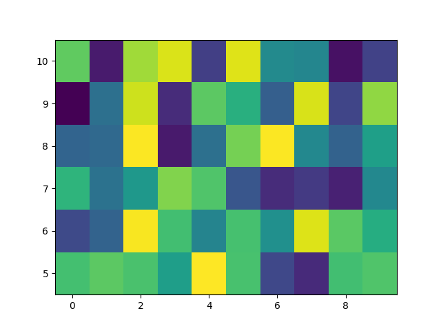
We usually specify a pcolormesh by defining the edge of quadrilaterals and the value of the quadrilateral. Note that here x and y each have one extra element than Z in the respective dimension.
np.random.seed(19680801)
Z = np.random.rand(6, 10)
x = np.arange(-0.5, 10, 1)  # len = 11
y = np.arange(4.5, 11, 1)  # len = 7

fig, ax = plt.subplots()
ax.pcolormesh(x, y, Z)
Out:
<matplotlib.collections.QuadMesh object at 0x7fe66cfa8310>
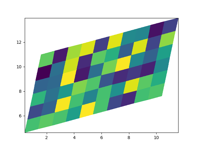
Non-rectilinear pcolormesh
Note that we can also specify matrices for X and Y and have non-rectilinear quadrilaterals.
Out:
<matplotlib.collections.QuadMesh object at 0x7fe66cfb3eb0>
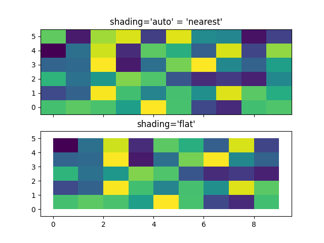
Centered Coordinates
Often a user wants to pass X and Y with the same sizes as Z to
axes.Axes.pcolormesh. This is also allowed if shading='auto' is
passed (default set by rcParams["pcolor.shading"] (default: 'flat')). Pre Matplotlib 3.3,
shading='flat' would drop the last column and row of Z; while that
is still allowed for back compatibility purposes, a DeprecationWarning is
raised. If this is really what you want, then simply drop the last row and
column of Z manually:
x = np.arange(10)  # len = 10
y = np.arange(6)  # len = 6
X, Y = np.meshgrid(x, y)

fig, axs = plt.subplots(2, 1, sharex=True, sharey=True)
axs[0].pcolormesh(X, Y, Z, vmin=np.min(Z), vmax=np.max(Z), shading='auto')
axs[0].set_title("shading='auto' = 'nearest'")
axs[1].pcolormesh(X, Y, Z[:-1, :-1], vmin=np.min(Z), vmax=np.max(Z),
                  shading='flat')
axs[1].set_title("shading='flat'")
Out:
Text(0.5, 1.0, "shading='flat'")
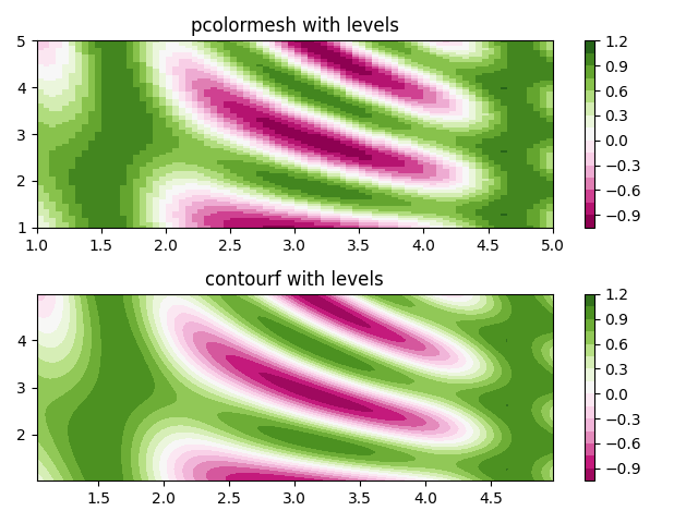
Making levels using Norms
Shows how to combine Normalization and Colormap instances to draw
"levels" in axes.Axes.pcolor, axes.Axes.pcolormesh
and axes.Axes.imshow type plots in a similar
way to the levels keyword argument to contour/contourf.
# make these smaller to increase the resolution
dx, dy = 0.05, 0.05

# generate 2 2d grids for the x & y bounds
y, x = np.mgrid[slice(1, 5 + dy, dy),
                slice(1, 5 + dx, dx)]

z = np.sin(x)**10 + np.cos(10 + y*x) * np.cos(x)

# x and y are bounds, so z should be the value *inside* those bounds.
# Therefore, remove the last value from the z array.
z = z[:-1, :-1]
levels = MaxNLocator(nbins=15).tick_values(z.min(), z.max())


# pick the desired colormap, sensible levels, and define a normalization
# instance which takes data values and translates those into levels.
cmap = plt.get_cmap('PiYG')
norm = BoundaryNorm(levels, ncolors=cmap.N, clip=True)

fig, (ax0, ax1) = plt.subplots(nrows=2)

im = ax0.pcolormesh(x, y, z, cmap=cmap, norm=norm)
fig.colorbar(im, ax=ax0)
ax0.set_title('pcolormesh with levels')


# contours are *point* based plots, so convert our bound into point
# centers
cf = ax1.contourf(x[:-1, :-1] + dx/2.,
                  y[:-1, :-1] + dy/2., z, levels=levels,
                  cmap=cmap)
fig.colorbar(cf, ax=ax1)
ax1.set_title('contourf with levels')

# adjust spacing between subplots so `ax1` title and `ax0` tick labels
# don't overlap
fig.tight_layout()

plt.show()
References
The use of the following functions, methods, classes and modules is shown in this example:
Total running time of the script: ( 0 minutes 1.147 seconds)
Keywords: matplotlib code example, codex, python plot, pyplot Gallery generated by Sphinx-Gallery