Note
Click here to download the full example code
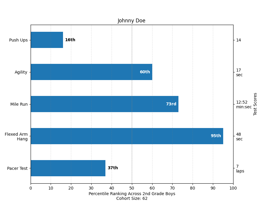
Percentiles as horizontal bar chart
Bar charts are useful for visualizing counts, or summary statistics with error bars. Also see the Grouped bar chart with labels or the Horizontal bar chart example for simpler versions of those features.
This example comes from an application in which grade school gym teachers wanted to be able to show parents how their child did across a handful of fitness tests, and importantly, relative to how other children did. To extract the plotting code for demo purposes, we'll just make up some data for little Johnny Doe.
import numpy as np
import matplotlib
import matplotlib.pyplot as plt
from matplotlib.ticker import MaxNLocator
from collections import namedtuple

np.random.seed(42)

Student = namedtuple('Student', ['name', 'grade', 'gender'])
Score = namedtuple('Score', ['score', 'percentile'])

# GLOBAL CONSTANTS
test_names = ['Pacer Test', 'Flexed Arm\n Hang', 'Mile Run', 'Agility',
              'Push Ups']
test_units = dict(zip(test_names, ['laps', 'sec', 'min:sec', 'sec', '']))


def attach_ordinal(num):
    """Convert an integer to an ordinal string, e.g. 2 -> '2nd'."""
    suffixes = {str(i): v
                for i, v in enumerate(['th', 'st', 'nd', 'rd', 'th',
                                       'th', 'th', 'th', 'th', 'th'])}
    v = str(num)
    # special case early teens
    if v in {'11', '12', '13'}:
        return v + 'th'
    return v + suffixes[v[-1]]


def format_score(score, test):
    """
    Create score labels for the right y-axis as the test name followed by the
    measurement unit (if any), split over two lines.
    """
    unit = test_units[test]
    if unit:
        return f'{score}\n{unit}'
    else:  # If no unit, don't include a newline, so that label stays centered.
        return score


def format_ycursor(y):
    y = int(y)
    if y < 0 or y >= len(test_names):
        return ''
    else:
        return test_names[y]


def plot_student_results(student, scores, cohort_size):
    fig, ax1 = plt.subplots(figsize=(9, 7))  # Create the figure
    fig.subplots_adjust(left=0.115, right=0.88)
    fig.canvas.manager.set_window_title('Eldorado K-8 Fitness Chart')

    pos = np.arange(len(test_names))

    rects = ax1.barh(pos, [scores[k].percentile for k in test_names],
                     align='center',
                     height=0.5,
                     tick_label=test_names)

    ax1.set_title(student.name)

    ax1.set_xlim([0, 100])
    ax1.xaxis.set_major_locator(MaxNLocator(11))
    ax1.xaxis.grid(True, linestyle='--', which='major',
                   color='grey', alpha=.25)

    # Plot a solid vertical gridline to highlight the median position
    ax1.axvline(50, color='grey', alpha=0.25)

    # Set the right-hand Y-axis ticks and labels
    ax2 = ax1.twinx()

    # Set the tick locations
    ax2.set_yticks(pos)
    # Set equal limits on both yaxis so that the ticks line up
    ax2.set_ylim(ax1.get_ylim())

    # Set the tick labels
    ax2.set_yticklabels([format_score(scores[k].score, k) for k in test_names])

    ax2.set_ylabel('Test Scores')

    xlabel = ('Percentile Ranking Across {grade} Grade {gender}s\n'
              'Cohort Size: {cohort_size}')
    ax1.set_xlabel(xlabel.format(grade=attach_ordinal(student.grade),
                                 gender=student.gender.title(),
                                 cohort_size=cohort_size))

    rect_labels = []
    # Lastly, write in the ranking inside each bar to aid in interpretation
    for rect in rects:
        # Rectangle widths are already integer-valued but are floating
        # type, so it helps to remove the trailing decimal point and 0 by
        # converting width to int type
        width = int(rect.get_width())

        rank_str = attach_ordinal(width)
        # The bars aren't wide enough to print the ranking inside
        if width < 40:
            # Shift the text to the right side of the right edge
            xloc = 5
            # Black against white background
            clr = 'black'
            align = 'left'
        else:
            # Shift the text to the left side of the right edge
            xloc = -5
            # White on magenta
            clr = 'white'
            align = 'right'

        # Center the text vertically in the bar
        yloc = rect.get_y() + rect.get_height() / 2
        label = ax1.annotate(
            rank_str, xy=(width, yloc), xytext=(xloc, 0),
            textcoords="offset points",
            horizontalalignment=align, verticalalignment='center',
            color=clr, weight='bold', clip_on=True)
        rect_labels.append(label)

    # Make the interactive mouse over give the bar title
    ax2.fmt_ydata = format_ycursor
    # Return all of the artists created
    return {'fig': fig,
            'ax': ax1,
            'ax_right': ax2,
            'bars': rects,
            'perc_labels': rect_labels}


student = Student('Johnny Doe', 2, 'boy')
scores = dict(zip(
    test_names,
    (Score(v, p) for v, p in
     zip(['7', '48', '12:52', '17', '14'],
         np.round(np.random.uniform(0, 100, len(test_names)), 0)))))
cohort_size = 62  # The number of other 2nd grade boys

arts = plot_student_results(student, scores, cohort_size)
plt.show()
References
The use of the following functions, methods and classes is shown in this example:
Out:
<function _AxesBase.twinx at 0x7f5f32c9baf0>
Keywords: matplotlib code example, codex, python plot, pyplot Gallery generated by Sphinx-Gallery