Version 3.1.3
Note
Click here to download the full example code
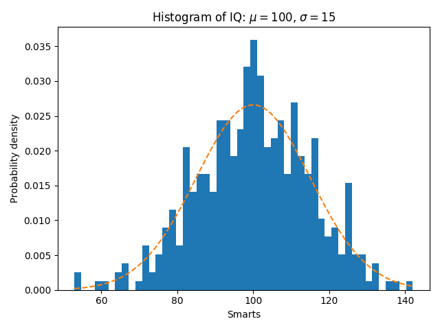
In addition to the basic histogram, this demo shows a few optional features:
normed flag, which normalizes bin heights so that the integral of
the histogram is 1. The resulting histogram is an approximation of the
probability density function.Selecting different bin counts and sizes can significantly affect the shape of a histogram. The Astropy docs have a great section on how to select these parameters.
import matplotlib
import numpy as np
import matplotlib.pyplot as plt

np.random.seed(19680801)

# example data
mu = 100  # mean of distribution
sigma = 15  # standard deviation of distribution
x = mu + sigma * np.random.randn(437)

num_bins = 50

fig, ax = plt.subplots()

# the histogram of the data
n, bins, patches = ax.hist(x, num_bins, density=1)

# add a 'best fit' line
y = ((1 / (np.sqrt(2 * np.pi) * sigma)) *
     np.exp(-0.5 * (1 / sigma * (bins - mu))**2))
ax.plot(bins, y, '--')
ax.set_xlabel('Smarts')
ax.set_ylabel('Probability density')
ax.set_title(r'Histogram of IQ: $\mu=100$, $\sigma=15$')

# Tweak spacing to prevent clipping of ylabel
fig.tight_layout()
plt.show()
The use of the following functions and methods is shown in this example:
matplotlib.axes.Axes.hist
matplotlib.axes.Axes.set_title
matplotlib.axes.Axes.set_xlabel
matplotlib.axes.Axes.set_ylabel
Out:
<function Axes.set_ylabel at 0x7f18a5a84940>
Keywords: matplotlib code example, codex, python plot, pyplot Gallery generated by Sphinx-Gallery