Version 3.1.3
Note
Click here to download the full example code
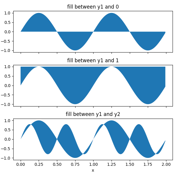
This example shows how to use fill_between to color the area
between two lines.
import matplotlib.pyplot as plt
import numpy as np
The parameters y1 and y2 can be a scalar, indicating a horizontal boundary a the given y-values. If only y1 is given, y2 defaults to 0.
x = np.arange(0.0, 2, 0.01)
y1 = np.sin(2 * np.pi * x)
y2 = 0.8 * np.sin(4 * np.pi * x)

fig, (ax1, ax2, ax3) = plt.subplots(3, 1, sharex=True, figsize=(6, 6))

ax1.fill_between(x, y1)
ax1.set_title('fill between y1 and 0')

ax2.fill_between(x, y1, 1)
ax2.set_title('fill between y1 and 1')

ax3.fill_between(x, y1, y2)
ax3.set_title('fill between y1 and y2')
ax3.set_xlabel('x')
fig.tight_layout()
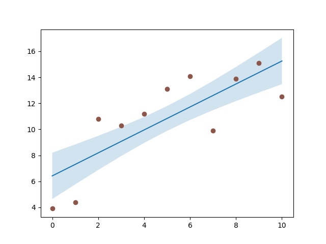
A common application for fill_between is the indication of
confidence bands.
fill_between uses the colors of the color cycle as the fill
color. These may be a bit strong when applied to fill areas. It is
therefore often a good practice to lighten the color by making the area
semi-transparent using alpha.
# sphinx_gallery_thumbnail_number = 2

N = 21
x = np.linspace(0, 10, 11)
y = [3.9, 4.4, 10.8, 10.3, 11.2, 13.1, 14.1,  9.9, 13.9, 15.1, 12.5]

# fit a linear curve an estimate its y-values and their error.
a, b = np.polyfit(x, y, deg=1)
y_est = a * x + b
y_err = x.std() * np.sqrt(1/len(x) +
                          (x - x.mean())**2 / np.sum((x - x.mean())**2))

fig, ax = plt.subplots()
ax.plot(x, y_est, '-')
ax.fill_between(x, y_est - y_err, y_est + y_err, alpha=0.2)
ax.plot(x, y, 'o', color='tab:brown')
Out:
[<matplotlib.lines.Line2D object at 0x7f188bc74fd0>]
The parameter where allows to specify the x-ranges to fill. It's a boolean array with the same size as x.
Only x-ranges of contiguous True sequences are filled. As a result the
range between neighboring True and False values is never filled. This
often undesired when the data points should represent a contiguous quantity.
It is therefore recommended to set interpolate=True unless the
x-distance of the data points is fine enough so that the above effect is not
noticeable. Interpolation approximates the actual x position at which the
where condition will change and extends the filling up to there.
x = np.array([0, 1, 2, 3])
y1 = np.array([0.8, 0.8, 0.2, 0.2])
y2 = np.array([0, 0, 1, 1])

fig, (ax1, ax2) = plt.subplots(2, 1, sharex=True)

ax1.set_title('interpolation=False')
ax1.plot(x, y1, 'o--')
ax1.plot(x, y2, 'o--')
ax1.fill_between(x, y1, y2, where=(y1 > y2), color='C0', alpha=0.3)
ax1.fill_between(x, y1, y2, where=(y1 < y2), color='C1', alpha=0.3)

ax2.set_title('interpolation=True')
ax2.plot(x, y1, 'o--')
ax2.plot(x, y2, 'o--')
ax2.fill_between(x, y1, y2, where=(y1 > y2), color='C0', alpha=0.3,
                 interpolate=True)
ax2.fill_between(x, y1, y2, where=(y1 <= y2), color='C1', alpha=0.3,
                 interpolate=True)
fig.tight_layout()
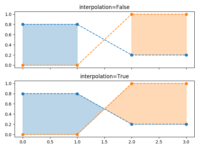
Note
Similar gaps will occur if y1 or y2 are masked arrays. Since missing values cannot be approximated, interpolate has no effect in this case. The gaps around masked values can only be reduced by adding more data points close to the masked values.
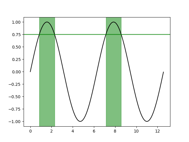
The same selection mechanism can be applied to fill the full vertical height of the axes. To be independent of y-limits, we add a transform that interprets the x-values in data coorindates and the y-values in axes coordinates.
The following example marks the regions in which the y-data are above a given threshold.
Out:
<matplotlib.collections.PolyCollection object at 0x7f188bd22760>
The use of the following functions, methods and classes is shown in this example:
import matplotlib
matplotlib.axes.Axes.fill_between
matplotlib.pyplot.fill_between
matplotlib.axes.Axes.get_xaxis_transform
Out:
<function _AxesBase.get_xaxis_transform at 0x7f18a5a7aee0>
Keywords: matplotlib code example, codex, python plot, pyplot Gallery generated by Sphinx-Gallery