Version 3.1.0

Note
Click here to download the full example code
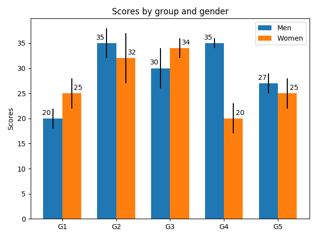
Bar charts are useful for visualizing counts, or summary statistics with error bars. This example shows a ways to create a grouped bar chart with Matplotlib and also how to annotate bars with labels.
import matplotlib
import matplotlib.pyplot as plt
import numpy as np


men_means, men_std = (20, 35, 30, 35, 27), (2, 3, 4, 1, 2)
women_means, women_std = (25, 32, 34, 20, 25), (3, 5, 2, 3, 3)

ind = np.arange(len(men_means))  # the x locations for the groups
width = 0.35  # the width of the bars

fig, ax = plt.subplots()
rects1 = ax.bar(ind - width/2, men_means, width, yerr=men_std,
                label='Men')
rects2 = ax.bar(ind + width/2, women_means, width, yerr=women_std,
                label='Women')

# Add some text for labels, title and custom x-axis tick labels, etc.
ax.set_ylabel('Scores')
ax.set_title('Scores by group and gender')
ax.set_xticks(ind)
ax.set_xticklabels(('G1', 'G2', 'G3', 'G4', 'G5'))
ax.legend()


def autolabel(rects, xpos='center'):
    """
    Attach a text label above each bar in *rects*, displaying its height.

    *xpos* indicates which side to place the text w.r.t. the center of
    the bar. It can be one of the following {'center', 'right', 'left'}.
    """

    ha = {'center': 'center', 'right': 'left', 'left': 'right'}
    offset = {'center': 0, 'right': 1, 'left': -1}

    for rect in rects:
        height = rect.get_height()
        ax.annotate('{}'.format(height),
                    xy=(rect.get_x() + rect.get_width() / 2, height),
                    xytext=(offset[xpos]*3, 3),  # use 3 points offset
                    textcoords="offset points",  # in both directions
                    ha=ha[xpos], va='bottom')


autolabel(rects1, "left")
autolabel(rects2, "right")

fig.tight_layout()

plt.show()

The use of the following functions, methods and classes is shown in this example:
Keywords: matplotlib code example, codex, python plot, pyplot Gallery generated by Sphinx-Gallery