Version 3.0.0
Note
Click here to download the full example code
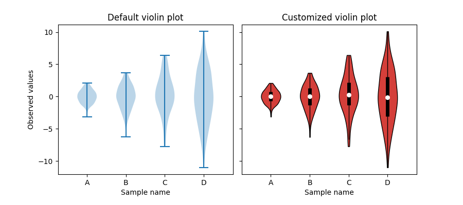
This example demonstrates how to fully customize violin plots. The first plot shows the default style by providing only the data. The second plot first limits what matplotlib draws with additional kwargs. Then a simplified representation of a box plot is drawn on top. Lastly, the styles of the artists of the violins are modified.
For more information on violin plots, the scikit-learn docs have a great section: http://scikit-learn.org/stable/modules/density.html
import matplotlib.pyplot as plt
import numpy as np


def adjacent_values(vals, q1, q3):
    upper_adjacent_value = q3 + (q3 - q1) * 1.5
    upper_adjacent_value = np.clip(upper_adjacent_value, q3, vals[-1])

    lower_adjacent_value = q1 - (q3 - q1) * 1.5
    lower_adjacent_value = np.clip(lower_adjacent_value, vals[0], q1)
    return lower_adjacent_value, upper_adjacent_value


def set_axis_style(ax, labels):
    ax.get_xaxis().set_tick_params(direction='out')
    ax.xaxis.set_ticks_position('bottom')
    ax.set_xticks(np.arange(1, len(labels) + 1))
    ax.set_xticklabels(labels)
    ax.set_xlim(0.25, len(labels) + 0.75)
    ax.set_xlabel('Sample name')


# create test data
np.random.seed(19680801)
data = [sorted(np.random.normal(0, std, 100)) for std in range(1, 5)]

fig, (ax1, ax2) = plt.subplots(nrows=1, ncols=2, figsize=(9, 4), sharey=True)

ax1.set_title('Default violin plot')
ax1.set_ylabel('Observed values')
ax1.violinplot(data)

ax2.set_title('Customized violin plot')
parts = ax2.violinplot(
        data, showmeans=False, showmedians=False,
        showextrema=False)

for pc in parts['bodies']:
    pc.set_facecolor('#D43F3A')
    pc.set_edgecolor('black')
    pc.set_alpha(1)

quartile1, medians, quartile3 = np.percentile(data, [25, 50, 75], axis=1)
whiskers = np.array([
    adjacent_values(sorted_array, q1, q3)
    for sorted_array, q1, q3 in zip(data, quartile1, quartile3)])
whiskersMin, whiskersMax = whiskers[:, 0], whiskers[:, 1]

inds = np.arange(1, len(medians) + 1)
ax2.scatter(inds, medians, marker='o', color='white', s=30, zorder=3)
ax2.vlines(inds, quartile1, quartile3, color='k', linestyle='-', lw=5)
ax2.vlines(inds, whiskersMin, whiskersMax, color='k', linestyle='-', lw=1)

# set style for the axes
labels = ['A', 'B', 'C', 'D']
for ax in [ax1, ax2]:
    set_axis_style(ax, labels)

plt.subplots_adjust(bottom=0.15, wspace=0.05)
plt.show()
Keywords: matplotlib code example, codex, python plot, pyplot Gallery generated by Sphinx-Gallery