Version 3.0.0
Note
Click here to download the full example code
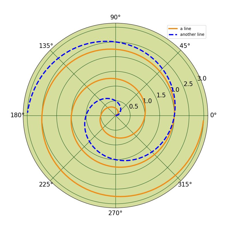
Demo of a legend on a polar-axis plot.
import matplotlib.pyplot as plt
import numpy as np

# radar green, solid grid lines
plt.rc('grid', color='#316931', linewidth=1, linestyle='-')
plt.rc('xtick', labelsize=15)
plt.rc('ytick', labelsize=15)

# force square figure and square axes looks better for polar, IMO
fig = plt.figure(figsize=(8, 8))
ax = fig.add_axes([0.1, 0.1, 0.8, 0.8],
                  projection='polar', facecolor='#d5de9c')

r = np.arange(0, 3.0, 0.01)
theta = 2 * np.pi * r
ax.plot(theta, r, color='#ee8d18', lw=3, label='a line')
ax.plot(0.5 * theta, r, color='blue', ls='--', lw=3, label='another line')
ax.legend()

plt.show()
The use of the following functions, methods, classes and modules is shown in this example:
import matplotlib
matplotlib.axes.Axes.plot
matplotlib.axes.Axes.legend
matplotlib.projections.polar
matplotlib.projections.polar.PolarAxes
Keywords: matplotlib code example, codex, python plot, pyplot Gallery generated by Sphinx-Gallery