Version 2.2.5
Note
Click here to download the full example code
Demonstration of using norm to map colormaps onto data in non-linear ways.
import numpy as np
import matplotlib.pyplot as plt
import matplotlib.colors as colors
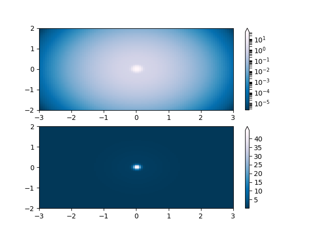
Lognorm: Instead of pcolor log10(Z1) you can have colorbars that have the exponential labels using a norm.
N = 100
X, Y = np.mgrid[-3:3:complex(0, N), -2:2:complex(0, N)]

# A low hump with a spike coming out of the top.  Needs to have
# z/colour axis on a log scale so we see both hump and spike.  linear
# scale only shows the spike.

Z1 = np.exp(-(X)**2 - (Y)**2)
Z2 = np.exp(-(X * 10)**2 - (Y * 10)**2)
Z = Z1 + 50 * Z2

fig, ax = plt.subplots(2, 1)

pcm = ax[0].pcolor(X, Y, Z,
                   norm=colors.LogNorm(vmin=Z.min(), vmax=Z.max()),
                   cmap='PuBu_r')
fig.colorbar(pcm, ax=ax[0], extend='max')

pcm = ax[1].pcolor(X, Y, Z, cmap='PuBu_r')
fig.colorbar(pcm, ax=ax[1], extend='max')
Out:
<matplotlib.colorbar.Colorbar object at 0x7fd7333cc040>
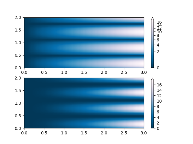
PowerNorm: Here a power-law trend in X partially obscures a rectified sine wave in Y. We can remove the power law using a PowerNorm.
X, Y = np.mgrid[0:3:complex(0, N), 0:2:complex(0, N)]
Z1 = (1 + np.sin(Y * 10.)) * X**(2.)

fig, ax = plt.subplots(2, 1)

pcm = ax[0].pcolormesh(X, Y, Z1, norm=colors.PowerNorm(gamma=1. / 2.),
                       cmap='PuBu_r')
fig.colorbar(pcm, ax=ax[0], extend='max')

pcm = ax[1].pcolormesh(X, Y, Z1, cmap='PuBu_r')
fig.colorbar(pcm, ax=ax[1], extend='max')
Out:
<matplotlib.colorbar.Colorbar object at 0x7fd733137520>
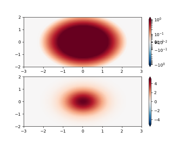
SymLogNorm: two humps, one negative and one positive, The positive with 5-times the amplitude. Linearly, you cannot see detail in the negative hump. Here we logarithmically scale the positive and negative data separately.
Note that colorbar labels do not come out looking very good.
X, Y = np.mgrid[-3:3:complex(0, N), -2:2:complex(0, N)]
Z1 = 5 * np.exp(-X**2 - Y**2)
Z2 = np.exp(-(X - 1)**2 - (Y - 1)**2)
Z = (Z1 - Z2) * 2

fig, ax = plt.subplots(2, 1)

pcm = ax[0].pcolormesh(X, Y, Z1,
                       norm=colors.SymLogNorm(linthresh=0.03, linscale=0.03,
                                              vmin=-1.0, vmax=1.0),
                       cmap='RdBu_r')
fig.colorbar(pcm, ax=ax[0], extend='both')

pcm = ax[1].pcolormesh(X, Y, Z1, cmap='RdBu_r', vmin=-np.max(Z1))
fig.colorbar(pcm, ax=ax[1], extend='both')
Out:
<matplotlib.colorbar.Colorbar object at 0x7fd73305b700>
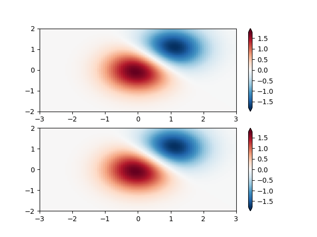
Custom Norm: An example with a customized normalization. This one uses the example above, and normalizes the negative data differently from the positive.
X, Y = np.mgrid[-3:3:complex(0, N), -2:2:complex(0, N)]
Z1 = np.exp(-X**2 - Y**2)
Z2 = np.exp(-(X - 1)**2 - (Y - 1)**2)
Z = (Z1 - Z2) * 2

# Example of making your own norm.  Also see matplotlib.colors.
# From Joe Kington: This one gives two different linear ramps:


class MidpointNormalize(colors.Normalize):
    def __init__(self, vmin=None, vmax=None, midpoint=None, clip=False):
        self.midpoint = midpoint
        colors.Normalize.__init__(self, vmin, vmax, clip)

    def __call__(self, value, clip=None):
        # I'm ignoring masked values and all kinds of edge cases to make a
        # simple example...
        x, y = [self.vmin, self.midpoint, self.vmax], [0, 0.5, 1]
        return np.ma.masked_array(np.interp(value, x, y))


#####
fig, ax = plt.subplots(2, 1)

pcm = ax[0].pcolormesh(X, Y, Z,
                       norm=MidpointNormalize(midpoint=0.),
                       cmap='RdBu_r')
fig.colorbar(pcm, ax=ax[0], extend='both')

pcm = ax[1].pcolormesh(X, Y, Z, cmap='RdBu_r', vmin=-np.max(Z))
fig.colorbar(pcm, ax=ax[1], extend='both')
Out:
<matplotlib.colorbar.Colorbar object at 0x7fd732f06f40>
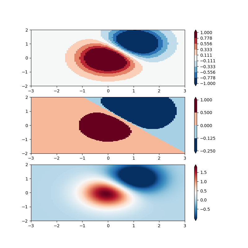
BoundaryNorm: For this one you provide the boundaries for your colors, and the Norm puts the first color in between the first pair, the second color between the second pair, etc.
fig, ax = plt.subplots(3, 1, figsize=(8, 8))
ax = ax.flatten()
# even bounds gives a contour-like effect
bounds = np.linspace(-1, 1, 10)
norm = colors.BoundaryNorm(boundaries=bounds, ncolors=256)
pcm = ax[0].pcolormesh(X, Y, Z,
                       norm=norm,
                       cmap='RdBu_r')
fig.colorbar(pcm, ax=ax[0], extend='both', orientation='vertical')

# uneven bounds changes the colormapping:
bounds = np.array([-0.25, -0.125, 0, 0.5, 1])
norm = colors.BoundaryNorm(boundaries=bounds, ncolors=256)
pcm = ax[1].pcolormesh(X, Y, Z, norm=norm, cmap='RdBu_r')
fig.colorbar(pcm, ax=ax[1], extend='both', orientation='vertical')

pcm = ax[2].pcolormesh(X, Y, Z, cmap='RdBu_r', vmin=-np.max(Z1))
fig.colorbar(pcm, ax=ax[2], extend='both', orientation='vertical')

plt.show()
Keywords: matplotlib code example, codex, python plot, pyplot Gallery generated by Sphinx-Gallery