Version 2.2.5
Note
Click here to download the full example code
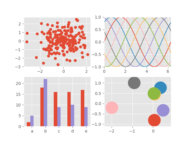
This example demonstrates the "ggplot" style, which adjusts the style to emulate ggplot (a popular plotting package for R).
These settings were shamelessly stolen from [1] (with permission).
| [1] | https://web.archive.org/web/20111215111010/http://www.huyng.com/archives/sane-color-scheme-for-matplotlib/691/ |
import numpy as np
import matplotlib.pyplot as plt

plt.style.use('ggplot')

# Fixing random state for reproducibility
np.random.seed(19680801)

fig, axes = plt.subplots(ncols=2, nrows=2)
ax1, ax2, ax3, ax4 = axes.ravel()

# scatter plot (Note: `plt.scatter` doesn't use default colors)
x, y = np.random.normal(size=(2, 200))
ax1.plot(x, y, 'o')

# sinusoidal lines with colors from default color cycle
L = 2*np.pi
x = np.linspace(0, L)
ncolors = len(plt.rcParams['axes.prop_cycle'])
shift = np.linspace(0, L, ncolors, endpoint=False)
for s in shift:
    ax2.plot(x, np.sin(x + s), '-')
ax2.margins(0)

# bar graphs
x = np.arange(5)
y1, y2 = np.random.randint(1, 25, size=(2, 5))
width = 0.25
ax3.bar(x, y1, width)
ax3.bar(x + width, y2, width,
        color=list(plt.rcParams['axes.prop_cycle'])[2]['color'])
ax3.set_xticks(x + width)
ax3.set_xticklabels(['a', 'b', 'c', 'd', 'e'])

# circles with colors from default color cycle
for i, color in enumerate(plt.rcParams['axes.prop_cycle']):
    xy = np.random.normal(size=2)
    ax4.add_patch(plt.Circle(xy, radius=0.3, color=color['color']))
ax4.axis('equal')
ax4.margins(0)

plt.show()
Keywords: matplotlib code example, codex, python plot, pyplot Gallery generated by Sphinx-Gallery